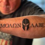
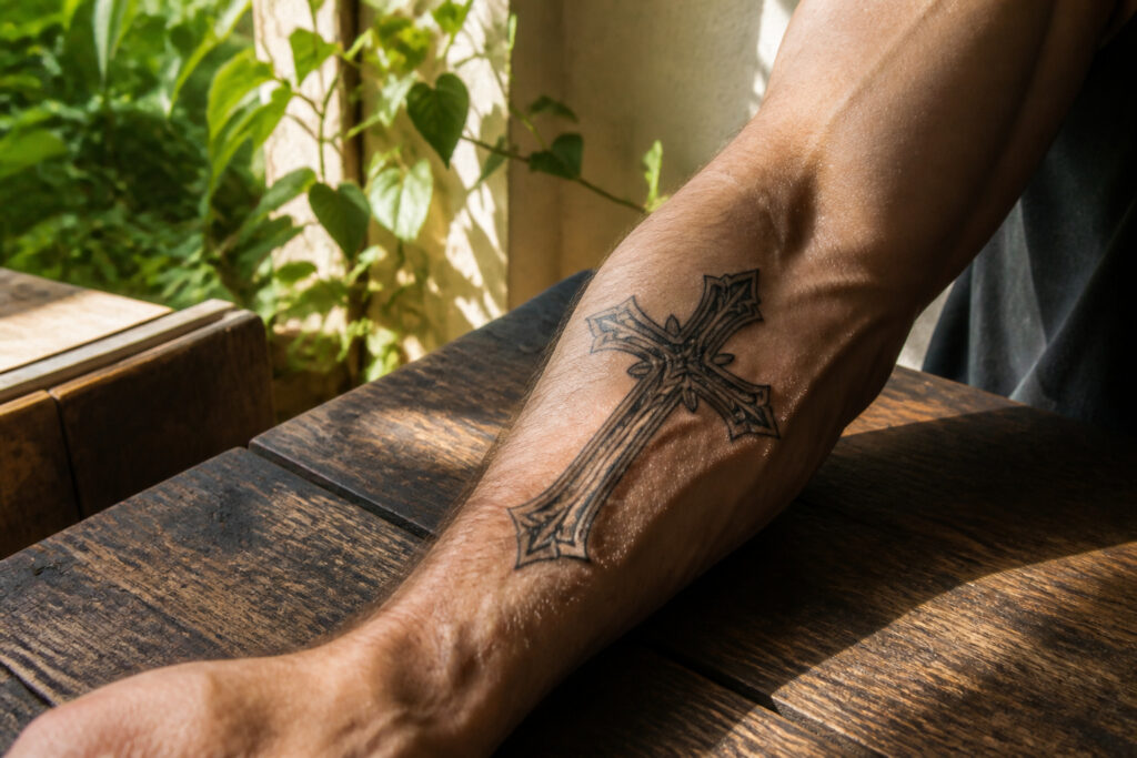
Cross tattoos for men range from half-inch hand pieces to full back compositions, and the deciding factor is usually how much room your artist needs for the detail you actually want.
The catch is that visibility and aging work against each other: forearm skin holds bold lines but exposes the work to every employer, while a chest or bicep piece stays hidden and keeps ink crisp for decades.
Most of the designs below use black-and-grey realism, but a simple blackwork cross ages better than almost anything else in the craft.
1. Cross Memorial Tattoo
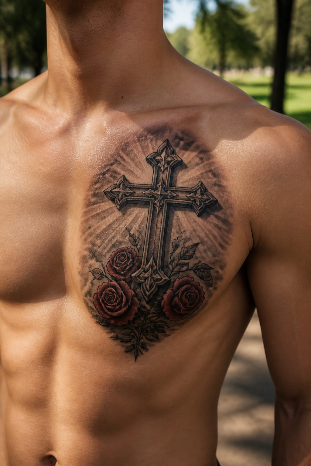
A cross memorial tattoo carries weight that goes well beyond the lines themselves.
The cross already speaks to eternal life, and placing that symbol over the heart adds a layer of intimacy while keeping the piece easy to conceal under a shirt when needed.
Names, dates, and bible verses layer in the specifics of one person’s memory. Roses or lilies climb the arms or sit at the base, softening the geometry with something alive.
Forget-me-nots work particularly well when the piece honors a mother or grandmother whose faith shaped the wearer’s own.
The chest, inner forearm, and inner bicep are the placements that earn repeat requests, since they balance visibility with the private nature of grief.
Lettering should run slightly larger than instinct suggests; legibility is the entire reason the name is there, and fine script that blurs with age defeats the purpose.
A banner across the cross arms or text wrapped around the vertical beam keeps the composition clean without crowding the symbol itself.
2. Religious Back Cross Tattoo

The back gives a cross tattoo room to breathe in a way no other placement does.
A single large cross running down the spine, a three-cross scene across the upper back, or an angel-wings-and-cross composition spanning the shoulder blades all use that flat, broad canvas to create something substantial.
The symmetry of a centered cross follows the natural lines of lats and shoulders, which means the design actually reads as part of your structure rather than sitting on top of it.
Simple linework with bold light shading keeps the finish clean and minimal, letting the scale do the work instead of crowding the space with detail.
Pain tolerance is manageable across the upper back and shoulder blades, though the spine itself and lower back demand more grit. For men who want religious symbolism that carries physical presence, this placement makes the statement without needing to shout.
3. Awesome Forearm Cross Tattoo
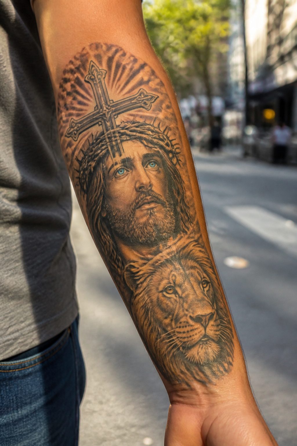
The forearm is where a cross tattoo earns its keep. The outer face gives enough flat ground for a Jesus portrait paired with a lion, both rendered in high-contrast shading that reads clearly from a few feet back.
Bright blue or colored eyes on either figure will hold their intensity here, since the skin takes ink evenly and the muscle underneath keeps the surface stable over time.
Inner forearm placement shifts the same design inward, turning it into something the wearer sees during the day rather than broadcasts.
Either way, the thick skin and underlying muscle make the session more tolerable than hands or ribs, and the ink stays crisp longer than on high-friction spots like fingers.
Detail work at this size demands an experienced hand; a realistic face or mane texture needs room to breathe, and a forearm sleeve offers just enough without sprawling into a full arm commitment.
Add a timepiece above the faces if the idea of faith outlasting time matters to the piece, or leave the composition clean and let the two figures carry the cross shape on their own.
4. Black Band Cross Tattoo
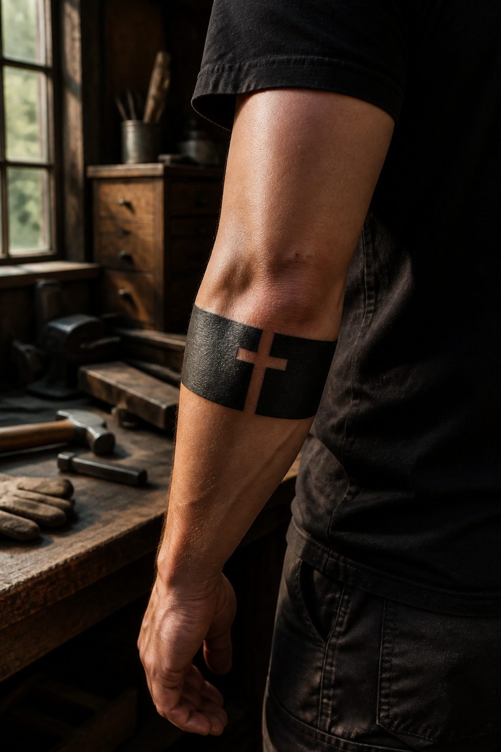
Solid black shading wrapped around or beside a cross gives the black band cross tattoo its particular weight.
The band itself reads as an unbroken ring, and when it sits at the crook of the elbow or wraps the forearm, that continuity turns the cross into something you carry rather than something you visit.
No interior shading softens the edges, so the lines stay sharp and the design keeps its legibility from a distance.
The format works best for men who want the symbol present without ornamental distraction.
A single band, thick enough to hold ink density, frames the cross or runs parallel to it; either placement keeps the religious mark central while the band suggests an eternal connection to faith.
Touch-ups stay minimal over time because the solid fill ages more evenly than fine detail or gray wash.
For guys who prefer direct, masculine ink that does not ask for attention, this is the set-it-and-forget-it option: bold, readable, and spiritually grounded without excess.
5. Cross with Wings Chest Tattoo

A cross with wings chest tattoo sits naturally over the sternum, the bone placement aligning the design directly with the heart.
That proximity matters for meaning: the combination draws on religious iconography where the cross signals faith and sacrifice, while wings carry divine protection, guidance, and the presence of someone who has passed.
Most men who choose this design dedicate it to a parent, grandparent, or close friend.
The chest gives the wings room to extend. They can stretch across both pectoral muscles or reach toward the shoulders and ribs, letting the feathers read as either grounded or ascending depending on how your artist shades them.
Soft feather shading tends to look more natural than hard lines here, though clean linework spans work if you prefer a bolder silhouette.
Pain is the real consideration. The sternum sits bone-close to skin, making it more sensitive than most placements.
Most men find the meaning worth the discomfort, and the chest holds ink well long-term since it sees limited sun exposure day to day.
6. Simple Cross Tattoo
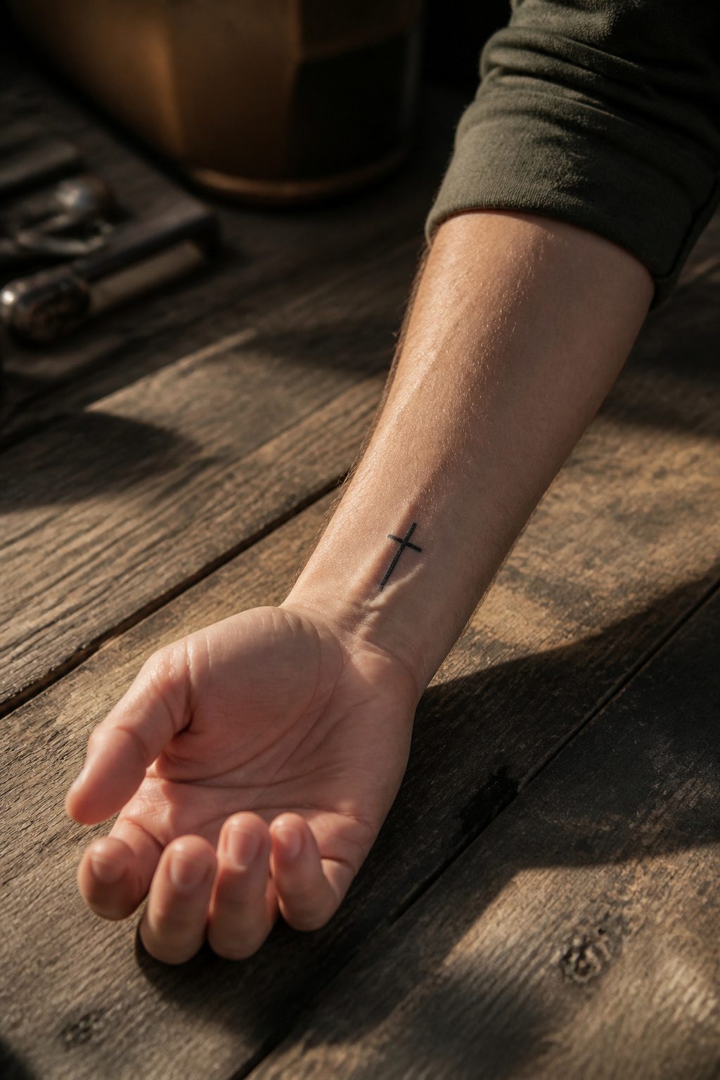
Clean linework and bold geometry carry the full weight of a simple cross tattoo without shading, color, or ornamental detail.
Most designs run a single black outline or a solid blackwork silhouette, and the restraint appeals to anyone who wants the symbol to speak for itself.
Bold linework holds up better over decades than ultra-thin lines, so giving the cross more weight than you first picture is usually the smarter call.
Placement stays flexible; the wrist or hand keep it visible, while behind the ear hides it unless you choose to show it.
Some artists add a grey wash for depth, though plenty of clients skip even that and stay with pure line.
The understated approach costs less than detailed work, and the small size, often between half an inch and two inches, means every line must be precise; imperfections have nowhere to hide.
For a first religious piece, the simplicity removes decision fatigue and leaves you with ink that reads clearly at a glance and ages without clutter.
7. Allusive Half Sleeve Cross Tattoo
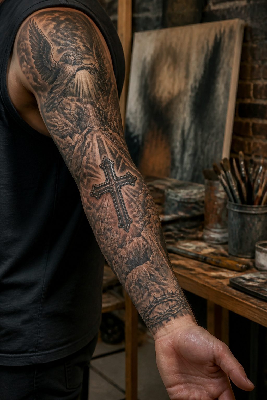
Heavy shading across the upper arm lets an allusive half sleeve read as a single scene rather than a collection of symbols.
The deltoid and outer bicep serve as the natural anchor points, with the cross typically centered on the shoulder cap so the eye travels downward through layered imagery.
Storm clouds and darker tones work the inner bicep where skin stays protected and ink holds longer; angels or lighter elements rise toward the deltoid where they catch light in a short sleeve.
A piece this dense breaks into multiple sessions over weeks or months, and planning the full composition upfront matters more than adding elements as you go.
Black-and-grey realism is the usual choice, though the structure can adapt to American Traditional or Trash Polka if the contrast stays consistent across both anchor points.
The half sleeve leaves the forearm open, which creates a natural path toward a full sleeve later or keeps the design concealable under a long-sleeve shirt when needed.
8. Cross Leg Tattoo
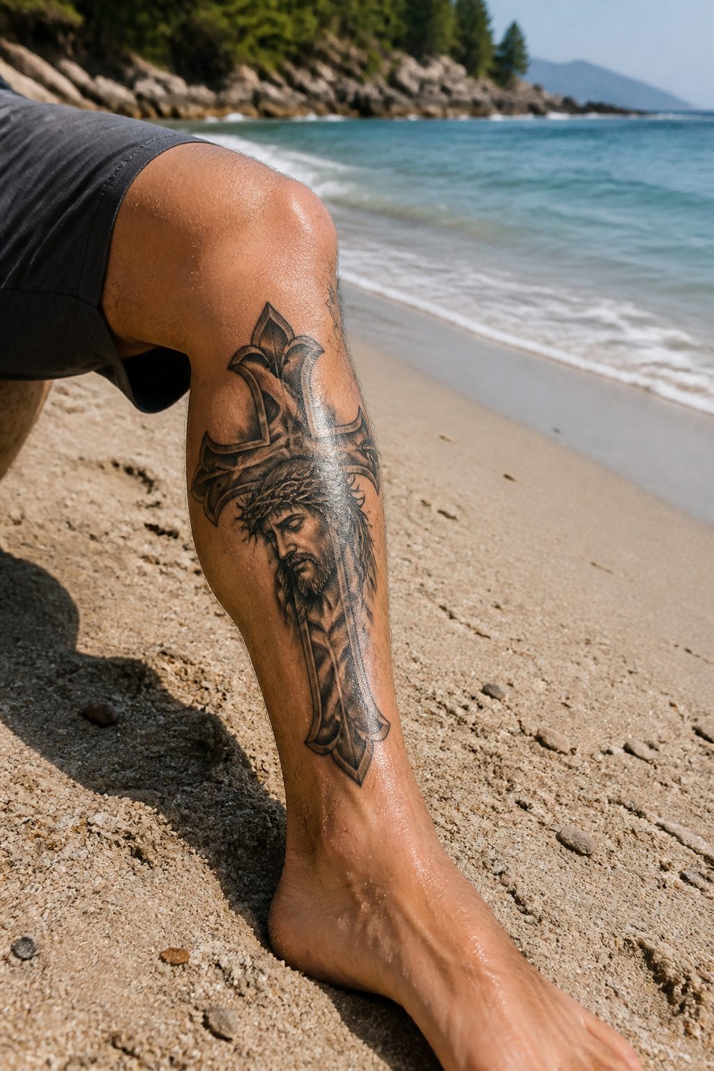
A cross leg tattoo lands in that useful middle ground, big enough for detail but easy to cover when the occasion calls for it.
The thigh or calf gives an artist real estate to work with, room for a curved cross with Christ’s face tucked inside, thorns, blood spattering, the full narrative weight.
Calf placement in particular carries a stark visual punch, the blackwork standing out against muscle definition in a way that reads as both declaration and personal totem.
What sells this placement for men in professional settings is the concealment factor. Long pants hide the work completely; shorts or a gym session reveal it.
That control matters more than people admit upfront. The leg also ages better than some spots, the skin holding detail longer than a hand or neck where sun and friction wear lines soft.
Ask for bold line weight if you want the piece to read clean from a distance, finer detail only where someone standing close will actually see it.
9. Creative Cross and Lion Tattoo
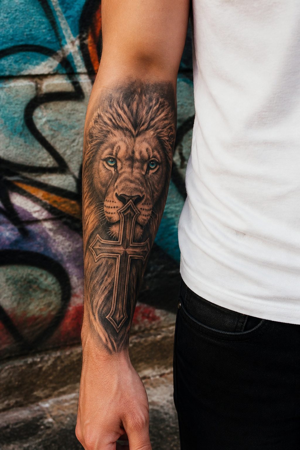
A lion paired with a cross reads as courage anchored to faith, but the placement decides whether it reads as one piece or two tattoos that happened to land on the same arm.
The lion should wrap the cross or emerge from behind it, not sit beside it with clear space between.
When the mane flows into the vertical beam or the paws grip the base, the eye travels continuously instead of snapping between two separate centers.
The sources describe two workable approaches. One keeps the lion’s face and the crucified figure overlapping so the negative space itself forms the cross shape, using the mane’s grey-ink shading to soften the edges where animal and symbol meet.
The other builds the cross from the architecture of the lion’s body, letting the forearm’s length carry a vertical design where the animal’s realism and the religious iconography share the same light source and the same depth of shadow.
What separates a unified piece from a collage is the handling of the eyes. Bright color there, piercing blue in one example, draws intensity to a single focal point rather than splitting attention.
The timepiece sometimes added above serves the same function, threading the composition upward so nothing floats isolated.
Without that connective tissue, the lion dominates and the cross shrinks to background decoration, or the reverse, and the meaning of either gets lost.
10. Unique Heart Bicep Tattoo with Cross Design
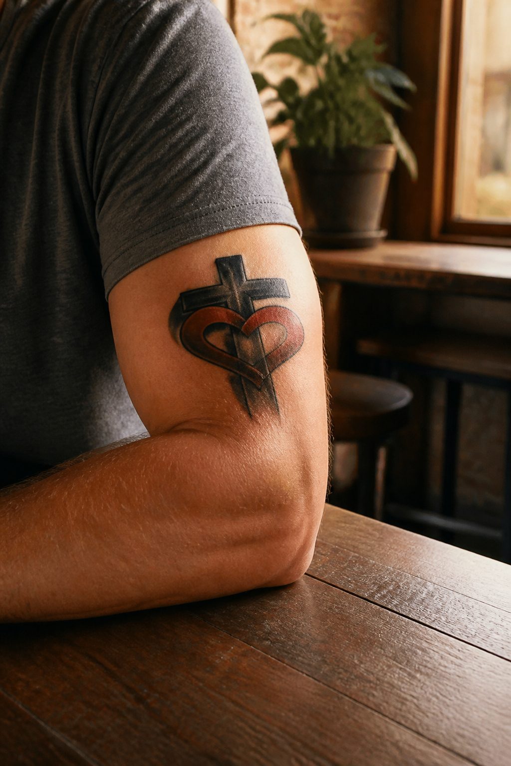
A heart and cross locked together on the bicep carries a meaning most men come to after loss rather than before it.
The pairing symbolizes undying love, whether that is Christ’s love for humanity with the cross at the center as a reminder of what that love cost, or a tribute to a partner or family member whose name or initial sits inside the design.
The curved surface of the bicep changes how the two shapes read.
The muscle’s natural arc will compress the heart’s width and stretch the cross vertical when the arm hangs relaxed, so the artist needs to account for that distortion in the stencil phase.
When the bicep flexes, the geometry shifts again; the interlock point where cross meets heart should sit slightly above the muscle peak, not dead center, so it does not distort past recognition in a t-shirt sleeve or at the gym.
The inner bicep keeps the piece private and the ink sharp for decades with minimal sun exposure, while the outer bicep puts the symbol where it shows when you want it seen.
11. Realistic Jesus and Cross Arm Tattoo
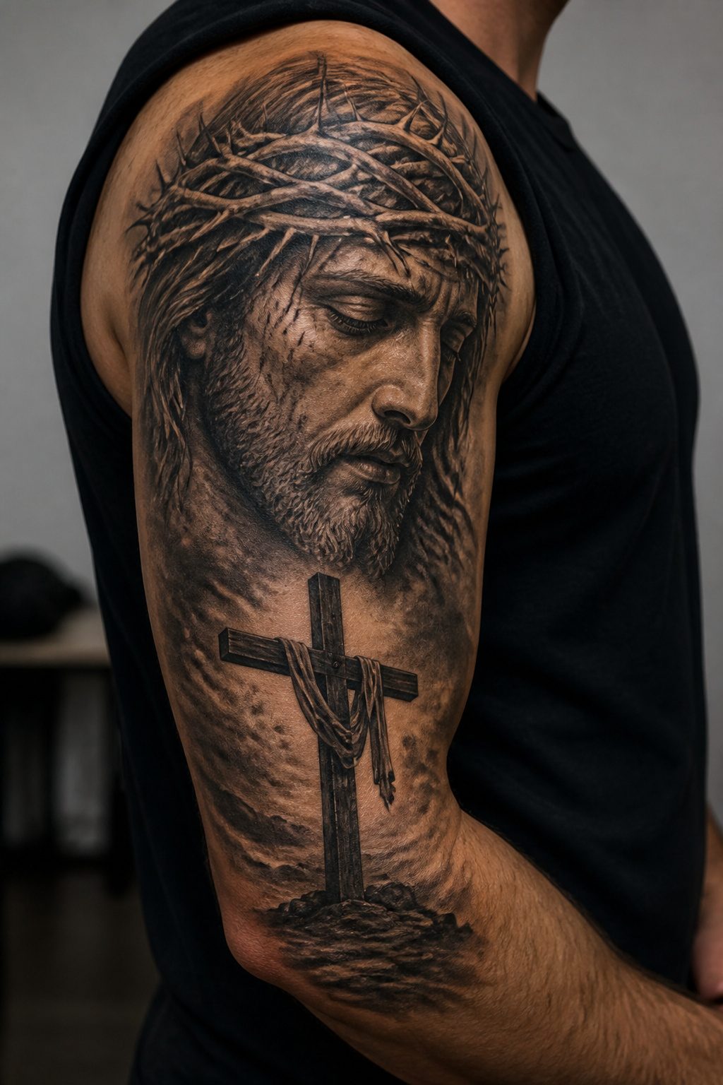
A realistic Jesus and cross arm tattoo demands the shoulder or upper arm simply because the scale lets the portrait breathe.
The face, the crown of thorns, the emotional weight in the eyes, all of that needs room or the detail collapses into mud. What separates a strong piece from a crowded one is how the cross is handled.
Rather than floating behind Christ as a flat symbol, the better approach fragments the portrait through the cross itself, letting the wood intersect the face so both elements share the same physical space.
The light rays and cloud work common in these designs then contrast against darker cross tones rather than competing with them for attention.
The technical bar here is non-negotiable. Soft shading on skin, realistic texture in the thorns, the gradation where light meets shadow on the face, this is portrait work first and religious imagery second.
An artist without strong fundamentals in black and grey realism will flatten the whole scene into something that reads as clip art from three feet away.
Budget for longer sessions and book someone who specializes in this; the arm placement is forgiving on canvas size but unforgiving on execution because you will see it every day.
12. Intricate Small Cross on Hand
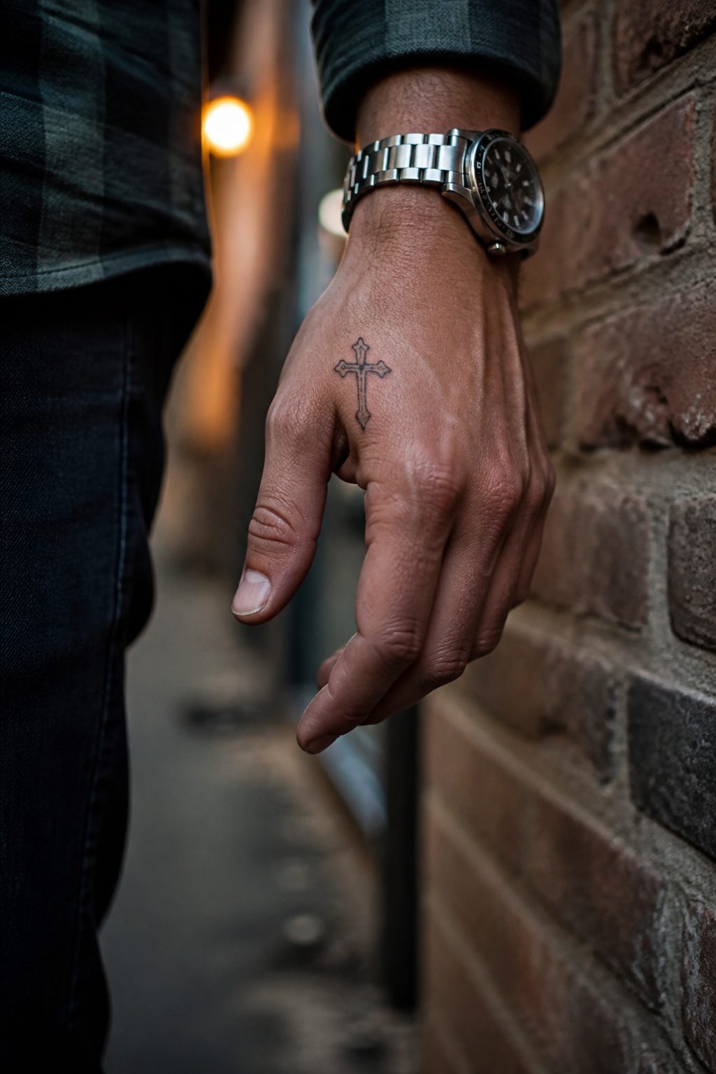
Hand skin turns over fast and takes a beating from washing, friction, and sun, which means a small cross here will blur faster than almost anywhere else on the body.
Dotwork and tight shading that read as three-dimensional on day one can soften into a gray smudge inside five to seven years, so budgeting for a touch-up is part of the real cost.
The scale itself is deceptive.
A cross measuring half an inch to two inches leaves the artist almost no margin; every line has to be precise because the eye cannot skip past a waver when the whole design is the size of a fingertip.
What looks understated from across the room is actually dense technical work up close, stacking black and white ink to create depth without the room to do it the easy way.
Visibility is the other calculation. The back of the hand, the side of the palm, and the web between thumb and index finger are all placements that show in every handshake, every job interview, every family photo.
That permanence suits some men fine and rules the option out for others. The design is small, but the commitment is not.
13. Praying Hands with Cross Rosary and Rose
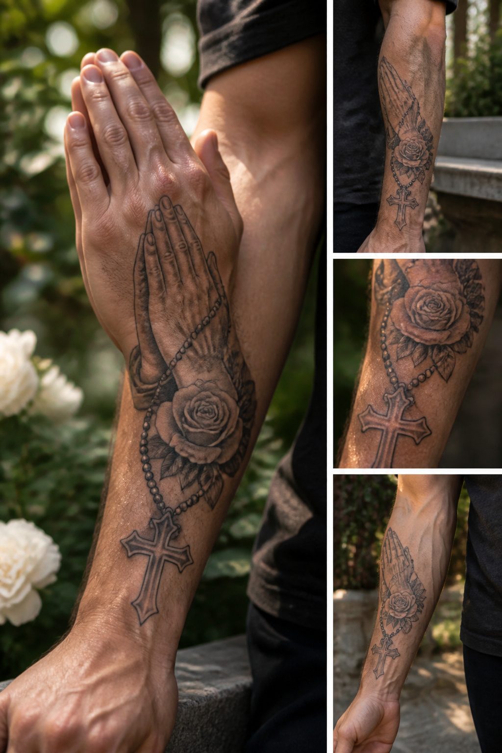
The praying hands, cross rosary, and rose arrangement works best when the hands sit lowest, palms pressed together and angled slightly upward, with the rosary beads draped naturally from them to lead the eye toward the cross above.
The rose typically anchors the base or weaves through the beads rather than competing with the cross for height.
Artists often reference the vertical line of the rosary chain as the spine that holds the composition together, using negative space for light rays behind the cross to separate it from grey-shaded hands and beads.
Forearm placement gives enough real estate for the hierarchy to read clearly without crowding, though the chest offers more room for the rose to open fully at the bottom.
Black and grey shading keeps the three symbols distinct; color risks making the rose read as decorative while the hands and cross carry the devotional weight.
14. Meaningful Cross and Name Tattoo
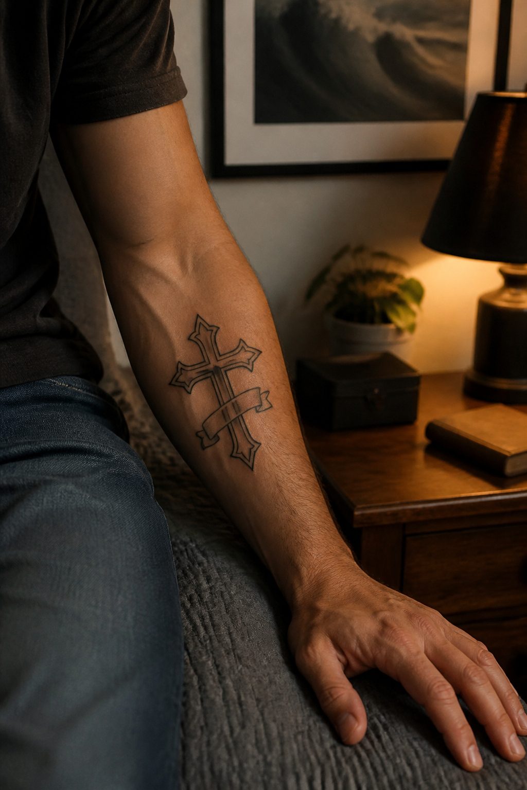
A cross and name tattoo only works if the name stays readable for decades, which means the lettering needs space the cross shape rarely gives it willingly.
The chest, inner forearm, and inner bicep tend to carry these pieces best; they offer flat ground where the eye can rest on both symbols without one crowding the other.
The name usually sits beneath the cross, wraps around its edges, or threads through a banner across the horizontal arms. Cursive can soften the geometry, but the loops need room or they collapse into solid black within a few years.
Slightly larger lettering than looks right at first glance is what keeps a parent’s name legible at ten paces, which is the entire reason you added it.
For subjects, the wearer’s own children, a partner, or grandparents whose faith shaped theirs appear most often. The shading on the cross itself should stay heavier than the name; reverse that balance and the tribute becomes background noise.
15. Bold Cross Forearm Tattoo
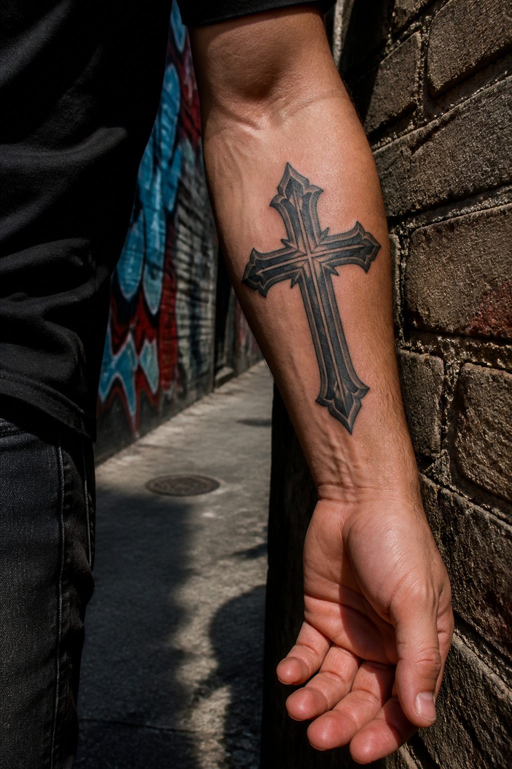
Bold line work survives the forearm better than fine detail ever will.
The skin there flexes thousands of times a day, and thin lines blur into gray fuzz within a few years while a solid black cross band keeps its edges.
I usually steer guys toward the crook of the elbow for this exact reason: the placement stays visible, but the thick skin and muscle underneath make the session easier and the ink holds its character far longer than it would on fingers or hands.
A stark cross band in solid blackwork removes the temptation to add shading or ornament that will age poorly.
Keep the weight heavier than you first picture; what looks slightly too bold on the stencil settles into exactly the right presence once healed.
The forearm offers enough canvas for the symbol to read instantly across a room without turning the piece into a production. For a first religious tattoo, this combination of placement and simplicity wins on longevity alone.
16. Classic Black Cross Tattoo
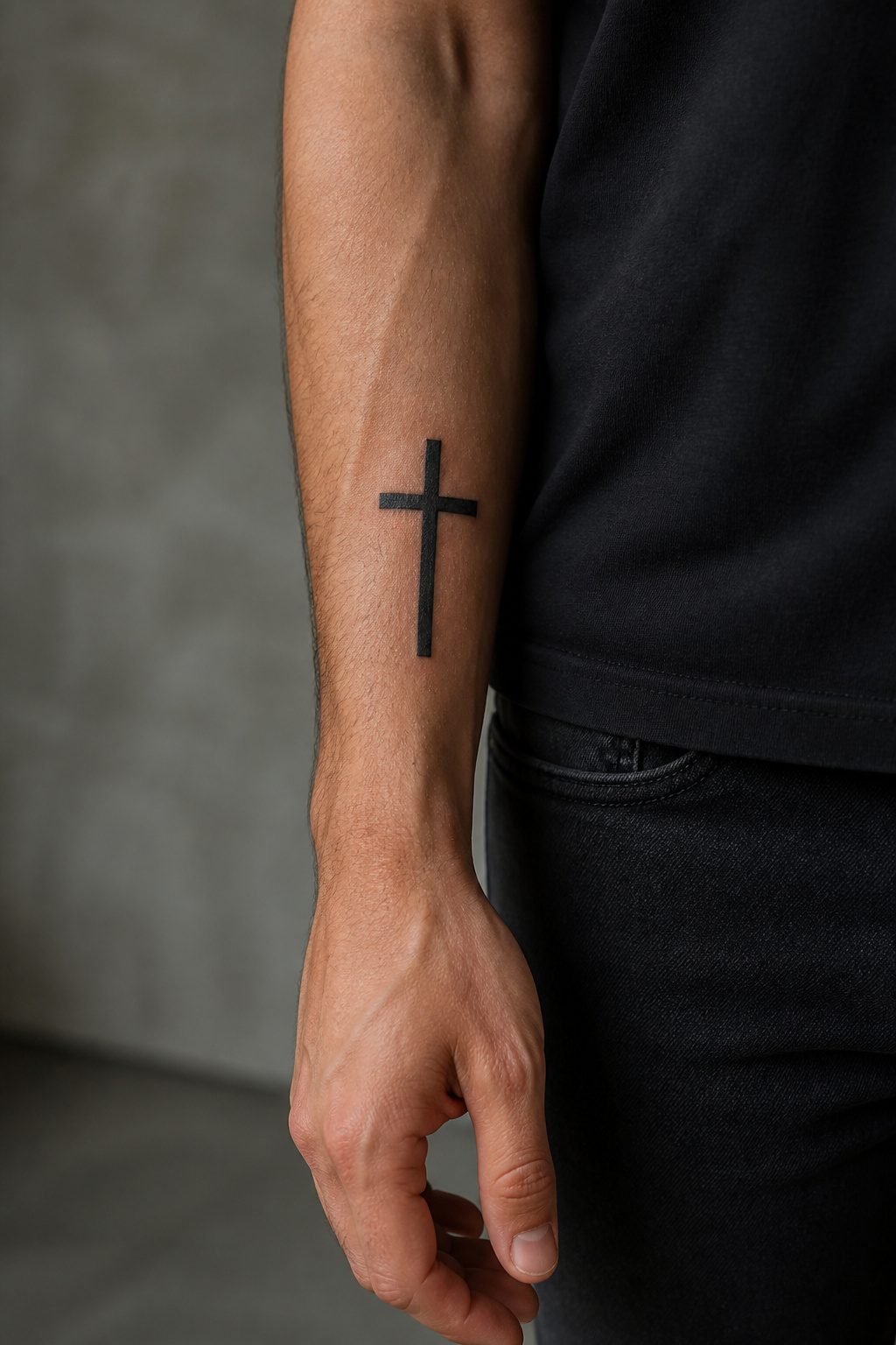
Pure blackwork on a cross tattoo ages better than almost anything else in the craft.
The ink sits heavy and the edges stay readable even as skin changes, which is why the style has never really left shop floors since the 1990s boom.
Bold linework holds up over decades where ultra-thin lines blur into haze, so the cross needs more weight than most first-timers picture.
Negative space does the actual design work here: the skin itself forms the light, the separation between beams, sometimes even the figure of Christ without a single gray wash.
A solid black silhouette with spiked edges reads instantly from across a room, and that visibility is usually the point. Forearm or hand placement turns the contrast up further, since those spots catch light and show the geometry cleanly.
No shading, no color, no ornamental filigree to distract from the symbol itself. The discipline is in the restraint.
17. Fear God Cross Tattoo
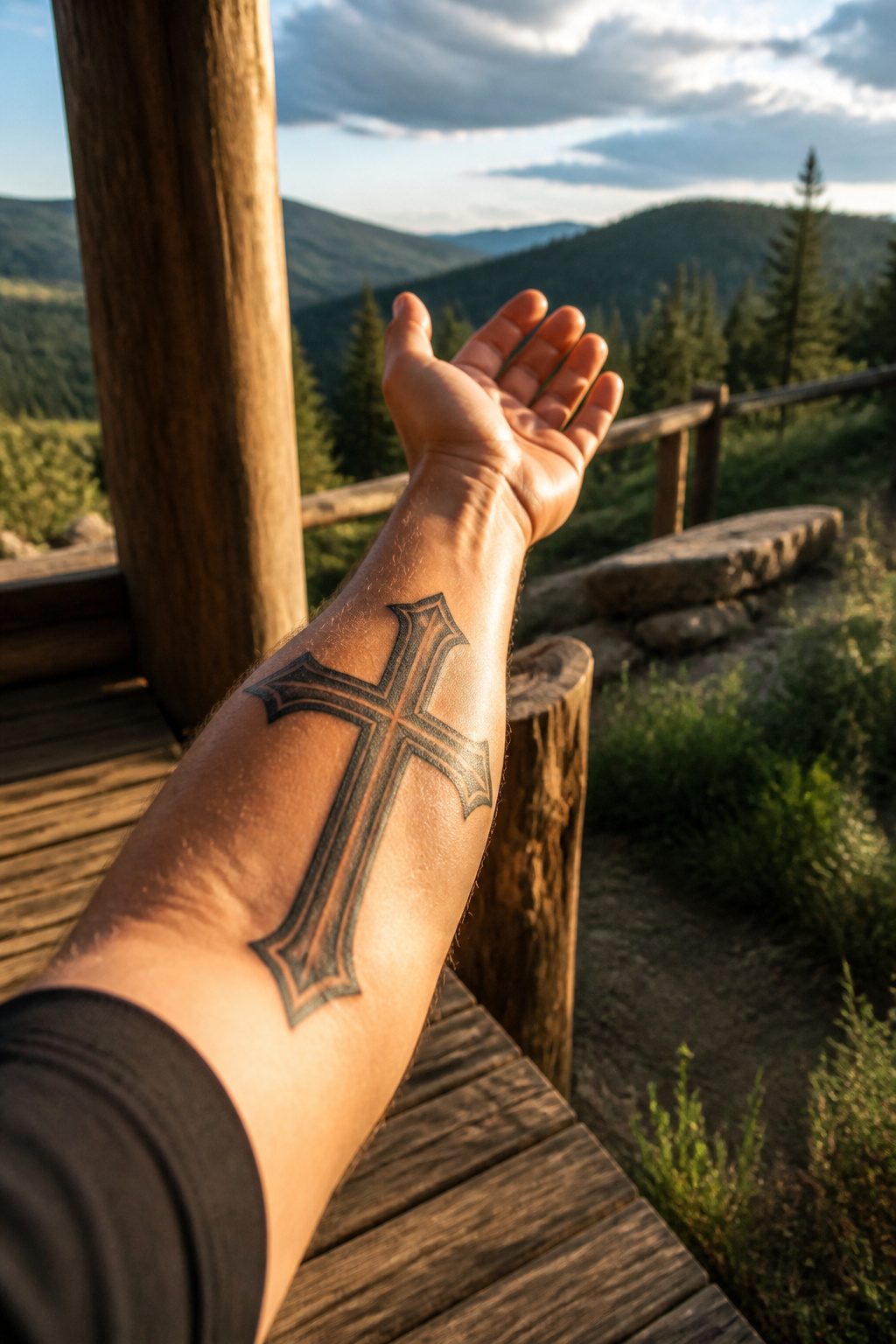
The "Fear God" cross tattoo carries a weight that goes beyond the usual religious ink. The phrase itself comes from scripture, repeated throughout Proverbs and Ecclesiastes as a call to wisdom rather than dread.
Solomon writes that the fear of the Lord is the beginning of knowledge, and the tattoo treats that line as a lifelong checkpoint, not a threat.
The lettering matters more here than on most text tattoos. A strong font with thick verticals and sharp serifs keeps the words readable from a distance, which matters when the piece sits across a forearm.
Heavy shading and negative space behind the cross add depth without cluttering the message. Some men add rays of light breaking from behind the cross, a visual cue that the warning comes with promise.
Sharp, black ink holds up over years better than gray wash or color, and the manly edge of the piece depends on that contrast staying crisp.
The best versions leave enough open skin around the words that the phrase breathes; crowding the letters into ornate filigree turns a reminder into a puzzle no one can read.
A clean font and bold lines keep the meaning visible even at arm’s length, which is the whole point of putting it there in the first place.
18. Artistic Sonic Cross Tattoo
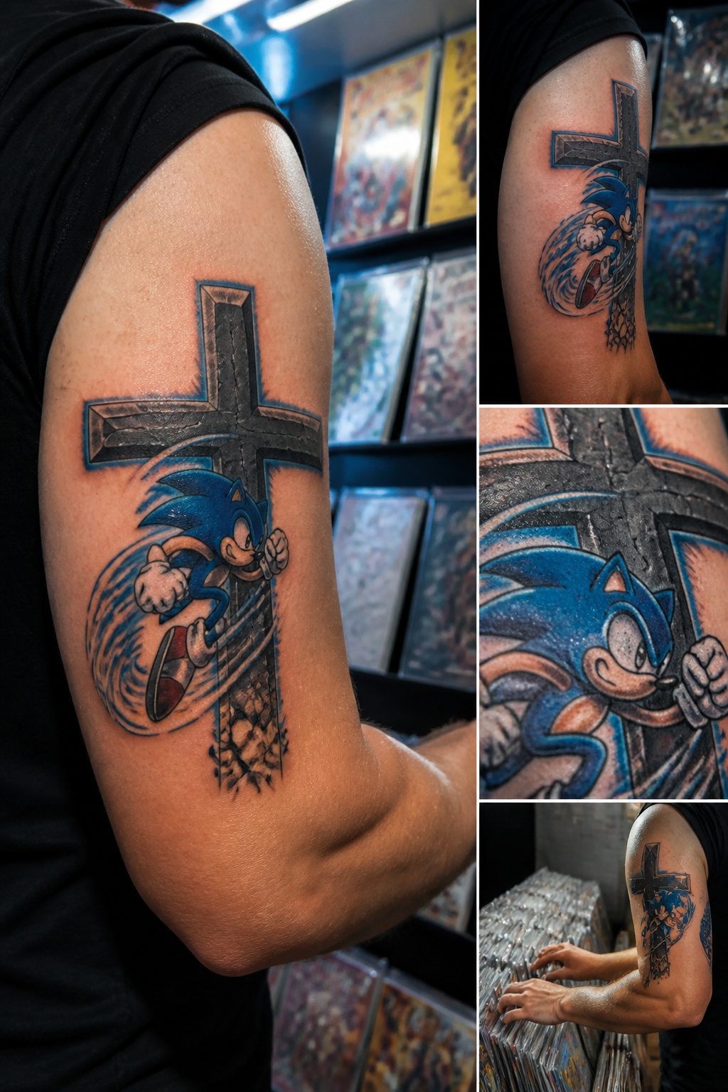
A Sonic cross tattoo works when the character sits at the center of the cross rather than floating beside it.
The motion lines, spikes, and smirk become the detailing of the cross itself, not a separate cartoon panel dropped onto a religious symbol. That integration is what keeps the design from trivializing either element.
The ’90s nostalgia lands because the wearer grew up with both the game and the faith, so the fusion reads as personal history rather than ironic juxtaposition.
Motion lines can extend along the cross arms like wood grain or light rays, letting Sonic’s speed read as spiritual energy. Without that structural blending, the tattoo becomes two stickers overlapping.
The smirk matters too. Sonic’s attitude keeps the piece from turning preachy; the cross keeps it from turning kitsch.
The balance is delicate. One artist I spoke with said the most successful versions he has done place Sonic small enough that the cross still reads clearly from ten feet away, then let the character detail reward closer inspection.
Reverse that hierarchy and the tattoo looks like a video game screenshot with a cross Photoshopped behind it.
19. Cool Cross Tattoo with Shadow Effect
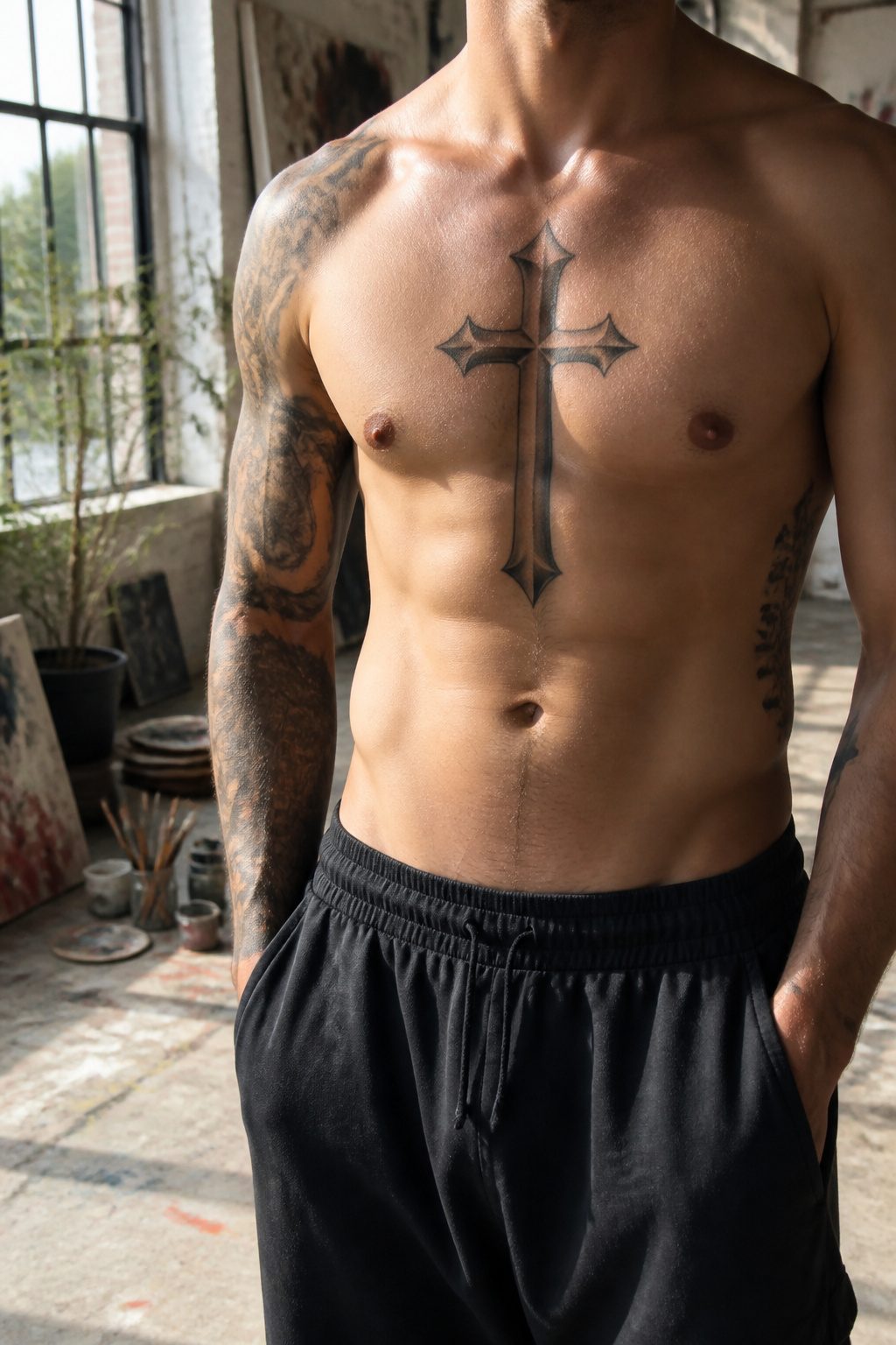
Shadow work turns a flat cross into something that sits on the skin like a real object. The artist builds this with 3D shading placed to match a single light source, not random darkening around the edges.
Get the direction wrong and the cross looks like a smudge; get it right and the piece seems to lift off the body.
The illusion depends heavily on where you actually get tattooed. Chest, shoulder, bicep, and upper back work best because the skin stays relatively flat and gives the perspective room to read.
Curved or moving areas break the effect. The popular torn-skin variation takes this further, adding shadowed edges that make the cross appear to sit beneath the surface rather than on top.
Lighting in the tattoo studio matters more than most clients expect. The artist needs steady, directional light to place highlights and shadows accurately; shifting lamps or overhead fluorescents from multiple angles make it easy to misjudge depth.
Ask how they stage their lamp before you commit. Stone or wood textures add another layer, but the shadowing still carries the weight of making the material feel physical rather than illustrated.
20. Detailed Archangel Saint Michael Tattoo with Cross
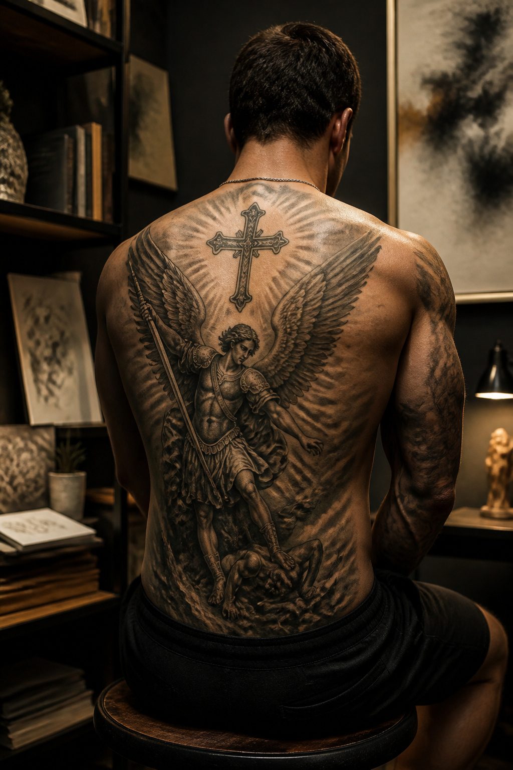
A detailed Saint Michael piece reads as strength made visible, the archangel standing with wings outstretched over the forces he has already beaten.
The cross enters these compositions as part of the story rather than the whole point: Michael grips it as a standard, or it hangs behind him as the backdrop to his victory.
That placement matters because the figure carries the eye first, and the cross lands second, which keeps the design from reading as generic religious filler.
The back offers the flat ground this narrative needs.
A full upper piece lets the artist set Michael at scale with real shadowing and light contrast across the shoulder blades, while the spine stays open for vertical elements like a descending cross or banner.
The upper back and shoulder blades sit relatively easy for long sessions, though the spine itself and lower back tighten up fast.
Commission an artist who has already handled this specific iconography, because the soft detail in the wings and the weight of the armor separate a convincing Michael from a costume-shop figure.
21. Classy Cross Neck Tattoo
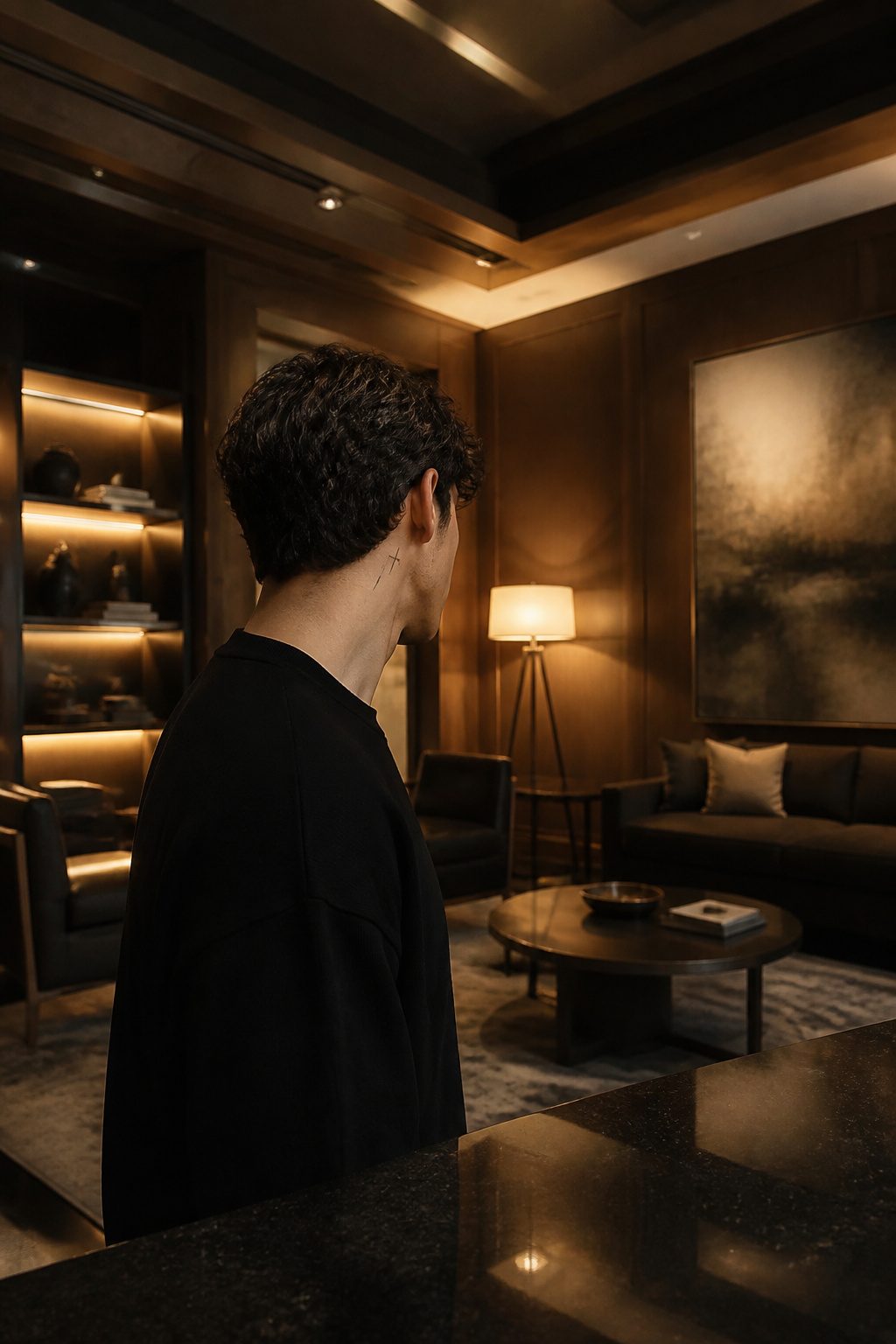
A cross neck tattoo sits right at the edge of visibility, visible from the front when the head turns but easy to hide under a collar when the situation calls for discretion.
The skin here is thin and the needle sits close to nerves, so the pain runs sharper than on fleshier placements like the arm or thigh.
That same thin skin moves constantly with every glance and conversation, which means lines soften faster here than on steadier ground.
The design that works best skips hard edges entirely, letting the sides of the cross fade out rather than end clean.
That unfinished quality turns the fading into a feature instead of a flaw, suggesting faith that does not need a border to be present.
Just below the ear or along the side of the neck are the common placements, though the back of the neck offers slightly more stable skin if you want the lines to hold their shape longer.
22. Cross Necklace Tattoo
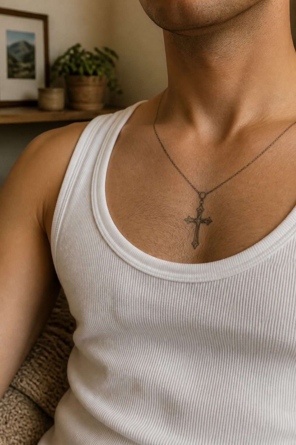
A cross necklace tattoo sits at the collarbone and replicates a pendant you already own or once owned, often a gift from a parent, grandparent, or partner.
The chain is rendered in clean linework, with the cross hanging dead center of the chest or just above the collarbone.
Two approaches to the chain itself win out: a simple beaded strand with heavy shading for depth, or a tighter choker-style loop for a bolder frame around the neck.
People choose permanent ink over actual jewelry when the piece has been lost, passed down, or carries family weight that wearing daily would risk. The tattoo becomes the keepsake instead of the object.
What separates a strong piece from a flat one is the chain rendering; beads need dimensional shading to read as metal or stone rather than a stamped bracelet pattern.
Adapt the drop length to your build, but keep the cross within hand’s reach of the sternum. Too low and it floats; too high and it chokes visually against the jawline.
23. Cross with Rose Tattoo
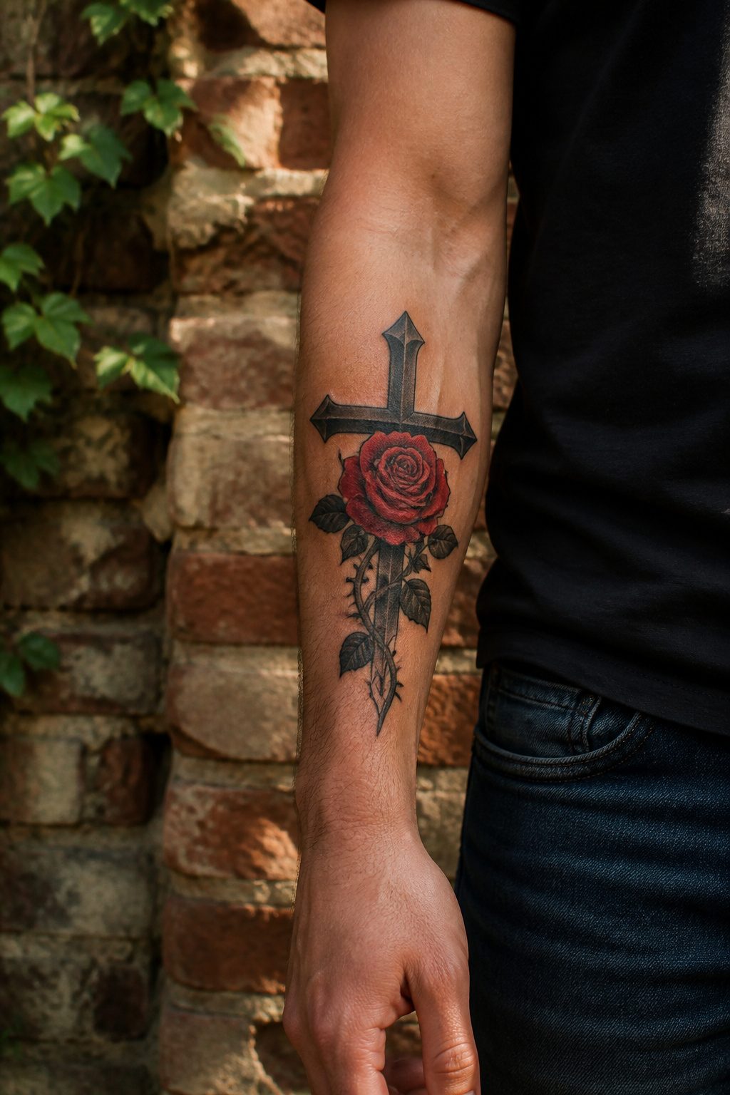
A cross with rose tattoo pairs two of the oldest symbols in the craft, and the balance between them changes the whole reading.
The cross gives the design its structure, while the rose either climbs the base or wraps the intersection, softening the geometry with something living.
Color versus black-and-gray shifts what the piece actually says. Red ink on the rose draws the eye straight to passion, sacrifice, or the blood of Christ in Christian reading.
Black-and-gray shading keeps both symbols in the same register, letting the cross read as weathered wood and the rose as something that grew there naturally rather than being placed for effect.
The sources I looked at favored the monochrome approach for exactly that reason: the two elements stay distinct instead of competing.
Placement runs to the forearm, bicep, shoulder, or chest, though one design I saw sat on the head for maximum permanence.
The rose can stand for the Virgin Mary, for a specific person whose favorite flower it was, or for the broader idea that faith and beauty aren’t separate territories.
What matters is knowing which one you mean before the needle starts, because the same image reads as devotion or as memorial depending on the color choice you make at the outset.
24. Cross, Rose and Feather Sleeve Design
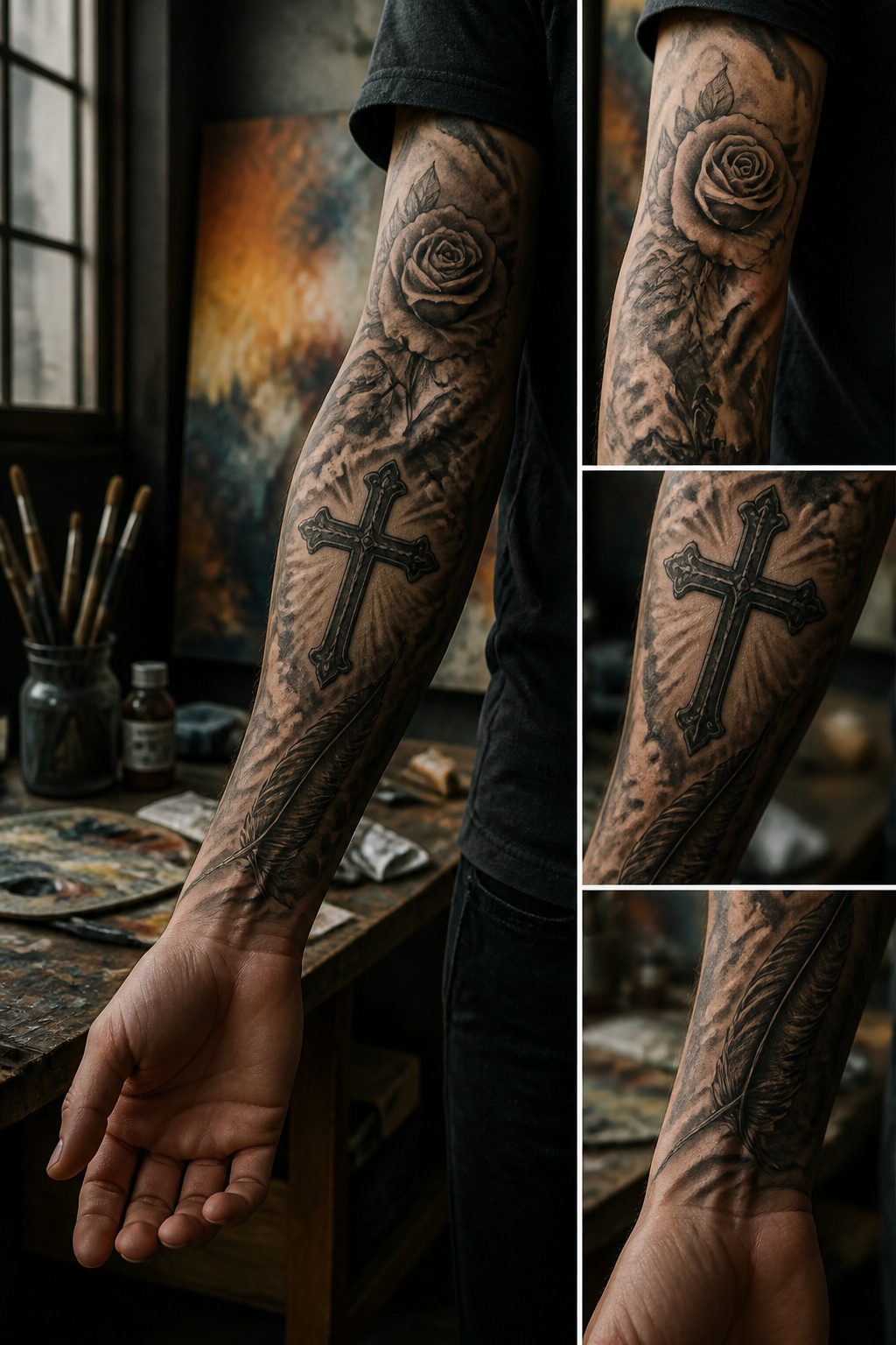
A cross, rose and feather sleeve design carries three distinct symbols that need room to breathe.
The rose sits at the center as the anchor for personal growth, the feather lifts the composition with freedom and lightness, and the cross provides the structural spine. Without careful spacing, three loaded symbols turn into visual noise.
The trick is letting negative space do the work. Lighter grey shading between the elements keeps the sleeve from flattening into one dense mass.
The rose can climb the cross base or wrap the intersection, while the feather trails upward to draw the eye along the arm’s natural line.
Black and grey shading suits this pairing best; it keeps each symbol recognizable without them competing for attention.
Muscular arms carry this well because the extra surface area lets the composition stretch.
The forearm, bicep and shoulder all work as placement zones, though a full sleeve demands enough real estate to separate the three symbols by at least a few inches of skin or soft wash.
Crowd them and the meaning gets lost. Space them and each symbol reads clearly while the overall piece still flows as one movement.
25. Chrome Cross Tattoo
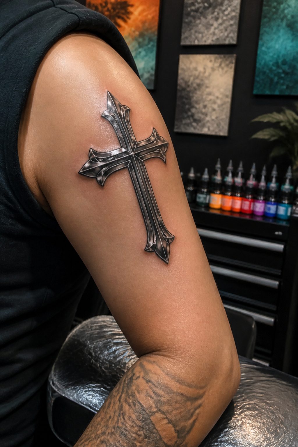
A chrome cross tattoo lives or dies in the contrast between highlights that read as reflection and shadows that read as depth, not flat gray.
The artist builds this with three-dimensional shading that mimics how polished steel catches and throws light, using clean lines as the spine but letting the tonal work do the heavy lifting.
Geometric patterns and crisp edge detailing sharpen the piece and keep the eye from sliding off the surface.
The technical demand is real. Chrome asks for smooth gradients without visible steps, and the skin’s texture fights that every millimeter.
An experienced hand with strong shading fundamentals is non-negotiable here; less-experienced work tends to collapse the effect into a muddy middle tone that reads as dirty rather than metallic.
Forearm, chest, and upper arm give the space this texture work needs to be appreciated.
What separates convincing chrome from a failed attempt is usually the highlight placement: too many or too bright, and the piece looks like clip art; too few, and the metallic illusion never arrives.
26. Powerful Religious Full Back Cross Tattoo

A full back cross tattoo uses every inch of the canvas, not just the space between the shoulder blades.
The lower back and sides become part of the composition, letting the artist carry filigree, script, or wing work around the torso so the piece reads as architecture rather than an isolated symbol.
The spine becomes the vertical axis, and everything else builds outward from that center line.
Pain sits unevenly across this much territory. The upper back and shoulder blades stay relatively forgiving, but the spine itself and the lower back pick up sensitivity fast.
Planning the session order matters: starting on the flatter, easier ground lets the body adjust before the needle moves toward bone and thinner skin.
Religious imagery here tends toward the narrative. A single cross down the spine reads clean, but many collectors build in a three-cross scene, angel wings spanning the width, or full biblical figures worked into the surrounding space.
The scale demands detail, and the detail demands time. This is not a piece that finishes in a sitting, and the commitment to the chair matches the commitment the image itself is meant to carry.
27. Full Sleeve with Cross, Dragon and Roses
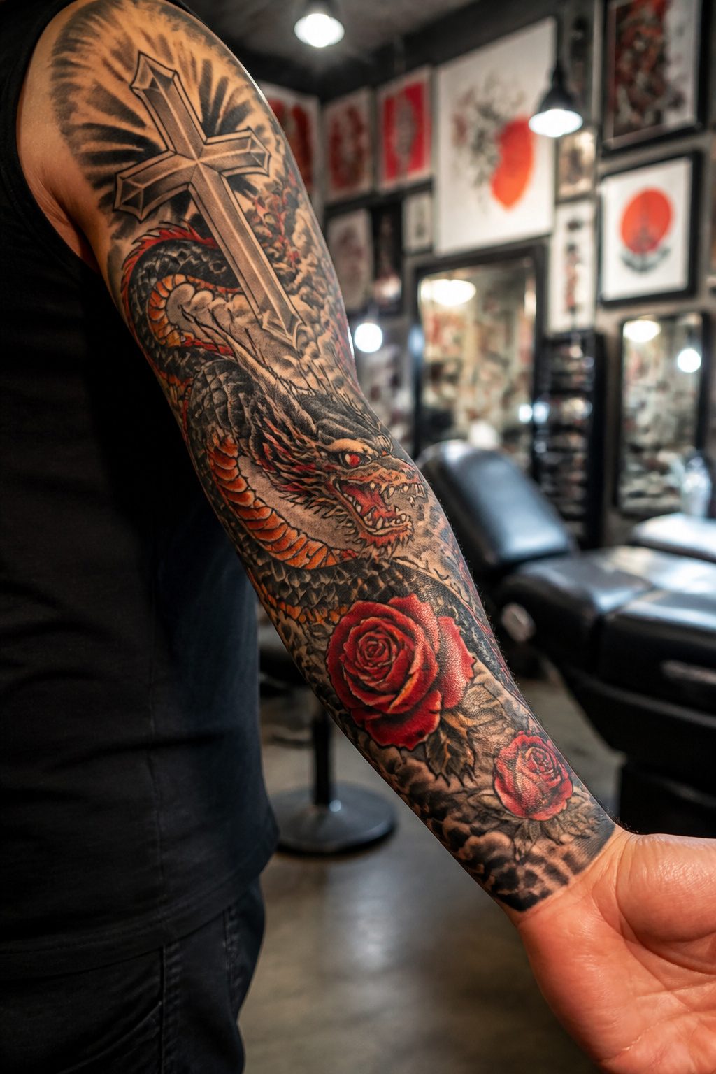
A Japanese-inspired dragon winding up the arm gives the sleeve its energy, but the cross stays central through negative space and dark shading that push the eye back to the faith element.
The roses threaded between the two carry their own weight: in Christian symbolism, the red rose marks the blood of the crucifixion, while the flower has long doubled as a sign of earthly love and devotion to the Virgin Mary.
That pairing of East and West sounds jarring on paper, yet the narrative logic is straightforward.
The dragon stands for struggle and spiritual guarding in Eastern tradition; the cross anchors the wearer’s own path; the roses soften the combat with sacrifice and tenderness.
The arm’s length becomes a timeline rather than a collage, each element answering the next.
Keeping the cross readable at a distance means letting the dragon’s scales fade into background texture near the shoulder and elbow, not competing for line dominance everywhere at once.
28. Jesus on the Cross Tattoo
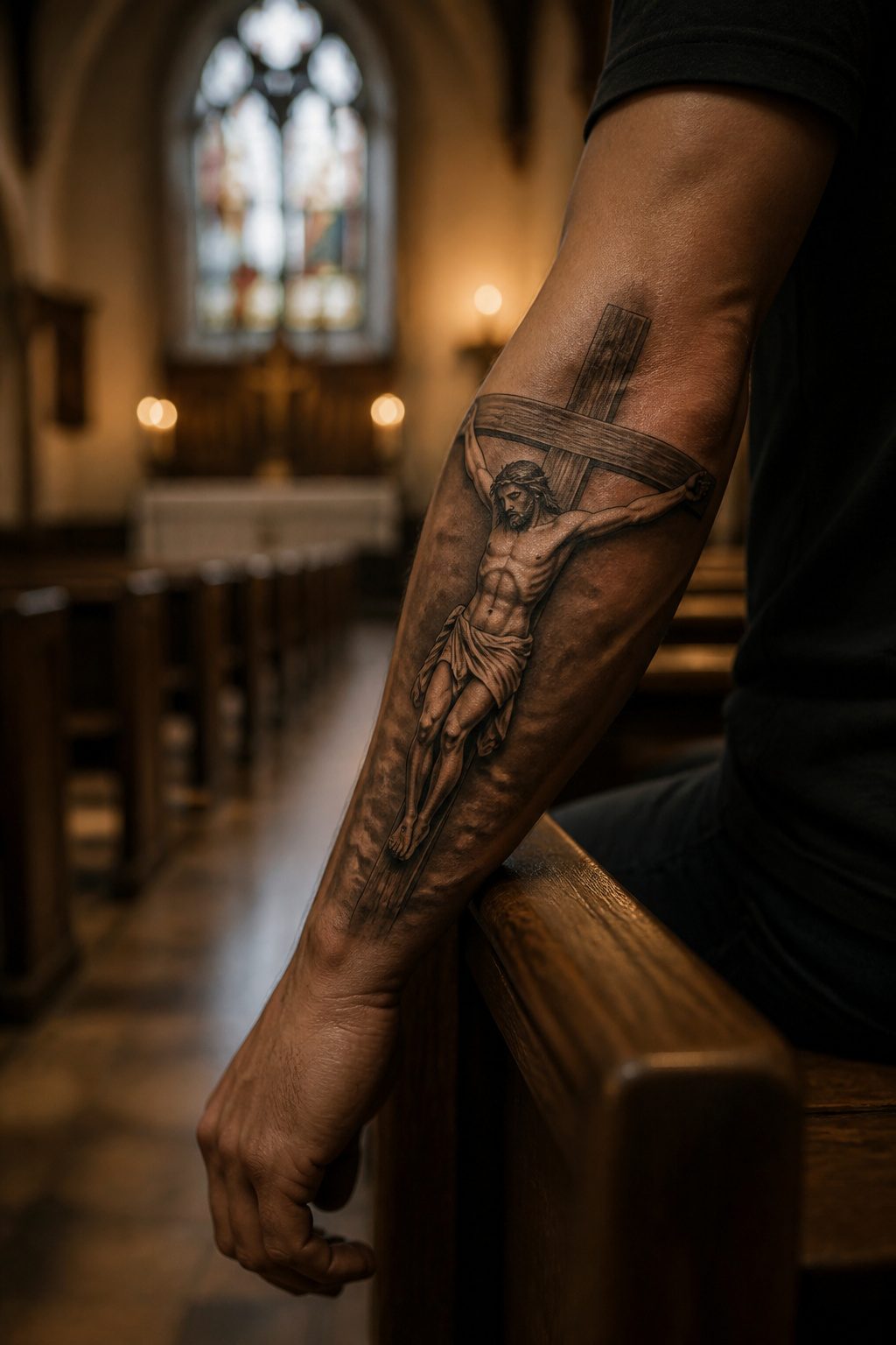
A Jesus on the cross tattoo carries the full emotional weight of sacrifice rather than symbol alone.
The design ranges from full realistic portraits capturing Christ’s expression and the texture of the crown of thorns to stylized black and grey work that leans on silhouette and shadow.
Either path demands space: the chest, back, upper arm and outer forearm give the piece room to breathe, while smaller placements flatten the detail that makes this imagery land.
The historical representations matter here. Light rays behind the cross, the "INRI" inscription on the headboard, surrounding clouds or scripture text, these elements layer meaning onto the central scene.
What separates this from a plain cross is the narrative moment frozen in skin: suffering made visible, strength drawn from endurance rather than ease.
From what I’ve seen in portfolios, realistic Jesus crosses need longer sessions and an experienced portrait artist. This is not the piece to compromise on budget or rush into a single sitting.
The emotional stakes are already high; a fumbled face or proportionally wrong cross undermines the entire point. Stylized work forgives more, but even there the balance between figure and cross determines whether the piece reads as reverence or mere graphic.
29. Embellished Crucifix Tattoo
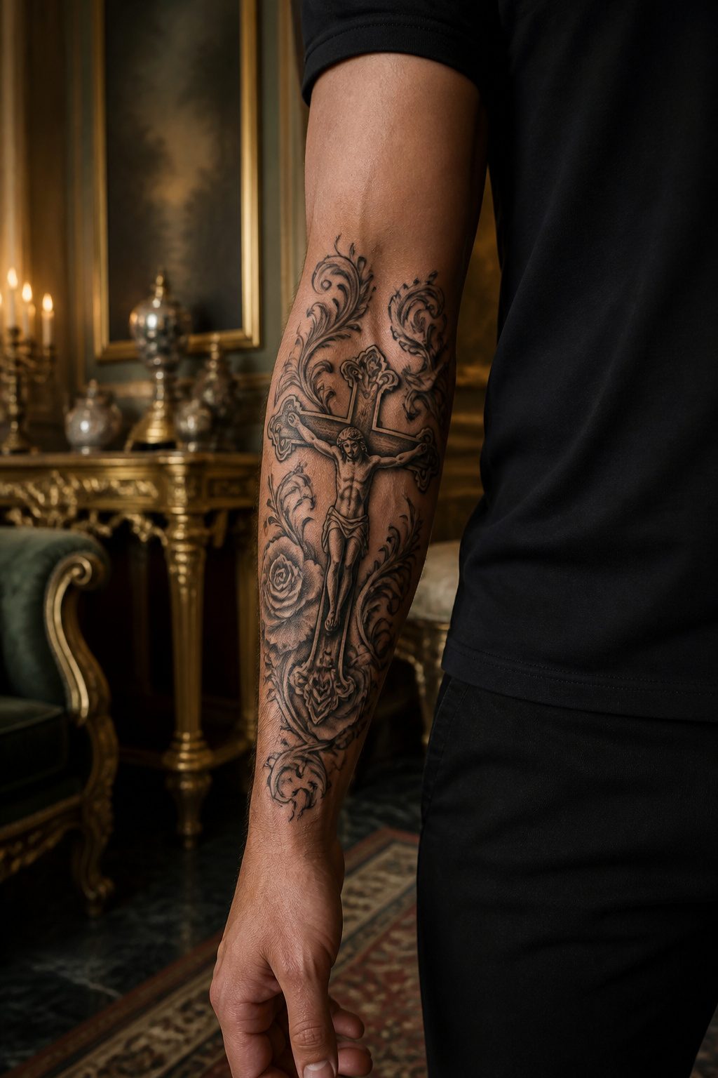
An embellished crucifix tattoo carries the same devotional weight as a plain Jesus on the cross design, but the ornamentation shifts the tone from raw suffering toward reverent celebration.
Where a stark crucifixion scene keeps the eye on agony, adding gothic flourishes, floral patterns, or rosary beads frames the image as something already sanctified.
The thorny branches that sometimes border these pieces, evoking the crown of thorns, add depth that can read almost three-dimensional against the skin.
That ornamentation comes with a tradeoff. The more detail packed into the work, the more the tattoo risks becoming decorative first and devotional second.
A plain crucifixion scene leaves nowhere for the eye to hide from what it depicts. Embellishment offers the viewer, and maybe the wearer, a little more distance.
For some men that distance is exactly what makes the piece livable day to day. For others it softens the commitment they wanted the tattoo to represent.
Placement matters here in a way it does not for simpler crosses. The arm gives enough real estate for thorn framing and layered texture without crowding the central figure.
Smaller areas force the artist to choose between detail and clarity, and detail usually wins until the image muddies.
What a Cross Tattoo Means
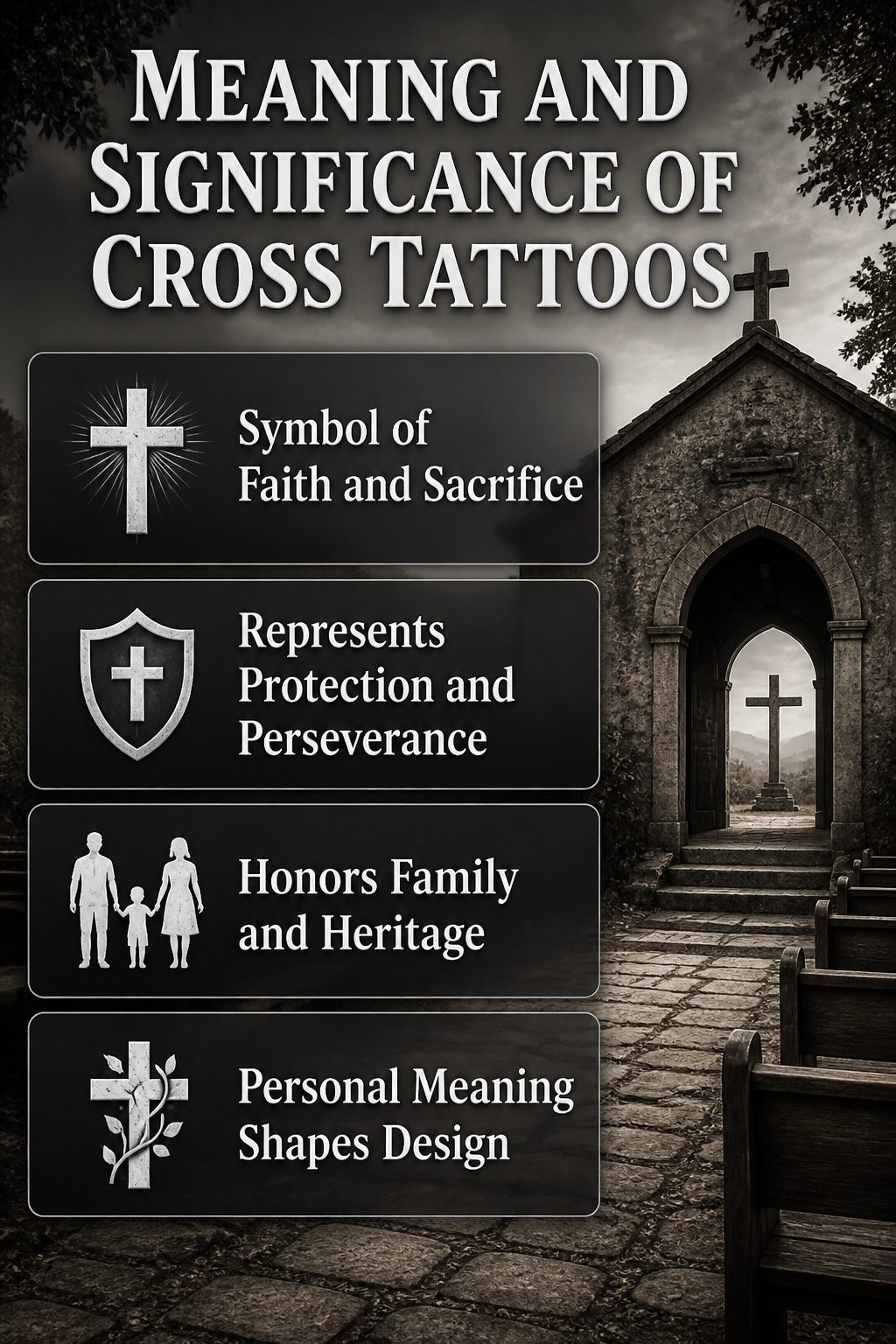
A cross tattoo carries weight long before ink touches skin. For Christian men, the symbol marks faith itself, Christ’s sacrifice, salvation, and a public declaration of belief.
The empty cross reflects resurrection; the crucifix, with Christ depicted, emphasizes sacrifice itself, a distinction that often falls along Protestant and Catholic lines.
Beyond formal religion, the cross has become a broader symbol of protection, perseverance, and connection to family or heritage. Many men wear it as memorial ink, honoring a parent, sibling, or child whose faith shaped their own.
Others choose it to represent sacrifice, integrity, and devotion to something larger, regardless of church affiliation.
The meaning turns personal fast. A memorial cross for a lost parent gets designed differently than a faith statement, even when the final piece looks similar to an outside observer.
What the cross means to the wearer shapes everything that follows.
Where to Place a Cross Tattoo
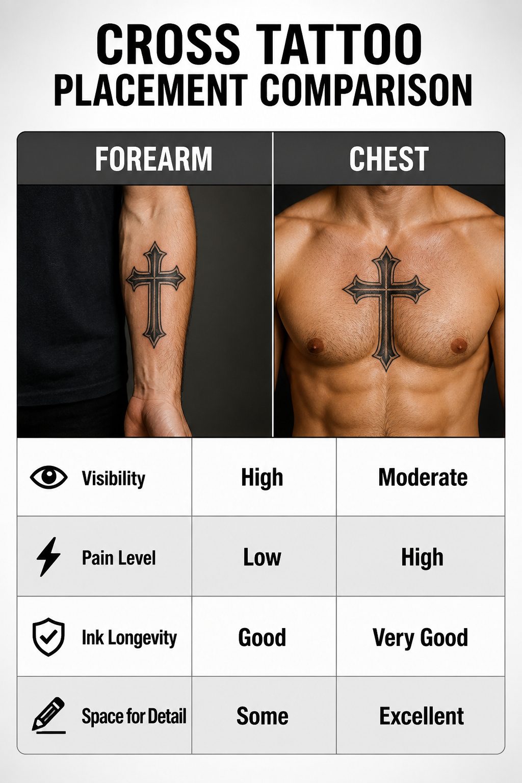
The forearm sits at the sweet spot for a first cross piece: visible enough that you see it daily, easy to cover with a sleeve when the situation calls for it, and the flesh there carries detail without making the session miserable.
A medium-sized cross fits neatly, with room to add wings, a banner, or background shading later if the meaning deepens.
The chest demands more commitment, both in pain and in intent. Skin over the sternum sits thin against bone, so the needle work stings worse than fleshier spots, yet that placement lands the cross directly over the heart.
For memorial pieces and faith declarations, that closeness matters enough that most men push through the discomfort. Ink holds well there too, since the chest sees limited sun under a shirt.
The neck broadcasts the design before you speak. Side placement, back of the neck, or just below the ear each read as deliberate, unhideable choices, and the thin skin near nerves makes the session sharper than the forearm.
The back offers the largest canvas for a full-scale piece, though the sources emphasize the chest and its symbolic weight more often for crosses specifically.
Pain and visibility trade off directly: the spots that hurt most tend to be the ones that show most, and the choice usually comes down to whether the meaning or the practicality drives the decision.
Types of Crosses
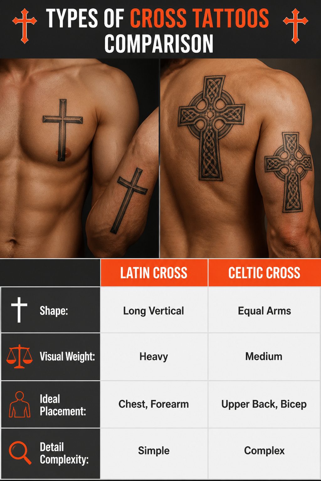
The Latin cross carries the most recognizable silhouette: a long vertical stem crossed by a shorter horizontal arm, the crux immissa.
That elongated base gives it visual weight, which is why it reads well on a chest or down a forearm. The Greek cross, or crux quadrata, keeps all four arms equal.
It sits differently on the body, more contained, and works where square footage is tight, like a hand or behind the ear.
The crux commissa, shaped like the Greek letter tau, sometimes called St. Anthony’s cross, narrows the field further with its T-form.
The Celtic cross layers a ring, the nimbus, around the intersection, with knotwork filling the arms. That detail demands real estate; the upper back, shoulder, or outer bicep gives the pattern room to stay legible.
A shaky hand on the knotwork turns the whole thing muddy, so artist selection matters more here than with simpler crosses. The Orthodox cross adds a third horizontal beam, the lowest slanted downward.
Each variation carries its own historical freight, but the visual logic of arm length and intersection shape is what decides whether the tattoo holds up at a glance or collapses into a generic plus sign.
Cross Tattoo Styles That Stand Out
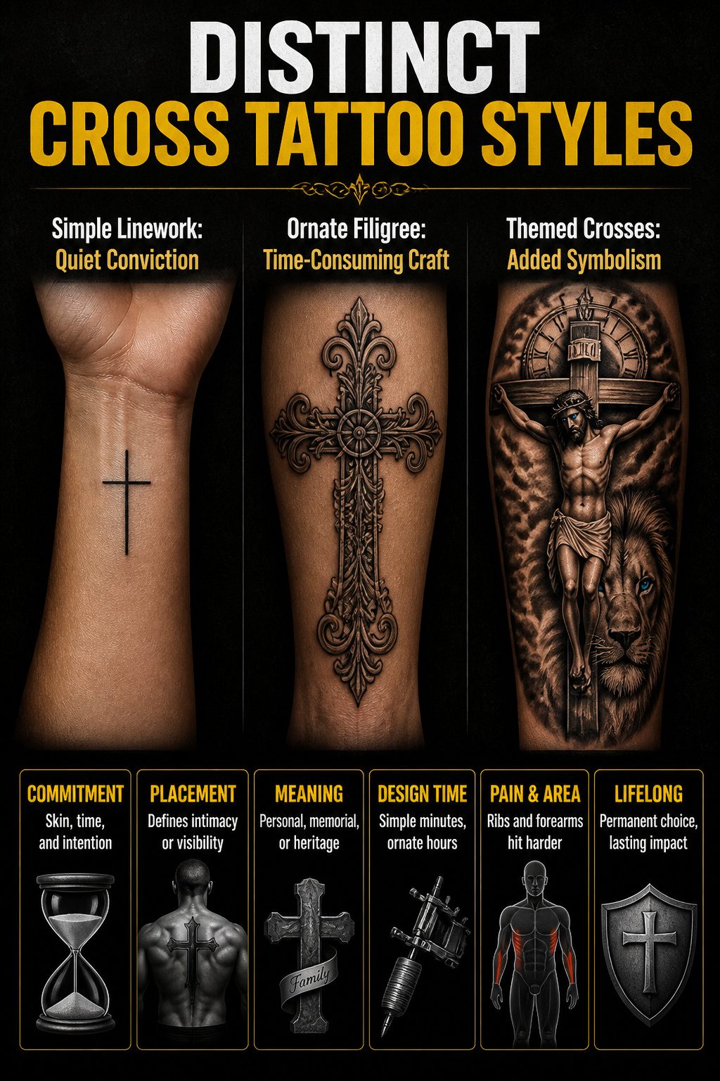
Simple linework and bold blackwork Latin crosses sit at opposite ends of the same spectrum, and the choice between them usually comes down to how much skin the wearer wants to commit.
A minimal cross on the inner wrist reads as quiet conviction, something the owner checks privately throughout the day.
The ornate filigree pieces that climb ribs or forearms demand the opposite: hours under the needle, skin given over to old-world craftsmanship that turns the body itself into the display surface.
Themed crosses layer additional meaning without abandoning the core symbol. A realistic crucifixion scene with Jesus Christ and a lion, placed vertically on the forearm, uses the long axis of the cross to fit the natural line of the muscle.
Colored eyes, often bright blue, draw intensity to the faces; a timepiece above can signal faith transcending time. Celtic knotwork pieces work the same way, heritage braided into the geometry.
The cross itself is only half the decision. Placement and density determine whether the piece reads as personal reminder or public declaration.
A name beneath or wrapped around the cross turns faith into memorial, parents or children or partners anchored to the symbol that shaped them.
Chest and inner bicep carry that intimacy; the back, with its broad symmetrical plane, lets the cross amplify muscle tone instead of replacing it.
Frequently Asked Questions
What does a cross tattoo mean?
For Christian men, a cross tattoo represents faith, Christ’s sacrifice, salvation, and a public declaration of belief. The empty cross specifically reflects the resurrection, while a crucifix with Christ depicted emphasizes the sacrifice itself.
Beyond religion, the cross has become a broader symbol of protection, perseverance, and connection to family or heritage, with many men choosing it as a memorial for someone whose faith shaped their own.
Where should I get a cross tattoo?
The forearm, chest, and back are the most requested placements for cross tattoos for men. The forearm offers flat ground for detailed work and stays readable over time.
The chest sits the cross directly over the heart, which matters for memorial or religious pieces.
The back provides the largest canvas for a centered cross that follows your natural structure, while the inner bicep keeps ink private and protected from sun exposure.
What are the different types of cross tattoos?
The main types include the Latin cross with its longer base stem, the Greek cross with four equal arms, the tau or St. Anthony’s cross, the Orthodox cross with three horizontal beams, and St. Andrew’s cross in an X shape.
Beyond these traditional forms, the article covers memorial crosses, black band crosses, crosses with wings, simple linework crosses, and creative combinations with lions, praying hands, rosaries, or even Sonic the Hedgehog for personal meaning.