Arm tattoos for women range from a single lightning bolt at the wrist to full blackout sleeves measured in months of healing, and the deciding factor is never just the design but how the placement changes what it means. A butterfly at the inner wrist stays private; the same insect opened across the shoulder becomes declaration. The arm’s length offers canvas, but its visibility is the condition that shapes every choice, whether that means a child’s name in 2–3 mm script to survive sun and friction, or a biomechanical piece routed precisely along tendons so the machinery seems to move when you do.
1. Butterfly Tattoo
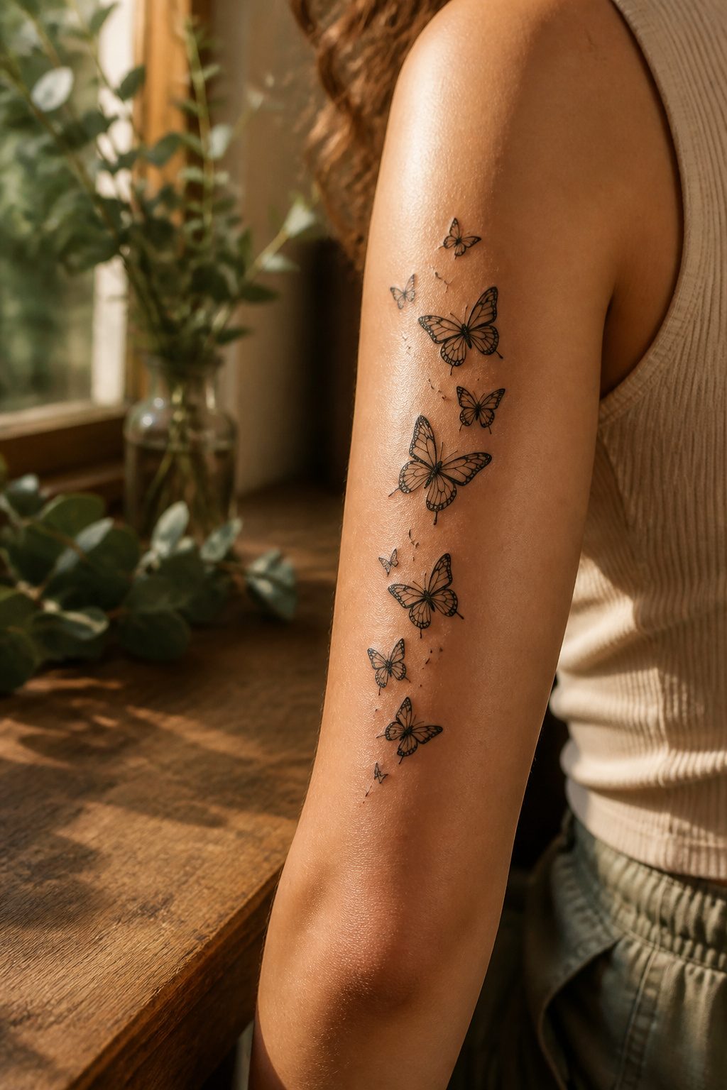
Butterflies carry the most requested meaning on women’s arms: transformation that happened, not transformation hoped for. The metamorphosis from caterpillar to winged insect maps cleanly onto a divorce finalized, a sobriety date, a career left behind. That specificity is why the design keeps climbing request lists year after year.
Placement shapes what the symbol reads as. A single butterfly at the inner wrist reads private, a reminder for the wearer. The same design scaled larger across the outer forearm becomes public declaration. A cluster of silhouettes trailing down the upper arm borrows movement from the insects themselves; the line of the muscle underneath gives the illusion of flight. Size follows suit: small keeps the meaning intimate, while a piece that opens its wings across the shoulder demands the detail work that justifies the space.
Color is the dividing line. Black linework ages cleaner and costs less chair time. Full color, especially the blues and oranges of monarch or morpho species, needs touch-up commitment but photographs the way clients imagine. Either route, the butterfly works because the symbolism is already understood. No one has to explain it, which matters for a mark you carry at a job interview or a parent’s kitchen table. The design does the explaining for you.
2. Snake Tattoo
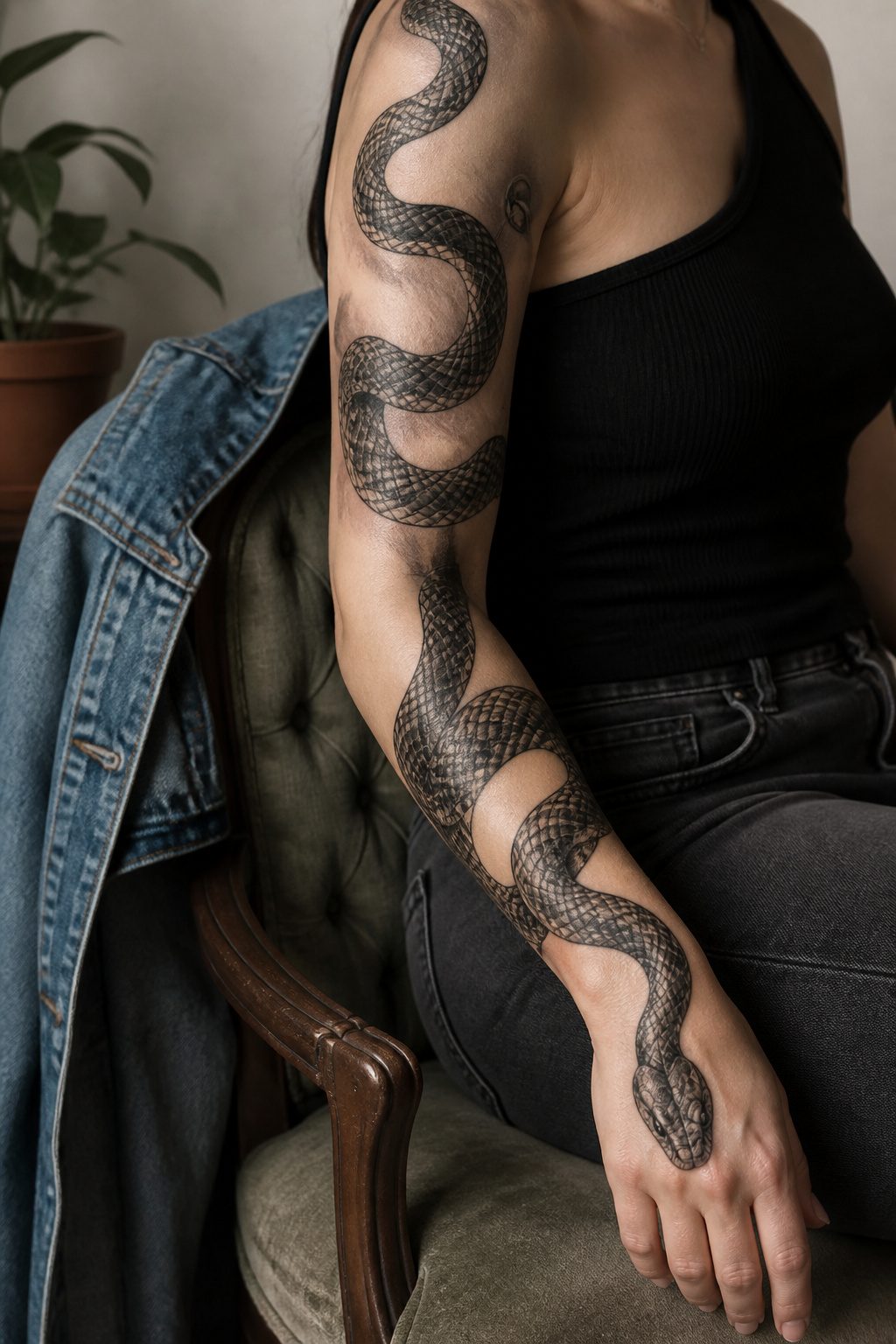
Snake tattoos carry one of the oldest meanings in tattooing, and the arm’s long canvas lets the design do its full arc. A snake wrapping from shoulder to wrist reads as continuous motion, the body coiling through its own shed skin or breaking into a new pattern mid-forearm. The symbolism lands on rebirth, healing, fertility, or the harder note of temptation and past mistakes, depending on what the wearer wants carried.
Realism builds the scales in layered black ink, catching light the way an actual serpent would against muscle. Dotwork softens that same texture into something more illustrative. Minimalist line work strips the form to a single continuous stroke, which ages cleaner on an arm that sees sun and sleeve friction daily. The snake’s polarized reputation, venom as both medicine and threat, gives the design its tension. That duality is what keeps it from becoming decorative noise.
3. Floral Arm Sleeve

A full floral sleeve turns the arm into a living garden, and the shape of that canvas matters more than I expected when I first started looking at designs. The long, gently curved surface lets vines trail from shoulder to wrist without fighting the body, and a skilled artist can use the forearm’s slight taper to make flowers feel like they’re growing rather than stamped on.
Partial sleeves work differently, and they suit someone who wants the effect without the commitment. A cluster that starts at the elbow and wraps toward the wrist leaves the shoulder and upper arm untouched, which means the tattoo hides under a short sleeve when you need it to.
The symbolism shifts hard depending on which flower you choose. Roses carry the weight of love and passion; lotus flowers lean toward spiritual awakening. Pastel pinks and peaches soften the whole piece toward grace and individuality, while black-and-grey work reads more graphic and structured. Janet, a blogger who documented her own sleeve, described how the tattoo changed her relationship with her arm after years of hiding it, though her experience with covering an previous tattoo isn’t the only reason women choose this route.
Tiny leaves at the entry and exit points can frame a central bloom with vertical symmetry, or you can let the arrangement flow asymmetrically. The choice between structured and organic is the first one to make, and everything else follows.
4. Crucifix Tattoo
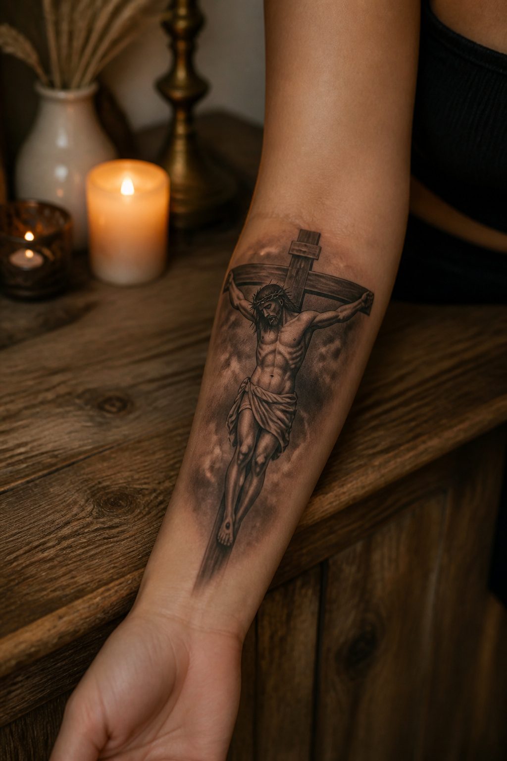
A crucifix on the forearm carries weight that a simple cross does not. The body on the cross makes it unmistakably about sacrifice and resurrection, and wearing it on the inner forearm keeps the image close enough to read during hard moments. Outer forearm placement turns it outward, a statement of faith visible to others before the wearer herself.
Size matters for legibility. Too small, and the corpus becomes a blur; too large, and the arm becomes a billboard. Four to six inches along the forearm hits the range where the figure reads clearly without dominating the limb. Some women add a name or date beneath, memorializing someone lost, though the crucifix alone needs no embellishment to carry its meaning.
The inner wrist-to-forearm curve softens the image, while the flat outer plane presents it straight on. Either way, this is a design that commits to being seen.
5. Name Tattoo
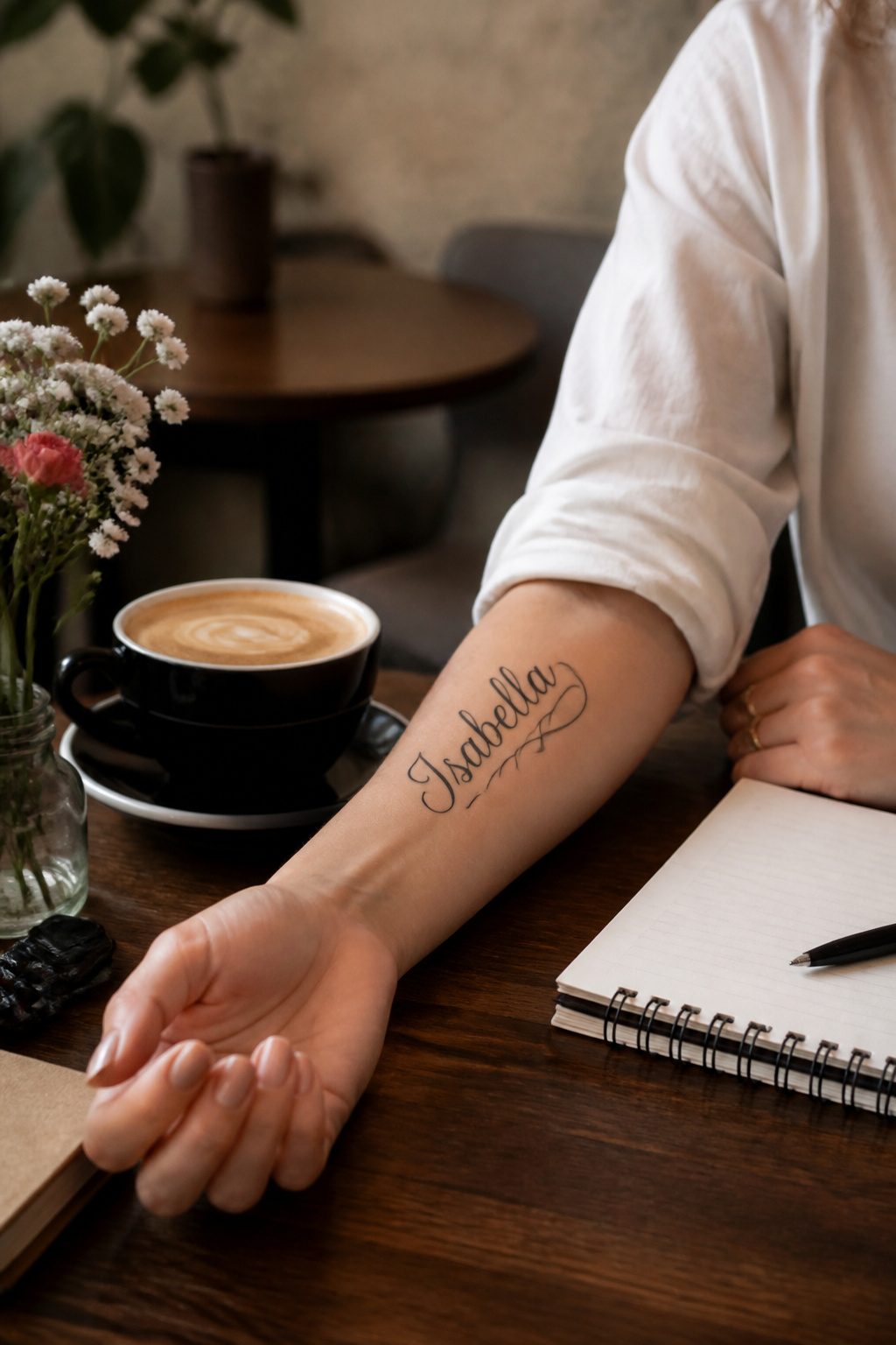
Script weight matters more than font name when you’re choosing a name tattoo on the arm. Hairline lettering blurs inside two years on forearms, where sun and friction hit hardest. A 2–3 mm stroke holds the edge longer, and your artist should pull the needle slowly enough that each curve closes without pooling ink.
Placement for readability follows how the arm moves. The inner forearm stays flat when you gesture or type, so a partner’s name or a child’s birth date sits there legibly. The outer bicep twists with every reach; script there reads as a shape first, words second, which works for honoring a parent who has passed but frustrates if you want the name recognized across a room.
Children’s names carry less risk than partners’ names. The bond does not dissolve. A partner’s name is the choice that makes cover-up artists stay busy, and the coverage itself runs larger and darker than the original piece. Family names threaded through leaves or a ribbon, like the capital-letter "family" wrapped in dotwork and red ink, spread the commitment across a concept rather than pinning it to one person.
If the name must stand alone, keep it to a single word and leave room below for a small date or symbol. The arm offers length, not unlimited width, and stacked lines crowd faster than you expect during the stencil phase.
6. Tiger Tattoo
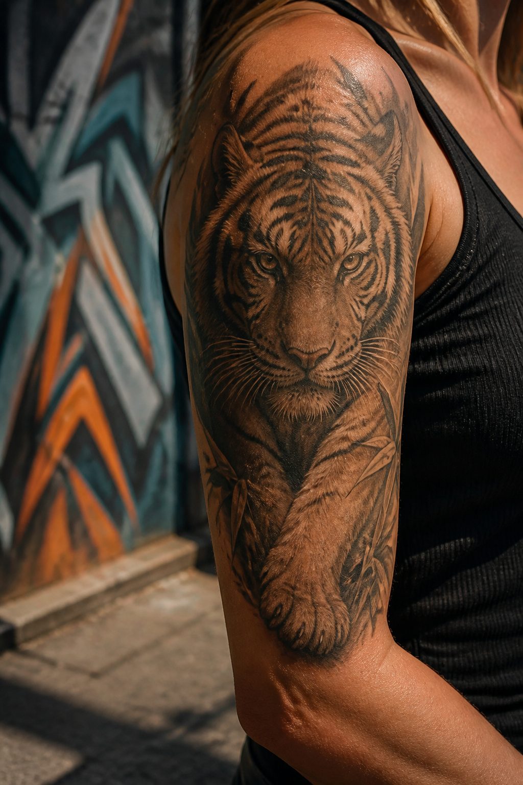
A tiger on the arm carries weight differently than smaller symbols. The muscle structure beneath the skin either supports the cat’s power or fights it, and that tension is part of the design’s point. The upper arm’s deltoid curve can echo a tiger’s raised shoulder, letting the ink seem to move when the wearer flexes. Forearm placement works against flatter bone, so the artist often exaggerates the jaw or stripe flow to create false depth where the body gives none.
The meaning runs toward strength, courage, and protection. Samurai once marked themselves with the white tiger Byakko as a guardian spirit, and that lineage still appeals to women who want the image to mean something specific rather than read as generic fierceness. Realistic tiger heads demand intricate shading to catch the intensity; without it, the face flattens into cartoon. Subtle gradation around the eyes and muzzle makes the difference between a symbol worn and one that stares back.
The arm’s visibility matters here. A tiger is not a private tattoo, and the placement says the wearer intends to be seen as unafraid. That confidence is part of the design’s function, not just its location.
7. Lightning Tattoo
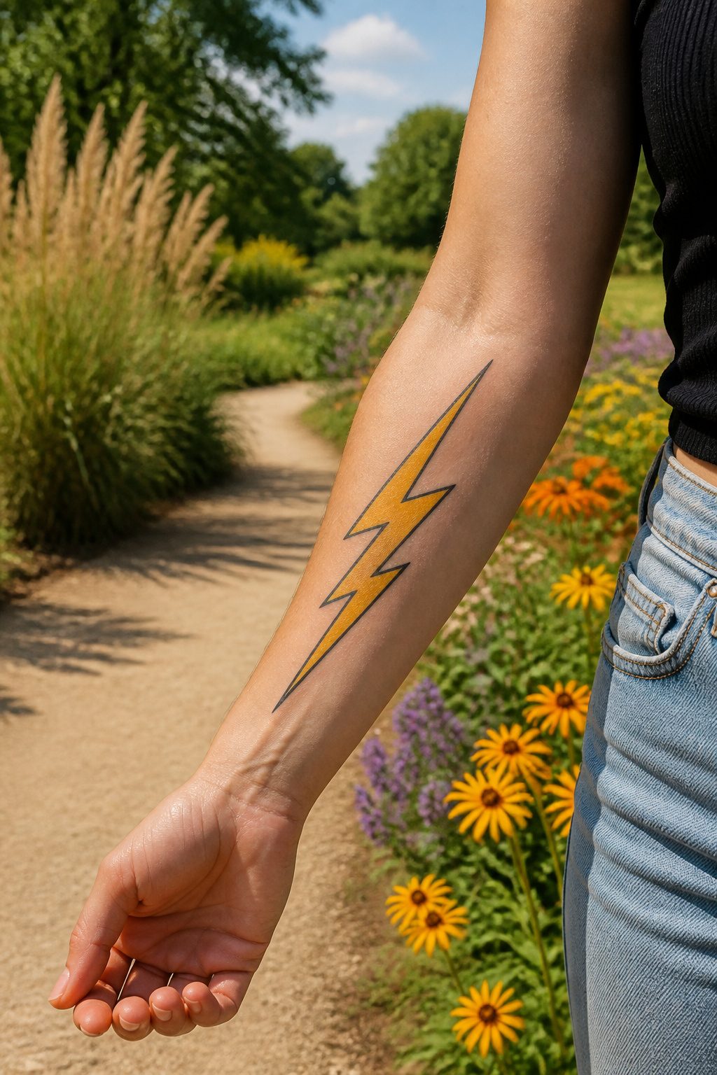
A single lightning bolt running the length of the forearm carries its own symbolism without needing extra elements. The vertical stretch of the arm mirrors the bolt’s natural descent, so the design reads as movement rather than a static symbol. Some wearers choose it for the idea of sudden change, the kind that splits a life cleanly in two; others mean it as a mark of adaptation, the ability to absorb a shock and keep current flowing.
The arm’s length matters here. A short bolt at the wrist loses the downward drive, while one that travels from elbow toward the hand uses the full canvas to build momentum. The sources note lightning as a symbol of inner strength and the desire for shift, but placement determines whether that reads as private reminder or public declaration. The forearm faces outward by default; the inner arm keeps the charge closer to the body. Either way, the bolt’s direction should follow the arm’s line rather than fight it, a diagonal that leans into the bone rather than cutting across it.
8. Vine Tattoo

A vine wrapping the arm makes use of a shape no flat canvas offers. The cylinder lets the design climb, spiral, or loop back on itself so the eye travels with the body in motion. Green leaves, brown stems, and a single red flower can carry growth and resilience without needing to explain themselves; the red bud in particular reads as beauty still unfolding, frailty included. For a continuous wrap, the inner arm still hurts more than the outer, so the dense detail lands better where the skin is easier to sit for. Color keeps the living quality, but a dark vine alone still reads as growth if the line weight varies enough to catch light. The commitment is moderate: enough ink to read as sleeve territory, easy enough to extend later if the story keeps growing.
9. Blackout Tattoo
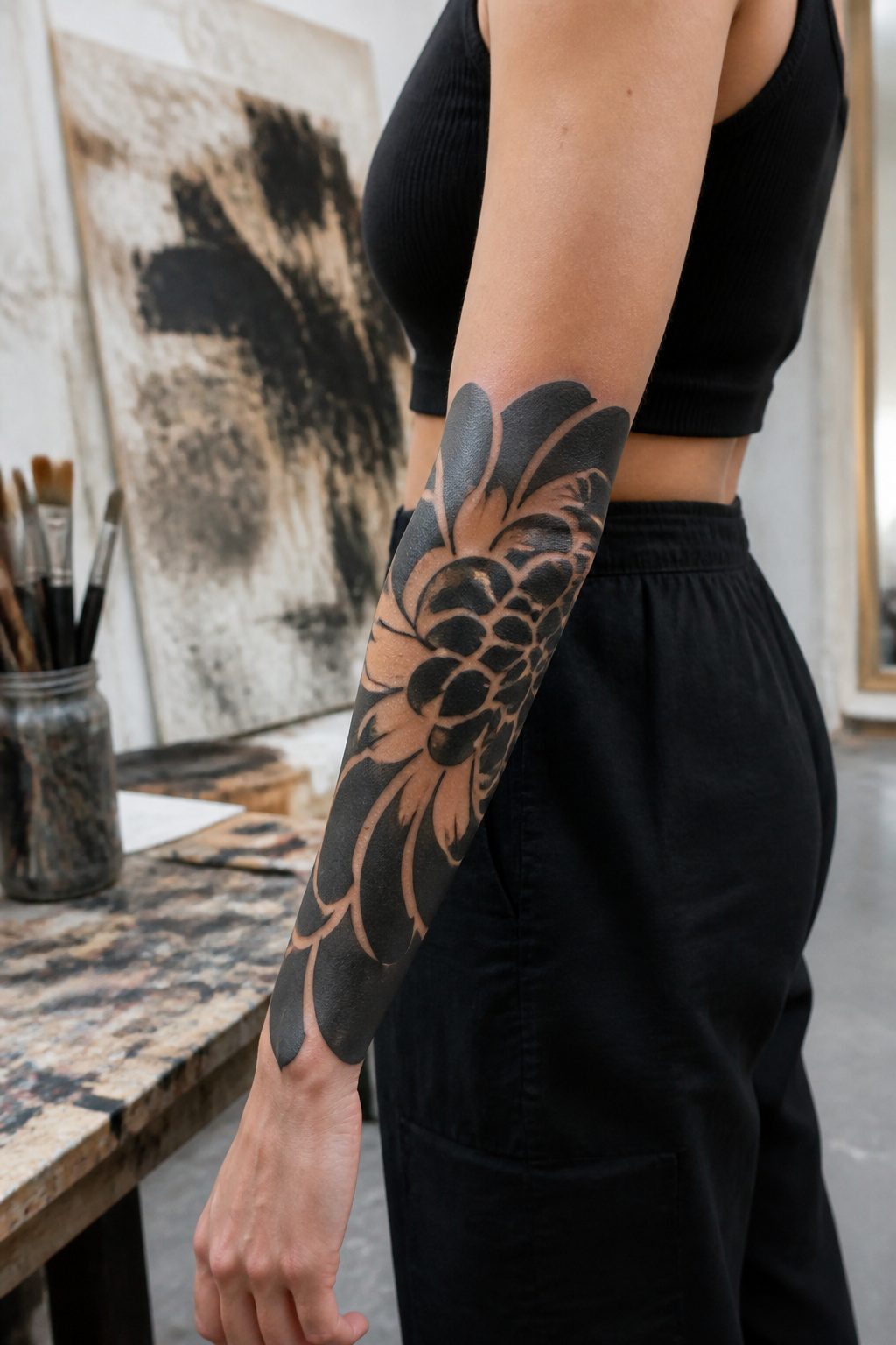
Dense blackwork demands more of the skin than most color or line pieces, and the arm shows that difference fast. Healing a blackout section takes roughly two to three weeks longer than lighter work, with the dense pigment trapping more heat and fluid under the surface during the first few days. The payoff, for those who commit, is the negative space left deliberately un-inked: a flower, a figure, a word shaped by what surrounds it rather than what fills it. That framing reads as almost luminous against the matte black, and it is the reason many women choose the outer forearm or a partial sleeve rather than a full blacked-out limb. Large solid fields also age differently; where fine lines blur, blackout stays visually flat but can develop a blue cast as the ink settles deeper. The real limit is not pain during the session, though that is significant, but the patience required for aftercare when the arm swells and the black surface weeps plasma for days. Anyone considering this should expect multiple sessions and a healing timeline measured in months, not weeks, for a full blackout piece.
10. Wing Tattoo
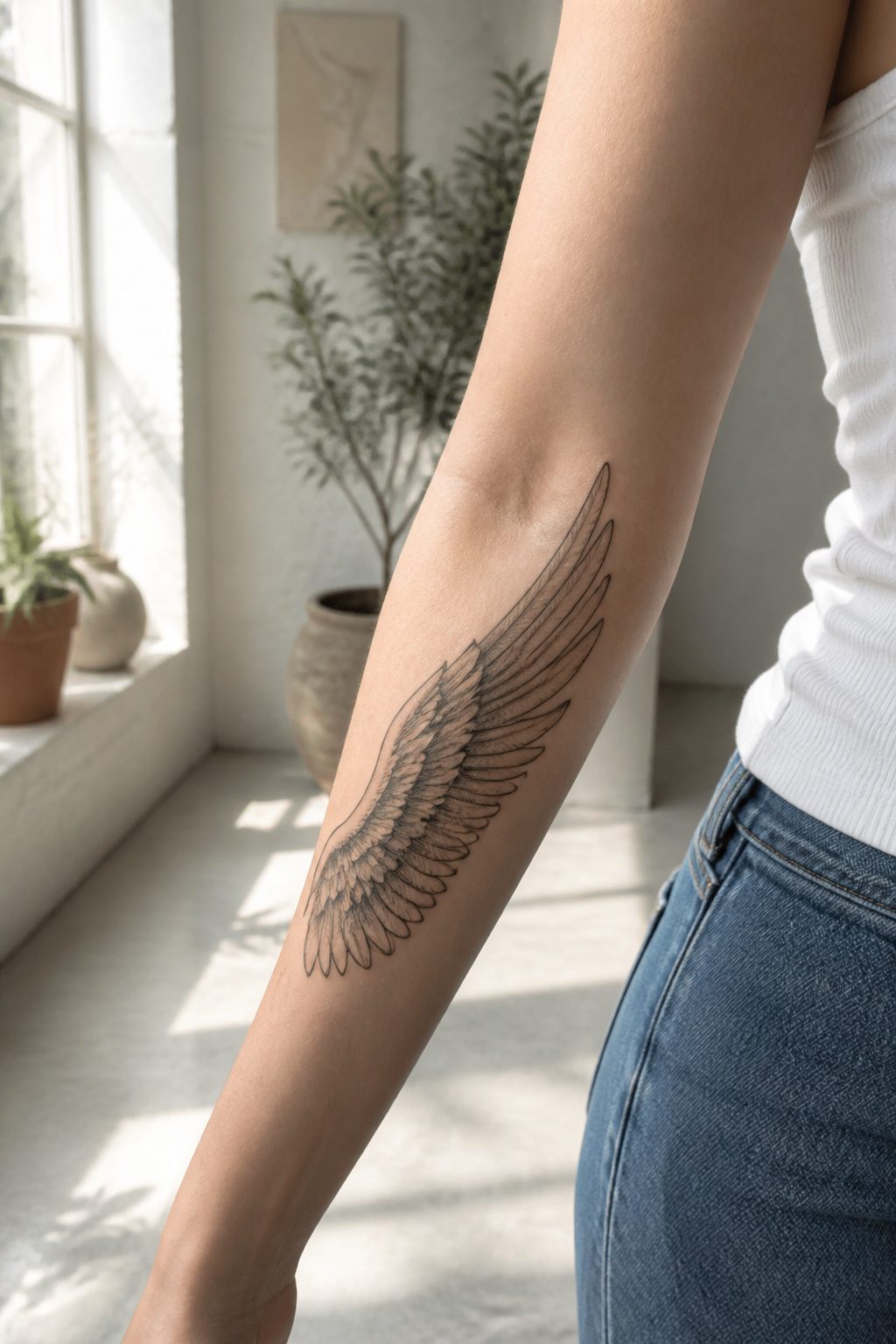
A single wing along the outer forearm reads as a gesture, something mid-motion, while the same design opened across the shoulder and upper arm looks like shelter. The span is the trick. Two wings mirrored on both arms can frame the body when the arms are held out, but one wing alone keeps the symbolism quieter: freedom without performance, or protection worn inward.
The dot work and fine linework that show up in larger pieces let each feather carry weight without color. A half-sleeve build leaves room for that detail. Smaller forearm wings pare the idea down to silhouette, which ages cleaner and keeps the meaning personal rather than public. The simpler the wing, the more it reads as private memory, especially when the reference is to someone lost.
Placement above the elbow versus below changes who sees it first. The upper arm stays partly hidden in daily clothes; the forearm becomes part of how you gesture. Neither choice is better, but they serve different relationships with the symbol, and the body carries each one differently.
11. Dragon Tattoo
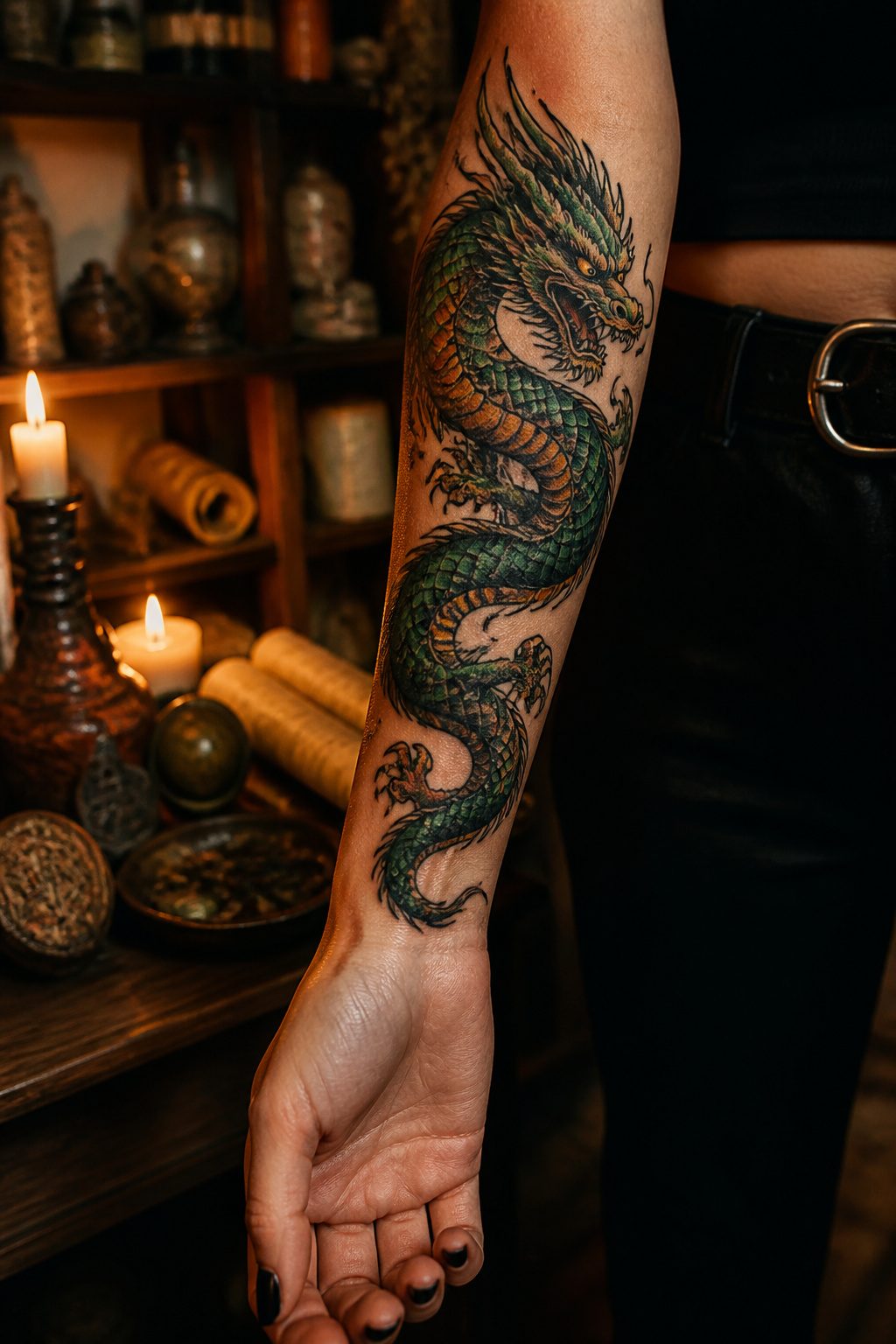
A dragon on the arm reads differently depending on which tradition you draw from. Eastern depictions carry weight as symbols of wisdom and protection, often shown coiled through water or clouds with long, serpentine bodies that wrap naturally around a forearm or bicep. The elongated, curving form fits the arm’s cylinder well, letting the design flow with the muscle rather than fighting it. Western dragons, by contrast, emphasize strength and ferocity, and an extended pose across the outer arm broadcasts that energy outward. The coiled Eastern body suits a forearm sleeve, while the spread Western wing or claw works better across the shoulder and upper arm where the broader canvas gives it room to breathe. Dotwork and blackwork techniques add texture to scales without softening the mythic presence. Either way, the arm’s visibility means this choice stays public; plan for placement that ages with your movement, not just your mirror.
12. Family Tattoo
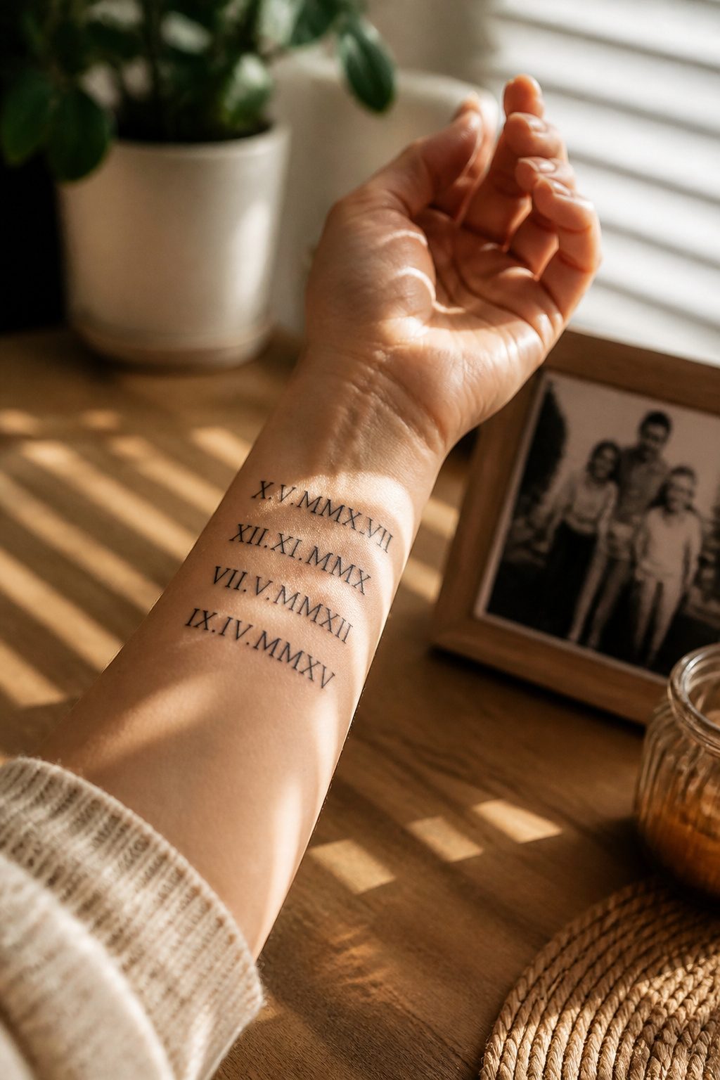
Birthdates in Roman numerals line the inner forearm like a private timeline you can read without a mirror. My own three dates sit just above the wrist bone, small enough to tuck under a watch band but there when I need them. The font matters more than people expect: a too-thin line blurs inside two years, while something with a little weight stays crisp.
Family trees branch up the upper arm with names worked into the roots or the canopy. The shape follows the muscle in a way that flat symbols do not, which is why this placement tends to look settled rather than stuck on. A portrait of a parent or grandparent demands more skin and more budget than most arm pieces, and the truth is that a stylized silhouette or a hand holding a small object often reads more clearly at the size an arm allows.
Symbols of connection work best when they carry specific weight rather than generic meaning. Two birds on a shared branch, an interlocking pattern from a quilt, a phrase in the actual handwriting of the person it names: these keep the design from sliding into clip art. The forearm’s visibility is the point, not a problem to solve. A family piece hidden where no one sees it misses its own purpose.
13. Dreamcatcher Tattoo
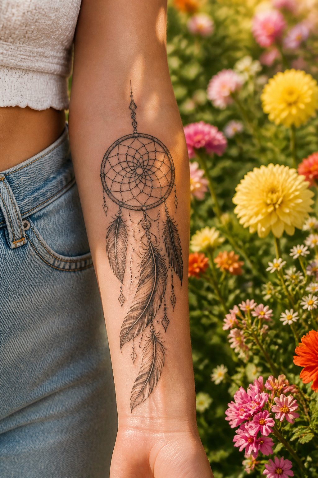
A dreamcatcher tattoo on the arm carries meaning that runs deeper than its current popularity in flash sheets. The design originates with the Ojibwe people, where the web was meant to catch harm before it reached the sleeper, and the feathers carried filtered dreams downward. That protective symbolism translates naturally to forearm placement, where the web’s concentric circles and radiating lines fill the vertical space without crowding. The feather drops follow the natural line of the muscle toward the wrist, which makes the composition feel intentional rather than squeezed in.
What convinced me, looking through portfolio after portfolio, is how much the piece changes when an artist understands the geometry. A stiff, symmetrical web reads as clip art. Slightly uneven tension in the threads, maybe a bead or two at the intersections, gives it the hand-wrought quality that separates respectful adaptation from careless copying. The question of who should wear this design matters. If you have no connection to Native American heritage, the respectful move is to research the specific nation whose imagery you’re borrowing, find an artist who has done that same work, and ask directly whether they take non-Native clients for this piece. Some will, with modifications that honor the source; others won’t, and that boundary is part of the respect. The forearm length suits two to four feathers maximum before the balance tips toward clutter.
14. Henna Tattoo
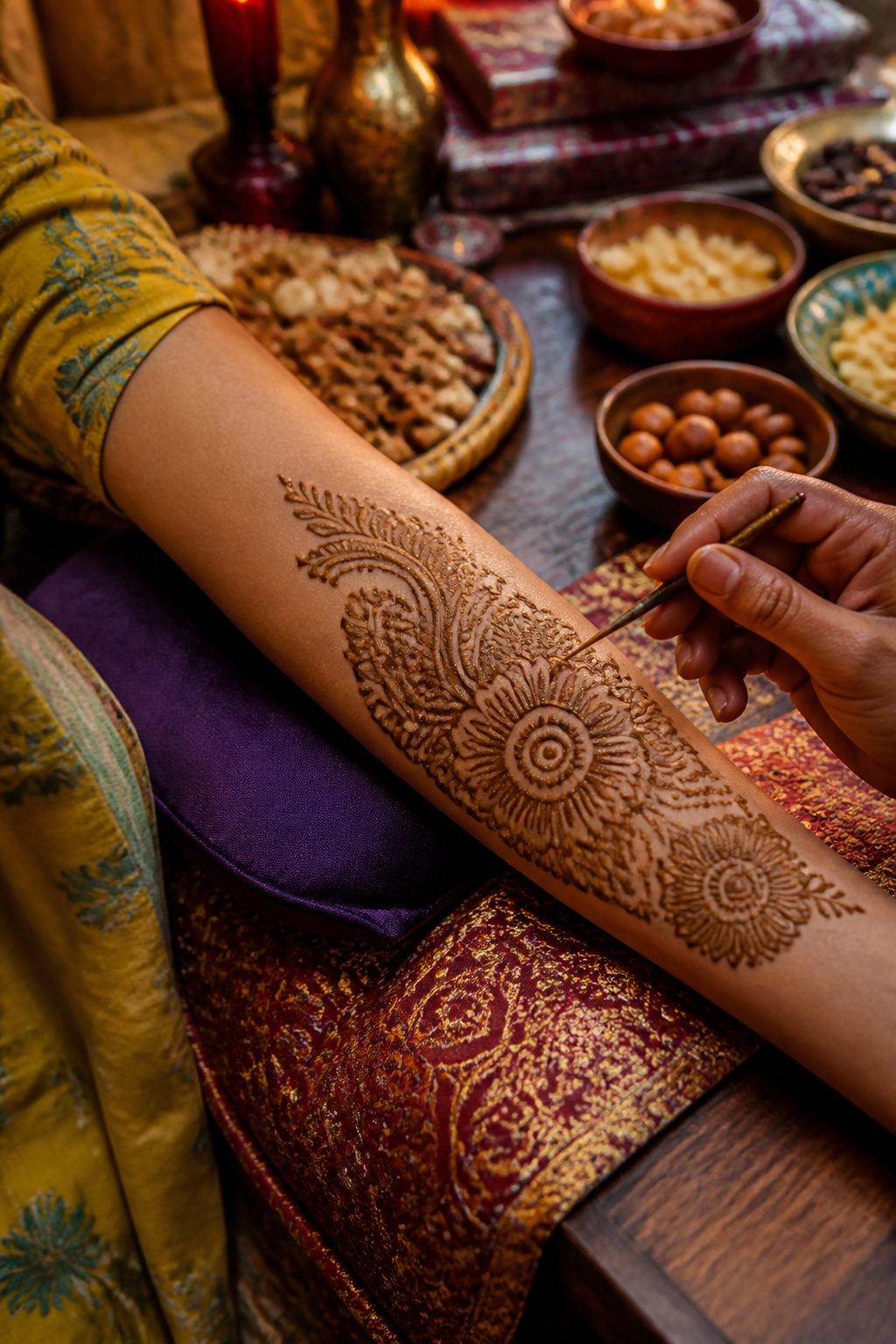
Henna paste, mixed from powdered Lawsonia inermis leaves, stains the outer skin layer in shades of burnt orange to deep mahogany that last one to three weeks. The art carries centuries of ceremonial weight in South Asian weddings and Middle Eastern festivals, where the darkness of the stain once signaled joy or prosperity. Modern wearers often book a henna session before committing to permanent ink, using the fading design to test placement, scale, and whether the image still feels right after the initial thrill passes.
Application takes steady hands and patience. A cone or squeeze bottle lays down lines that must dry undisturbed for hours; scraping too early leaves a faint ghost instead of the intended saturation. The paste itself carries little risk for most skin types, though "black henna" cut with PPD hair dye can scar and should be refused outright.
The temporary nature is the point, not a flaw. A vine curling from wrist to elbow for a summer wedding disappears before job interviews or family gatherings where visible ink would complicate the room. What remains is the memory of sitting still, the cooling paste tightening, the slow reveal after brushing away the dried crust. Some women return annually for the ritual itself, not the design.
15. Biomechanical Tattoo
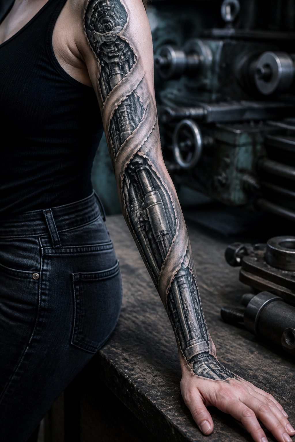
A biomechanical arm tattoo works because the body already gives it a head start. Tendons at the wrist, the hollow of the elbow, and the line of the shoulder joint map almost perfectly onto where gears would sit, where pistons would slide, where cables would run. The design peels back a strip of skin and lets machinery show through: robotics, gears, pistons, cables layered against the bones and muscles they replace. The surreal effect lands hardest when the tattoo follows an actual joint, so the arm’s movement completes the illusion of mechanical function.
The style borrows heavily from sci-fi and body-horror aesthetics, and it reads as body modification even when the only modification is ink. What separates a convincing piece from a busy one is how precisely the artist routes those cables and pistons along the body’s existing topography. A forearm with visible veins becomes a conduit; a flexed bicep becomes a piston housing. The tattoo should move with you, not fight your anatomy.
Color choices tend toward gunmetal, oxidized copper, and the raw red of exposed tissue, though some pieces stay entirely in black and gray and let shadow do the mechanical work. The level of detail means these pieces usually take multiple sessions and demand an artist who specializes in the style, not just someone who can render a gear.
16. Mandala Tattoo
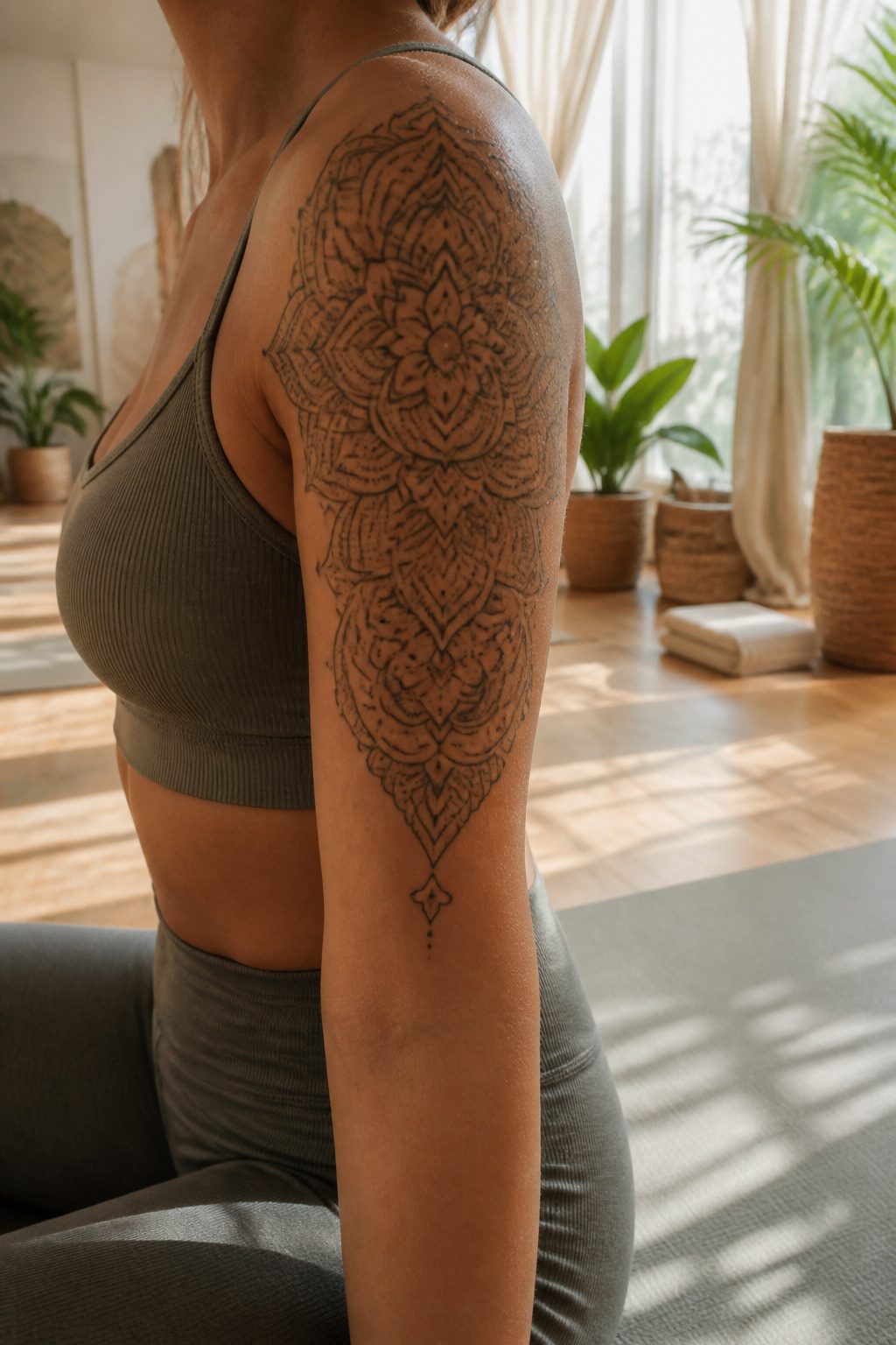
Mandala designs build outward from a center point in repeating layers of triangles, circles, and other shapes, creating the kind of symmetry that holds up on a curved surface. That geometry is why the shoulder or the elbow works so well: the circle can wrap the joint or sit flat on the cap, and the eye reads it as balanced from almost any angle.
The spiritual weight comes from Hindu and Buddhist roots, where mandalas represent the sun, the universe, and the stars. A design that carries that history reads as meditative even at a glance, which is part of why women who want something meaningful without a literal symbol tend toward it.
Dotwork or linework handles the detail best. Dotwork builds tone through density; linework defines the structure. Either way, the artist needs a steady hand. The fine lines blur faster on arms than on, say, the back, so placement matters: the outer upper arm weathers better than the inner elbow if you want the geometry crisp five years out.
17. Tribal Tattoo
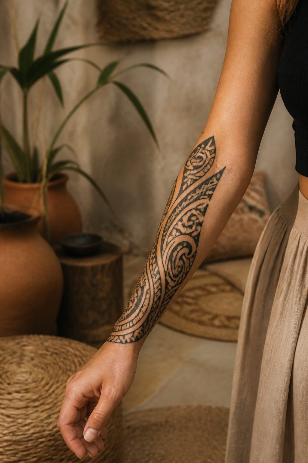
Polynesian and Maori arm tattoos carry some of the oldest continuous tattoo traditions still practiced today. The patterns are not decorative filler: each line weight, spiral placement, and negative-space gap records genealogy, social rank, or personal achievement. A koru spiral marks new beginnings; shark teeth patterns signal adaptability and strength. The arm’s length suits the narrative flow these designs demand, wrapping the story from shoulder to wrist in a way a small canvas cannot hold.
The question of who should wear them is harder than the placement. These patterns belong to specific families and regions; a copied template without that lineage is empty symbolism at best. What convinced me, reading through a dozen accounts of women who chose tribal arm work, is that respectful adoption looks like collaboration: commissioning an artist with verifiable ties to the tradition, sitting for the design process rather than pulling from a flash sheet, and accepting that some motifs are simply not available to outsiders. The women I found who felt at peace with their pieces had done the homework, asked the uncomfortable questions, and sometimes been told no. That refusal is part of the respect too.
18. Rose Tattoo
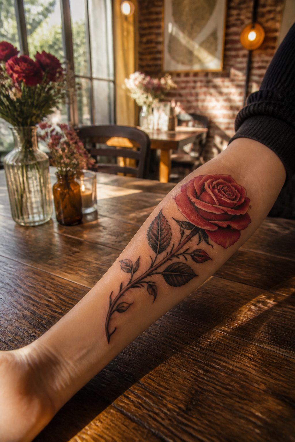
Roses carry the most layered symbolism of any flower in tattoo work, which makes them especially useful when the arm is the canvas. A single stem on the forearm reads as direct declaration: love, passion, romance, stated plainly. The arm’s length lets that stem run true, from near the wrist toward the elbow, and the muscle underneath gives the petals something to wrap around so the tattoo keeps its shape when the arm moves.
Color shifts the message more than people expect. Wine red and dark red together, worked with attention to light and shadow, can create a velvet depth that turns a simple rose into something almost photographic. That heavier pigment also serves a practical purpose; it covers older work beneath it, which matters on an arm that may have collected ink over years.
A bouquet arrangement changes the equation entirely. Clustered roses on the upper arm or sweeping toward the shoulder let each bloom carry a separate meaning: one for a wedding date, one for a child’s birth, one for someone lost. The arm’s full vertical span gives those relationships room to breathe without crowding.
For women building toward a sleeve, roses integrate cleanly. They soften transitions between heavier pieces, and their natural curves follow the arm’s own lines better than geometric work. A single rose at the wrist, repeated in smaller form up the arm, can tie a sleeve together without the design ever announcing itself as a system. The pain is real, especially along the inner arm, but the result reads as commitment rather than decoration.
19. Heart Tattoo
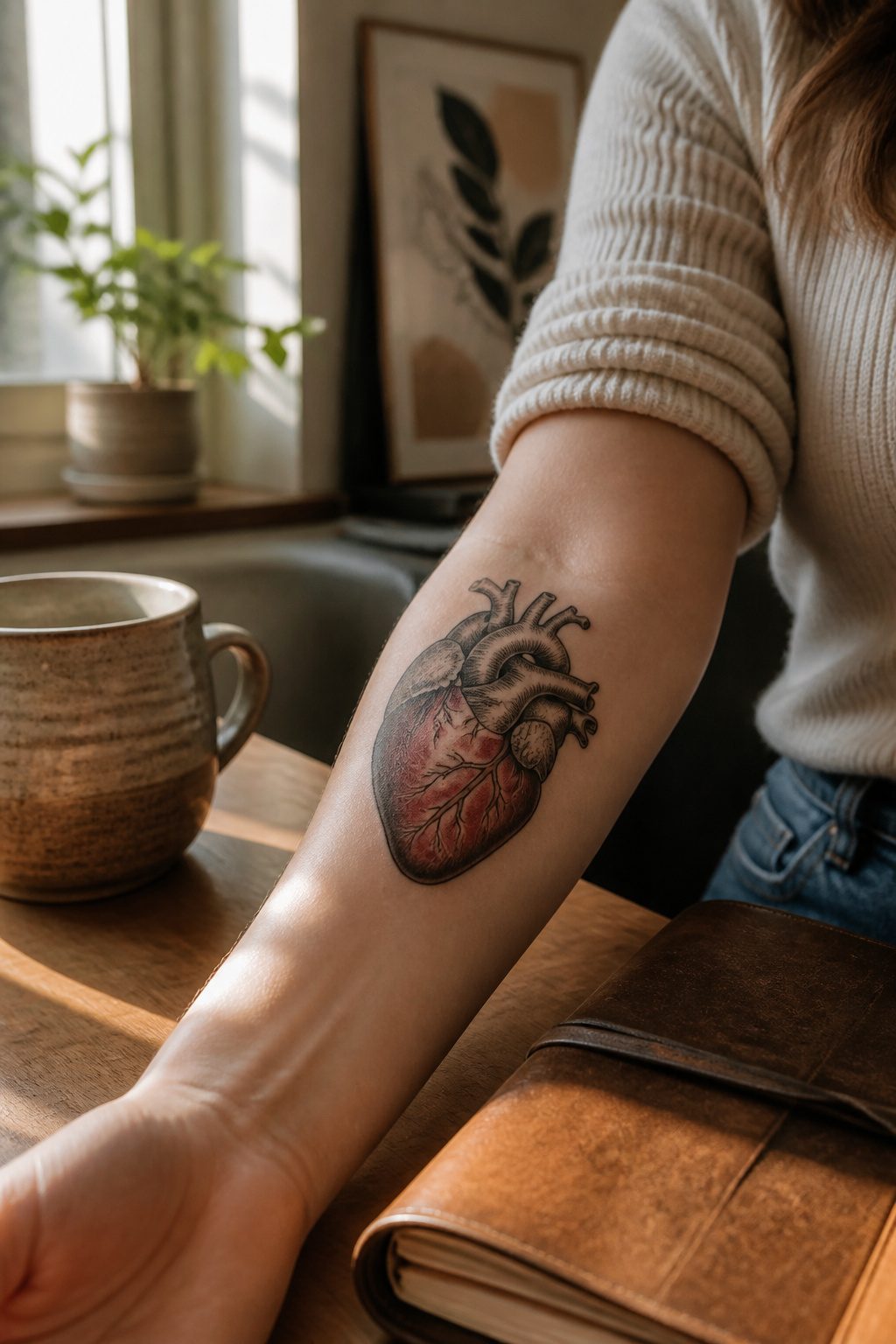
Heart tattoos on the arm split cleanly into two camps, and the choice between them says more about the wearer than most people realize. An anatomical heart, valves and chambers rendered in fine line or shaded realism, reads as something medical, almost clinical; it carries weight for nurses, for anyone who has watched their own heart on a monitor, for people who want the organ itself rather than the idea of love. Stylized hearts, the classic two-lobed shape, leave room for play. A thin outline at the wrist looks like a secret. Filled in bold at the inner bicep, it becomes a declaration.
Placement turns these into keepsakes faster than almost any other symbol. The inner forearm fits names, dates, small coordinates tucked beneath the curve. A heart cradling a parent’s initials sits differently than one wrapped around a birth date in Roman numerals. Adding a pulse line, a small bird breaking free from the top lobe, or a banner with text changes the register without crowding the design.
What convinced me, looking through portfolios for this piece, was how often the simplest hearts aged best. Heavy black fill on a small heart tends to blur after a few years; a single needle outline with breathing room around it stays readable where detail collapses. The arm moves, stretches, sees sun. A heart that relies on precision rather than density survives that better.
20. Cartoon Tattoo
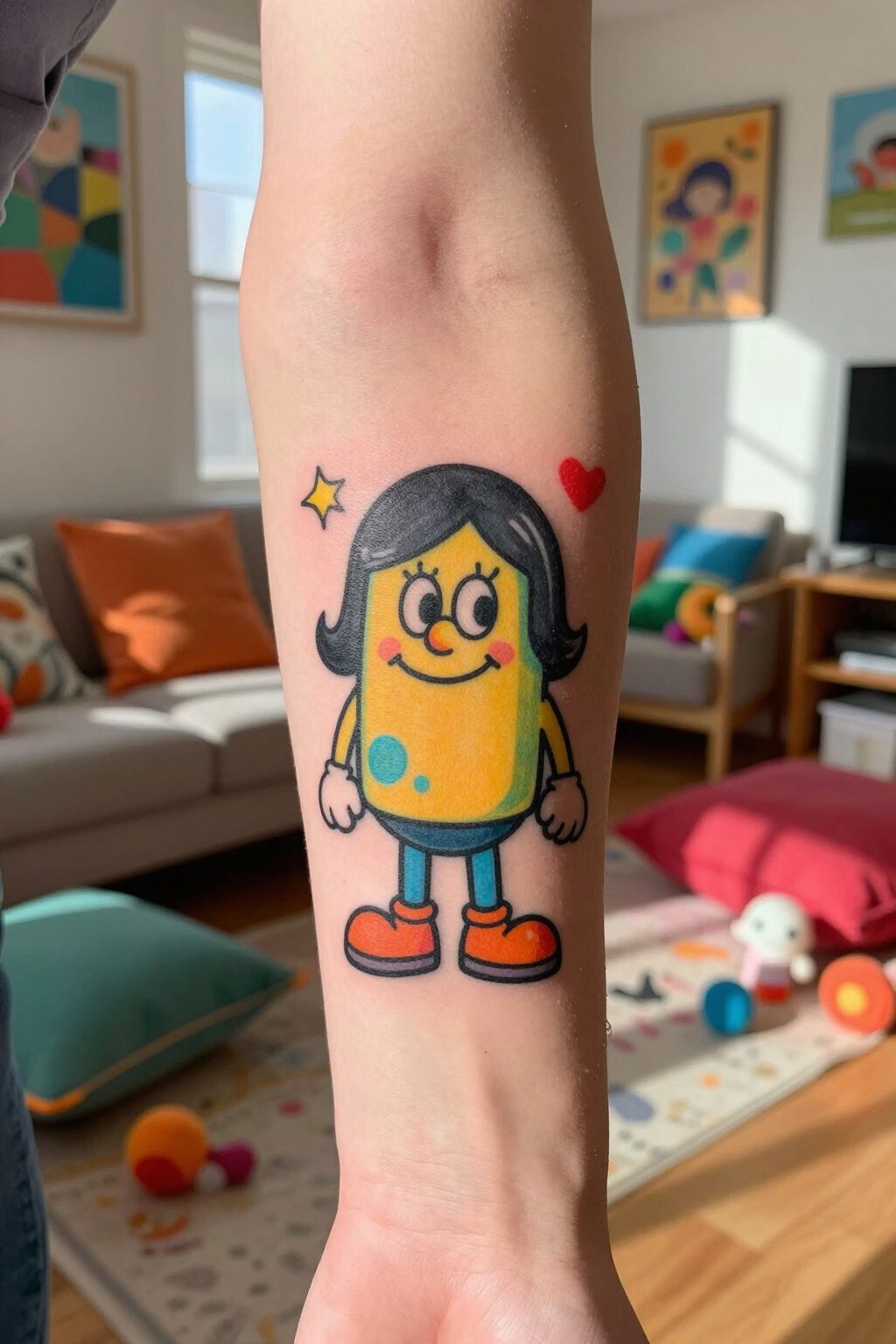
A cartoon character on your arm carries weight because the design already lives in your memory. Bold outlines and flat, saturated color fields that read well on skin are built into the animation style, which is why a good cartoon tattoo still registers clearly from across a room years later. The arm’s flat planes and gentle curves suit these graphics better than spots that bend or twist the image.
Nostalgia drives a lot of the choices here, though the connection runs deeper than remembering a Saturday morning. The character you pick says something about who you were when you first needed it, or who you decided to become. That personal thread matters more than chasing a trend, because a cartoon face you outgrow leaves you with expensive regret.
Bright pigments on arm skin do need planning. Yellows and light greens can muddy over time without enough contrast behind them, and areas that see sun regularly fade faster than you’d expect. A skilled artist will push the saturation darker than the reference image so the tattoo settles where you want it, not where UV takes it.
21. Peacock Tattoo
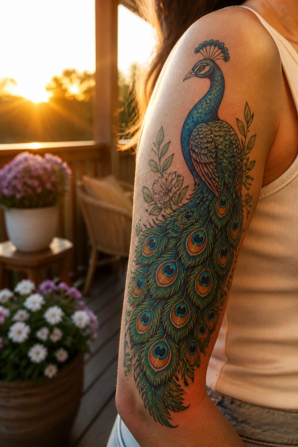
A peacock on the arm carries the obvious read of beauty and pride, but the bird also signals renewal, the way it molts and regrows that tail each year. The arm’s length gives two workable approaches. A full spread of feathers reads as a sleeve or half-sleeve, the eye patterns stacking from shoulder to wrist with the body anchoring near the elbow or upper arm. The shape follows the muscle naturally. A portrait focus, head and a shortened fan, sits cleaner on the forearm or outer bicep where the curve stays gentle.
Color does the heavy lifting here. The iridescent greens and blues separate a striking piece from something that looks like clip art. Saturated teals and golds hold up better over time than the softer pastel versions that trend on social feeds. Line weight matters too. Fine detail in the feather eyes blurs faster on the inner arm where skin moves more.
Placement shapes the symbolism more than people expect. A peacock facing forward, straight on, tips toward vanity, almost watchful. In profile, walking, the same bird reads as movement and change. The choice between them says something different about why you picked it.
22. Elephants Tattoo
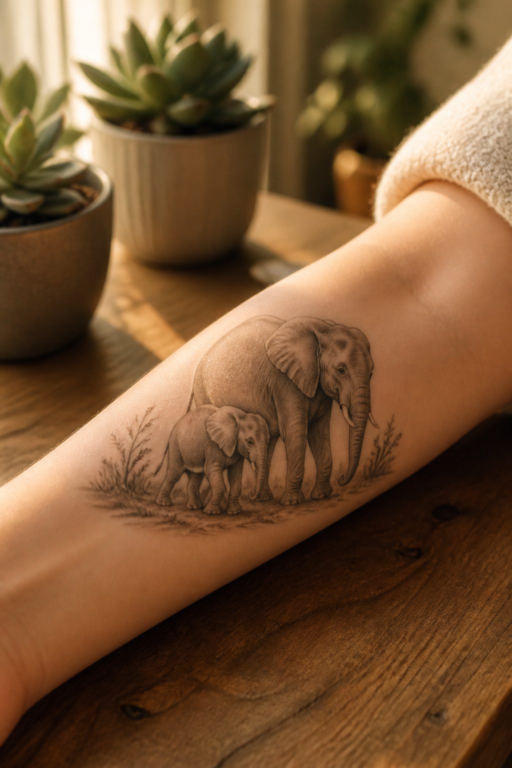
Elephant arm tattoos for women carry weight that goes deeper than the image itself. A mother elephant walking with her calf tucked close speaks to loyalty and the family values a lot of us are trying to hold onto. The design reads as protective without being loud about it. A single strong male elephant, trunk raised, lands differently: physical and mental strength, independence, the kind of quiet success that doesn’t need explaining.
Placement shapes which version works. The mother-and-calf pairing needs room for the relationship to read, so the outer forearm or a vertical upper arm placement gives the pair space to move together. A lone elephant, especially one drawn in black and grey with a playful stance, can sit smaller and still carry presence. I have seen one design where the elephant stands on its back legs reaching for the moon with its trunk. It pulls off whimsical without tipping into cartoon territory, and it fits a narrower canvas like the inner wrist or a bicep wrap.
The family group arrangement asks more of the skin real estate but repays it with narrative. Single elephant designs scale down more forgivingly for a first piece or a spot you might want to build around later.
23. Clouds Tattoo

Clouds on the arm carry a specific pull for women mapping a life change. The blue coloring of a summer sky piece reads calm and open, while a bright yellow sun breaking through marks the point where mystery meets forward motion. Arm placement matters here: the wrap from shoulder to wrist traces an actual passage, one stage to the next made visible.
What works is restraint. A single cloud cluster above the elbow reads as quiet atmosphere; dense filler behind a larger subject can swallow it. The designs that stay with me keep the cloud as either pure background or the whole story, never half each. A standalone sleeve of layered sky with one sun focal point carries the meaning without crowding. The ethereal quality holds only when the negative space is planned, not whatever skin happened to stay open.
Color choice shapes this directly. Blue tones carry the dream symbolism; too much gray drifts toward storm, which shifts the message whether you meant it or not. If the goal is freedom and transition, keep the sun central and the clouds in motion around it, not stacked static. The movement does the work.
24. Abstract Tattoo
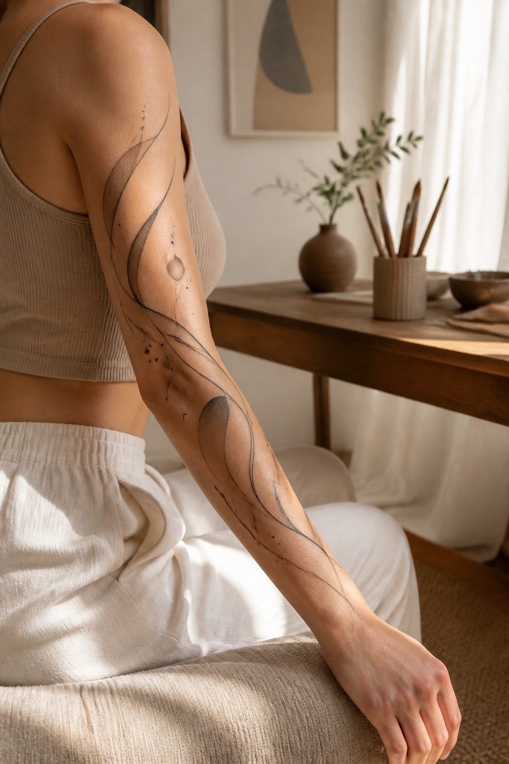
Abstract work on the arm carries a different contract with the viewer than a rose or a name. Nothing in the design tells them what it means, so the meaning stays private, carried in the shape and the color rather than in a symbol anyone can read. That appeals to women who want the tattoo to mark something specific, a grief or a shift or a private victory, without turning it into public explanation.
The arm’s long muscles and the curve from shoulder to wrist become part of the piece itself. A line that starts tight at the inner forearm can widen as it crosses the elbow, using the body’s own geometry to create movement that flat paper would not allow. Color field work, where large soft shapes bleed into each other, sits especially well on the outer upper arm; the surface there is broad and relatively flat, so the tones read cleanly without distortion. Fine line abstraction needs the inner wrist or the narrow channel along the forearm, where the eye expects precision and the skin holds detail with less blurring over time.
The risk is vagueness. Without the anchor of a recognizable image, an abstract piece can drift into decoration that means nothing even to the person wearing it. What saves it is constraint: limiting the palette to two or three tones, or committing to a single gesture repeated at different scales. The best work I have seen came from a woman who brought her tattooist a piece of weathered metal she had found after her divorce, and asked him to translate its rust patterns into line. The result was hers alone, and the arm carried it like a map she never had to explain.
25. Aesthetic Tattoo
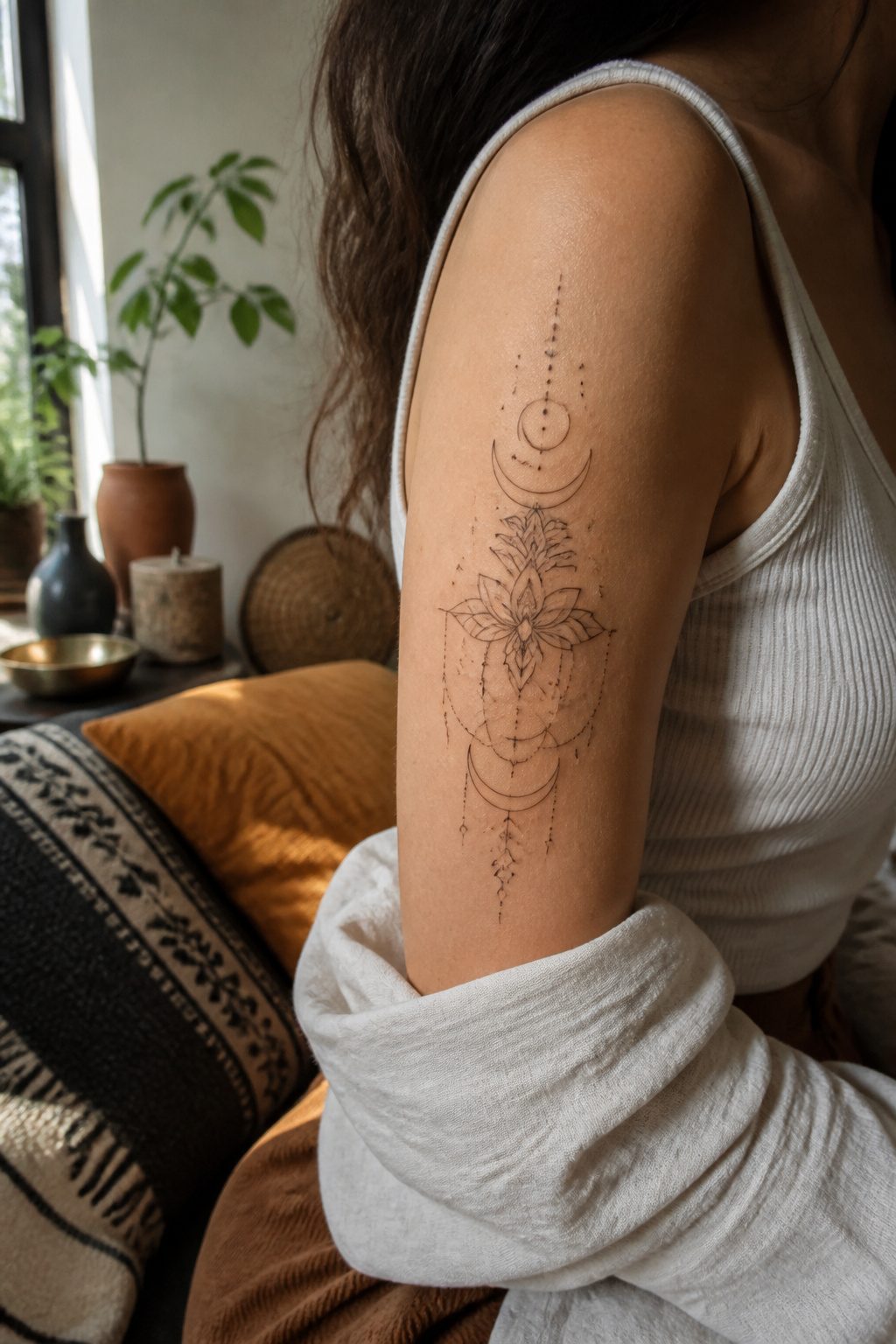
An aesthetic tattoo lives or dies on how the shapes sit together on your arm, not what any single element supposedly means. I learned this watching a friend spend months on Pinterest boards full of moons and hands and floating eyes, only to end up with a piece where nothing talked to anything else. The line weight jumped from needle-fine to heavy block with no transition. The negative space sat in the wrong places for her muscle movement. She loved every symbol individually and disliked the whole thing within a year.
The composition matters more than the content. Aesthetic work borrows from editorial design, from album cover layout, from the way a florist builds an arrangement so no stem competes. Colors get limited to two or three, or the piece stays entirely black and lets texture do the variation. Placement on the arm follows the same logic: a design that wraps the forearm like a cuff reads differently than one that runs vertical from inner elbow toward wrist, and the right choice depends on whether your daily wardrobe shows skin in panels or in full sleeves.
Personal style alignment is the part nobody photographs well for Instagram. A soft, blurred pastel piece sits oddly on someone whose closet runs to sharp tailoring and metal hardware. The same design on a different person looks intentional, coherent. The tattooist’s job is to build that bridge between image and wearer. Your job is knowing which clothes you actually wear, not which ones you wish you did.
26. Feminine Face Tattoo
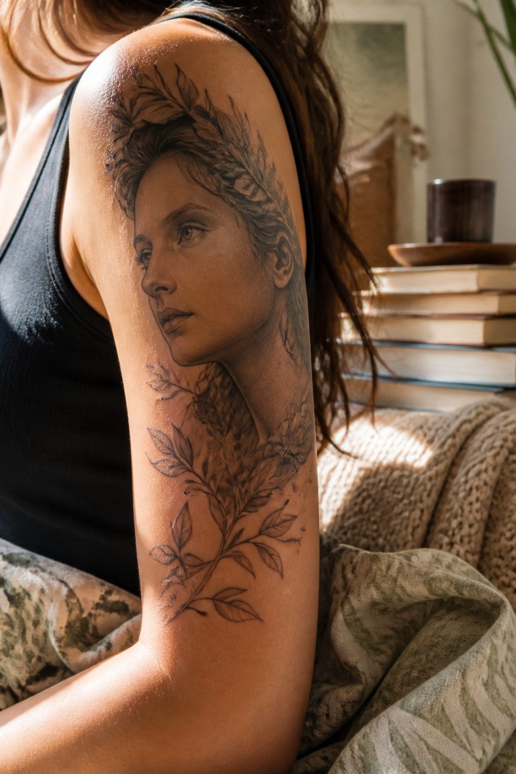
A portrait of a woman’s face carries weight on an arm because the limb’s flat vertical planes echo the proportions of a real face hung on a wall. The upper arm in particular gives the artist room to stretch the design vertically without wrapping awkwardly around bone.
Two approaches dominate what works here. Realism demands clean skin and a patient hand; the face reads as a photograph frozen under glass, which means every millimeter of shading matters and touch-ups are almost guaranteed as the piece settles. Art Nouveau takes the opposite path, borrowing the looping hair and elongated necks of Alphonse Mucha to let the line itself do the work. The stylized route ages more forgivingly, since a slightly blown line in a decorative border matters less than a nostril placed two millimeters off.
The classic image centers beauty or independence depending on whose face it is and how she looks back at the viewer. Some artists render a specific muse or heroine; others keep the features generic so the wearer projects her own reading onto the skin.
Placement shapes the effect more than most subjects. The upper arm’s width lets the face sit at true scale, where a forearm compresses the same design into a strip that can feel crowded. A face needs the space to breathe, and the upper arm offers it straight across.
27. Sailor Jerry Tattoo
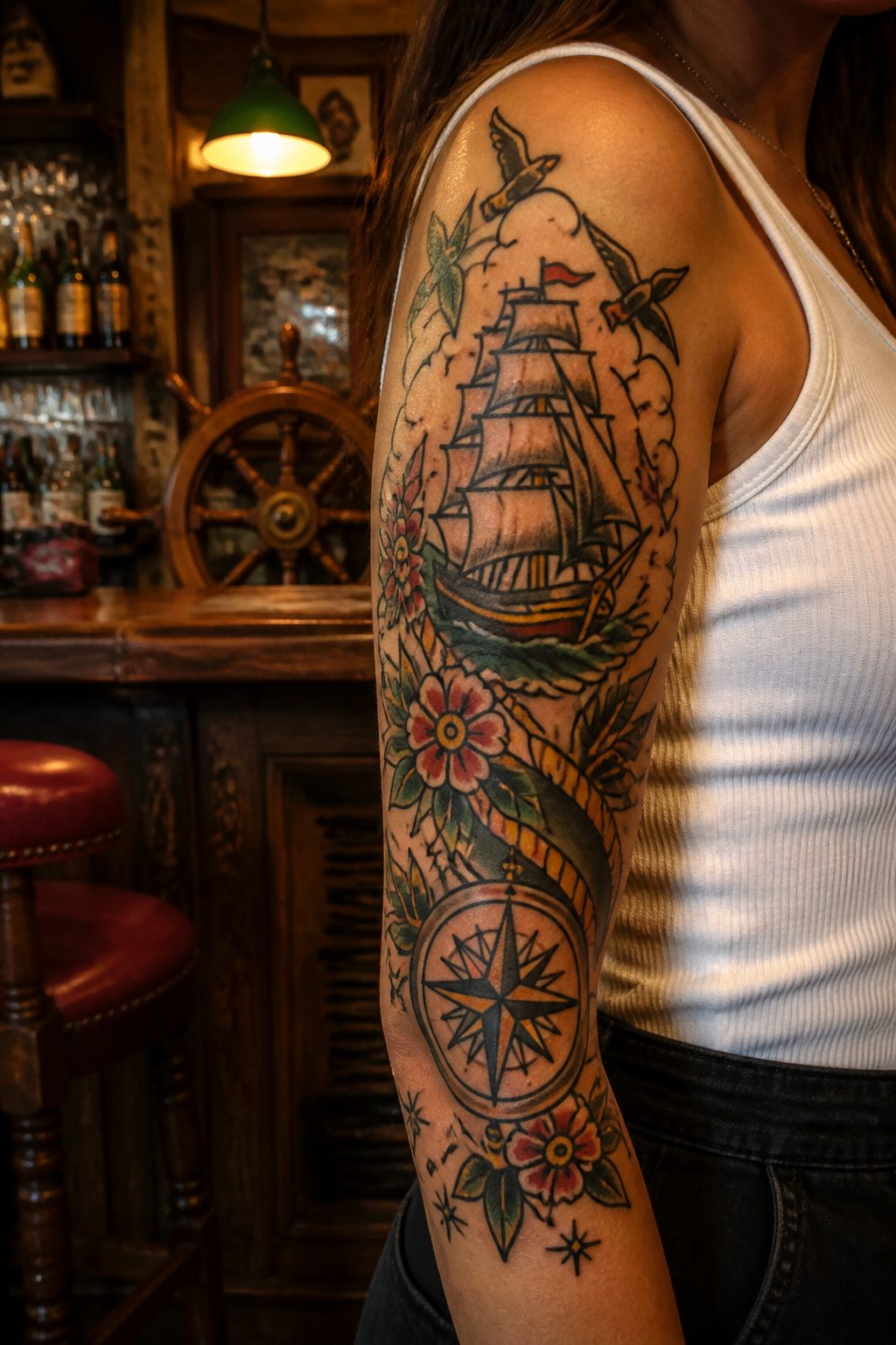
Bold lines and a tight color palette are what make Sailor Jerry tattoos read as classic American traditional rather than just vintage-themed. The style keeps its ink saturated, usually limiting the palette to red, green, yellow, and black, with thick black outlines holding everything together as the piece ages.
Anchors, swallows, ships, and compasses carry the nautical roots, though skulls and pin-up figures have moved just as firmly into the vocabulary. A skull paired with an anchor, done with clean gradient shading, sits well on a woman’s forearm or upper arm without reading as purely masculine. The imagery was built for visibility at a distance, which means these designs hold up even when scaled to fit smaller placements.
The swallow, originally earned for sailing a set number of nautical miles, now works as a standalone piece or as part of a larger composition. Pin-up figures in this style keep the same heavy linework and flat color fills, avoiding the soft gradients that would push them toward realism. What keeps the look coherent is restraint: one or two focal images, a banner if lettering matters, and enough skin left between elements that each shape breathes.
28. Bird and Feathers Tattoo
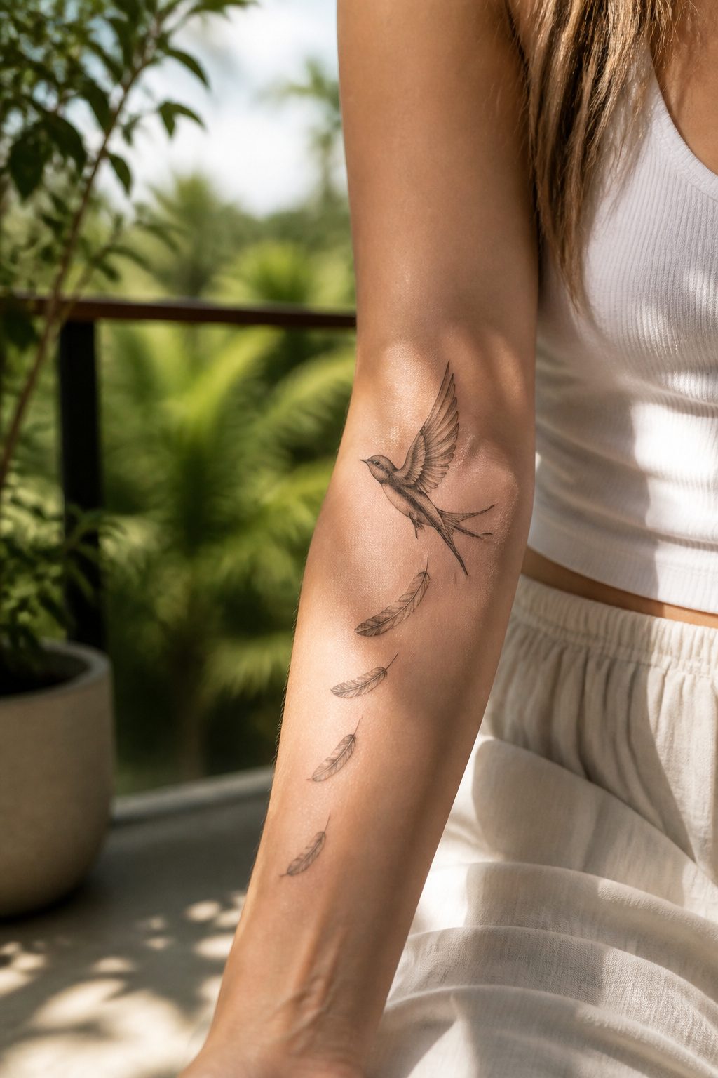
Birds and feathers land on the arm with a lightness that heavier motifs struggle to match. A swallow in flight along the forearm reads as movement itself, the line of the wing following the muscle in a way that feels native to the body. Sparrows carry their own cargo of meaning, something I noticed only after watching a friend explain hers: two for a journey taken, three for miles still ahead. Feathers work the same territory but softer, a single plume curving with the inner arm or tucked behind the elbow where the eye catches it in motion.
The upper arm gives larger birds room to breathe. A raven spreads across the shoulder with the gravity of myth, while a heron lengthens the line of the limb in ways that flatter the silhouette. What convinced me, paging through portfolios, is how much the specific species matters: a dove reads as peace, a crow as survival, a hummingbird as appetite for the next thing. The feather alone keeps this open, a borrowed quality rather than a fixed one, which some wearers prefer and others find too vague.
Placement shapes the effect more than size. A feather following the forearm bone draws the eye lengthwise; the same design arcing the bicep wraps and rounds. The inner forearm wins for detail you want to examine up close, the outer upper arm for shapes meant to read across a room.
29. Bird’s Nest Tattoo
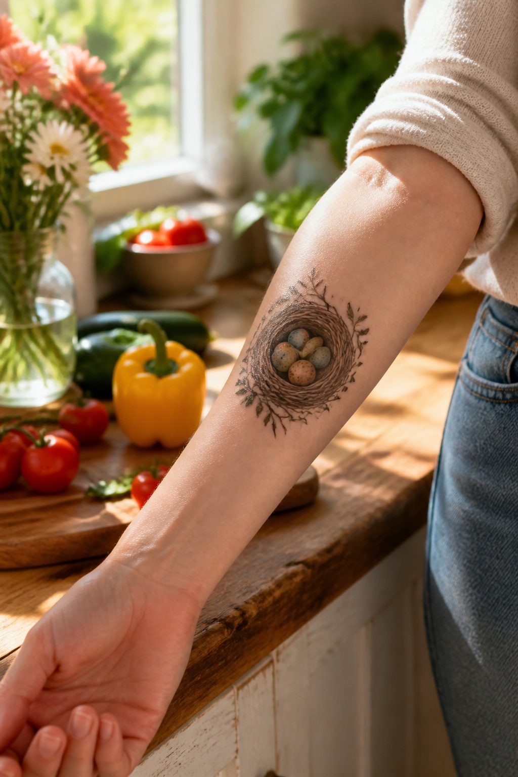
A bird’s nest carries the weight of home without needing much space, which makes it one of the more flexible arm tattoos for women when placement is tight. The curved bowl of twigs sits naturally along the inner forearm or the curve above the elbow, and the arm’s length gives room to build outward: eggs tucked inside, a branch extending toward the wrist, small birds perched or in flight. The symbolism runs toward nurture, family, and commitment, the work of building something warm and defended. Style matters more than size here. A nest rendered too plainly can look like clip art; texture in the twigs, variation in the eggs’ shading, keeps it from flattening into a generic emblem. The arm shows it off when you choose to, covers it when you don’t, and the daily sight of it becomes a quiet reminder rather than a statement.
30. Matching Tattoos
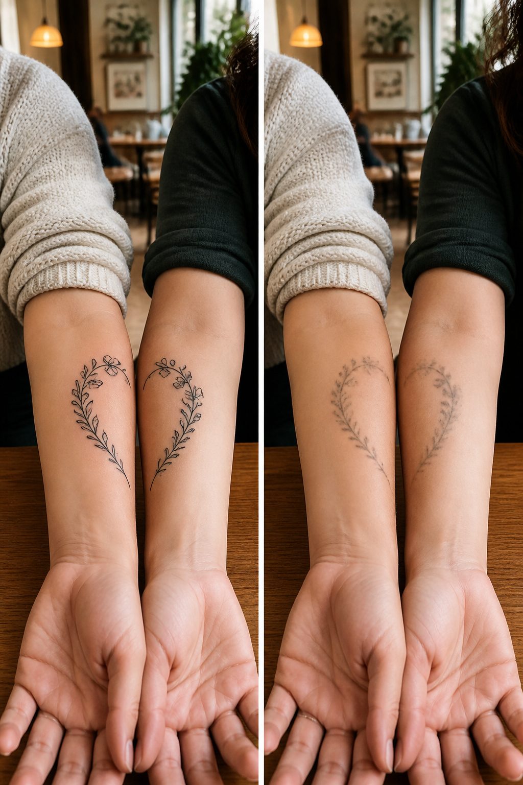
Matching tattoos on the arm work best when both people want to see the design daily without reaching for a mirror. The forearm sits right in that sweet spot, visible during morning coffee or while typing at a desk, which makes it the default choice for pairs who want the reminder to travel with them through ordinary hours rather than hide under sleeves.
Sister pairs tend toward identical linework, two halves of one image, or the same symbol in matching scale. Friends often split a design between them, each carrying the piece that only makes full sense when the two arms line up side by side. What separates a good matching tattoo from a forced one is placement that accounts for how the two people actually stand together. A forearm tattoo reads face-up when arms rest on a table, while the inner arm shows only when one of you reaches out.
The cat tattoos by Tattooist Eden show the logic clearly: small enough to not dominate a professional setting, placed where the wearer sees it constantly, themed around something both people already share. That last part matters more than the design itself. Matching tattoos fail when the symbol means more to one person than the other, or when one of you picked the image and the other just went along.
31. Gemstone Tattoo
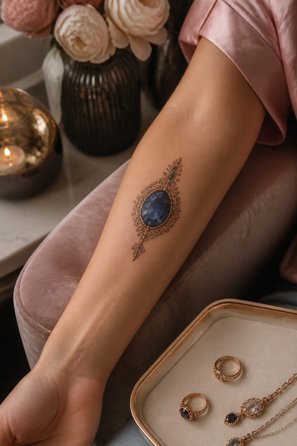
A sapphire set in a teardrop crown of gold filigree reads differently on an inner forearm than a raw chunk of rose quartz hugging the tricep. Birth-month stones carry the cleanest symbolism, which matters when you are explaining the tattoo at forty to someone who was not born when you got it. The January garnet holds up; the modern spin of opal for October feels less certain, more likely to date itself.
Faceted gems demand a steady hand. The light play that makes a diamond convincing lives in single-needle white highlights placed off the expected spots, not where an actual gem would throw them. Raw crystals forgive more. Their irregular surfaces hide a wobble, and the supposed healing properties, amethyst for calm or citrine for energy, land softer as texture than as diagram. An artist who has worked in color realism for less than five years usually overworks the facets, turning the stone into a sticker. The better move is often a healed piece seen in person, not a fresh photo on a shop wall.
32. Matching Cat Tattoos
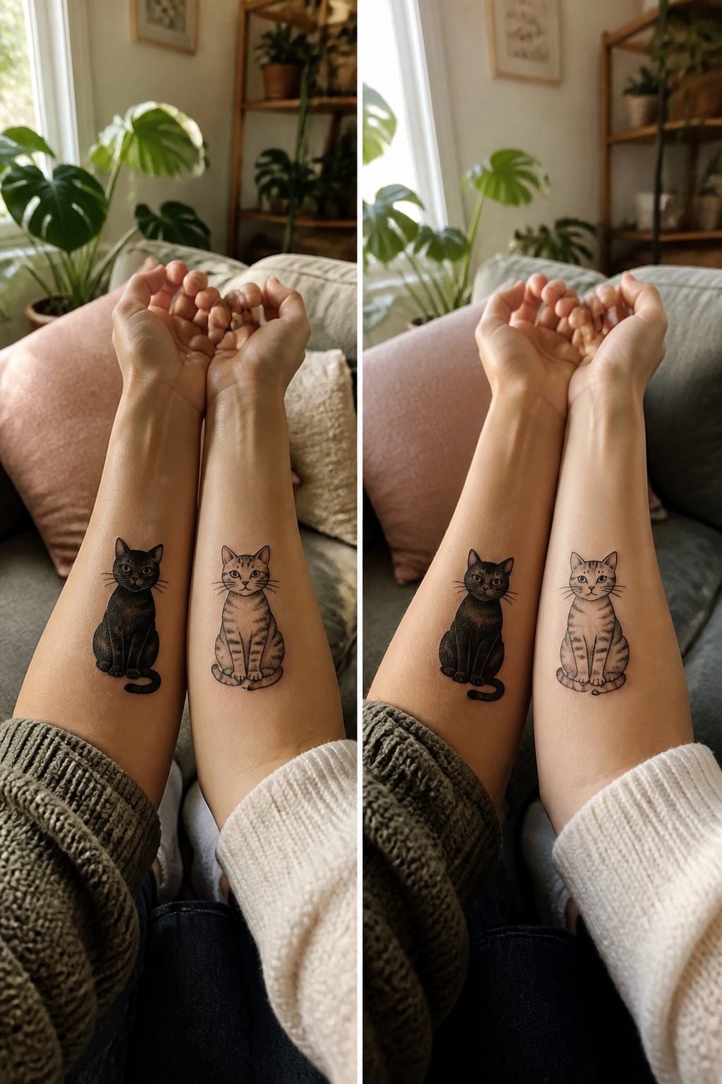
A small cat on the forearm sits where you’ll see it every morning while you reach for coffee or check your phone. That visibility makes it a natural spot for something you want to keep close, and matching cat tattoos play on that daily reminder in a few different ways.
Some pairs go the memorial route, each wearer carrying the same sleeping outline or paw print of a shared pet who died. The design stays small enough that a glance down brings the memory back without announcing it to a room. Others start from friendship: two people who met at a shelter volunteer shift, or who bonded over sending each other cat memes for years, picking stylized portraits of their own living cats in matching poses.
Realistic fur detail demands space, so a forearm cat done true-to-life often needs three or four inches of flat skin to read clearly. Stylized versions, line-art silhouettes or geometric interpretations, shrink down better and age cleaner on wrists or inner arms where the skin moves more. A pair of friends I watched plan theirs split the difference: one got her tabby’s actual face on the outer forearm, the other took a simplified version of the same pose on the inner wrist so they’d match without mirroring exactly.
The shared element matters more than perfect duplication. Same cat, different style; same style, different cats; or one continuous image that completes only when you stand shoulder to shoulder.
33. Manta Ray Tattoo
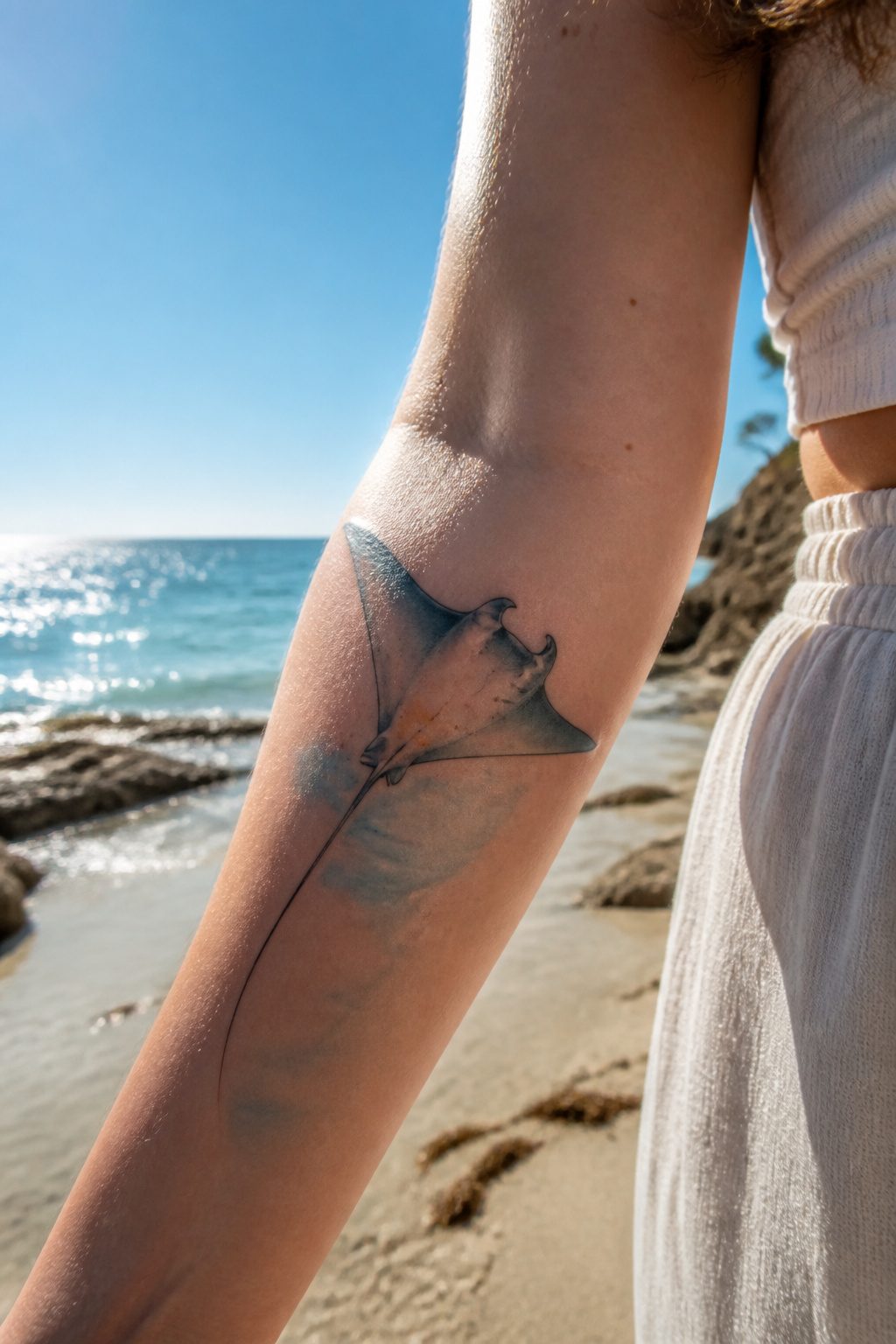
A manta ray’s wingspan traces the same arc as an arm in motion, which is why this design settles so naturally along the forearm or outer bicep. The creature glides rather than swims; its movement is a slow ripple rather than a thrust, and that quality of unhurried grace transfers directly to the body. Watercolor washes behind the ray can suggest depth without hard borders, though a clean black outline keeps the silhouette readable as the arm ages and skin changes.
The negative space between the wing tips matters as much as the figure itself. Too narrow, and the ray looks pinched; too spread, and the wings wrap awkwardly at the wrist or shoulder. A skilled artist maps this to your specific reach and rotation. Single-needle line work suits smaller placements, while a larger piece can carry stippled shading across the back to suggest the ocean’s particulate light.
Meaning sits lightly here. The manta carries associations of intuition and flow without the heaviness of more loaded symbols, so it works for someone drawn to the water rather than someone claiming a spiritual system. That openness is either its strength or its limitation, depending on what you want the piece to hold.
34. Self-Love Tattoo
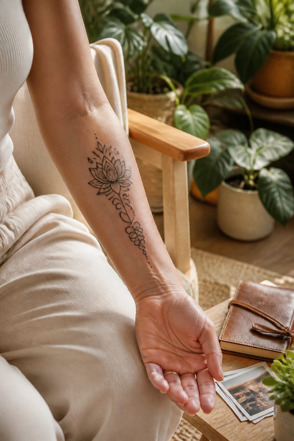
A self-love tattoo on the arm works because you see it while brushing teeth, typing, reaching for coffee. The placement turns the reminder into habit rather than ceremony.
Script phrases land best when they stay short. "Enough," "grow through," "my own" — words that read fast and wear well. A friend of mine went with "still here" in her own handwriting after a year of weekly therapy, and the slight wobble in the lettering matters more than any font would. The arm gives you space for that personal scale.
Symbols of personal journey follow the same logic as the butterfly’s metamorphosis or the vine’s creeping growth. A seedling, an unfolding fern, a moon phase sequence — these carry the same weight without spelling it out. The green leaves of a vine design represent life, while a single red budding flower can mark beauty and frailty together.
The inner forearm softens the message for yourself. The outer arm puts it on display. Either way, the arm placement means the tattoo ages with your movement, the ink settling into skin that bends and works. That visible wear becomes part of the point.
35. Minimalist Tattoo
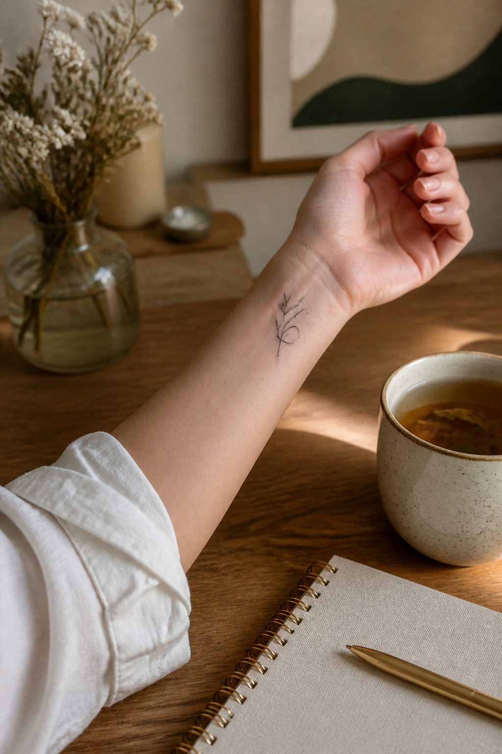
Fine line work sits close to the skin, almost like a pencil sketch that stayed put. The appeal is restraint: a single sprig of lavender running along the inner wrist, a constellation of seven dots trailing the forearm, a word in hair-thin script above the elbow crease. These pieces read as personal shorthand rather than broadcast statements, which matters for women who move between professional settings and want control over when the work shows. A cotton blouse sleeve hides the upper arm; a watch band covers the wrist.
The aging question comes up in every consultation, and the answer is not gentle. Thin lines spread, and ink that looked crisp at twenty-five can soften to a gray haze by forty. Placement below the elbow, where sun exposure is constant, accelerates this. The trade is conscious: you accept the fade for the lightness of the original piece, or you plan for a touch-up schedule from the start. Artists who specialize in this style often build the line weight slightly heavier than the final look requires, knowing the blur is coming.
Concealment favors the inner bicep and the rib-facing side of the upper arm, spots that see less light and less friction. The back of the arm, by contrast, takes impact from desk edges and bag straps; a minimal design there wears faster than the same work tucked against the body.
What Arm Placement Changes
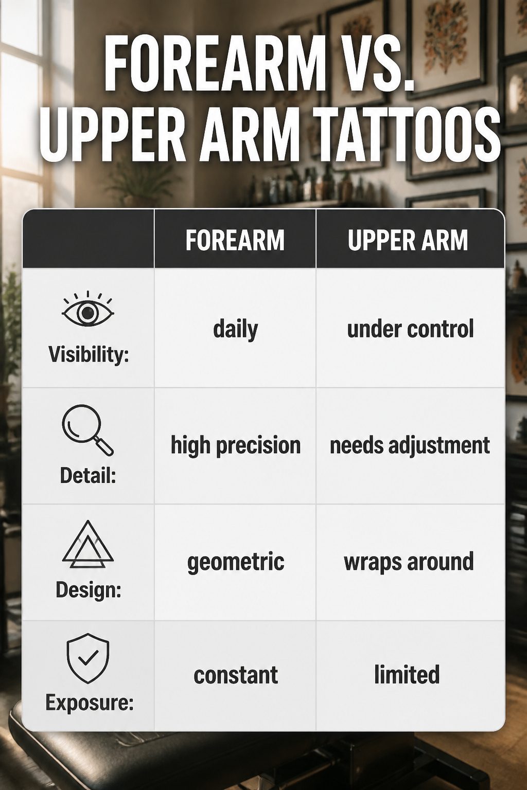
The flat plane of the forearm behaves almost like paper, which is why fine linework and dense detail settle there so naturally. An artist can lay down a small geometric piece or a script tattoo and trust that the skin stays still enough for precision. The upper arm is a different surface entirely: the curve softens straight edges and can swallow thin lines that looked crisp on the stencil. What reads as a clean band around the bicep from the front turns elliptical from the side, and designs that wrap need extra planning so the image does not distort where the muscle rounds.
Visibility splits the choice in two directions. The forearm is present in almost every handshake, every reach for a coffee cup, every video call. That exposure works for artwork you want seen, but it also means the tattoo enters your professional life without your say on any given day. The upper arm hides under a short sleeve, so the reveal stays under your control. Full sleeves borrow from both territories: the forearm portion stays public, the upper arm private until you roll a cuff or wear a tank.
A forearm piece commits you to daily visibility; an upper arm piece keeps the option open. That difference matters more than most people weigh before they book. The arm is elongated enough for either, wide enough for creativity, but the same design does not translate across placements without adjustment.
Tattoo Care for Arm Healing
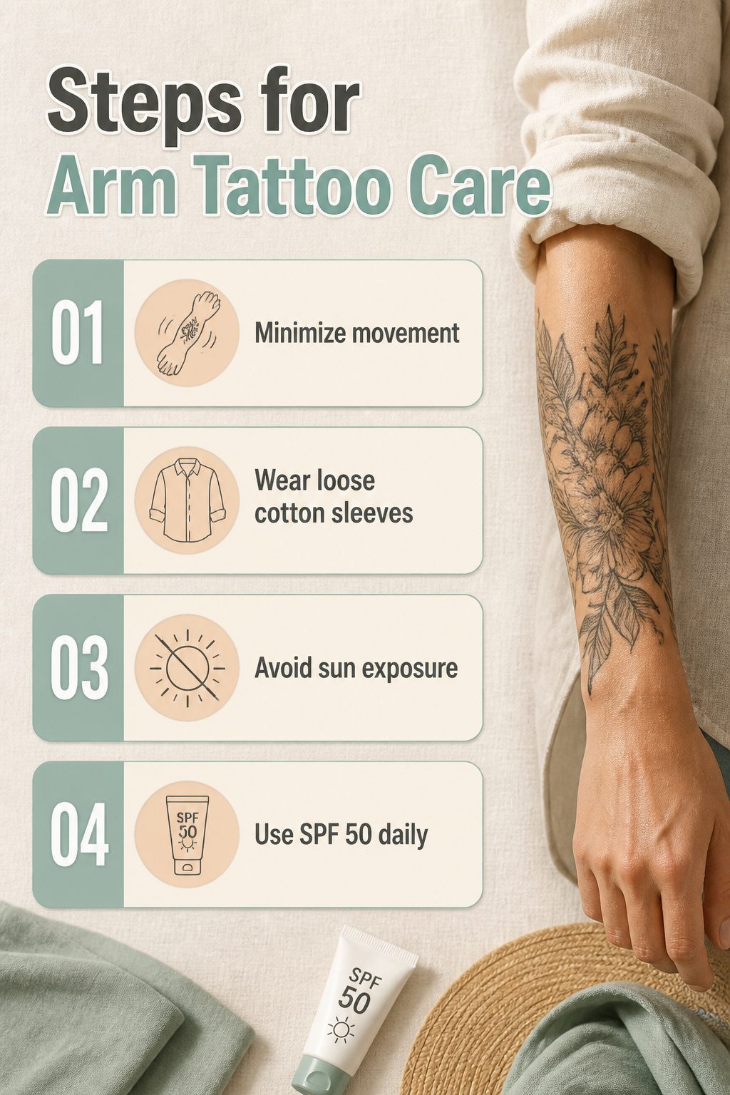
Arm movement during the first two weeks pulls at fresh scabbing in ways you do not notice until the lines blur. The skin on a forearm or bicep stretches every time you reach, lift, or turn your wrist, and that motion cracks healing tissue before it sets. I learned this the hard way on a piece that crossed my inner elbow, where the constant bend of daily life left the color patchy enough that my artist had to touch up three spots at the six-week mark.
Loose sleeves help, but the wrong fabric causes its own problems. Wool or stiff denim rubbing against a new tattoo lifts plasma and pulls scabs early, and tight long sleeves trap sweat against broken skin. Cotton layers you can roll up or down without pressure give the best buffer while letting air reach the work.
Sun exposure is the slow killer for visible arm pieces. A fresh tattoo burns in minutes, and even after healing, UV fades pigment faster on arms than on covered skin because they catch light at every angle. I keep a lightweight linen shirt in my car for unexpected outdoor plans, and on healed work, SPF 50 goes on like lotion every morning. The arm is the place everyone sees; it is also the place easiest to neglect once the itching stops.
Color and Line Work Choices
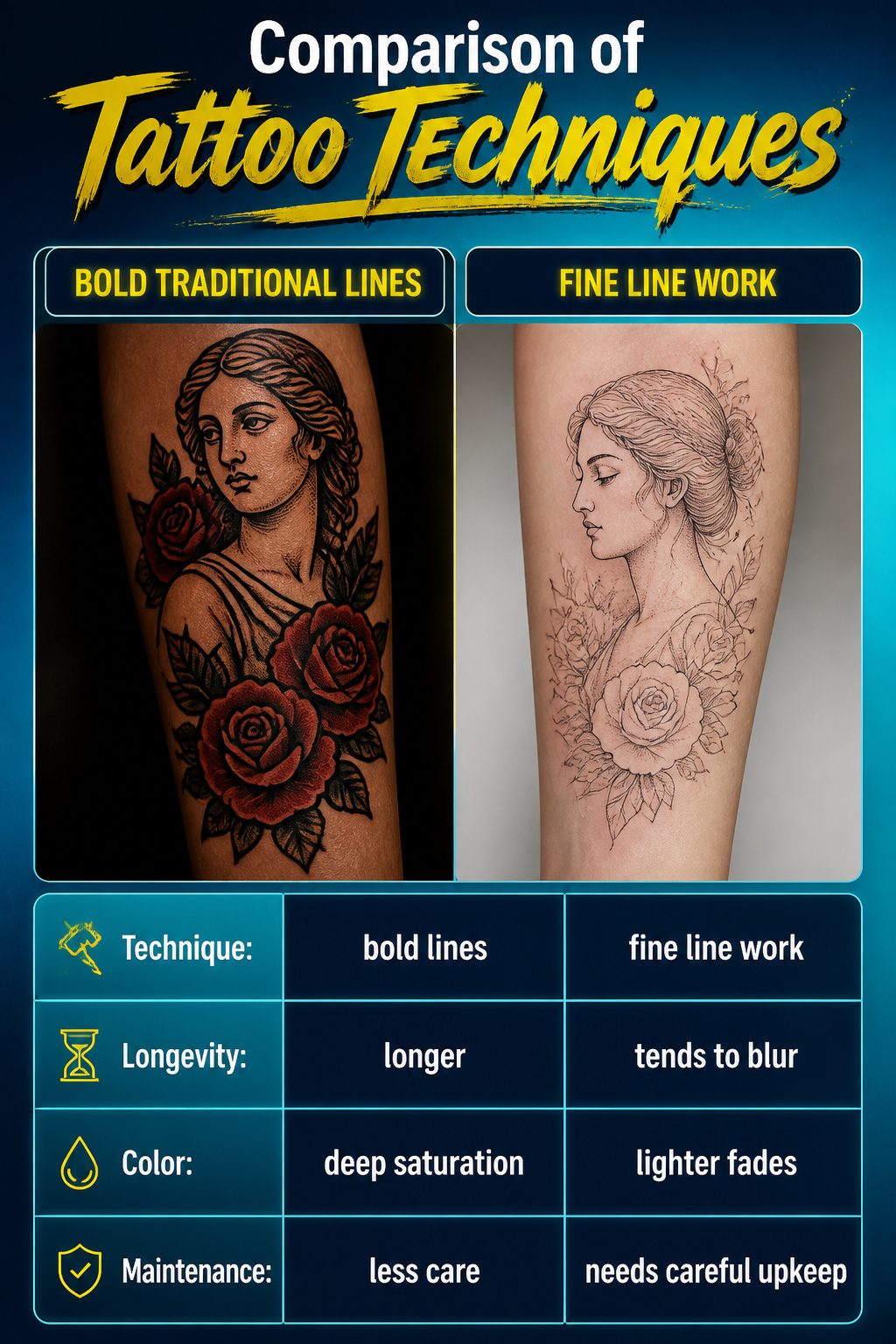
Bold traditional lines and heavy dotwork carry a tattoo across years of sun and skin movement on the arm. The Venus piece from the passages relies on exactly this: thick outlines keep the deity readable as the ink settles and spreads. Fine single-needle work does the opposite trick, etching detail that looks delicate on day one but blurs faster on an area that bends and flexes constantly.
Color saturation faces its own test. The wine red and dark red roses show how deep pigment density beats light washes for longevity on forearm skin that sees daily light exposure. Black and grey heals more predictably, yet a saturated color piece, done with those velvet-dark reds, holds its identity longer than pastels or watercolors that fade to a hazy suggestion.
What convinced me, reading through how these pieces age, is that the technical choice is the real symbolism. A bold-lined Venus declares permanence in the very way she is built; a fine-line single needle whispers something intended to evolve. Neither is wrong, but they are different promises to your future self.
Cultural Symbols and Respect
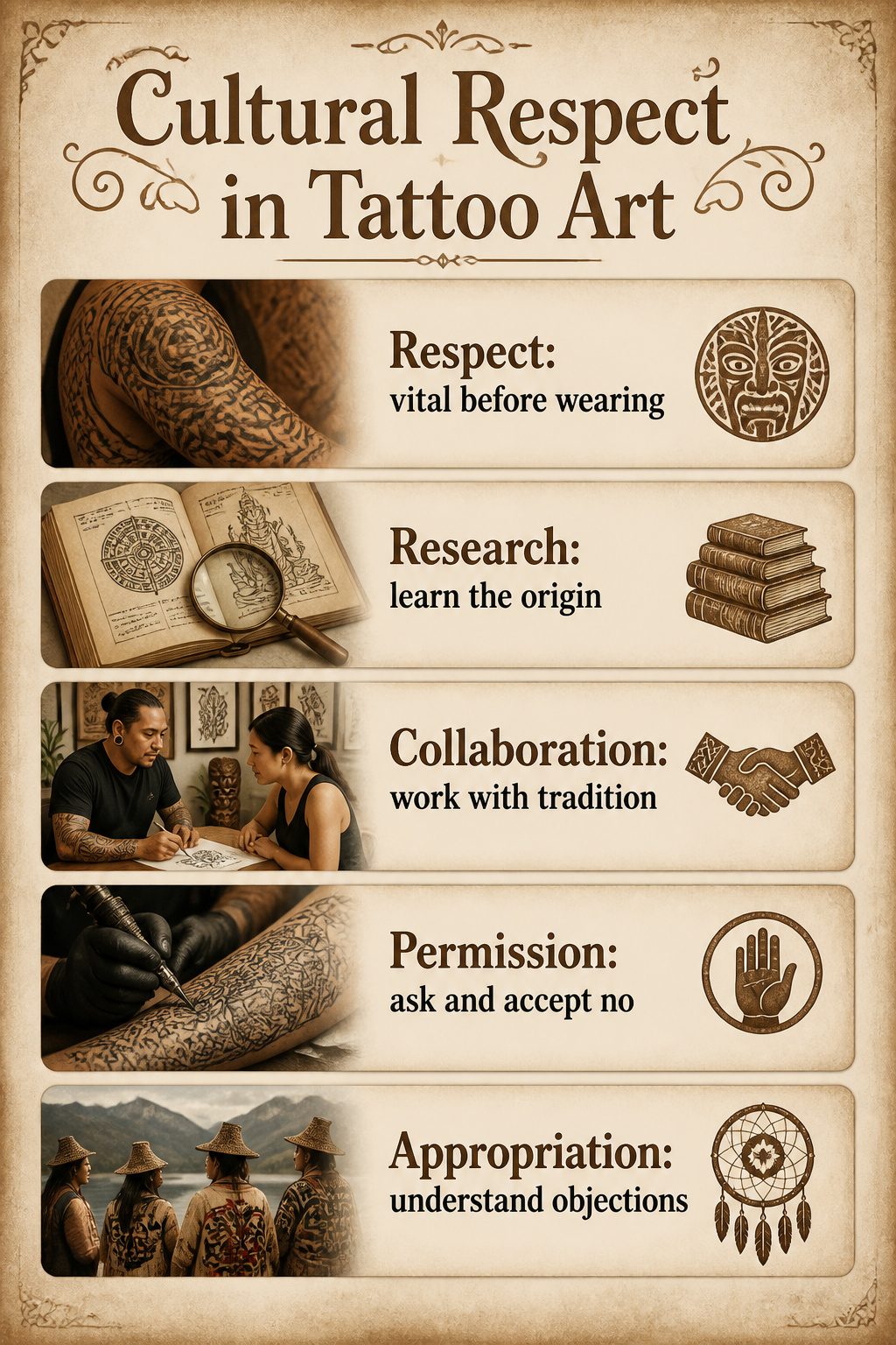
Tribal patterns, religious imagery, and designs drawn from specific cultures carry weight that goes far past how they look on skin. A Polynesian sleeve or a Hindu deity on a forearm connects to living traditions with rules, histories, and communities still practicing them today. The question of who can wear what, and under what circumstances, matters enough that skipping it risks reducing someone’s sacred symbol to mere decoration.
Research before booking matters more here than with any other style. Reading the origin story of a pattern, learning which motifs belong to specific families or ranks, and understanding whether a design is even intended for outside use takes time, but it is the minimum. Working with an artist who belongs to the tradition you are drawing from changes the exchange entirely; they can grant permission through their own knowledge and sometimes decline a request that would misrepresent or cheapen the work. I have seen portfolios where a non-Native artist offered "tribal" wolves and dreamcatchers without attribution, and the difference in care between those shops and ones run by Indigenous tattooers is visible in the linework and in the consultation.
Appropriation in tattooing is not a settled debate, but the practical standard is straightforward: if the community of origin objects to commercial use of their imagery, that objection counts. Some designs have been reclaimed and are offered openly; others remain restricted. The respectful path is asking, not assuming, and accepting no when it comes.
Building a Sleeve Over Time
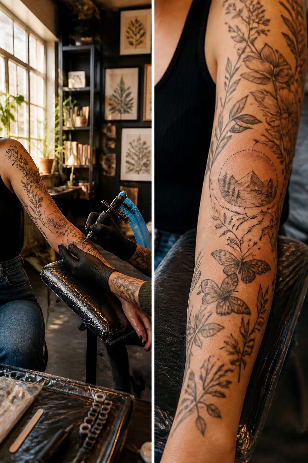
A sleeve built in stages asks more patience than a single marathon session, but the payoff is control over how each piece talks to the next. Leave breathing room between early tattoos and you keep options open for connections later; dense packing from the start locks you into whatever style fit your mood at twenty-two.
The real decision is artist loyalty versus variety. One hand guiding every needle gives you a voice that stays consistent, same line weight, same approach to shading, same logic for where skin shows through. Multiple artists can work if you hand them the map, a folder of healed photos, the stipulation that nobody overrides the negative space already agreed upon. What breaks a sleeve is the piece that ignores the architecture around it.
Connecting disparate work means bridges, filigree, smoke, geometry, whatever fills the gap without shouting louder than the tattoos it joins. Some women prefer the patchwork look, deliberate mismatched pieces with skin between, and that reads as intention too. The mistake is assuming a sleeve has to mean full coverage. Half the women I see at shops now are planning for skin as carefully as for ink, letting the arm’s natural shape stay visible.
Frequently Asked Questions
What are the most popular arm tattoo ideas for women?
Butterfly, snake, floral sleeve, and crucifix tattoos lead request lists. Butterflies work for transformation already completed, snakes fit the arm’s long canvas with continuous motion, floral sleeves turn the limb into a living garden, and crucifix designs carry unmistakable weight on the forearm. Each of these adapts well to the arm’s shape and visibility.
What do different tattoo designs symbolize?
Butterflies mark transformation that happened, not hoped for. Snakes carry rebirth, healing, fertility, or temptation depending on what the wearer wants carried. Roses hold love and passion; lotus flowers lean toward spiritual awakening. Tigers run toward strength and protection. Lightning signals sudden change or the ability to absorb shock and keep going. The meaning sharpens when you match it to placement and personal history rather than choosing generic flash.
How should I care for my tattoo?
Proper care before and after getting inked ensures healing and prevents infections. Dense blackwork needs roughly two to three weeks longer healing than lighter pieces, with the arm swelling and weeping plasma for days. Multiple sessions and patience matter more than pain tolerance during the session itself. Follow your artist’s aftercare instructions exactly; the arm sees sun and friction daily, so protection during healing pays off in how the piece ages.