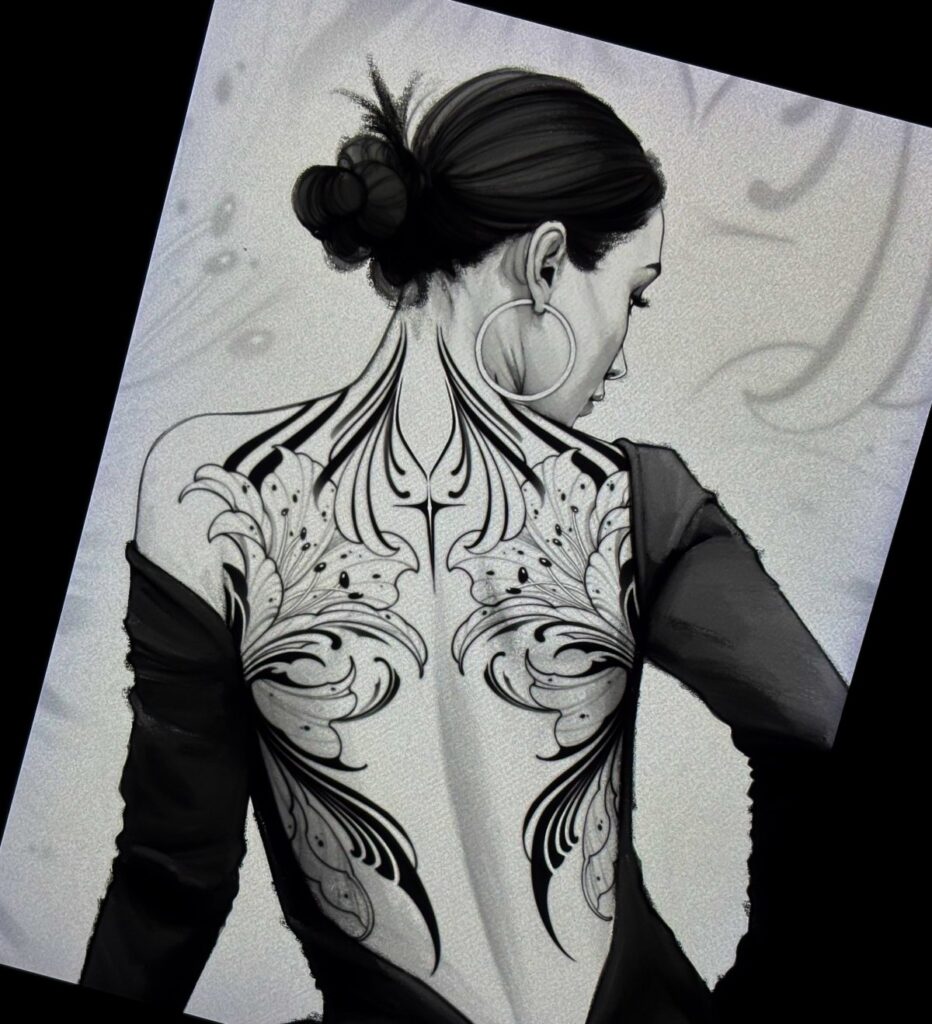
The list runs from a small constellation of dots to a full portrait that eats multiple long sessions, and the deciding factor is how much time you have already spent in the chair.
A first timer might start with a small butterfly or a single fern tracing the spine; someone whose skin has already proven it holds ink well can handle the heavy fill of ornamental blackwork or a phoenix that stretches from shoulder to shoulder.
The single flowing stroke of abstract line art, built from continuous paths rather than closed shapes, rewards an artist with a light hand and a client willing to let the design stay open to interpretation.
1. Butterfly Tattoos
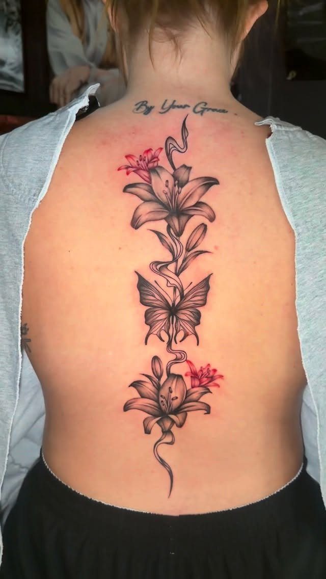
A butterfly on the back reads as transformation you can wear. Lilies running the spine with a single butterfly and script at the neck let you layer meanings without crowding the space.
Color holds up here if you want the piece to read from a distance; black and grey stays subtle under open backs or thin straps. Placement matters more than size.
Upper back draws the eye upward, lower back sits private until you choose to show it. I would pick this for a first large piece, the symbolism is clear and the shape adapts to whatever space you have.
2. Floral Tattoos
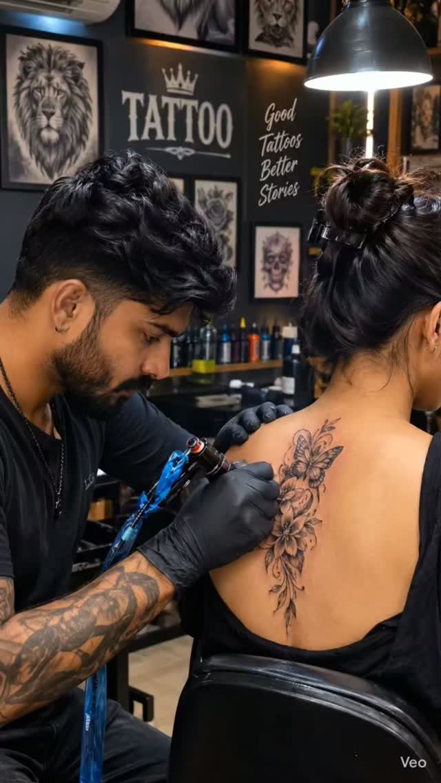
Flowers drape over bone the way fabric does, which is why florals own the shoulder blade territory.
Symmetrical botanicals spreading to each side of the spine are harder than they look; both blades need to match from angles you cannot see yourself. Scale decides everything.
One peony centered between the blades reads intentional, the same flower shrunk to hand-size disappears on a back that wide. Vines down the spine give you delicacy without the weight of a full bouquet.
Roses carry the most cultural baggage, peonies read softer, wildflowers suit someone who wants the arrangement to feel picked rather than arranged.
3. Dragon Tattoos
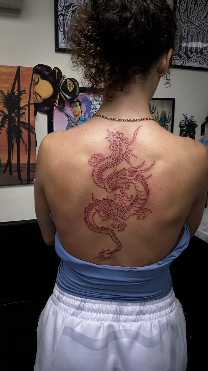
A dragon uses the full vertical of a back the way few subjects can. Red ink pushes a dragon toward fire and visibility; black and grey would sink into shadow and read more menacing than you might want.
Scales eat time in the chair and money in the budget, so know whether you want the whole serpent or just the head and neck emerging from fabric or waves.
Eastern dragons carry luck and water associations, Western versions lean guardian or destructive depending on the source material. I would not mix the two vocabularies in one piece; pick a tradition and let the artist commit to it.
4. Koi Fish Tattoos
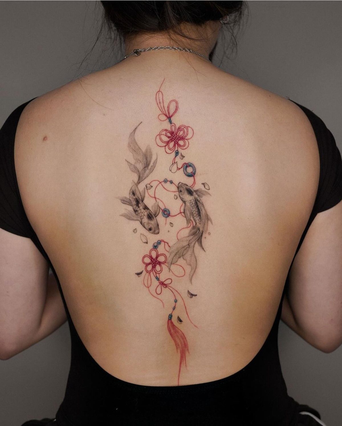
Two koi swimming upward turn the spine into a current. The photo works in black, grey, and red with knots and tassels woven through, a Japanese-influenced composition that keeps the fish from looking isolated.
Color matters less than direction here; koi swim upstream or downstream, and the meaning changes with the angle. Upstream means perseverance against the current, downstream can mean you have already arrived.
Knots add textile detail that breaks up the biology and gives the eye somewhere to rest. This wants space, a single koi on a shoulder blade loses the narrative.
Budget for multiple sessions if you want the scales and fin rays done with any patience.
5. Angel Wings Tattoos
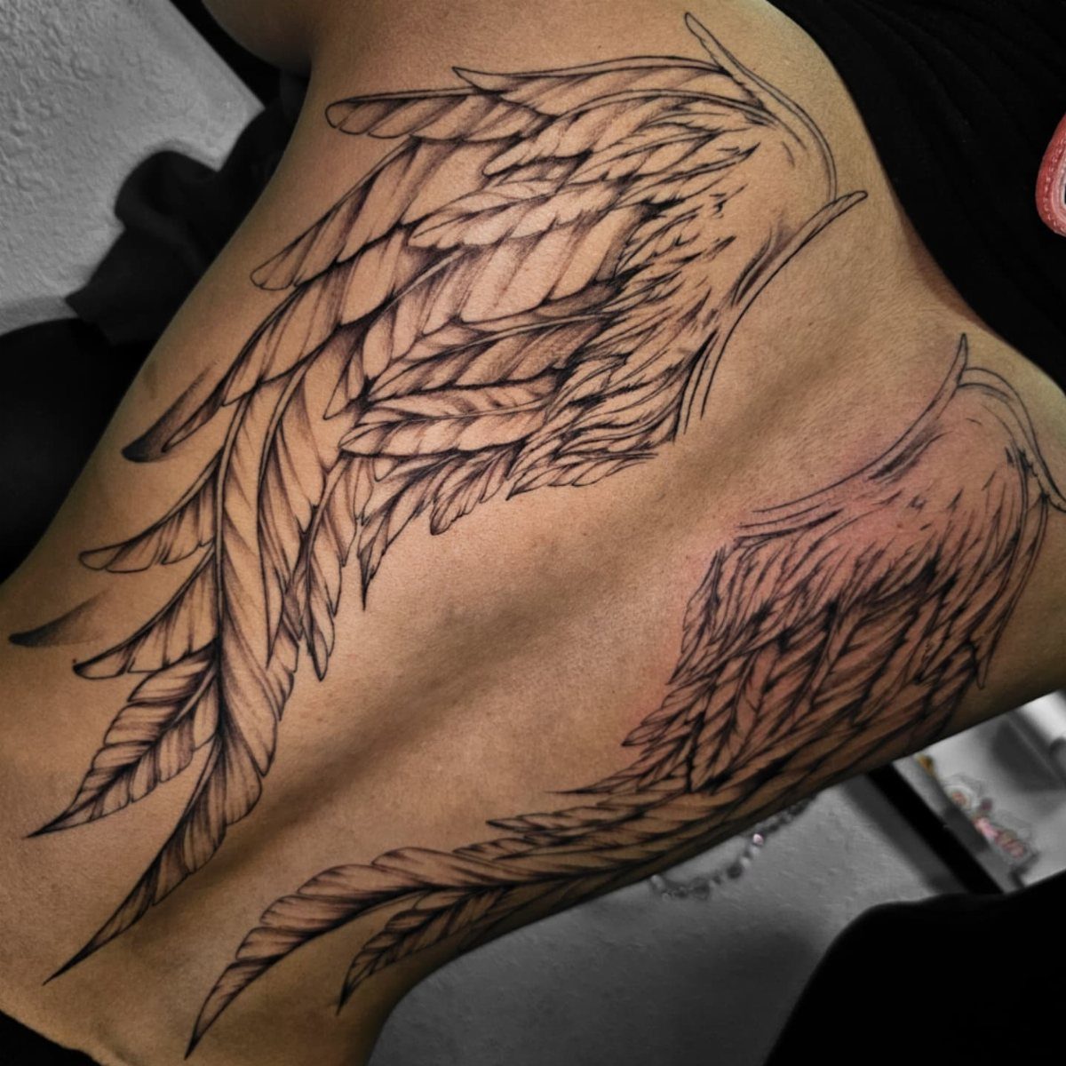
Wings turn your own shoulder blades into the structure holding feathers. A full spread in black and grey, detailed enough that each barb reads individually, carries its own weight without color.
That density of feather work sits heavy and takes hours; a lighter version with fewer primary feathers and more suggestion of wind reads faster and ages softer.
The classic formula is symmetrical wings, but I have seen single wings with birds trailing off the opposite shoulder, and that asymmetry suits someone who wants movement over monument.
Angel wings carry protection and ascent meanings, plain bird wings lean freedom. Pick based on whether you want the spiritual weight or not.
6. Tribal Tattoos
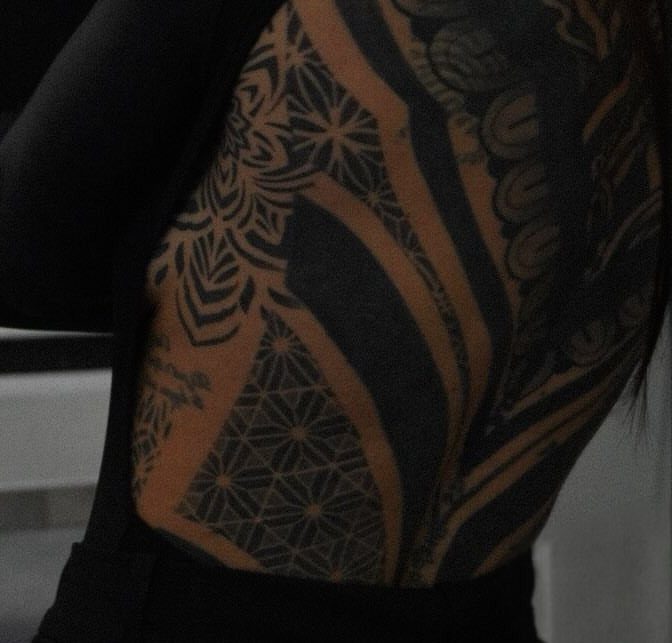
Tribal work lives or dies on the precision of its black. Dense geometric patterning with star shapes and thick bands needs an artist with steady saturation; greying out in the heal turns the geometry muddy and the whole piece collapses.
Full back coverage in this vocabulary reads as commitment to the form itself, not to a single symbol.
If you carry Polynesian or Maori heritage, the patterns can speak that directly; without that connection, you are borrowing a visual language that carries specific genealogy.
Some artists will refuse the work on those grounds, and that refusal is worth respecting.
Lower back placement in tribal reads as 90s revival in a way upper back or full coverage does not; the shape of the canvas changes the cultural timestamp.
7. Watercolor Tattoos
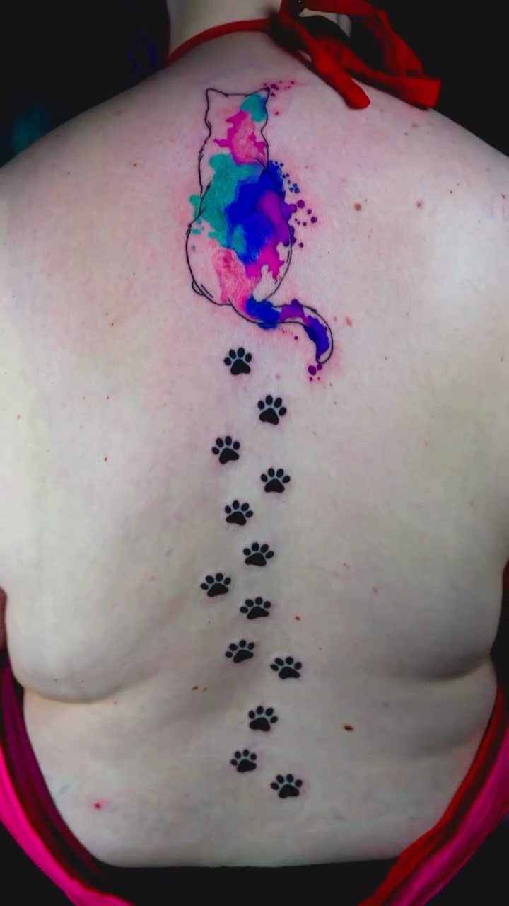
A watercolor tattoo on the back reads like a painting that happened to stay.
Pigment pools and fades the way it would on cold-press paper, which is the point: the cat carries pink, blue, and violet splatters inside its silhouette, with paw prints trailing down the spine in solid black so the color has something to push against.
This style suits floral or abstract subjects best, since both forgive a bleed. The color needs space, so a small watercolor piece tends to look like a bruise; plan for at least a hand’s width.
Fine linework underneath anchors the wash and keeps it from turning to soup over time. I’d put this on someone who already wears bright clothes without thinking twice.
8. Spine Tattoos
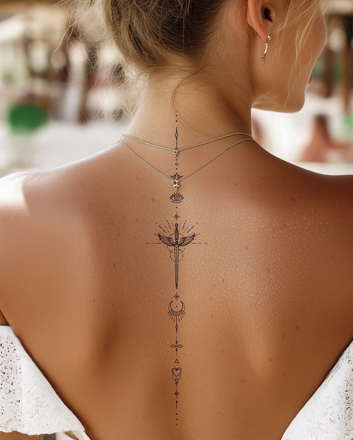
The spine draws the eye without trying, which makes it natural territory for a single vertical line. What you put there should stay narrow: a sword, a fern stem, a string of moons and dots, all in fine line black.
Heavy shading along the vertebrae risks blurring as the skin flexes with every bend and stretch.
Pain sits higher here than on most of the back, since bone lies close to surface. Sessions run shorter than you might want because of it.
A geometric or celestial motif works well; the spine’s length gives a natural frame for progression, from crescent to full or root to tip. Keep the design narrow so it does not wrap and distort when you turn.
9. Mandalas
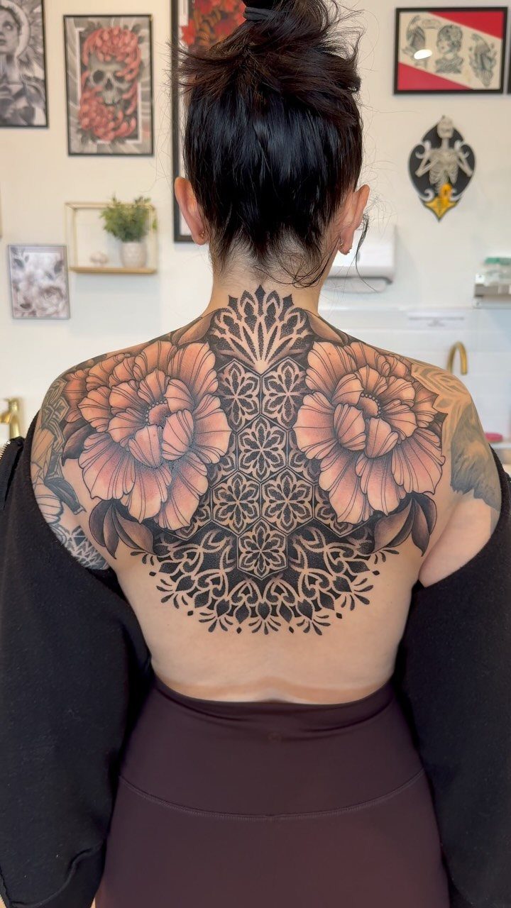
Symmetry flatters the back’s broad planes, and a mandala uses every inch between the shoulder blades or across the lower back.
A mandala even two hands across will look wrong by half an inch, so the artist needs a steady eye and time to measure.
Intricate linework holds for years on the upper back, where sun hits less and skin shifts less than lower down. For someone who wants meaning without narrative, the form itself stands in: balance, repetition, a center to return to.
10. Quote Tattoos
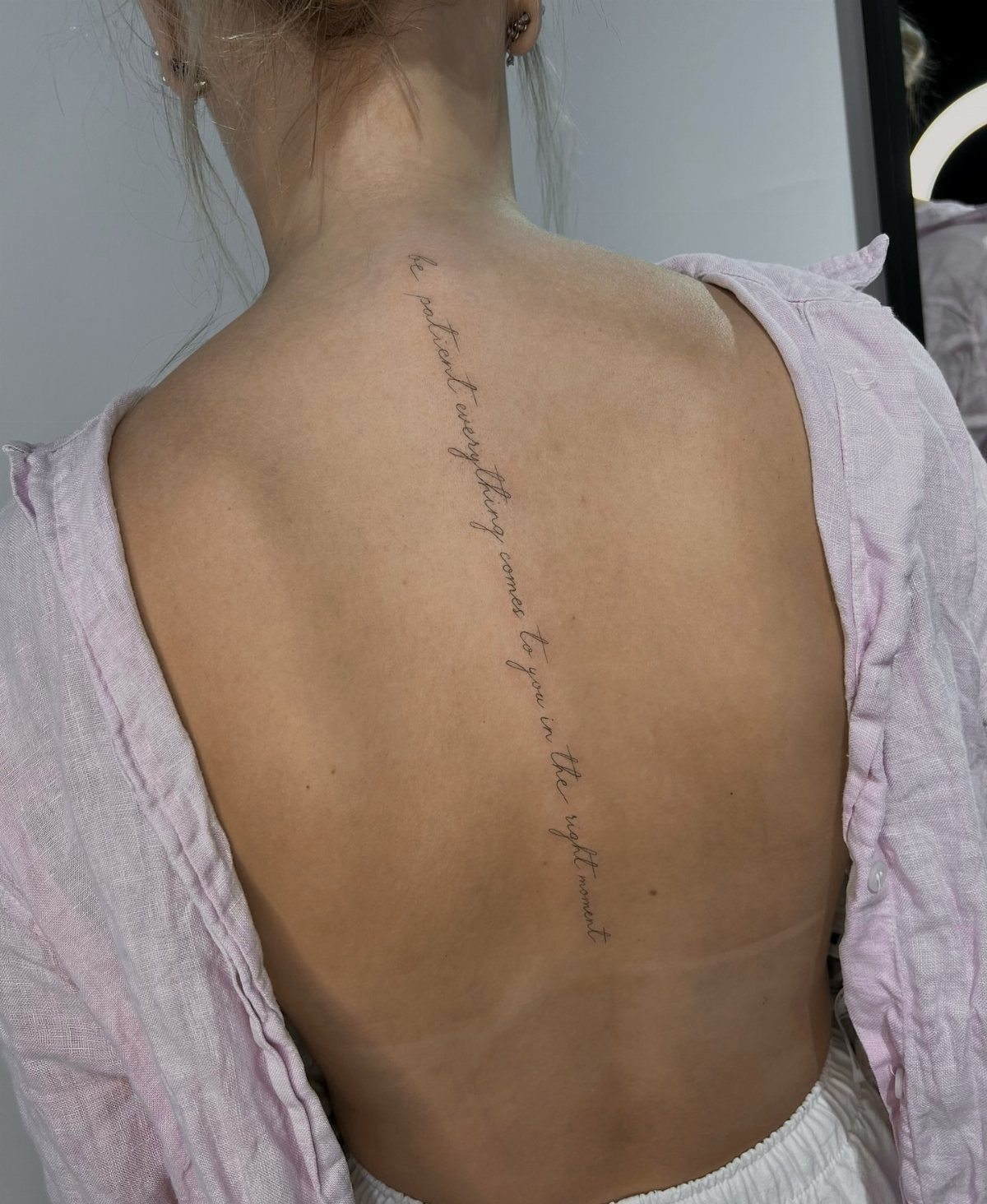
Words on the back do their work in private; you choose who reads them. Vertical script down the spine is the familiar choice, though a single line beneath the nape, seen only when hair lifts, runs a close second.
One language, one font, one or two lines. Artists prefer it, and healed skin agrees.
A short phrase plus a small mark, a flower or a star, gives the eye a rest from text. Cursive ages faster than block letters on the back, where moisturizer reaches less often than hands or arms.
Pick words you will not need to explain; the meaning should stay personal.
11. Phoenix Tattoos
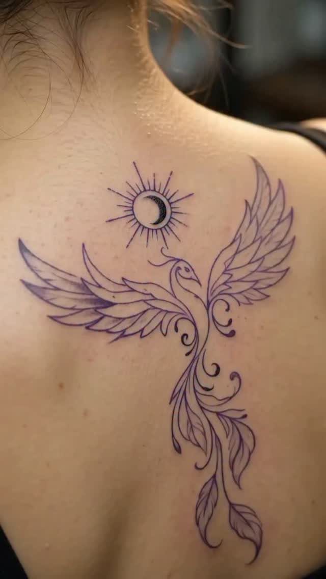
A phoenix carries more narrative than most back pieces, which is either exactly what you want or a reason to look elsewhere. The bird rises, burns, rises again: the symbolism is fixed, so the interest has to come from execution.
Purple linework against black sun and moon, as above, keeps the story from turning literal.
Size changes the reading. A small phoenix looks like a bird; a full-back piece, wings spread across shoulder blades, reads as event.
Color helps, though a single hue in careful line can carry the same weight. This one suits someone at a threshold, which is a cliché only if the timing is wrong.
The maker of the large piece noted sessions back to back; that is the commitment a full span asks.
12. Abstract Tattoos
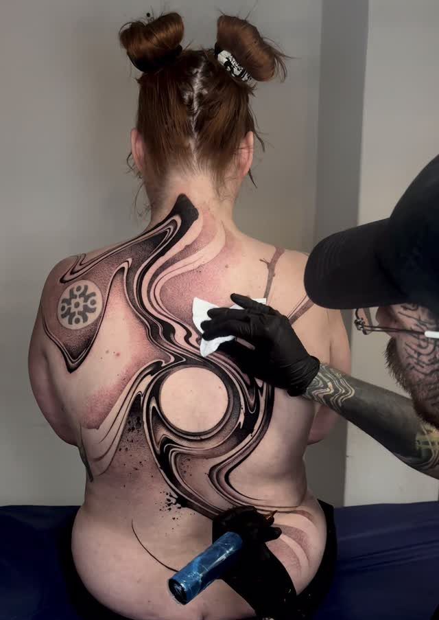
Abstract work on the back moves with the muscle underneath, which is its advantage over anything representational.
Swirls and circles in black and grey shift when you stretch and settle when you still; the tattoo becomes a record of your own motion rather than a picture of something else.
Bold color works here too, though the example stays monochrome. Freeform patterns need an artist who builds the design directly on skin, since paper sketches transfer badly to the back’s curves.
I’d steer someone toward abstract if they want a tattoo that ages as their body changes, since distortion matters less when there is no fixed image to distort.
13. Ornamental Tattoos
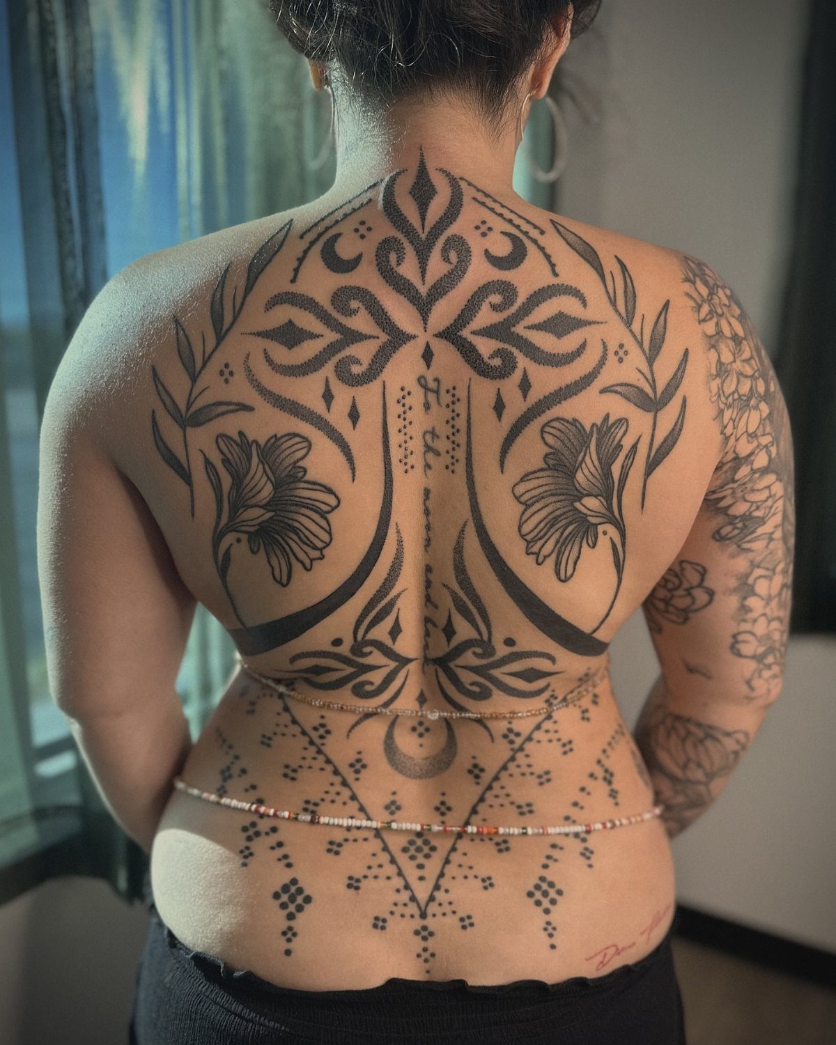
Ornamental tattoos treat the back like a surface for permanent jewelry. The style borrows from geometric patterns and dotwork, though some artists push it toward bold, thick outlines instead of the usual fine-line approach.
A full-back piece needs a specialist in symmetry; the spine acts as a center line, with mirrored panels spreading to the shoulder blades.
The lotus placement at the top, common in this style, gives the eye somewhere to land before the pattern continues downward.
Ask to see healed photos of any artist’s ornamental work. The density of black ink shifts as it ages, and crisp lines can blur faster than you expect.
Someone already collecting tattoos and comfortable with long sessions will get the most from this; a first piece might start at the upper back only.
14. Geometric Tattoos
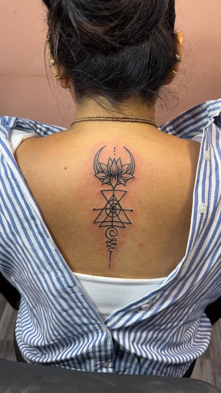
Geometric tattoos suit the spine because the body already supplies the straight line. Triangles, circles, and the unalome symbol stack vertically, each shape sized to the vertebrae beneath it.
The lotus at the top anchors the design; below it, the pattern can stay minimal or build into something denser. Symmetry across the shoulder blades raises the difficulty significantly.
An artist who handles botanical geometry on one side needs the same steadiness for the other, or the back looks lopsided when the client walks away.
This style reads modern without trying for it. The clean edges appeal to someone who wants their tattoo noticed but not questioned.
For a softer entry point, keep the geometry to the spine alone and leave the blades blank.
15. Dreamcatcher Tattoos
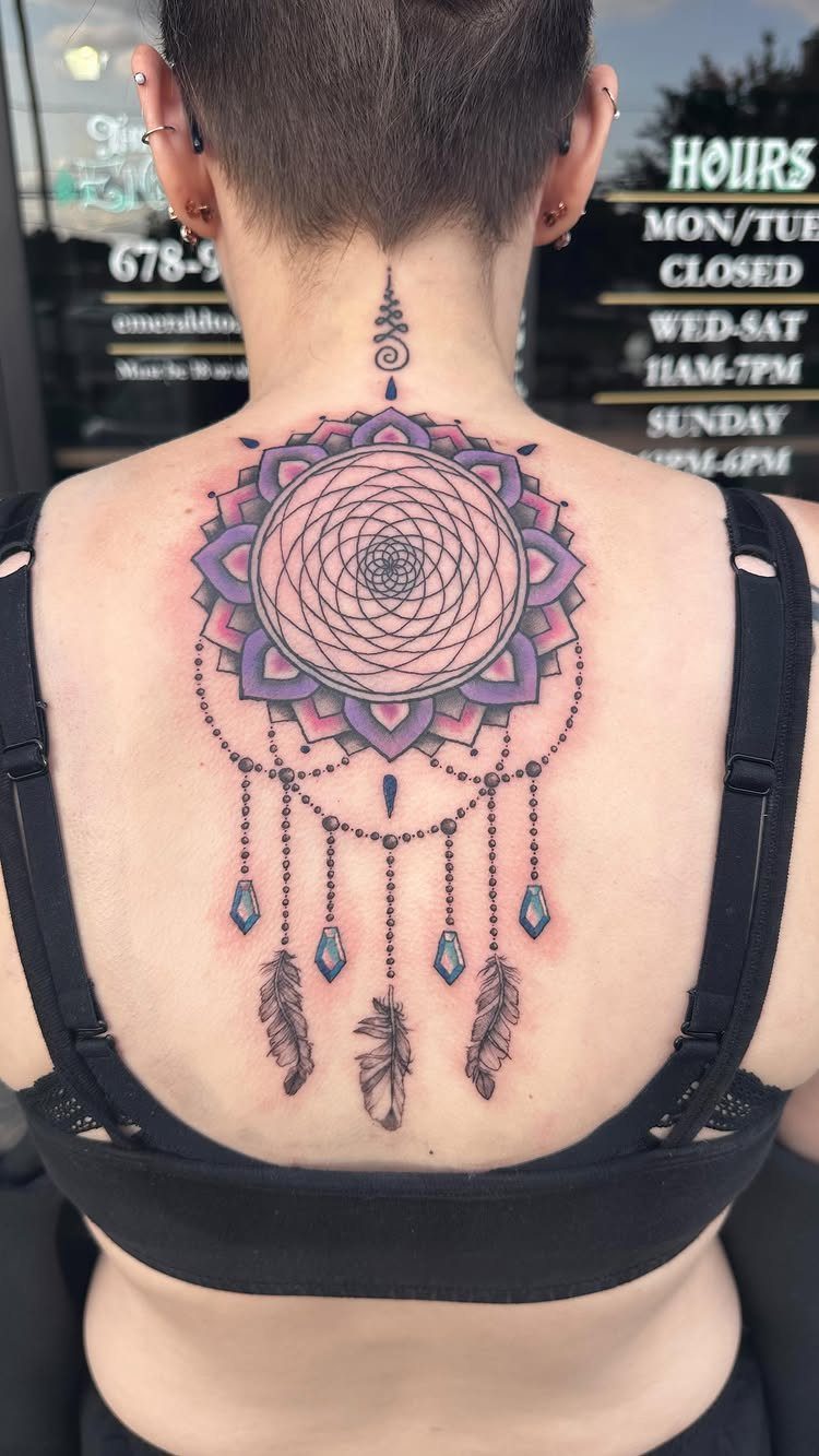
A dreamcatcher on the upper back carries the weight of a necklace you never remove. The webbed center, hanging beads, and trailing feathers fill the space between the neck and the shoulder blades naturally.
Color shifts the tone: the purple-to-pink mandala center in one version reads more decorative than traditional, while a single butterfly dropped into the web adds femininity without softening the piece too far.
Gemstone highlights catch light the way real stones would.
Too small and the web tangles into a dark spot; too large and the lower feathers wrap awkwardly around the bra line.
Someone who wears her hair up regularly gets the benefit, since the full design shows only when the neck is bare.
16. Tree of Life Tattoos
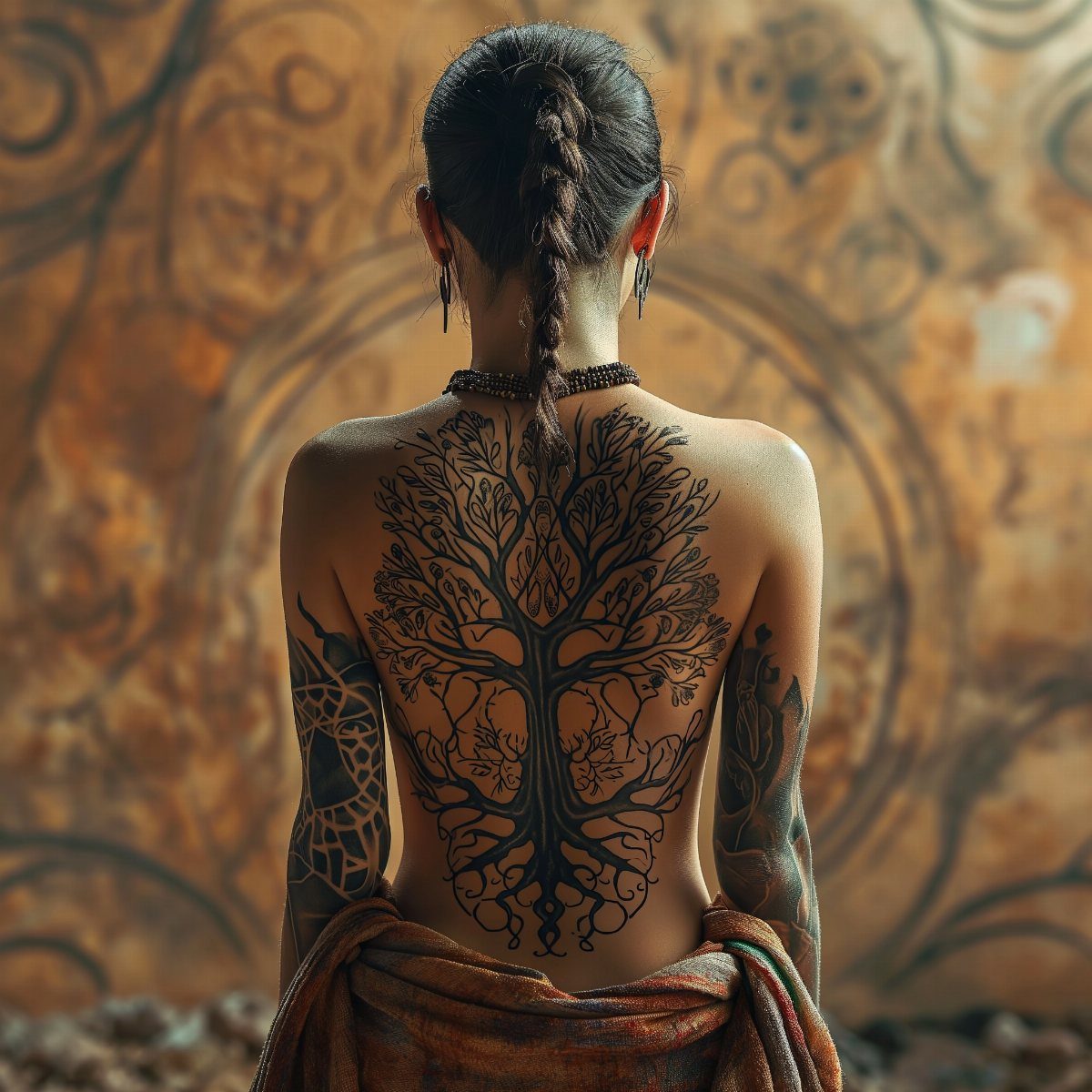
A full-back Tree of Life needs center placement to keep the roots and branches in balance. The roots sit at the lower back, the trunk follows the spine, and the branches spread to the shoulders.
One version uses four trees to mark the seasons, turning the back into a timeline the wearer carries.
That level of detail needs a large canvas; a shorter back or a preference for high-waisted clothing will cut off the roots or the crown.
The style works in black ink alone, though the seasonal version gains meaning if each tree differs slightly in leaf density or bareness.
This is a tattoo for someone who wants to explain it, since the symbol is common enough that people will ask what hers means.
17. Constellation Tattoos
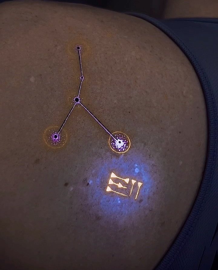
Constellation tattoos stay minimal by nature: dots for stars, thin lines for the connections. The upper back gives enough flat space for Orion or a personal pattern without wrapping around bone.
UV-reactive ink adds a second tattoo that shows only under blacklight, though that requires a separate session and a specialist; the glow fades faster than standard black, and touch-ups are harder to match.
A more practical personalization assigns one star per family member, turning the geometry into a private chart.
The risk is over-explaining. A constellation should look like itself from across the room, not resolve into a shape only when someone stands close.
Someone with a science background or an astronomy habit wears this most naturally.
The best part about the once-controversial tattoo is that there’s no limit as to where you can get inked.
18. Serpent Tattoos
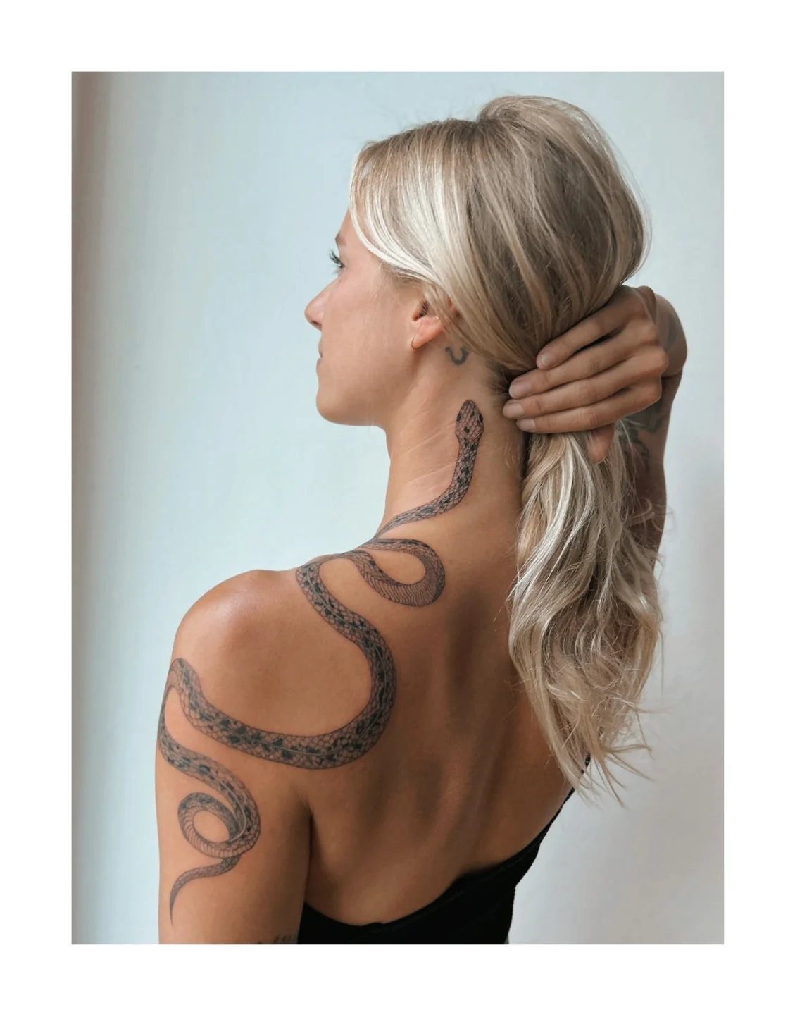
A serpent winding across the back uses the body’s curves as the snake’s path. The design starts at the neck or shoulder, follows the spine’s edge or crosses the blades, and lets the scales add texture without needing color.
Fine black lines keep the snake sleek; heavy shading turns it into a different creature entirely. The lower back placement, with the snake’s body accentuating the natural curve there, is the classic choice for this symbol.
A neck-to-shoulder serpent puts the design where anyone behind you can see it. Hair covers it partially, but the head and tail will show in most updos.
Someone mid-transformation, literal or otherwise, tends to choose this; the meaning is worn openly, and the snake’s movement across the skin makes it hard to forget.
19. Abstract Line Art Tattoos
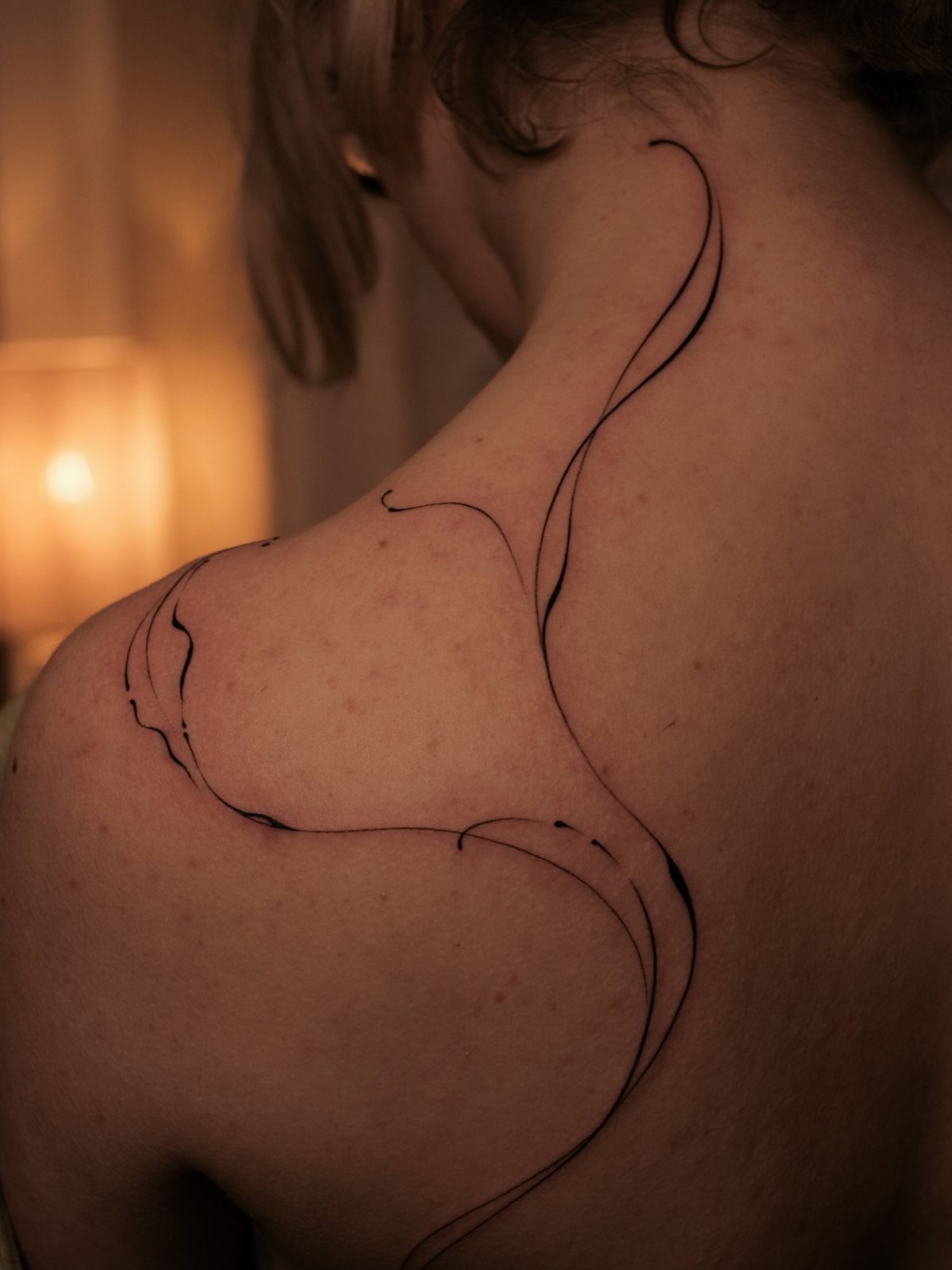
Abstract line art turns the back into a canvas for movement itself.
A single flowing stroke can follow the shoulder blade’s curve or trace the spine without ever becoming a recognizable object, which suits anyone who wants the tattoo to stay open to interpretation.
The artist builds these from continuous paths rather than closed shapes, so the skin between the lines matters as much as the ink.
Placement changes the effect sharply: across the upper back, the lines read as draped fabric; down the center, they elongate the torso.
This style rewards patience in the chair and a light hand from the artist. Heavy black will kill the delicacy.
For someone who wants color, a half-transparent moon or soft wash behind the lines adds depth without breaking the spareness.
20. Large Portrait Tattoos
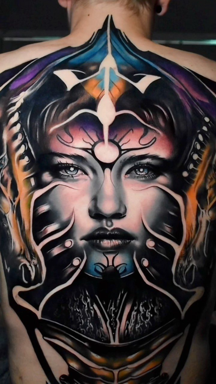
A portrait across the full back demands the most sitting time of anything on this list and the most careful choice of artist.
The scale lets the face carry real detail in the eyes and skin texture, but it also means every proportion error shows at distance.
Color work like the blue and purple tones visible here needs a specialist in saturated ink, not every shop that handles black and gray.
The ornamental framing around the portrait, geometric elements or florals, helps the composition hold together as a back piece rather than a flat poster.
Budget for multiple long sessions. This is not a first tattoo or a spontaneous choice; it suits someone who has already lived with large work and knows how their skin takes ink.
21. Inverted Tattoos
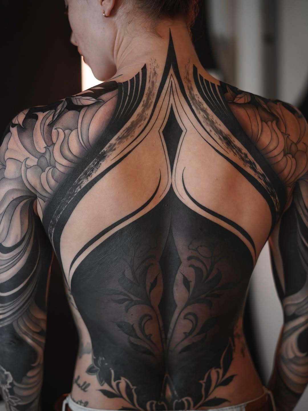
Inverted tattoos reverse the usual logic: the design lives in the un-inked skin, surrounded by heavy blackwork. The effect is closest to looking at a photographic negative, with the pattern emerging from darkness rather than sitting on top of it.
This technique needs an artist comfortable with both dense black saturation and precise line control, since the linework inside the black areas must stay clean without touch-up room.
The negative-space approach follows the body’s contours well, especially along the spine and shoulder framing visible here.
Healing is harder than with open designs; large blacked areas scab thick and risk patchiness. Someone drawn to this should check healed photos from the artist, not just fresh work, and plan for a touch-up session.
The final result reads as armor more than ornament, which suits a particular temperament more than a particular style preference.
22. Celestial Moon Tattoo
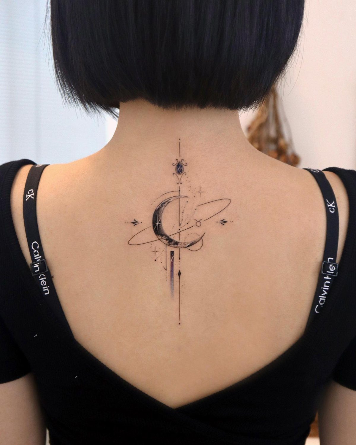
A crescent moon with planetary rings turns a common symbol into something that reads like a private astronomy reference.
Fine-line work keeps it light enough for a first back piece, and the vertical line element draws the eye down the spine without demanding the full length.
Color is where this idea splits. A black ink moon stays subtle under work clothes; a blue and purple moon, or a crescent cradling an orange sun, shifts the same shape toward something louder.
That second route needs a colorist comfortable with gradients, not every shop handles them equally.
Upper back placement means the rings sit where a tank top strap or necklace might fall; check your usual necklines before settling on size. This one suits someone who wants a night-sky reference without the full zodiac catalog.
23. Honeybee Tattoo
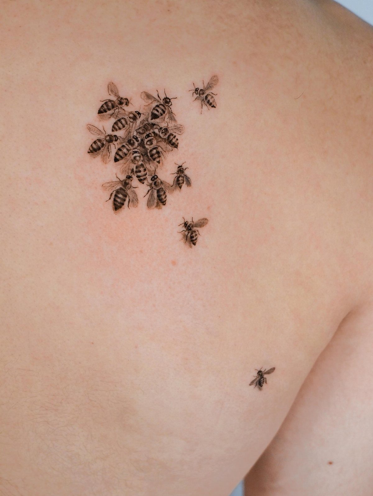
Clustered bees read as movement frozen mid-flight, which only works if the artist understands insect anatomy well enough to break it.
Scattered placement, some overlapping, some solitary, keeps the composition from feeling stamped-on; each bee needs its own angle and shadow direction.
Black and grey realism demands skin that holds fine detail. Older skin, or skin that sees heavy sun, will blur the wing veining sooner than you might expect.
A touch-up plan matters more here than with bolder designs.
Size is the tradeoff. Bees that span the upper back carry the scatter effect best; shrinking them for a shoulder blade or rib placement loses that quality.
Someone wanting a single bee as a personal emblem, a job transfer or a memorial, should place it larger and alone instead.
Choosing Tattoo Style
A tattoo style is its own language, and the back’s size lets you choose one that actually speaks.
Realism suits a portrait or a landscape you want someone to study up close; the detail holds because the canvas is flat and mostly sheltered from sun.
Watercolor reads lighter, almost accidental, which works if your clothes already run bright and you want the tattoo to match that energy.
Minimalism keeps the commitment low and the aging clean; a single unbroken line down the spine carries more weight than its size suggests.
Tribal or ethnic patterns need a heavier hand with black, and they carry cultural signatures you should mean, not just wear.
Black-and-grey classic stays the safest bet for a first large piece; the lines stay legible as color fades, and the style pairs with anything you might add later. Pick the mood first, then let the subject fit it.
Placement Considerations
The back is not one surface. Skin on the upper back carries more padding and fewer nerve endings; most people put the sensation at about a 4 or 5.
That tolerance makes it the usual starting point for a first large piece. The lower back and spine sit closer to bone with thinner coverage, and the needle’s vibration travels straight through; that same scale jumps to a 7 or 9.
A design that crosses all five zones will feel like several tattoos, not one.
How the piece reads changes with each zone too. Lower back stays private until you bend or lift, which changes who sees it and when.
Full coverage needs the artist to stencil while you stand; skin shifts between lying down and upright, and a design that looks centered on the table can drift once gravity takes hold.
Pain Levels
Pain on the back is placement-specific, not universal. Most people find the space between the shoulder blades easier to sit through than plenty of other placements.
Move toward the spine or the sacrum and the sensation changes; bone lies close to the surface there, so the needle’s vibration travels differently and the intensity climbs.
Eating a solid meal beforehand keeps blood sugar steady, which matters more than most first-timers expect.
Long designs should split across multiple sessions; the skin swells and the mind fatigues, and pushing through both at once rarely gives the best result.
The spine is not the most painful place on the body, but it is harder than the upper back and easier than the belly. Plan the session length to match the zone, not the design’s total complexity.
Aftercare Tips
Black-and-grey work tends to hold up better over the years on back skin than heavy color saturation; factor that in when you settle on a palette.
A full back takes 20 to 40 hours split across sessions, which means you are choosing a partner for a long project, not someone for one afternoon.
The back’s skin settles differently against the table, and a centered design can drift once you are upright.
The first 10 days, line up help with washing and lotion; your own arms do not reach every spot evenly, and skipped patches heal rough.
Know what infection looks like and call a doctor if you see it; this is about design, not treatment.
Frequently Asked Questions
What are the best back tattoos for women?
Floral, butterfly, dragon, and spine tattoos are the most popular choices. The back’s large canvas suits pieces that need vertical space, like a dragon using the full length or florals draping over the shoulder blades.
How painful is a back tattoo for a female?
Pain varies sharply by placement. Down the spine or across the lower back, the pain jumps to about a 7 or 9.
The needle sits close to bone with almost no padding in those spots, so you feel every vibration. A solid meal beforehand and breaking larger work into shorter appointments both help keep the session from overwhelming you.
What are the trendy tattoos for women in 2026?
Geometric, ornamental, botanical, and animal tattoos lead the current choices. Spinal tattoos stay popular because they read as subtle or bold depending on the size you pick.
What is the most feminine spot for a tattoo?
The back ranks high for feminine placement because it carries larger designs with elegance and hides or shows them at your choice.
Adding moon and flower elements to any back piece pushes the reading further toward feminine, though the back itself suits any style you prefer.