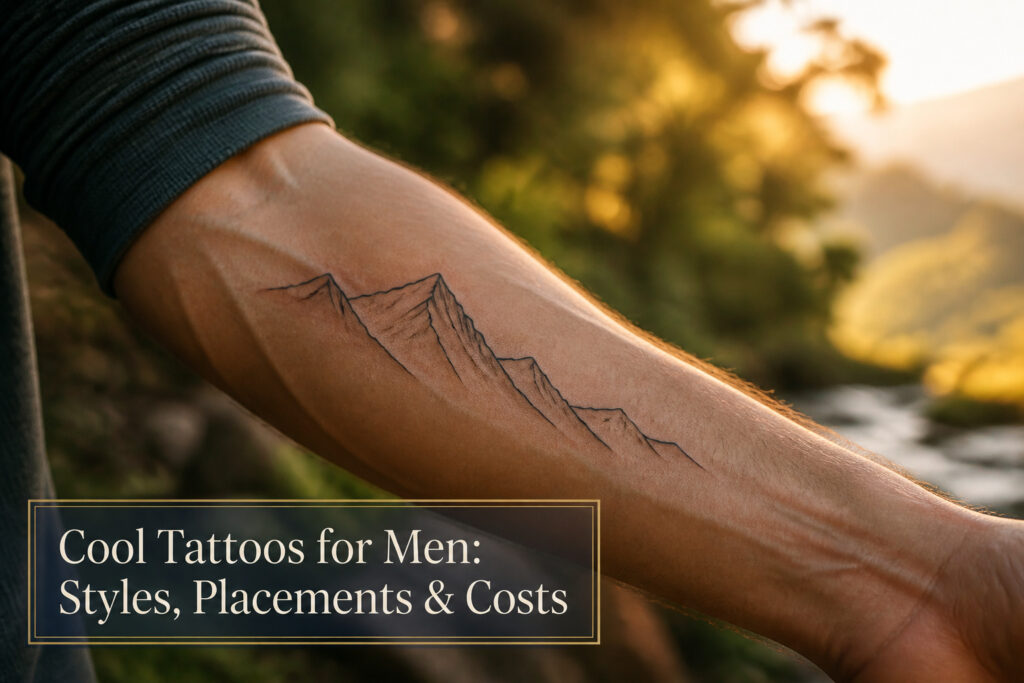
The right tattoo for a man in 2026 sits anywhere between a single-line wrist piece and a full narrative sleeve, and the deciding factor is how much skin he is willing to commit on the first appointment.
The catch is that detail does not shrink; a lion head forced onto a bicep will distort every time that muscle flexes, which is why first-timers dominate the minimalist rankings and veterans fill their chests and backs.
Five separate rankings place small linework at the top for men starting out, not because it is safer artistically, but because a coordinate or single animal silhouette ages cleanly when it never tried to do too much in the first place.
1. Minimalist Tattoos
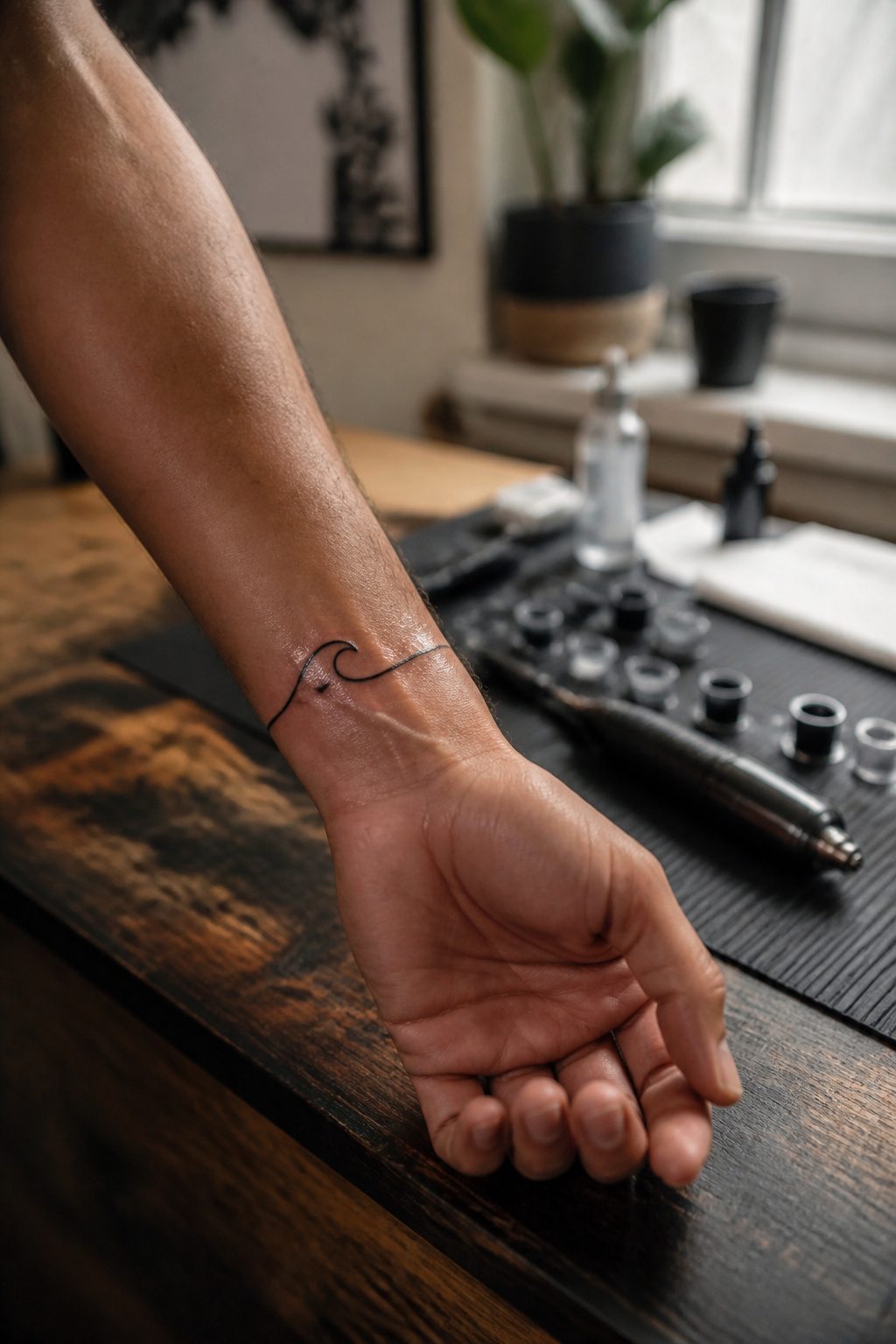
A single unbroken line can carry more weight than a sleeve ever could.
Small, clean designs built from line work and negative space sit quietly on the skin and still draw the eye, which is exactly why they dominate first-tattoo conversations.
The wrist, ankle, or behind the ear are the natural homes for these pieces, each placement controlling visibility in its own way. A wrist piece shows when you gesture and hides under a cuff when work demands it.
Behind the ear stays personal, visible only when hair is short or tied back. The ankle keeps the secret longest, revealed by shorts or socks rather than daily routine.
Five separate rankings place this category at the top for men starting out, and the logic is straightforward: less skin committed, less time in the chair, and a design language, coordinates or a single-line animal silhouette or abstract geometry, that ages cleanly because it never tried to do too much in the first place.
The risk is asking for detail that belongs at a larger scale. A Norse scene the size of a coin will blur; a single anchor or a rune will not.
2. Animal Tattoos
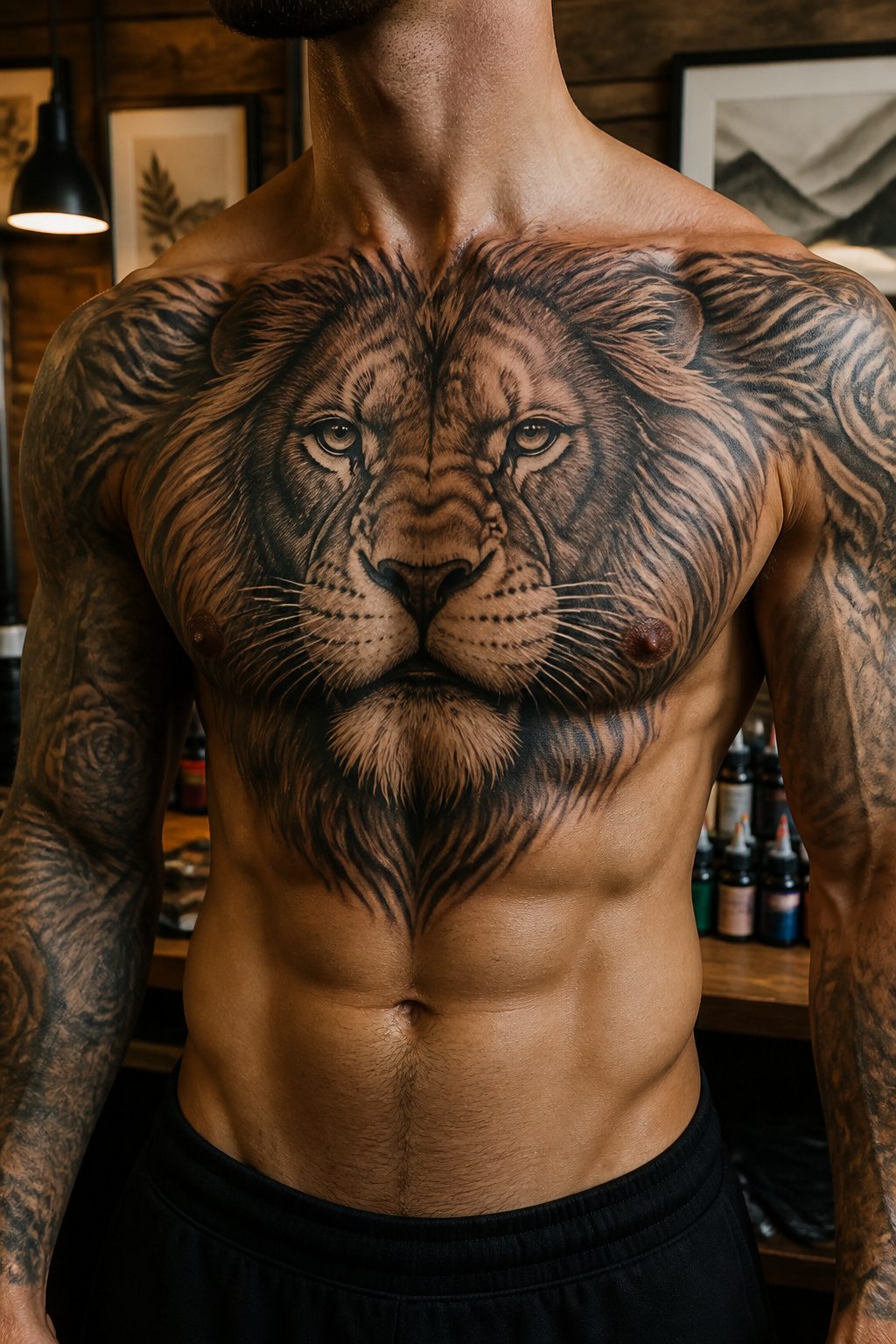
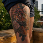
Lions, wolves, and owls dominate animal tattoo requests for good reason, each carrying weight that outlasts trend cycles. A lion signals leadership and raw nerve, the kind of image that reads clearly from across a room.
Wolves trade on pack loyalty and solitary grit in equal measure, while owls compress wisdom and nocturnal self-reliance into a single watchful shape.
Six separate roundups of 2025–2026 designs identify animal ink as the most consistently requested category, which surprised me until I noticed how many guys return for a second piece in the same family: lion chest, then wolf shoulder, building a loose narrative without ever needing a caption.
Size dictates where these live. A lion chest piece demands enough real estate for the mane to breathe; shrink it to a forearm and the detail turns muddy.
The upper back handles a wolf mid-stride or an owl at full wingspan with room for habitat elements that anchor the predator in something wild.
Forearms work for tighter compositions, a single owl eye or a wolf’s profile, visible without shouting.
What I would skip: squeezing a full lion head onto a bicep so the jaw distorts when the muscle flexes. Chest and back win for anything over six inches; forearms for compact, single-focus designs.
3. Geometric Tattoos
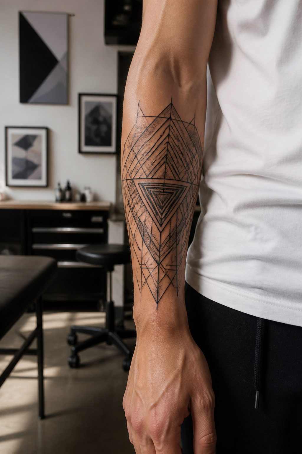
Geometric tattoos turn the body into a surface where symmetry and line do the talking. The patterns create optical effects that can make a flat design look folded, stretched, or floating, depending on how the shapes interlock.
Some men wear these as standalone pieces, a single mandala or a broken-planes design that holds its own without extra imagery.
Others use geometric work as a background, letting the clean lines frame a central figure or run beneath it like architecture under a statue.
The catch is that this style lives or dies by precision. A line that wavers by even a few millimeters throws off the whole balance, and the eye catches the flaw instantly.
That means finding an artist who specializes in geometric work, not someone who dabbles. The sources make this point directly: the risk of botched ink drops sharply when the person holding the machine does these patterns daily.
Symmetrical shapes hold best on flat, stable areas like the forearm, chest, or back, where the skin moves less and the geometry stays true.
The wrist or ankle can work for smaller pieces, but the curves there fight against rigid lines.
Hand placements, including sacred geometry near the knuckles, bring the same issue plus faster fading from daily use, so plan for touch-ups if you go that route.
4. Tribal Tattoos
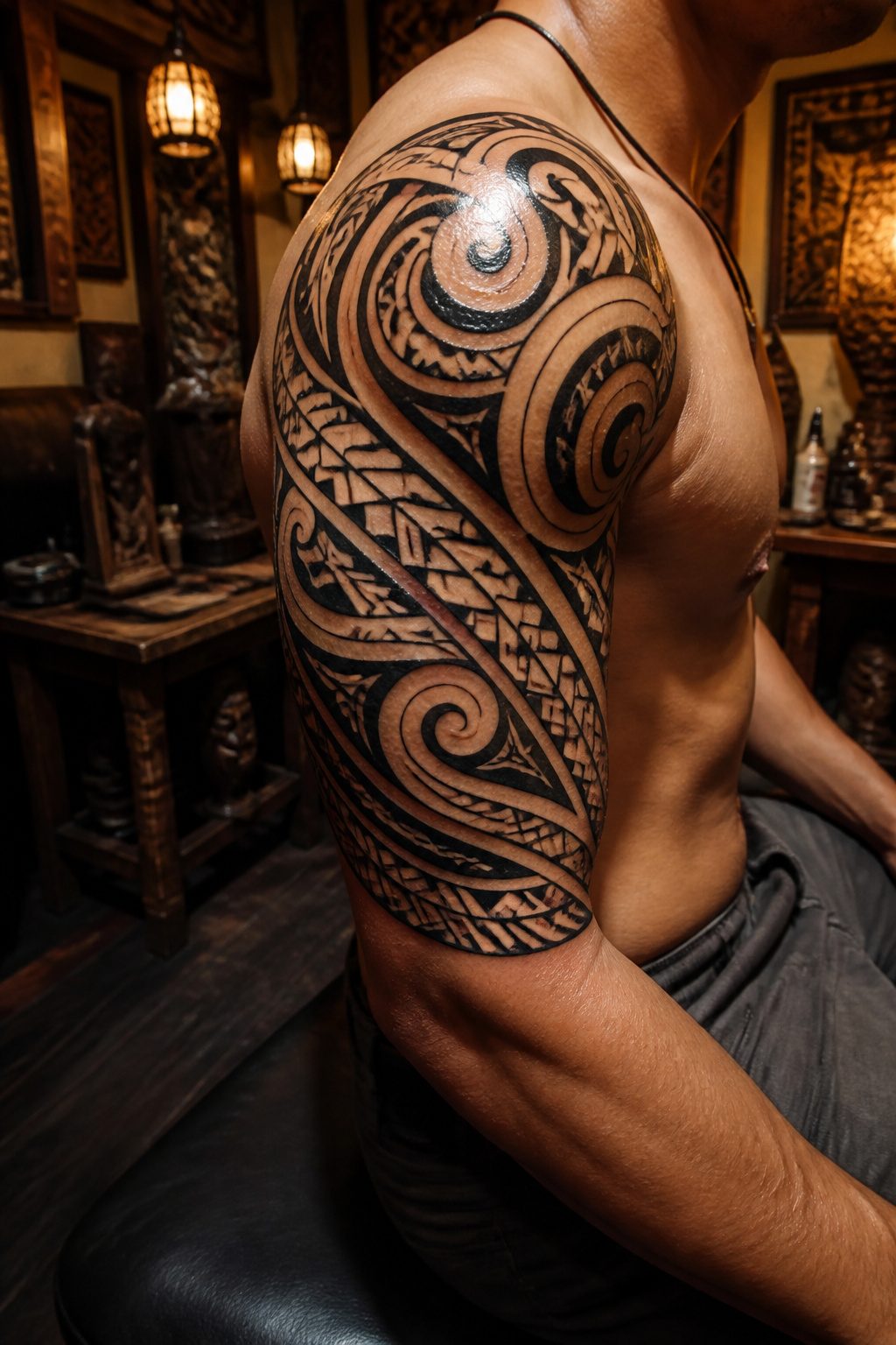
Bold black lines and interweaving gradients define tribal work, a style that carries centuries of lineage behind its patterns.
The designs that read as genuinely cool rather than generic draw from specific traditions, whether Polynesian, Maori, or Samoan, where placement itself carried meaning.
The upper shoulder and chest served as the traditional sites, and that placement still carries visual weight today.
Respect sits at the center of any decision here.
A design rooted in someone else’s heritage demands homework, not impulse. The difference between homage and appropriation usually shows in whether the wearer can name the culture, the symbol’s meaning, and the artist’s connection to that tradition.
Figures like Dwayne Johnson brought tribal work mainstream, but the power in those pieces came from their actual genealogical ties.
For men considering this route, the question is whether the pattern connects to something real or just borrows the aesthetic.
Full sleeves can drive home a cultural message when the art expands from authentic symbols rather than invented ones. The bold statement tribal tattoos make works best when the statement includes knowing what you are wearing and why.
5. Nature-Inspired Tattoos
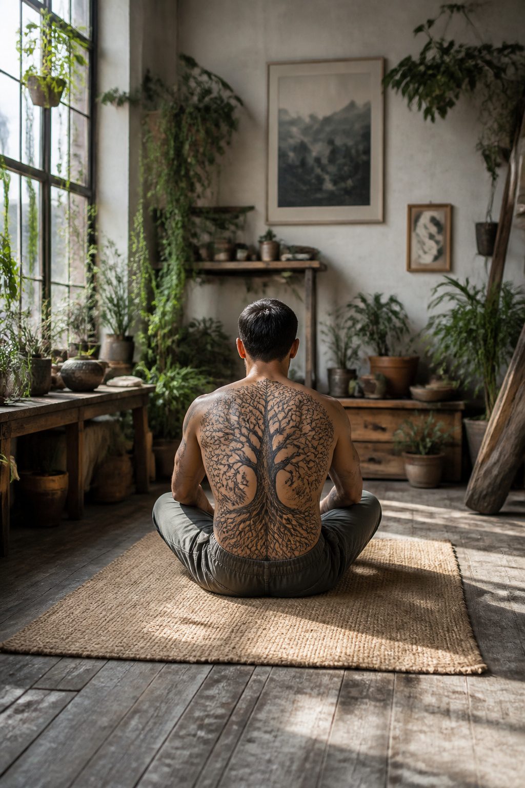
A tree tattoo on the chest or back carries the weight of family and ancestry, and the growth rings read like a story the longer you look.
Black-and-gray shading keeps those layers visible over time; color tends to blur at the edges after a decade, especially on skin that sees sun.
Mountains and waves follow the same rule. The rib cage hides a larger composition under a shirt, but the stretch and twist of breathing will shift the lines slightly.
Thighs offer steadier ground for big pieces, and the muscle underneath gives waves a natural sense of motion. Celestial bodies, moons and scattered stars, sit well on the upper arm where a short sleeve frames them.
Black-and-gray wins for longevity on any of these placements, though a single accent color in a mountain peak or wave crest can work if you keep the rest restrained.
Arms age the cleanest. Ribs and thighs ask for touch-ups down the line, but the scale you gain there is hard to match on smaller ground.
6. Script and Lettering Tattoos
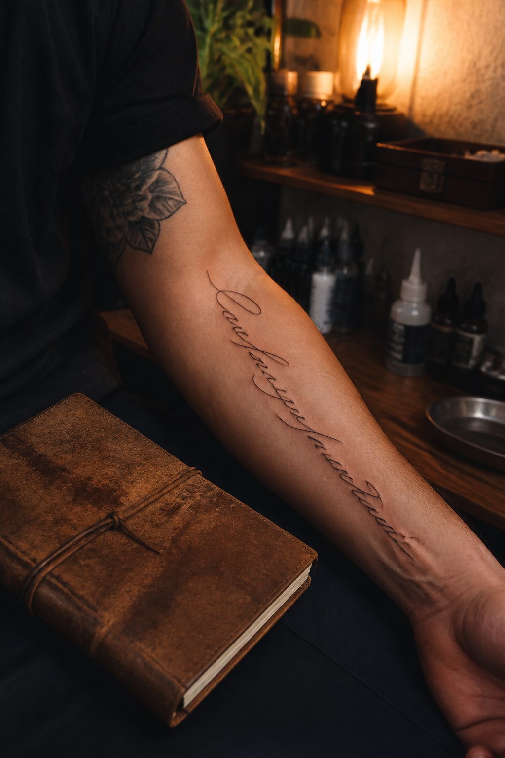
Script tattoos sit somewhere between a signature and a billboard, and the gap matters more than most people expect when they walk in.
A clean serif or a restrained sans-serif ages far better than the ornamental swirl that looked sharp on Pinterest in 2019; thin lines blur, tight loops close up, and what read as elegant at twenty-five can turn into a bruise-shaped smudge by forty.
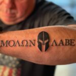
The forearm gives the artist length to work with and the viewer a natural reading distance, which is why short quotes and coordinates land well there.
Names belong where you can protect them: the ribcage hides a child’s name under a work shirt, the collarbone keeps a partner’s initials close without turning every handshake into an explanation.
The risk with any script is trend gravity. That 3D shadow effect or exaggerated drop shadow might feel modern now, but the same sources that pushed it will move on to the next texture by 2028.
Pick a font you could live with on a gravestone, not a sneaker release.
7. Traditional Tattoos
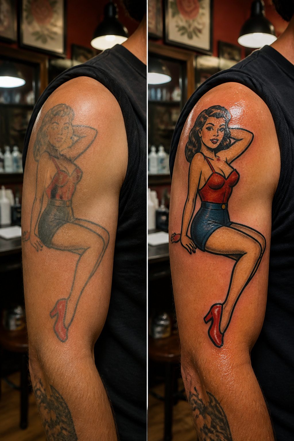
American traditional and Japanese irezumi sit at opposite ends of the same instinct: both demand that you respect the rules rather than freestyle.
The American school grew out of sailor tattoos from the early 1900s. Thick black outlines frame a limited palette of bright, flat colors — red, yellow, green, navy — with gradients that separate a skilled artist from a mediocre one.
Pin-up girls, anchors, skulls, and mermaids still dominate, though the style has stretched onto newer subjects. What keeps it alive is how well it ages; the heavy linework holds its shape as skin changes.
Japanese traditional inverts almost every choice. Irezumi builds from centuries of practice into flowing, full-body compositions where black ink carries the weight and color accents punctuate rather than lead.
Dragons, koi, samurai, and flowers weave together as narrative elements, not standalone images. The storytelling density is higher, the commitment larger.
Both styles have lasted decades for the same reason discipline beats novelty.
American traditional wins on accessibility; you can walk into most shops and find someone competent. Japanese traditional wins on depth of subject matter true to its roots, though finding an artist who understands the symbolism layer by layer is harder.
Between them, the choice is whether you want a single bold image or a body-length story.
8. Symbolic Tattoos
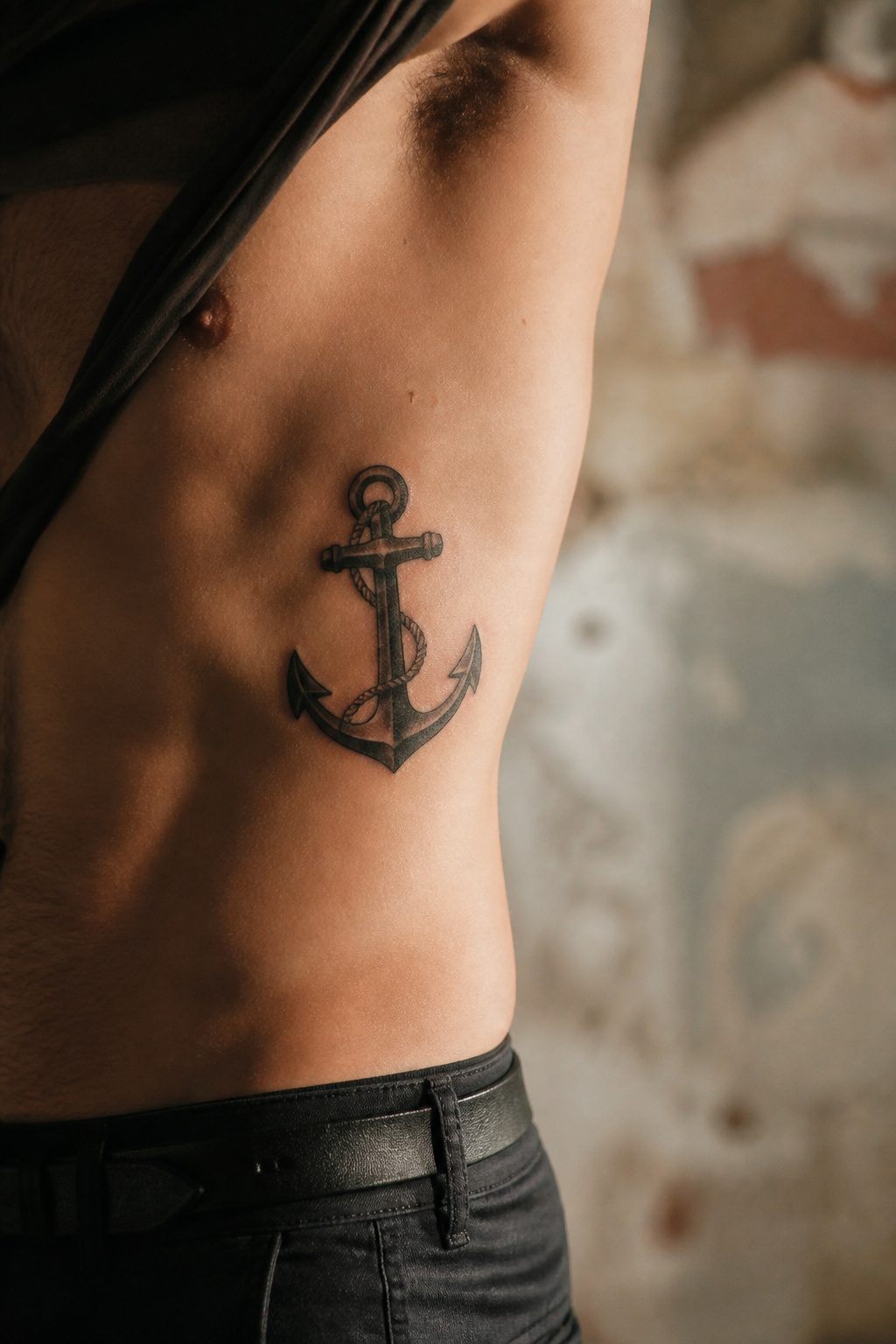
Anchors and compasses carry weight because the meaning was settled long before the needle touched skin. An anchor holds ground, a compass finds direction, and neither needs explanation when someone spots it across a room.
Arrows work the same way: the hunter’s weapon turned symbol of resilience, of pushing forward after the draw. These icons earn their keep in ink because they already live in the culture, not because the wearer invented them.
The real decision is scale and placement.
A single anchor on a wrist reads as personal shorthand, almost private. The same anchor woven into a chest piece becomes architecture, something that holds the surrounding work together.
Small tattoos of this kind, coordinates or a tiny rune, stay sharp when the design stays simple. Add too much filigree to a one-inch compass and the needle disappears.
What saves these from feeling like clip art is the interpretation you layer on top. The arrow that means resilience to one guy might mark a specific road trip for another.
The meaning does not have to be original, but it does have to be yours. That is what keeps a 200-year-old sailor symbol from looking like a costume piece in 2026.
9. Portrait Tattoos
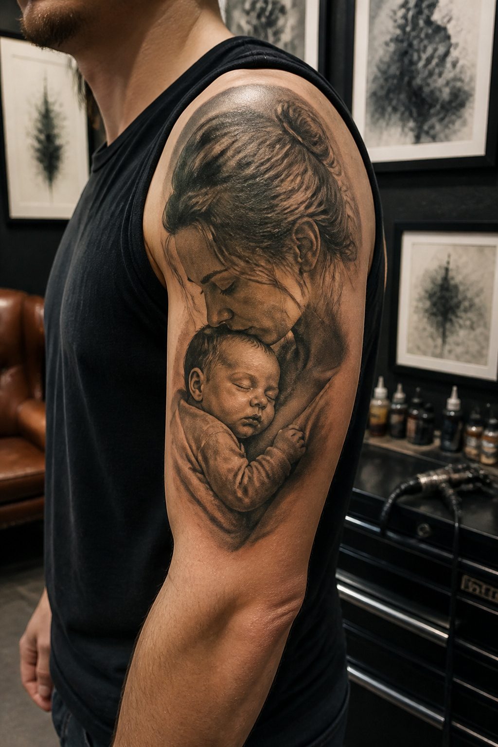
Realistic portraiture on skin is one of the most technically demanding disciplines in tattooing, and the margin between a likeness and a flat image is almost entirely in the artist’s control of light and shadow.
Skin is not canvas. It heals, it stretches, it ages, and the subtle gradations that make a face read as alive will blur or drop out if the artist hasn’t built them with enough separation to survive that process.
The scale matters more than most first-timers expect. A portrait the size of a playing card gives the artist no room to place the half-tones that bridge a highlight to a deep shadow.
What reads as soft modeling at two inches across turns to mud in five years. Most serious portrait work starts at palm-sized and runs larger, especially if the subject is a full face rather than a profile or partial study.
Lighting in the reference photo shapes everything that follows. Flat, on-camera flash kills dimension.
A single directional source, even a window on an overcast afternoon, gives the artist something to build from: a clear shadow side, a defined core shadow, a catchlight placement that fixes where the subject was looking.
Bring that reference, not a snapshot, and ask to see healed work from at least two years back. An artist who only shows fresh tattoos hasn’t let time test their technique.
10. Abstract and Watercolor Tattoos
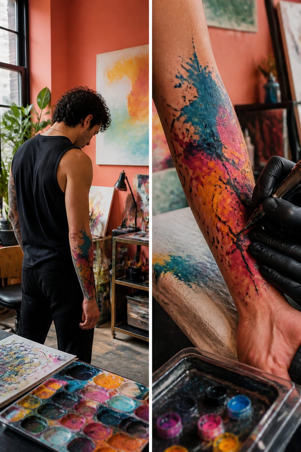
Abstract and watercolor tattoos borrow directly from canvas techniques, with pigment splashed, layered, or washed to mimic brushstrokes rather than inked lines.
The style looks striking when fresh, but the same diffusion that gives it movement lets color migrate under skin over years.
Black outlines traditionally act as walls that keep hues in place; without them, watercolor pieces can soften into hazy pools where the original shape becomes guesswork.
Placement shapes how this plays out.
Areas that flex and stretch, like the ribs or inner bicep, accelerate the blurring. Firmer ground, the outer thigh or upper back, lets the color settle with less mechanical disturbance.
What convinced me, reading through a dozen healed examples, was that watercolor needs touchup budget built in from day one, not treated as a maybe.
The men who keep these looking intentional plan for maintenance the way you’d plan for tire rotation, not repair.
11. Cultural and Heritage Tattoos
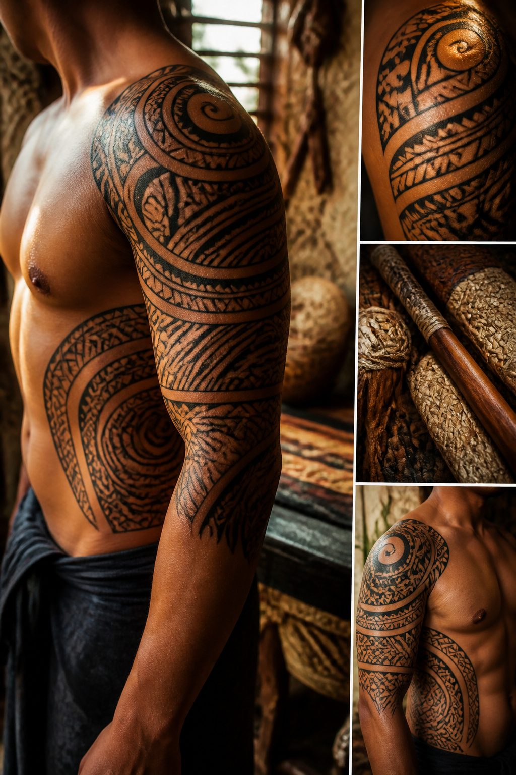
Polynesian patterns wrap around shoulders and ribs in ways that follow the muscle, but the real weight sits in what the marks mean.
Triangles in a Samoan sleeve might read as shark teeth to someone who grew up near the ocean, or as something else entirely to an artist working from a Pinterest board.
Research the lineage before the needle touches skin, because these designs carry family history, rank, and story in every line.
Celtic knots and family crests work the same way.
A crest across the chest or back speaks to pedigree and honor, yet the same shield copied from a genealogy website without checking the heraldry can misstate the very history it claims to honor.
The difference between a tattoo that connects you to something and one that just looks ancestral is the hours spent in archives or with elders who know the pattern’s origin.
Lineage-based work demands more than finding a cool reference photo. It asks whether the symbol belongs to your story, and whether you have done enough to earn wearing it.
12. Full Sleeve Tattoos
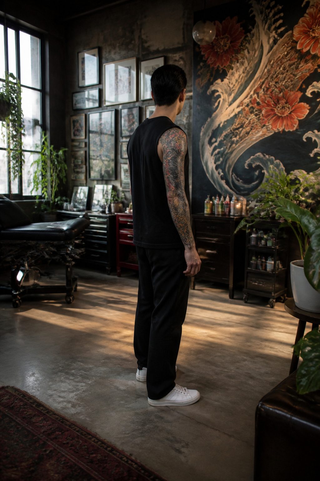
A full sleeve runs from shoulder to wrist, while a half sleeve stops at the elbow. That extra real estate changes everything: the canvas becomes large enough for narrative design with layered depth, not just a single statement piece.
The commitment is serious. Most sleeves need multiple sessions spaced weeks apart for healing, and the cost scales with that time.
Japanese irezumi-inspired work, black and grey realism with transitions between themes, fine line architecture, and surrealist visual storytelling all lend themselves to this format because they can evolve as the piece grows.
Cohesion versus collected pieces is the choice that defines the result. Working closely with one artist over time lets the design unfold as a single story.
The alternative, patching together work from different hands and eras, reads as exactly that: a collection. Neither is wrong, but the first option uses arm anatomy as a flow device.
Muscle curves guide the eye, the inner arm carries quieter detail, and the outer arm holds what the world sees first. Ignoring that flow leaves even beautiful work looking like it landed randomly.
Plan the negative space, not just the ink. The skin you leave bare shapes the design as much as the tattoo itself, and that is the part most men wish they had thought through sooner.
Where to Place It
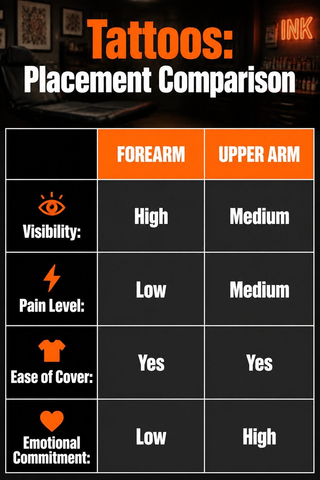
The forearm sits at the top of most lists for a reason: flat, visible, and easy to cover with a long sleeve when the occasion calls for it.
The skin there tends to hurt less than other spots, which makes it a practical entry point if you are still testing your tolerance. Upper arm follows close behind on comfort, and the muscle padding helps soften the session.
Chest and back demand a different commitment. These areas give you the broad canvas a large design actually needs; a detailed piece that would crowd a forearm opens up naturally across a shoulder blade or the center of the chest.
The trade is visibility and sensation. A chest piece sits under a shirt collar easily enough, but a back piece only shows when you choose to show it, and both areas rank higher on the pain scale than arm work.
Employment still matters. Spots that stay under a standard work shirt, back and upper arm especially, keep the decision private until you decide otherwise.
Forearm ink walks into every meeting with you. That is not a reason to avoid it, but it is a reason to be deliberate about what you put there and whether your workplace has already weighed in.
How to Choose
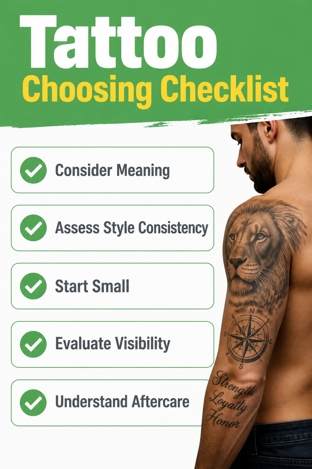
Meaning matters more than trendiness when you are choosing something permanent. A family initial, a religious symbol, or a quote you actually live by will still feel right in ten years.
The test is simple: if the idea still feels solid after a few months of sitting with it, it is probably the right one.
Style consistency matters too. A single bold lion on your chest does not pair well with a delicate wrist piece later unless you planned the mix.
Most guys do better building around one visual language, whether that is black-and-grey realism, clean linework, or something else entirely.
For a first tattoo, smaller and less painful beats ambitious and regrettable.
The ribs and hands have a reputation for a reason. A symbol, a short quote, a compass, or a wolf gives you something meaningful without committing half an arm before you know how your skin takes ink.
Script in a timeless font, placed with care, almost never looks bad and carries low risk for a first piece.
Drop shadows or 3D effects can work if your artist has the portfolio to back them up, but plain text holds up longer.
Visibility is the choice few people think through. A tattoo you can cover for work and show on weekends gives you freedom you will not value until you need it.
Pain and Healing
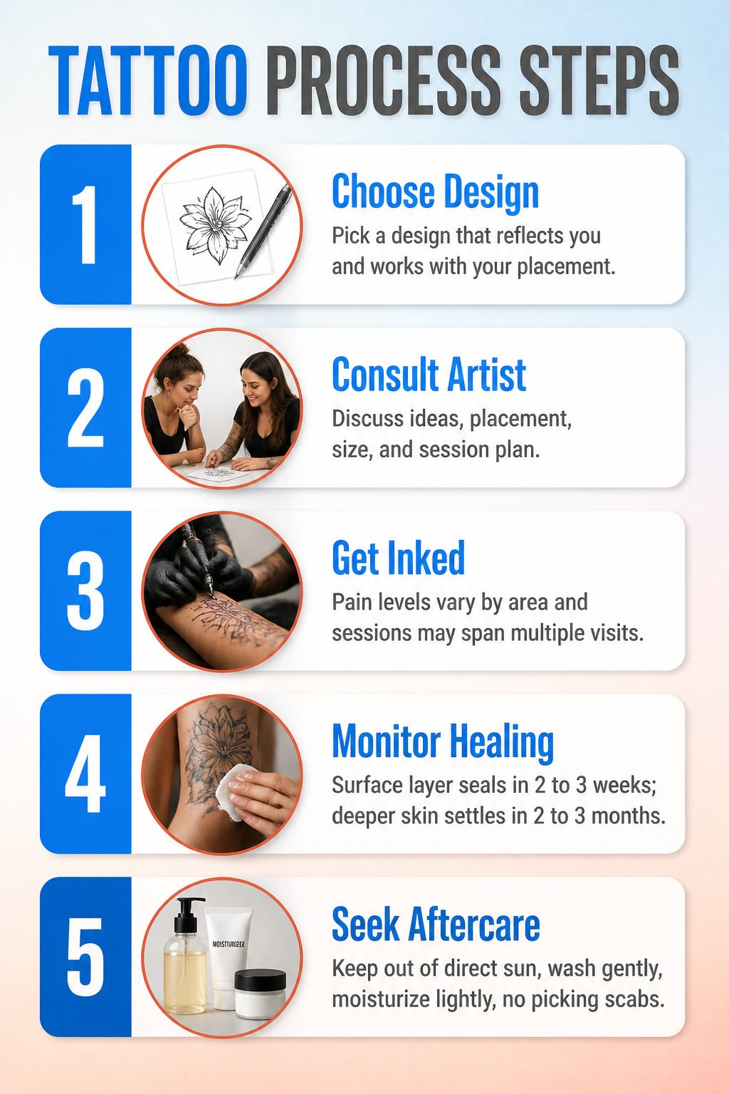
Pain levels shift dramatically depending on where on the body the needle meets skin. The outer arm and calf generally carry the lightest sting, while the ribcage, spine, and inner elbow collect the most winces from people in the chair.
A full sleeve session runs long enough that most artists break it into multiple appointments, not for the design but for the swelling that sets in after hour three.
Healing timelines get mentioned across most tattoo guides, though rarely in depth. The surface layer seals within two to three weeks; the deeper skin settles over two to three months.
During that window, keeping the area out of direct sun matters more than any ointment choice, since UV exposure fades fresh ink faster than almost anything else.
Basic aftercare is straightforward: gentle washing, thin moisturizer, no picking at scabs. The rest, artists tend to adjust based on what they have seen hold color in their own chairs over the years.
What Costs What
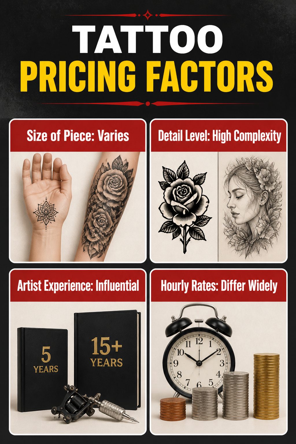
Tattoo pricing runs on three levers: the size of the piece, the level of detail, and how long the artist has been at it.
A palm-sized blackwork design takes less chair time than a full forearm of fine-line shading, and the hourly rate of someone five years in usually sits below a veteran with a year-long waitlist.
What convinced me, reading through a dozen of these guides, is that nobody wants to pin down a dollar figure for you.
Two of the sources that even brought up cost stopped short of numbers entirely, which tells me the spread is too wide to quote without misleading someone.
My own take: budget for the artist, not the image. A simple design from a practiced hand still costs more than a complex one from someone building their book, and that gap is where most first-timers get surprised.
Frequently Asked Questions
What is a good first tattoo for a man?
A symbol, a short quote, a compass, or a wolf works well.
Pick something smaller on a less painful spot like the forearm so you can test your tolerance without committing half an arm. If the idea still feels solid after a few months, it is probably the right one.
What are the most popular tattoos for men?
Animal designs, minimalist tattoos, and traditional styles lead the pack.
Lions, wolves, and owls dominate animal requests, while single-line work and clean geometry top the minimalist category. Six separate roundups from 2025–2026 identify animal ink as the most consistently requested category overall.
Where do tattoos hurt the least for men?
The outer forearm and upper arm carry the lightest sting, with the calf close behind.
Muscle padding in these areas softens the session, and the forearm skin stays relatively flat and stable. The ribcage, spine, and inner elbow sit at the opposite end of the pain scale.
How much does a tattoo cost for men?
Pricing hinges on size, detail, and artist experience, so the spread is too wide to pin to a single figure.
A veteran with a year-long waitlist charges more per hour than someone five years in, and a palm-sized blackwork piece takes less chair time than a full forearm of fine-line shading.
Budget for the artist rather than the image; a simple design from a practiced hand still costs more than a complex one from someone building their portfolio.
What is the difference between a full sleeve and a half sleeve?
A full sleeve runs from shoulder to wrist, while a half sleeve stops at the elbow.
That extra real estate lets a full sleeve carry narrative depth and layered design rather than a single statement. Most sleeves need multiple sessions spaced weeks apart for healing, and the cost scales with that time.