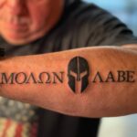
Small forearm tattoos for men run from a single star or cross to a full lion portrait with sword, leaves, and name, with most falling in the one-session range.
The deciding factor is whether you need the piece to hide under a watch or sleeve for work, since placement closer to the elbow than the wrist makes that possible.
1. Small Tattoo
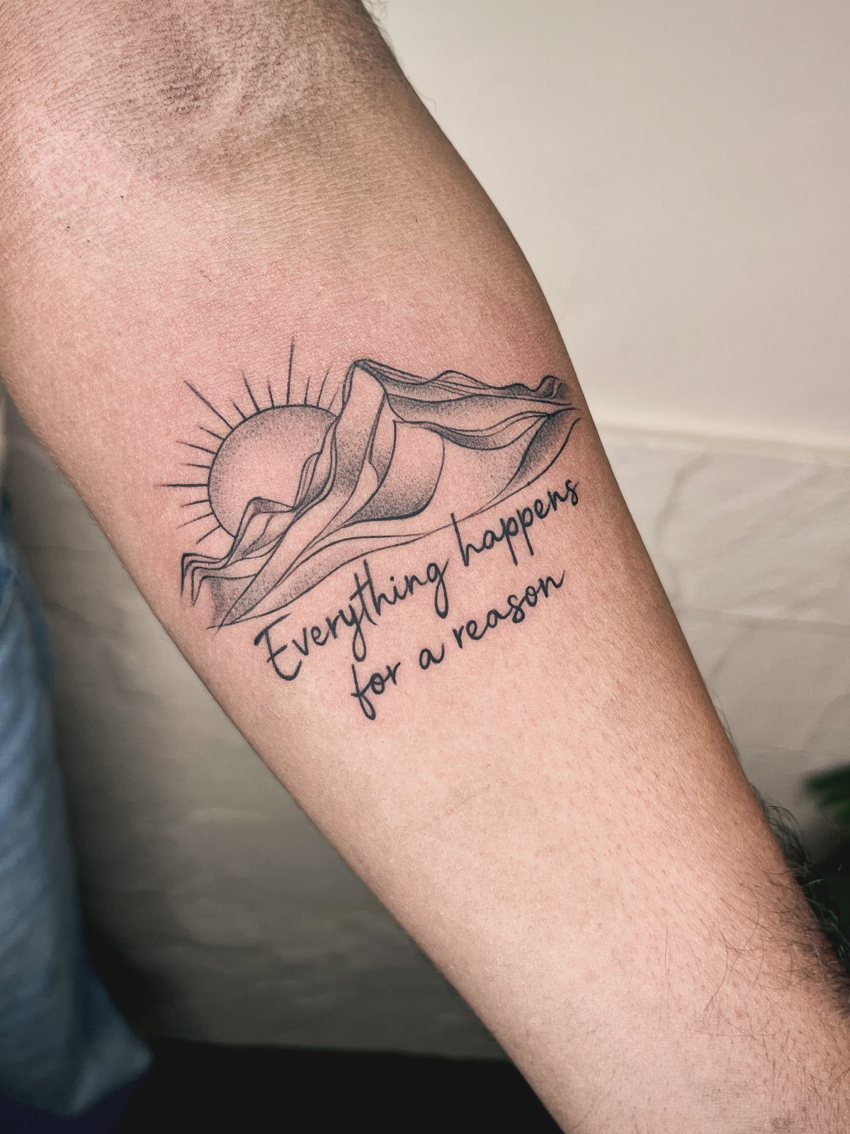
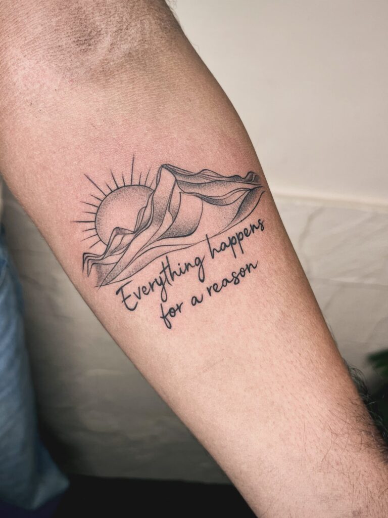
A first tattoo on the forearm needs to stay readable at the size you’re willing to commit to. Two simple shapes, a mountain and sun with a line of script underneath, carry a phrase without crowding it.
Placement matters more than design for hiding it: the inner forearm faces your body when your arm hangs, and a long sleeve covers it without thought.
For discretion, keep it small and sit it closer to the elbow than the wrist, where a watch or cuff can finish the job if needed.
Check how the script reads at a glance; thin lines blur over time, so ask your artist about weight.
2. Dragon Tattoo
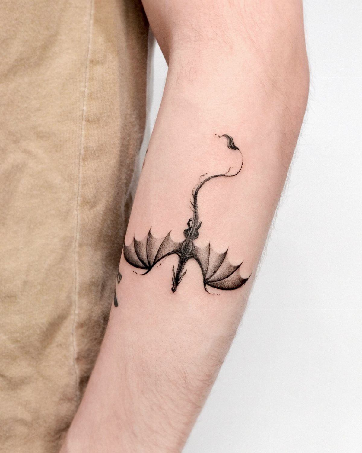
A small dragon on the forearm works because the shape wraps the muscle without fighting it. Wings spread across the inner arm give the creature room to breathe at a scale that still reads as fire and motion.
Strength and luck are the usual readings, though the fantasy pull alone is reason enough. Keep the head toward the elbow so the tail can taper toward the wrist; the flow follows the arm’s natural line.
3. Wolf Tattoo
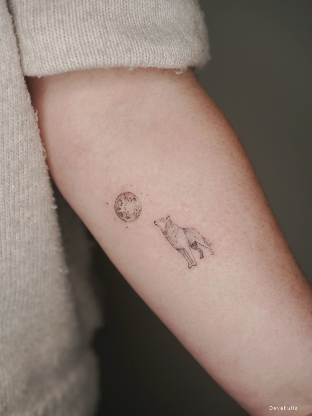
The howl pointed upward, the wolf paired with a moon, turns a common pairing into something you can read from across a room even at an inch or two.
Black and grey keeps it quiet enough for an office where tattoos stay covered, loud enough to matter when the sleeve comes up. Loyalty and guardianship are the old meanings; the visual weight comes from the pose, not the size.
This sits under fabric without announcing itself. For placement, the inner forearm lets you look down and see it, which matters more than you’d think for an animal that stands for watching over your own.
4. Lion Tattoo
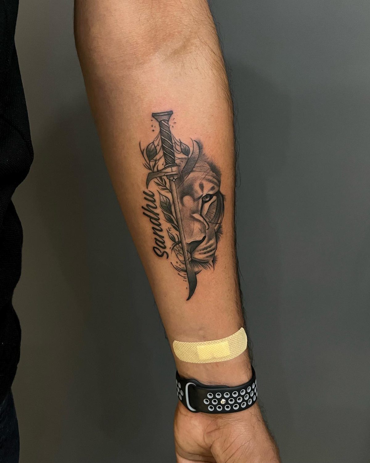
Half a face, a sword, leaves, and a name running vertical: this is how you pack several elements into a forearm without turning it into a sleeve.
The lion reads as courage and leadership, but the real choice here is the mix of symbols rather than the animal alone. Black and grey shading carries the depth that a single-color piece would flatten.
A name in script beside the sword makes it personal; the vertical line breaks up the horizontal flow of the arm in a way that draws the eye up.
This suits someone with a few tattoos already who knows how crowded the forearm gets and wants one piece to do several jobs.
5. Small Snake Tattoo
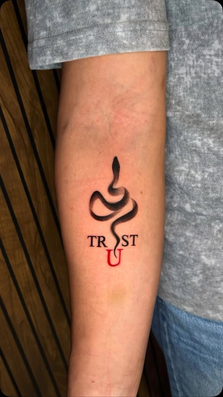
The red "U" against black ink is a small risk that pays off: one color, one letter, enough to make the eye pause.
Transformation and rebirth are the standard readings, though the shape alone, that S-curve wrapping whatever space you give it, is reason enough to choose it.
The forearm’s length suits the snake’s natural line; wrap it too tight around a wrist and it reads as a bracelet instead of a creature.
Ask your artist about the gap between body and text, too close and the two blur together over years.
6. Star Tattoo
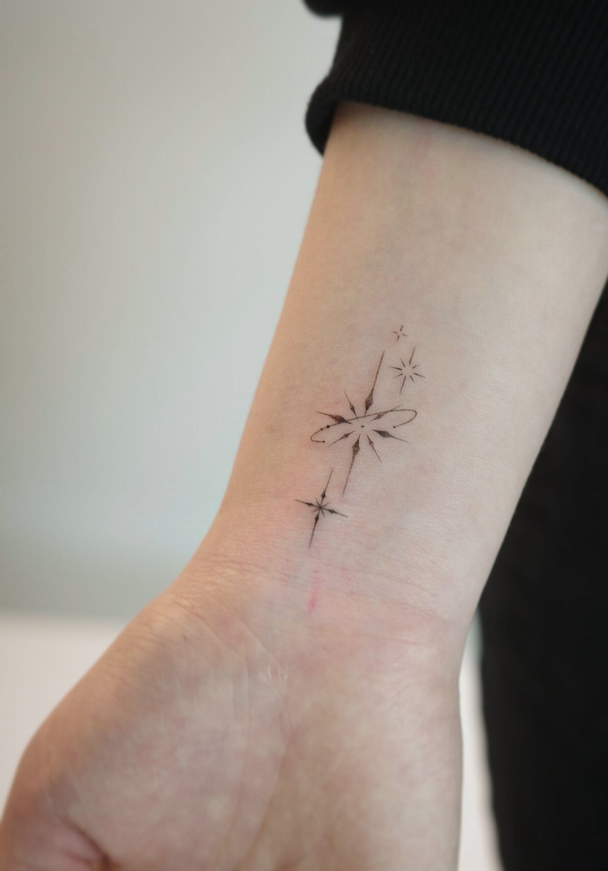
Several small stars with an orbital ring scattered across the inner wrist and forearm: this is filler that became the whole point.
Stars work at any scale, which is their advantage and their trap; too many and they read as noise, too few and they look accidental.
The orbital ring, that single connected shape, gives the scatter a logic it wouldn’t have alone. Guidance and protection are the old meanings, though plenty of people choose them for the geometry alone.
Placement near the wrist means a watch covers them, a bracelet frames them, or nothing at all leaves them visible. For a first piece, three stars in a loose line takes under an hour and heals fast.
7. Small Cross Tattoo
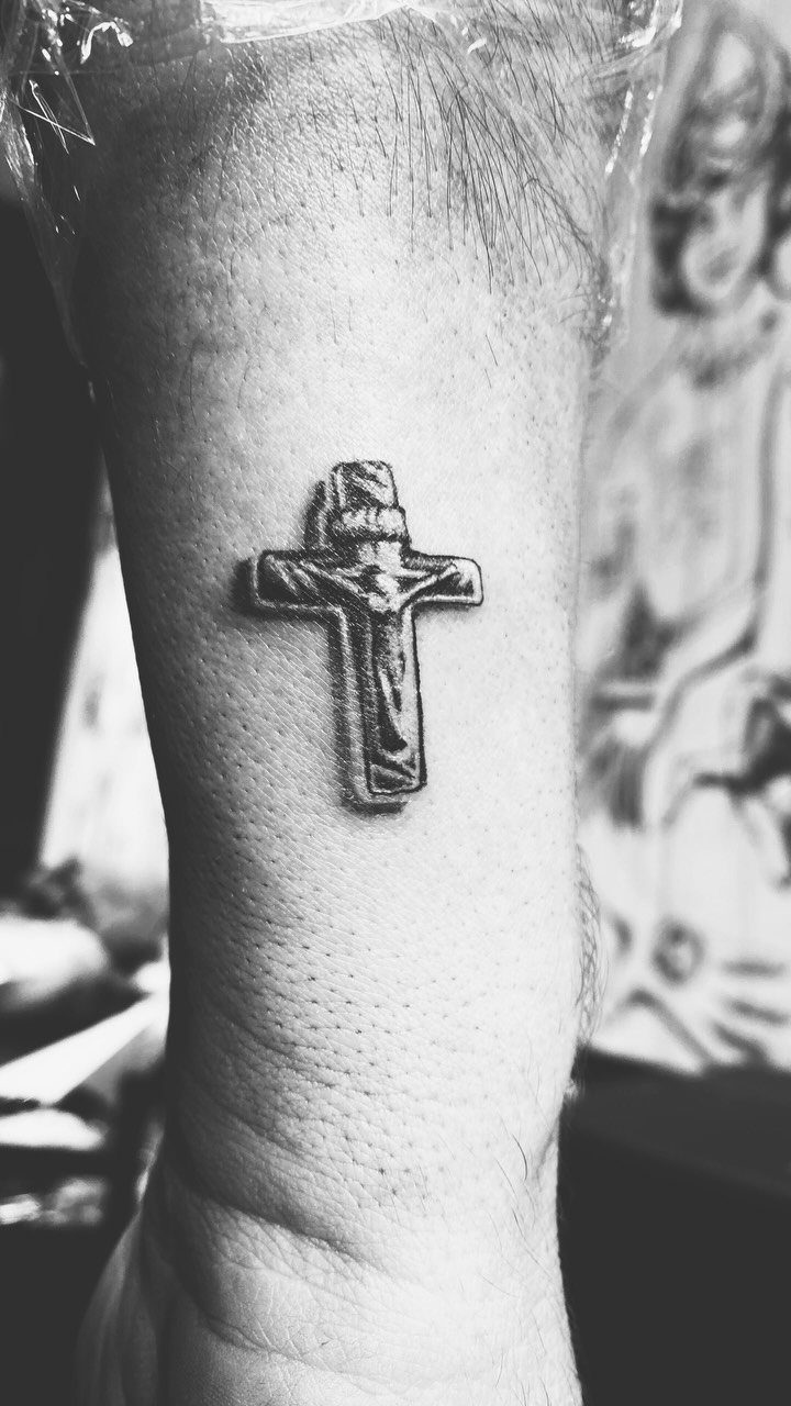
A small cross tattoo works best when it carries weight without shouting. A tight cross keeps its detail through subtle shading around the figure, with highlights that catch light only when the arm turns.
That restraint is what makes it readable at this scale.
Placement matters more than size. The inner forearm lets you see it yourself; the wrist turns it into something others notice first.
Either way, the linework needs to be clean enough that the cross still reads as a cross long after it heals, not a blob.
If plain feels too spare, a small shaded skull at the base adds grit without losing the meaning. I’d keep the cross itself traditional and let the extra element do the talking about personality.
The faith part stays quiet; the style part gets to speak up.
Check your artist’s healed work on religious pieces before you commit. Thin lines in crosses blur faster than you’d think.
8. Small Skull Tattoo
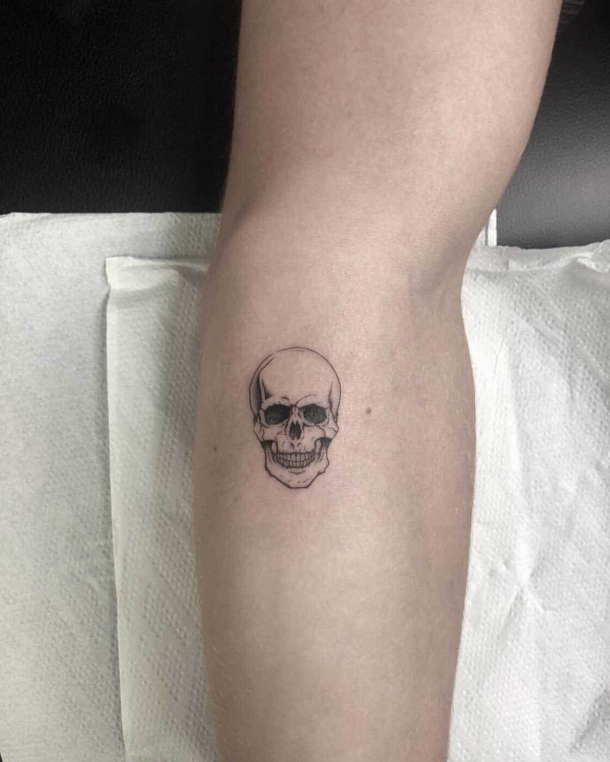
Skulls have outlasted every trend in American tattooing for a reason. A small skull on the forearm, done in black and grey, carries enough detail to read as bone rather than cartoon.
That middle ground is where the design lives or dies.
At this size, shading does the heavy lifting. Solid black fills in too heavy; too much white highlight and it looks like a sticker.
Ask to see healed photos of palm-sized skulls from your artist, especially ones that have settled for a year or more.
The forearm keeps it visible for you, which matters more than most people admit. The wrist or hand works too, though those spots fade faster and hurt more.
As part of a sleeve, a small skull bridges gaps between larger pieces without demanding its own spotlight.
For something that reads rugged rather than gothic, keep the jaw closed and the eye sockets moderate. Open-jaw screaming skulls need more space to work; at small scale they just look busy.
9. Small Anchor Tattoo
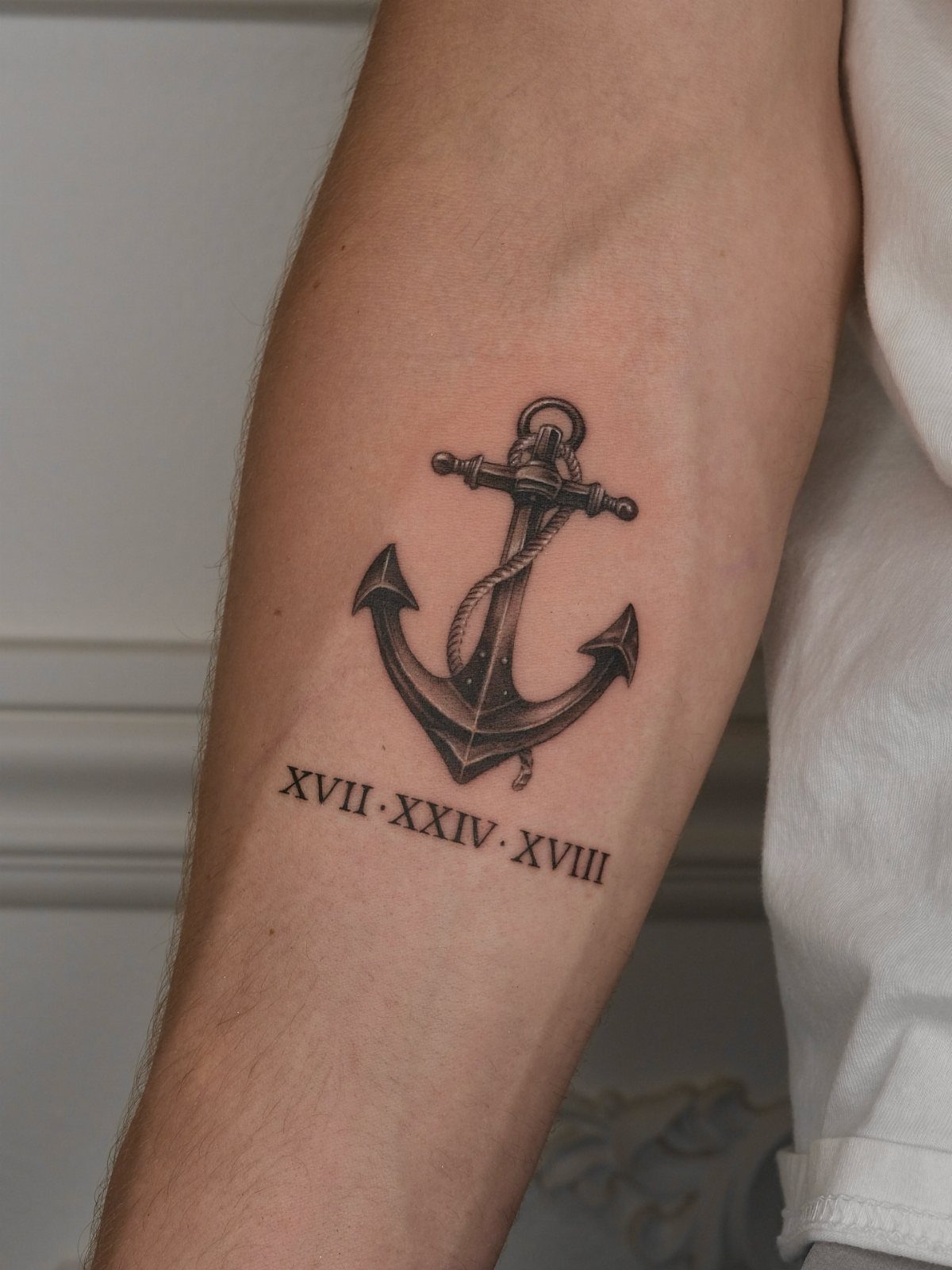
An anchor carries its meaning without needing explanation, which is half the appeal for a first tattoo or a discreet one. The classic anchor form runs shank, ring, flukes, with rope wrapped natural around the stock.
Roman numerals underneath turn it personal without cluttering the image itself.
Roman numerals in the date format XVII · XXIV · XVIII break up cleanly and read well at small size.
I’d keep any text below rather than beside the anchor; the vertical shape of the anchor wants a vertical partner, not a horizontal one fighting for arm space.
Nautical purists might want a specific anchor type, a stockless or a Admiralty pattern, but at small scale the generic reads fine. What changes the look more is the rope: twisted line versus simple chain, present or absent.
Absent reads cleaner; present reads more traditional.
Stability is the usual meaning, though plenty of guys get anchors who have never been on a boat. The symbol has outgrown its origin.
What grounds it is the personal detail underneath or the reason you picked it, not the ocean connection itself.
10. Small Angel Wings Tattoo
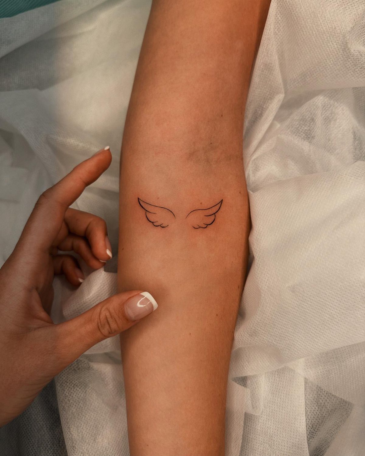
Angel wings compress a lot of meaning into a simple outline. The minimalist version runs two wings, symmetrical, no background, no extra elements.
That spareness is what keeps it from turning sentimental in a way that feels forced.
For remembrance, the wings work without a name or date attached, which I prefer. The viewer knows something is being honored; the specifics stay private.
If you do want text, a small line underneath the wings reads better than curved around them.
Inner forearm placement puts the wings where you can see them, where they move slightly when you rotate your wrist. That small motion keeps them alive in a way a static back piece never manages.
Delicate linework needs a steady hand and a light touch. Wings with too much feather detail at small scale turn into grey smears once the ink settles and spreads.
I’d rather see a few clean lines than a mass of fuzzy ones.
11. Small Portrait Tattoo
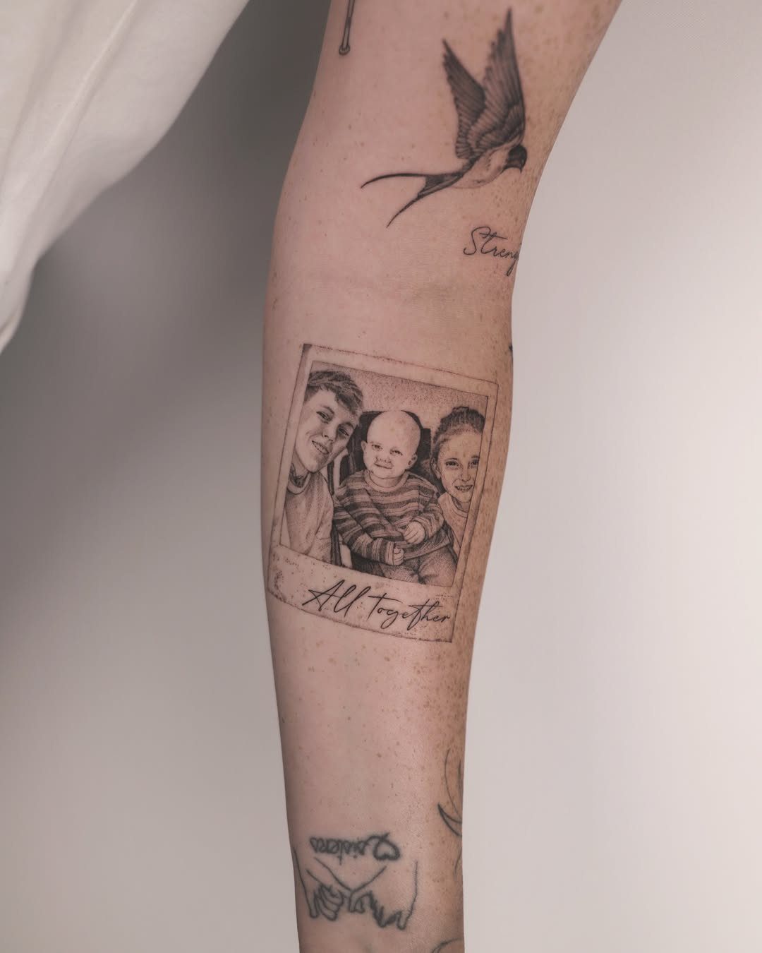
A portrait at small scale is the riskiest choice for a forearm piece. The Polaroid-frame workaround shows three children in a rectangle, captioned "All together," with the white border doing the compositional work.
That frame gives the eye a reference point, which helps the faces read at size.
Black and grey shading carries more detail than color at this scale. The photo’s style, with its soft tones and clear edges, is what you want to ask for specifically.
"Photo-realistic" means different things to different artists; ask to see their smallest healed portrait before you book.
The forearm offers flat, stable skin that ages better than fingers or the side of the hand. Even so, faces blur.
I’d limit a small portrait to someone you will still want to carry decades from now, not a current favorite figure you might outgrow.
For a tribute that does not depend on likeness, a name or symbol often outlasts a face. But when the likeness matters and the artist is right, the result stops conversation.
12. Owl Tattoo
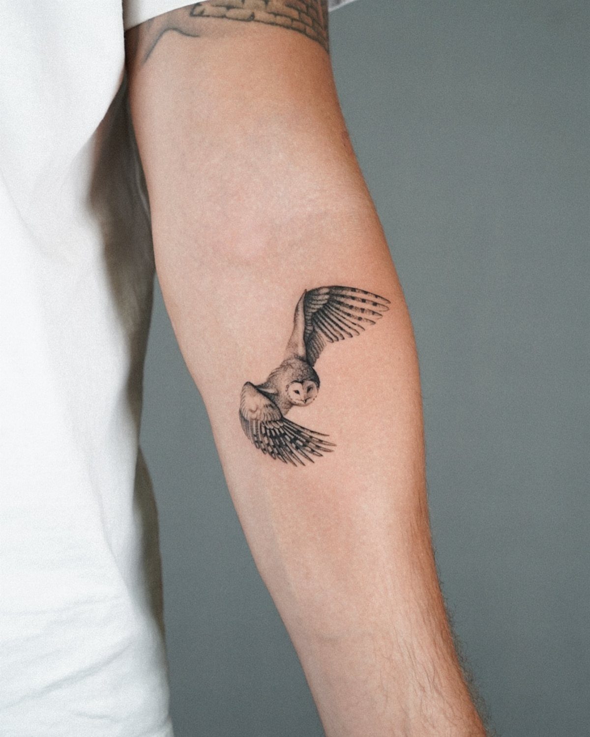
An owl in flight carries motion that most small tattoos lose. Wings spread, feathers catching light, the bird angled as if just leaving the wrist.
That sense of movement is what separates a good owl from a stuffed one.
Night associations run deep with this design: wisdom, mystery, the moon. The masculine reading leans toward the watcher, the patient hunter, rather than anything mystical.
I’d play up the dark eyes and the talons if you want that edge; soften the wing edges and add more background if you want something closer to a spirit animal piece.
The forearm suits owls because the length of the wing spread fits the length of the bone. A rounder placement, on the shoulder or chest, forces the bird into a shape that fights its natural silhouette.
Color on an owl turns decorative fast; the bird becomes emblem rather than animal. For something that looks alive on your arm, stick to tones that shadow rather than announce.
13. Crown Tattoo
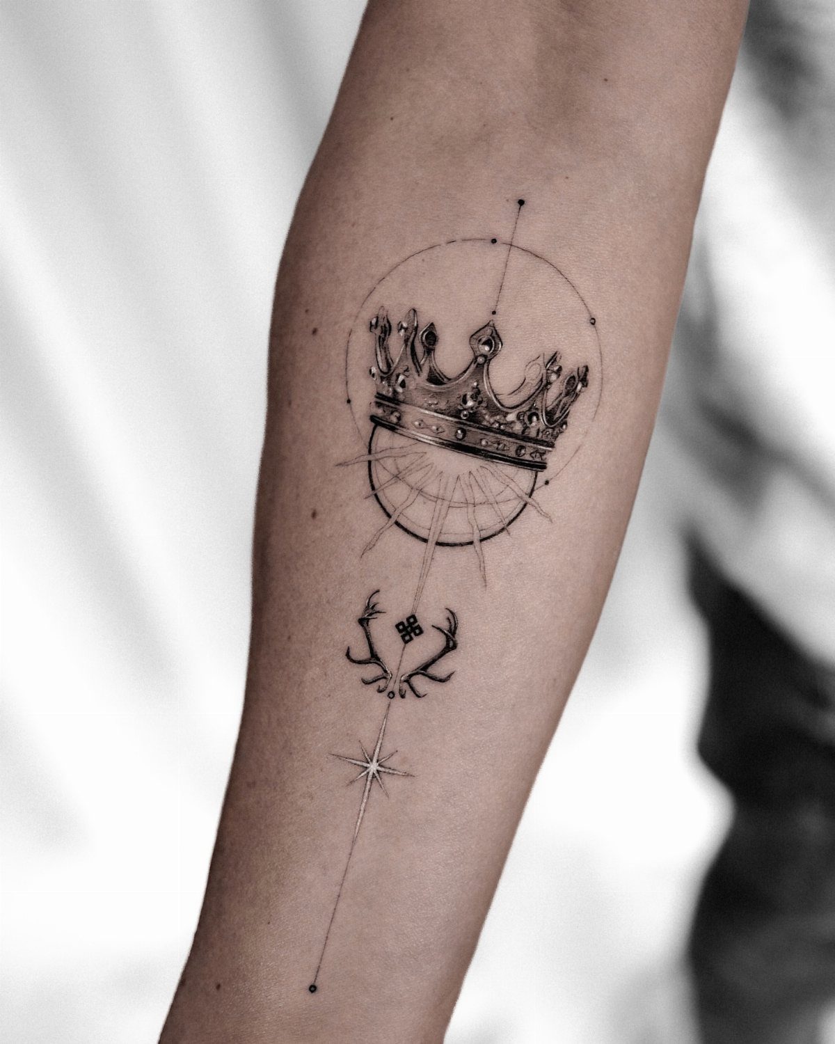
A crown on the forearm works best when it stays small enough to read as jewelry rather than costume. Mixing the crown with antlers and knotwork keeps the design from looking like a playing card.
Black and grey shading gives the metal its weight, while fine line work keeps the whole piece reading as delicate rather than heavy.
I’d pick this for a guy who manages people or runs his own operation and wants the reminder without saying it out loud.
Crowns carry some baggage from older fashion trends, so the surrounding geometry matters more than the crown itself.
14. Small Elephant Tattoo
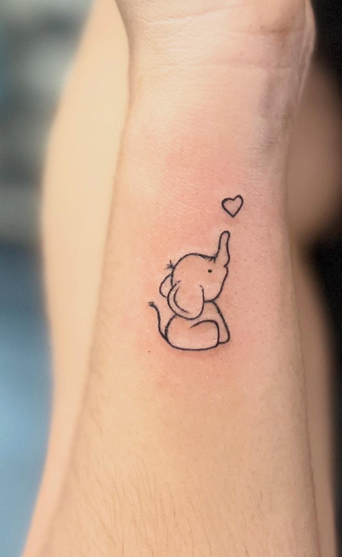
The elephant is drawn in single-needle line work with a heart floating off the trunk, small enough to read as a detail rather than a statement.
An animal known for size and strength, shrunk down to something that reads as gentle rather than dominant.
Single black ink keeps it readable at this size without the muddiness that comes from shading too small.
The trunk-up position carries the luck association, though the heart adds a layer that shifts the meaning toward family or protection rather than raw power.
This suits someone who wants the symbolism without the aggressive posture of a lion or wolf. A similar design at the inner bicep hides under a short sleeve but still shows when you want.
15. Small Quote Tattoo
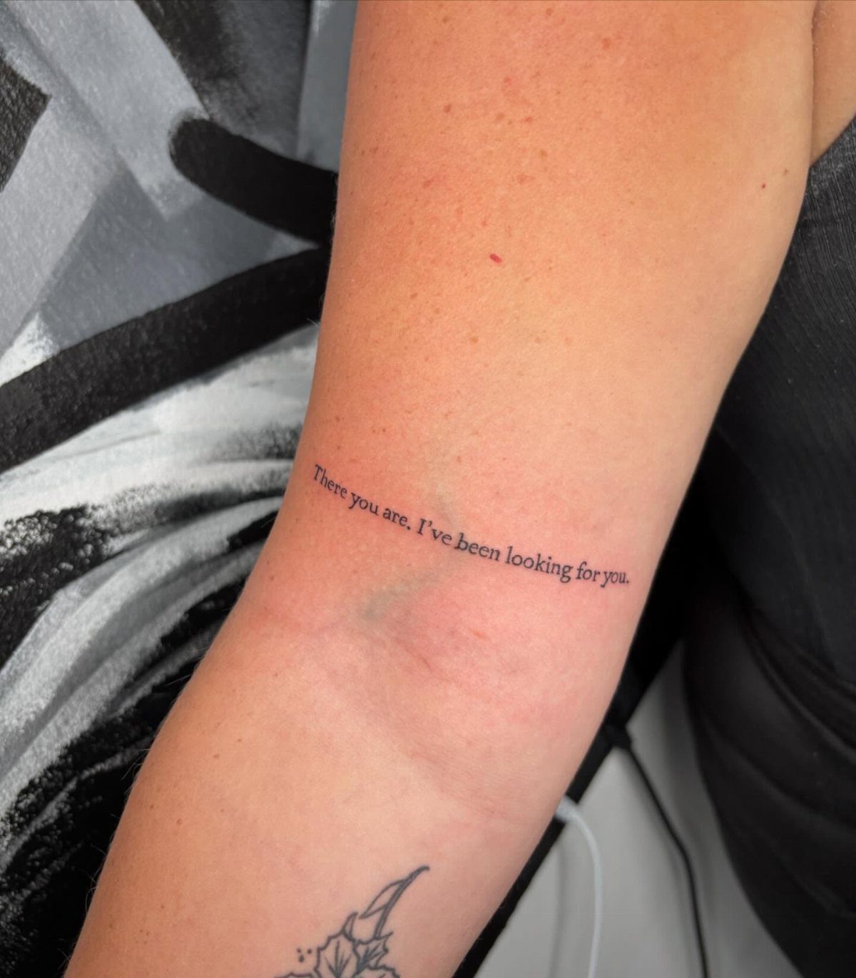
The phrase runs in a clean serif font, low enough on the forearm to stay covered by a watch or shirt cuff.
That placement is deliberate: quote tattoos need to flow without wrapping around the arm, or they become unreadable to everyone including you.
Font choice matters more than the words themselves. At this scale, shorter lines keep the letters from compressing to illegibility.
This works when the phrase has actual history for you, not just something you found motivational on a Tuesday. I’d suggest living with the words taped to your mirror for a year before committing.
Inspiration quotes, sayings, or song lyrics are popular tattoos and your arm is the perfect place to ink these personal mantras. A placement on your arm, especially your forearm, ensures you see them often.
16. Small Geometric Tattoo
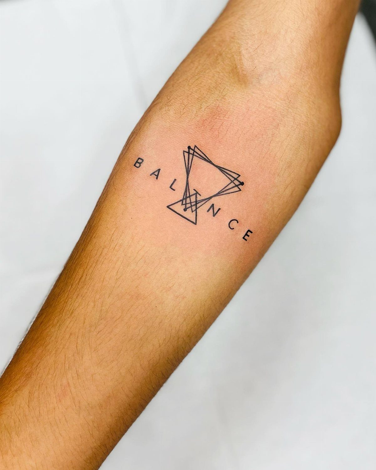
The triangle-and-text piece uses overlapping lines to build depth without shading, all in black ink.
Geometric work lives or dies on precision: one wavering line ruins the whole effect, so this style demands an artist who specializes in it rather than a generalist who "does some geometry too."
The word "BALANCE" here is optional. Pure shape carries meaning on its own, triangles for stability or transformation, circles for continuity.
Adding text anchors the design to a specific intention but also dates it faster.
Size can run smaller than figurative work because lines stay clear where details would blur. A single element on the forearm needs to stay small enough that the proportions feel right against the arm’s length.
This suits men who want modern, abstract art rather than recognizable symbols, though combining geometry with a small animal or object, as some artists do, splits the difference.
17. Small Hourglass Tattoo
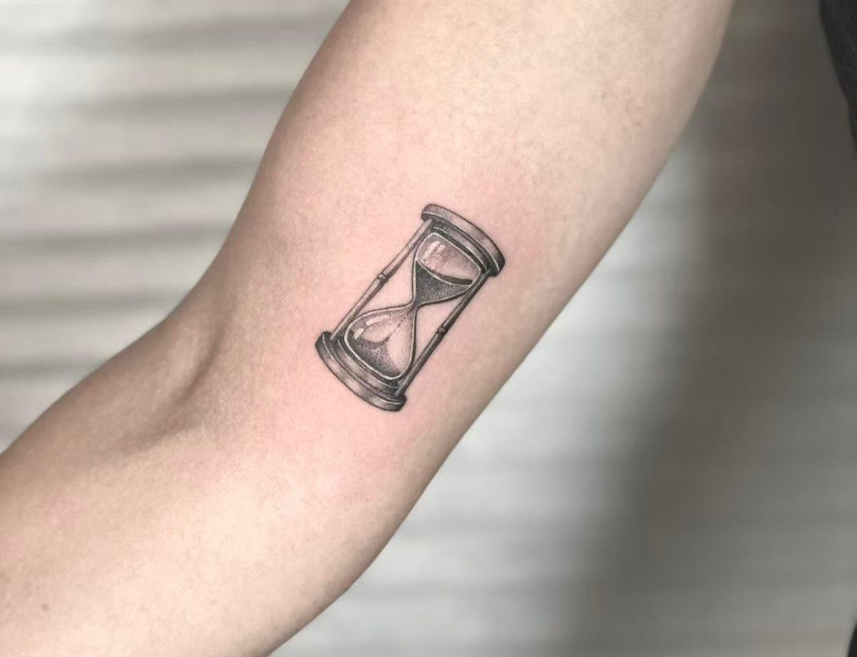
Sand through glass makes a natural tattoo subject: the image itself is black and grey, with shading doing the work of showing individual grains and the glass curve.
That detail level is achievable on the forearm, though the artist needs to understand how light hits a transparent object or the glass reads as solid.
The meaning is direct, almost too direct for some. It works best when the placement connects to action, the wrist of your writing hand or the forearm you see when checking a watch, rather than as pure decoration.
Single-session piece. I’d avoid adding banners or extra elements; the hourglass is complete in itself and clutter weakens the symbol.
18. Small Sun Tattoo
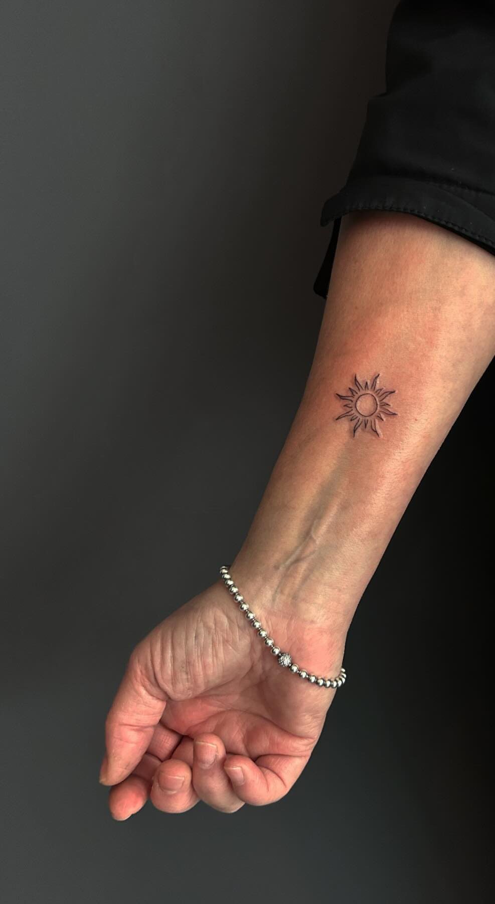
A sun this small, just radiating lines without a face or features, reads as clean and contemporary rather than tribal or retro.
The fine-line version sits on the inner forearm where a bracelet would hang, a placement that treats the tattoo as accessory.
Color is an option the photo doesn’t take. Your call based on whether you want the pop now or the longevity later.
This suits someone building a collection of small symbols rather than a single statement piece. It pairs well with moon or star work elsewhere, though I’d keep enough space between them or they compete.
The meaning is light and energy without the religious weight of a cross or the aggression of animal imagery.
19. Small Barbed Wire Tattoo
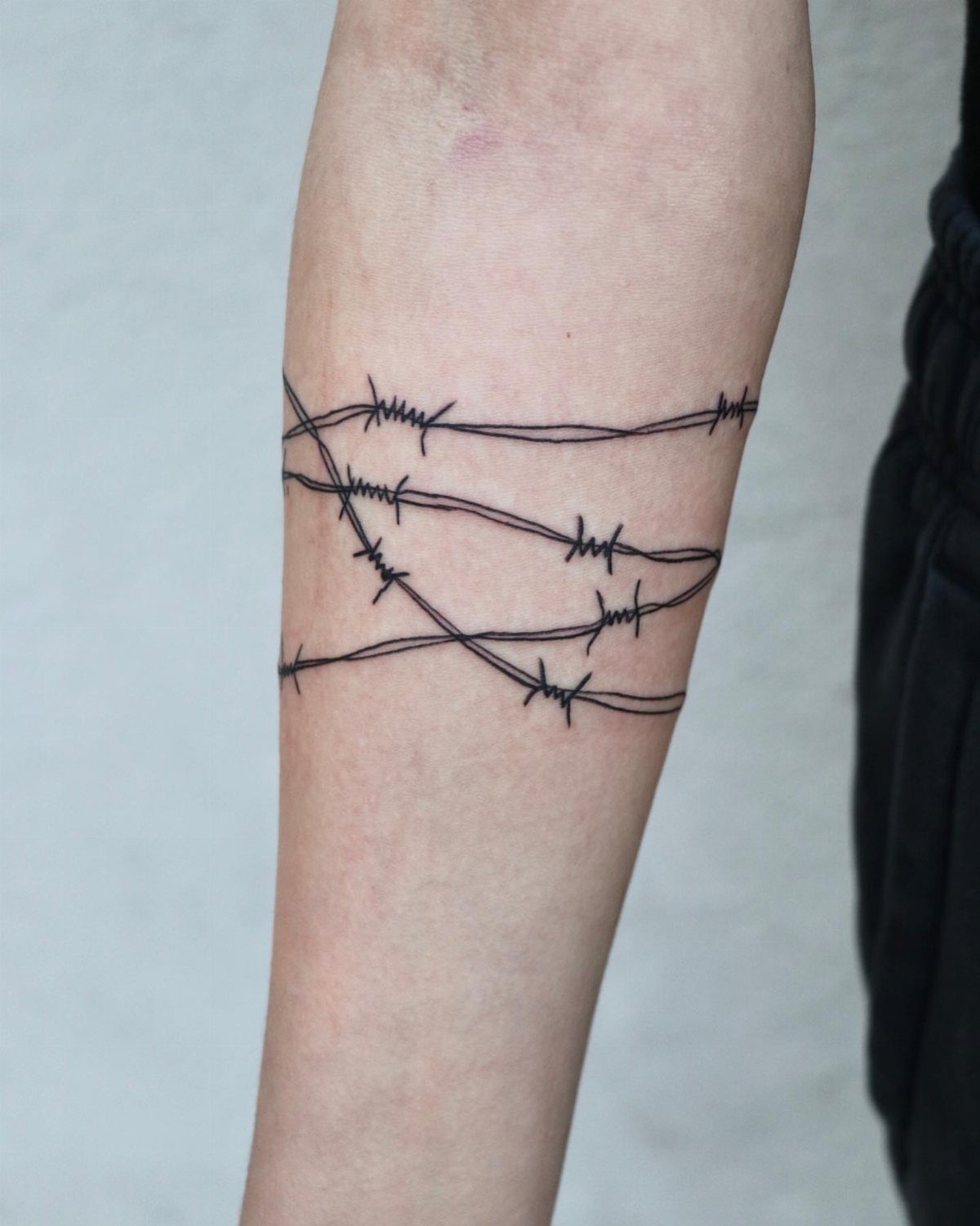
A barbed wire band reads like jewelry you do not take off. I have seen this done as a single strand or stacked three deep, and the single version hides under a sleeve far more easily.
Placement matters more than detail here: too high toward the elbow and it catches on shirt cuffs, too low and the wrist bone distorts the line.
A barbed wire tattoo that follows the arm’s curve keeps it from looking like a flat stamp. Black ink holds up; color would read as costume.
If you work with your hands, consider how often the outer forearm meets door frames and table edges. This spot ages fast.
20. Small Spider Tattoo
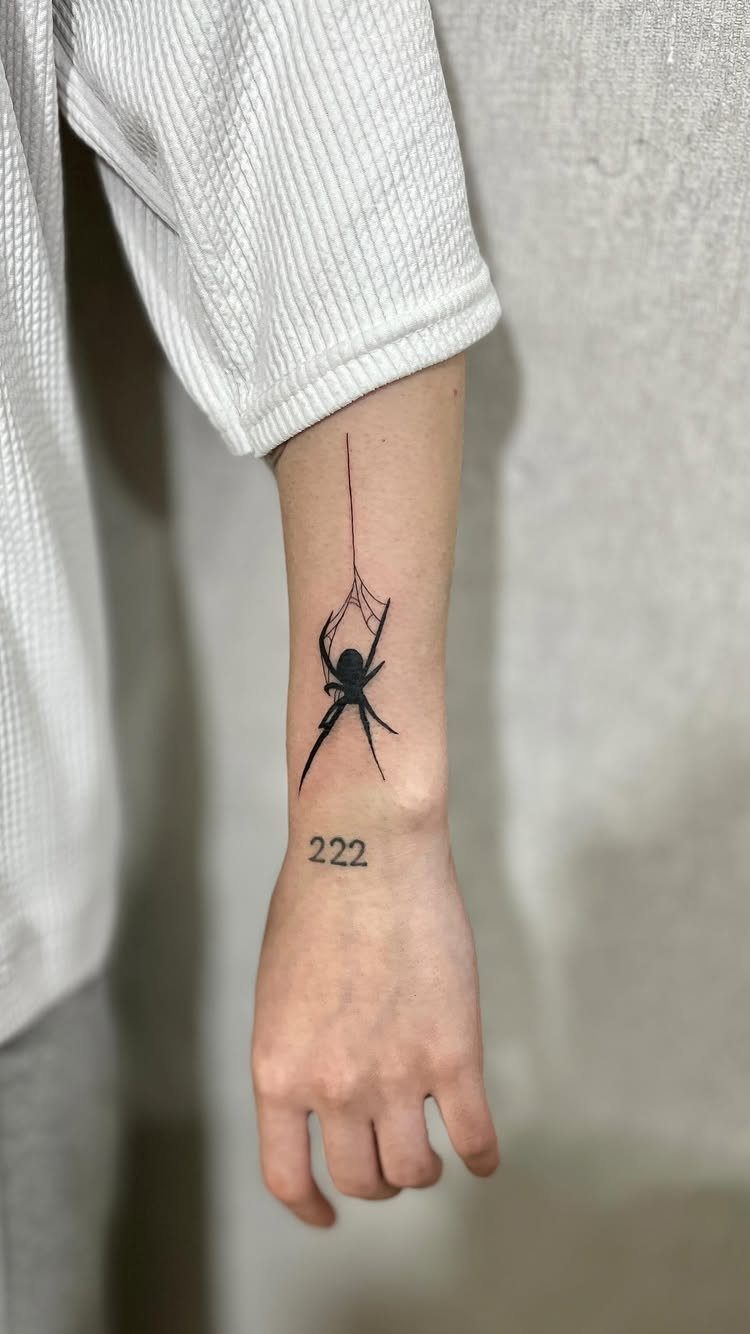
Spider tattoos carry two separate audiences. The web itself is optional; I have seen the spider alone read as more modern, the full web as more traditional.
Adding numbers beneath the spider shifts the meaning toward personal numerology rather than the spider’s own connotations of patience and entanglement.
Fine legs need a steady hand. Ask to see healed photos of the artist’s line work before committing; blown-out legs turn to smudges fast.
21. Small Lego Character Tattoo
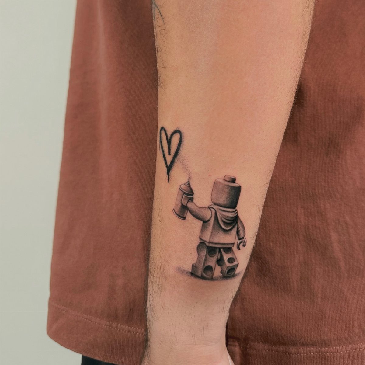
A Lego minifigure on skin works because the shape is already designed to read at small scale.
A Lego figure carrying a spray can and a heart turns a generic toy into a specific statement about the wearer’s work and what drives it. That is the move: pick the prop, not just the character.
A plain figure looks like a brand logo; a figure doing something looks like a memory.
Black and grey suits the molded-plastic reference better than color, which can tip toward cartoon. Keep the size small; the cylindrical limbs lose definition if blown up.
Forearm placement lets you see it yourself, which matters for a tattoo about personal meaning rather than display.
22. Small Ghost Tattoo
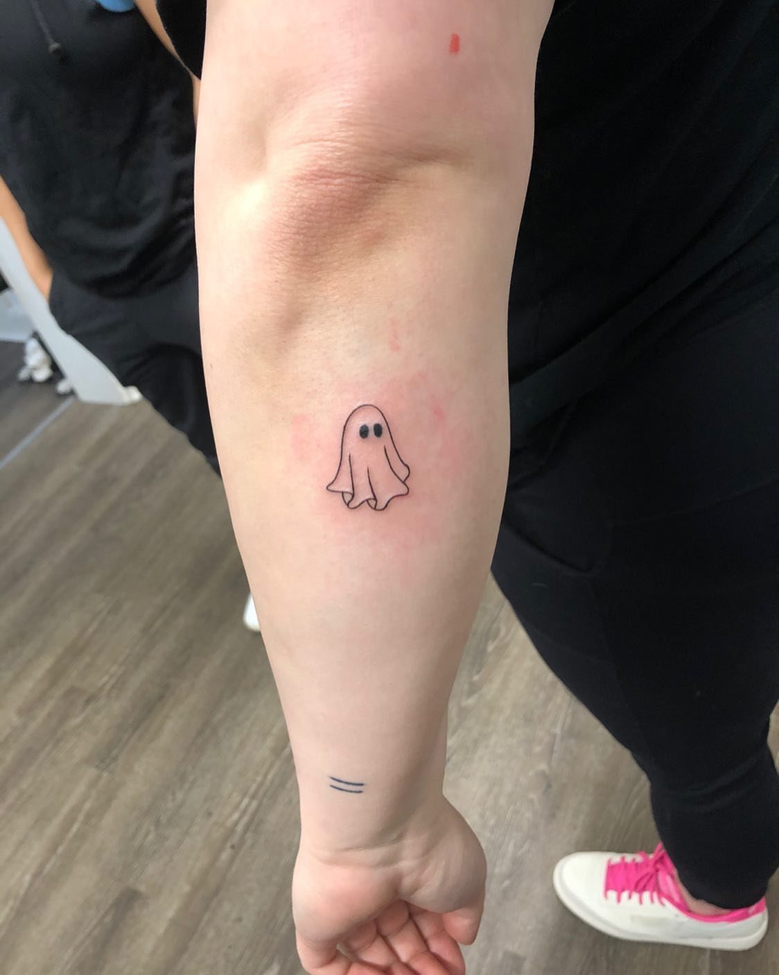
The sheet ghost is the easiest tattoo to get right and the hardest to make interesting. Two black eyes on a white blob is the baseline; what saves it is the posture.
Give the ghost a slight lean, almost curious, to keep it from looking like a clip art afterthought. I have seen versions with a single raised arm that changes the whole tone from spooky to friendly.
Outline-only heals cleaner on the inner forearm, where skin sees less sun and abrasion. A filled-in body goes grey faster in that spot.
This design suits someone testing whether they want more tattoos, or someone who wants a visible reminder that does not announce itself across a room.
23. Small Archer Forearm Tattoo
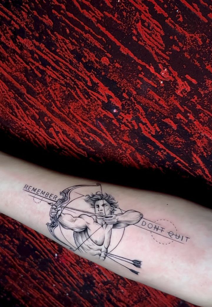
A drawn bow holds tension better than most symbols of ambition. The archer fits a forearm because the arm’s length mirrors the bow’s draw: the muscle flexes, the tattoo seems to pull.
Black and grey shading keeps the geometry crisp at small sizes; color would blur the arrow’s line against the flame.
The text around the circle is optional and easy to overfill. One word lands harder than three.
If you add lettering, space it wide; skin shifts and tightens, and crowded text blurs faster than you’d think.
This one suits someone mid-goal: the marathon, the degree, the career switch. Finished achievements usually get simpler marks.
24. Small Feather and Birds Tattoo
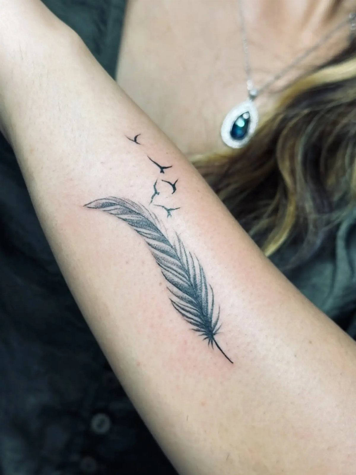
Feathers carry weight beyond their lightness. The single plume dissolving into birds reads as release, the body becoming flight, and the forearm’s inner surface frames the transformation where the skin stays relatively flat.
The bird species matters more than most people assume. An eagle feather carries a different register than a sparrow’s; some carry legal restrictions if they resemble protected species too closely.
A good artist will know which native birds are safe reference and which to avoid.
Black and grey holds the detail of barbs and vanes without the maintenance color demands. The fade from feather to flock needs a steady hand; the transition point is where cheap work shows first.
Budget for someone who specializes in fine line if you want the birds readable at distance.
25. Small Armband Tattoo
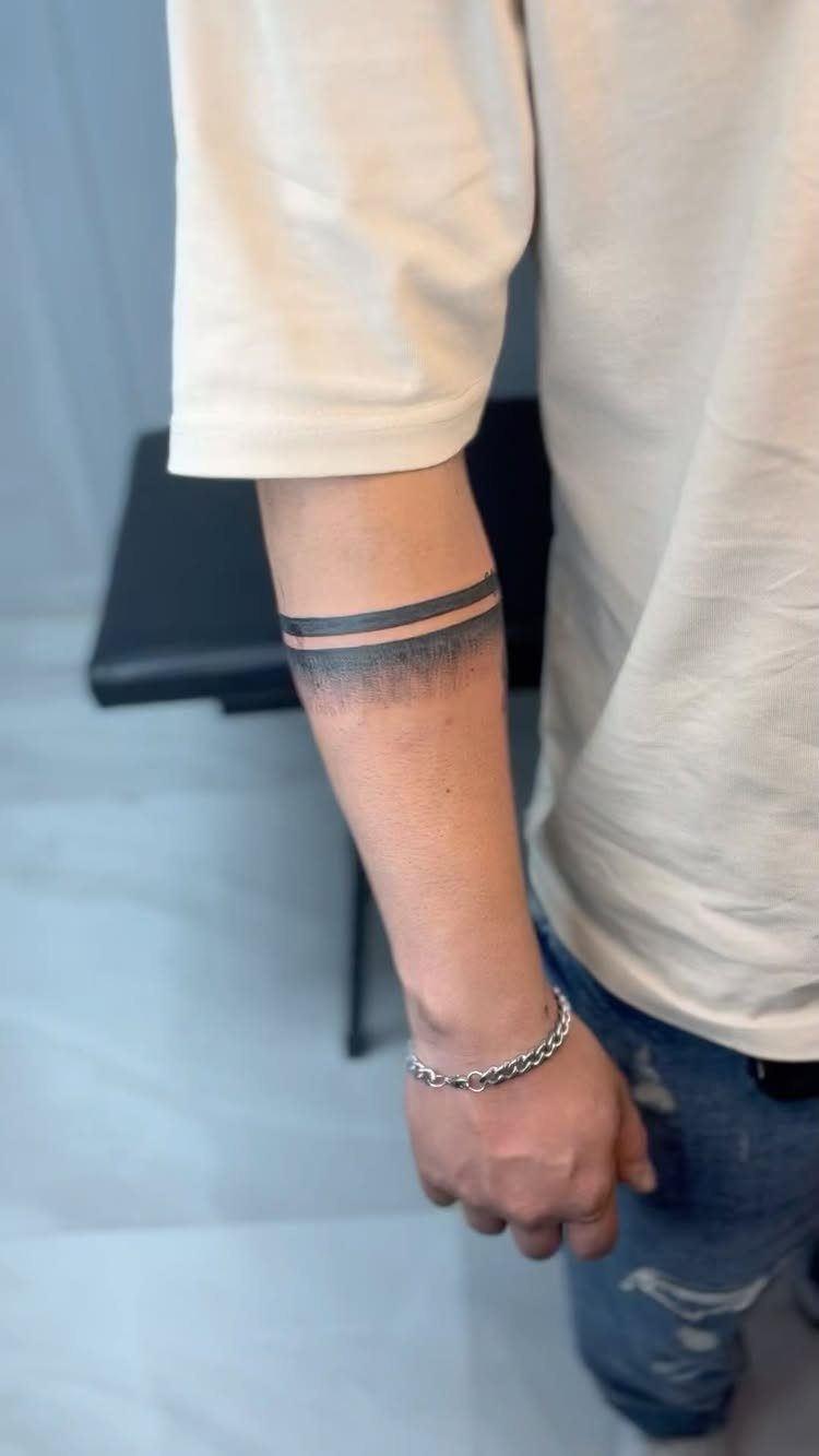
Two solid bands read as structure without story, which is exactly the point for men who want ink that does not start conversations.
The parallel lines sit clean on a forearm because the muscle’s curve gives them slight tension; perfectly straight bands would look mechanical and flat.
The faded gradient underneath softens what would otherwise read as a cuff or a shackle. That shadow takes skill; too heavy and it looks like a smudge, too light and it disappears into the black.
Ask to see healed photos, not fresh work. Fresh black always looks darker.
This style ages well because there is no fine detail to blur. It also limits future options: bands frame the arm and divide it, so plan whether you will add above or below before you commit to placement.
26. Small Flaming Eight-Ball Tattoo
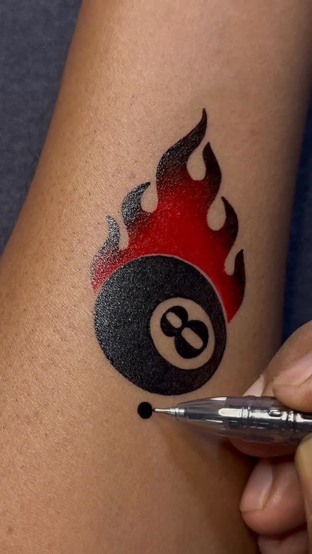
The eight-ball carries its own irony: a symbol of chance, now locked permanently into skin. Flames rising from it add motion to an otherwise static object, and the red against black keeps the palette restrained enough for professional settings.
Small size works here because the ball’s design is already simple: a circle, a number, a white circle inside.
The flames need the most attention; at this scale, each lick of fire takes multiple needle passes, and sloppy linework turns them into tongues of sausage. Find an artist comfortable with American traditional or neo-traditional flash.
A small flaming eight-ball reads younger than a compass or a family date. The same image later in life looks like a decision made young that survived longer than expected.
If you still want it then, you will still want it; just know the demographic.
27. Small Swallow Tattoo
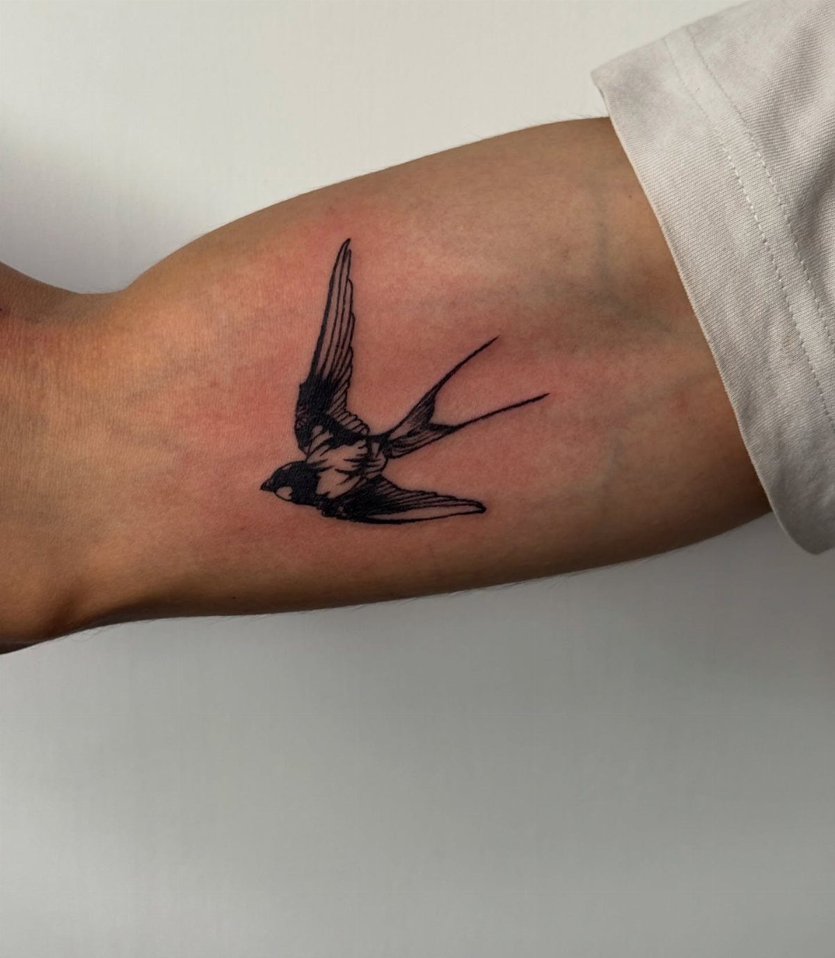
Sailors earned swallows for miles traveled: one for 5,000 nautical, a second for 10,000. The tradition outlived the reason, and now the bird carries open meaning: return, loyalty, the long way home.
Its small size suits a forearm because the swallow’s forked tail and pointed wings need length to read correctly; compressed onto a finger or behind an ear, it becomes a smear.
Black ink keeps the silhouette sharp. The bird in flight, wings angled, reads as movement; perched, it becomes a different symbol entirely, closer to captivity than freedom.
This one works for travelers who actually travel, not aspirational ones. The disconnect between inked miles and lived miles is visible to anyone who asks.
Choosing the Right Tattoo Style
Personal significance, style preference, and whether you might build around it later are the three filters worth applying before you settle on a design.
Popular styles that hold up on men’s forearms include Realism, American Traditional, Neo Traditional, Japanese Traditional, and Tribal.
Each reads differently: American Traditional carries its weight in bold outlines and limited color, while Neo Traditional flows with the body’s shape in a way that shows off muscle structure.
Tribal work follows the muscle with heavy black ink, a choice that demands confidence since removal or cover-up gets complicated.
I’d start with the style that matches your existing taste in art or clothing; a mismatch there shows up every morning in the mirror.
Placement Considerations
Skin texture and shape in this area hold detail well over time, and the pain level sits lower than most placements, which matters when you’re still learning how your body reacts to the needle.
Small forearm pieces work alone or as anchors for larger work later; a bit of script or a simple symbol here can stand on its own or get drawn into a more complicated design as the collection grows.
Tattoo Design Tips
A design that follows the body’s natural lines looks like it belongs there rather than sitting on top.
The muscles and tendons connect in an S-shape through the arm, and placing elements along those flow lines helps the tattoo move with you.
Tense your forearm and you’ll see the diagonal wrap across the top; that line is where a snake, a wind bar, or a dagger wants to travel.
Linework suits smaller areas precisely because it does not overthink the space; a clean line or simple shape on wrist, hand, or forearm shows what you want shown without demanding the whole canvas. Overcrowding kills the effect.
One or two elements with room to breathe always outlast a crowded field.
Pain Level and Care
Forearm placement ranks among the less painful spots for tattooing, which is why artists send first-timers here.
The flat surface and moderate nerve density keep the session manageable, though pain varies by person and by how close the needle works to the wrist or the inner elbow. Aftercare determines how the detail holds.
The skin texture here ages ink well, but only if you keep it clean, moisturized, and out of sun during healing. Scabbing pulls pigment out; picking at it leaves gaps that show up for years.
I’d plan the timing so you can wear loose sleeves at first, especially if your work demands long sleeves that rub.
Frequently Asked Questions
What tattoo style looks best on a male forearm?
Minimalist, geometric, and traditional styles all hold up well on the forearm. The skin there is flat and stable, so linework stays crisp and detail holds over time.
I would add that the forearm’s length suits horizontal designs like scripts, snakes, and daggers, while the width can handle mandalas or stacked elements without feeling cramped.
How small is a $100 tattoo?
A $100 tattoo usually covers something palm-sized or smaller, depending on the shop’s hourly rate and how detailed the design gets.
Tattoo rates vary too widely by city and artist for a useful rule; your best move is to ask shops in your area what their minimum runs and how much time that buys.
What are the tattoo trends for men in 2026?
Small, meaningful tattoos and minimalist designs continue to dominate. Single-needle elephants, fine-line suns, and geometric pieces with clean linework are showing up most right now.
I would note that the trend is less about the symbol itself and more about restraint, letting one or two elements carry the whole design.