These fourteen verses and three decision guides move from short anchors to fuller lines, and the right length depends on how much of the text you need on your skin versus how much you already carry.
A private reminder tends toward shorter phrases tucked out of sight; marking a season or a relationship for others to recognize usually means fuller lines in visible ink.
The cross formation for Philippians 4:13, with "I can do" and "Me" anchoring the vertical and "ALL things through Christ which STRENGTHENS" filling the horizontal, shows how layout can solve what a straight line of text cannot.
1. Be Still and Know
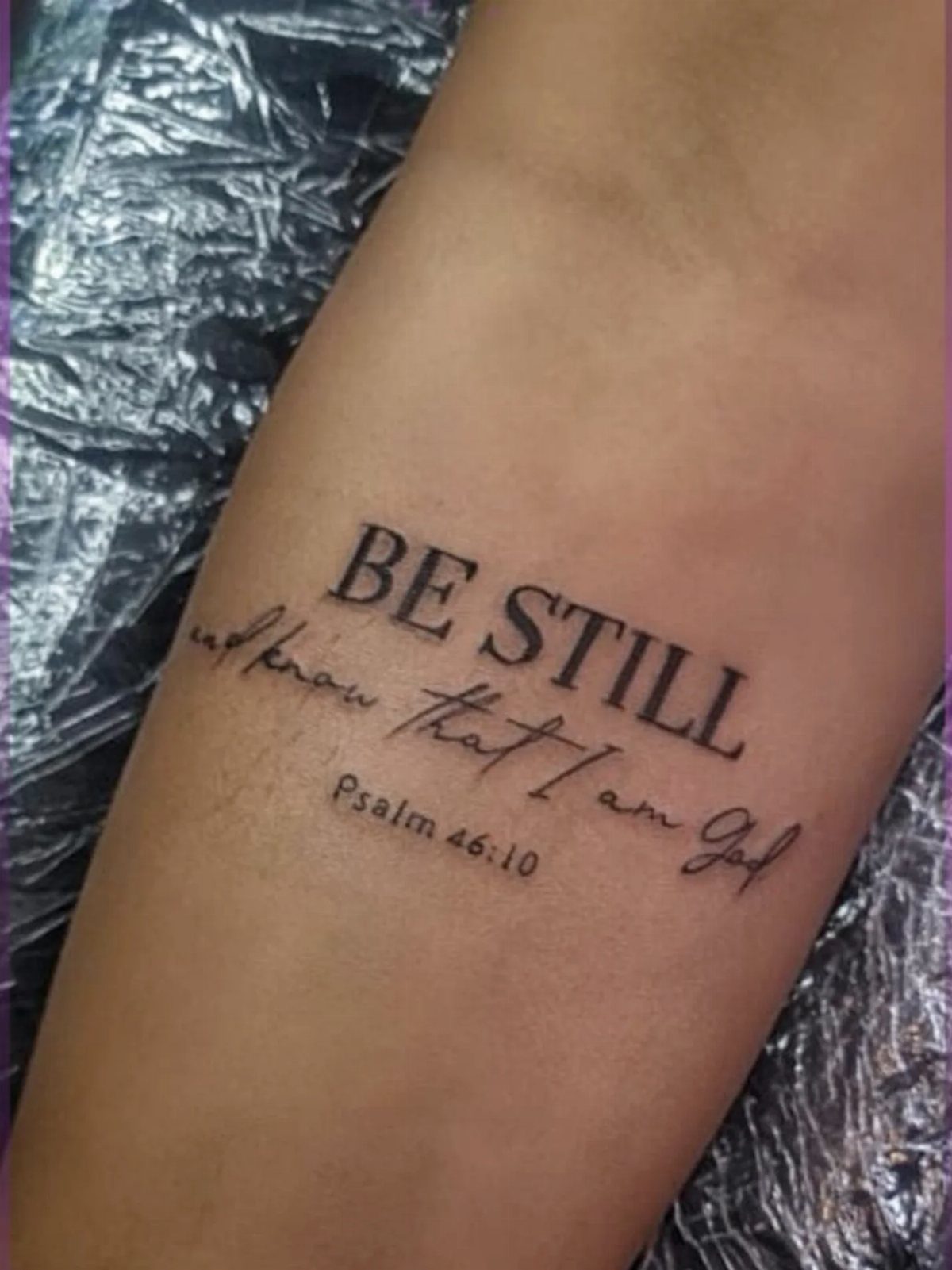
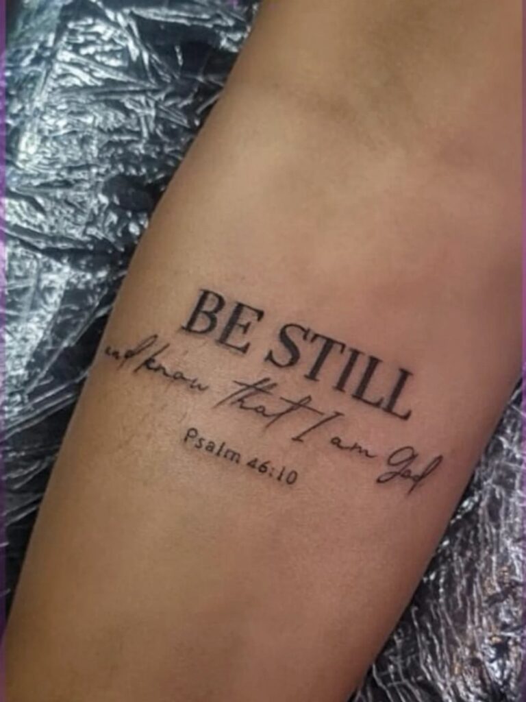
Psalm 46:10 works best in a spot you glance at during stress, which is why wrists and forearms carry so many.
The phrase splits neatly: "BE STILL" in a heavier serif, "and know that I am God" flowing lighter beneath, with the reference tucked small at the bottom. That two-weight layout keeps the words readable at arm’s length without shouting.
A wrist placement means the text runs narrow; keep the lines short or the letters pinch together. Forearm gives you more room to let "BE STILL" breathe.
Either way, the verse suits someone who wants the reminder more for themselves than for display.
2. She Is Clothed with Strength
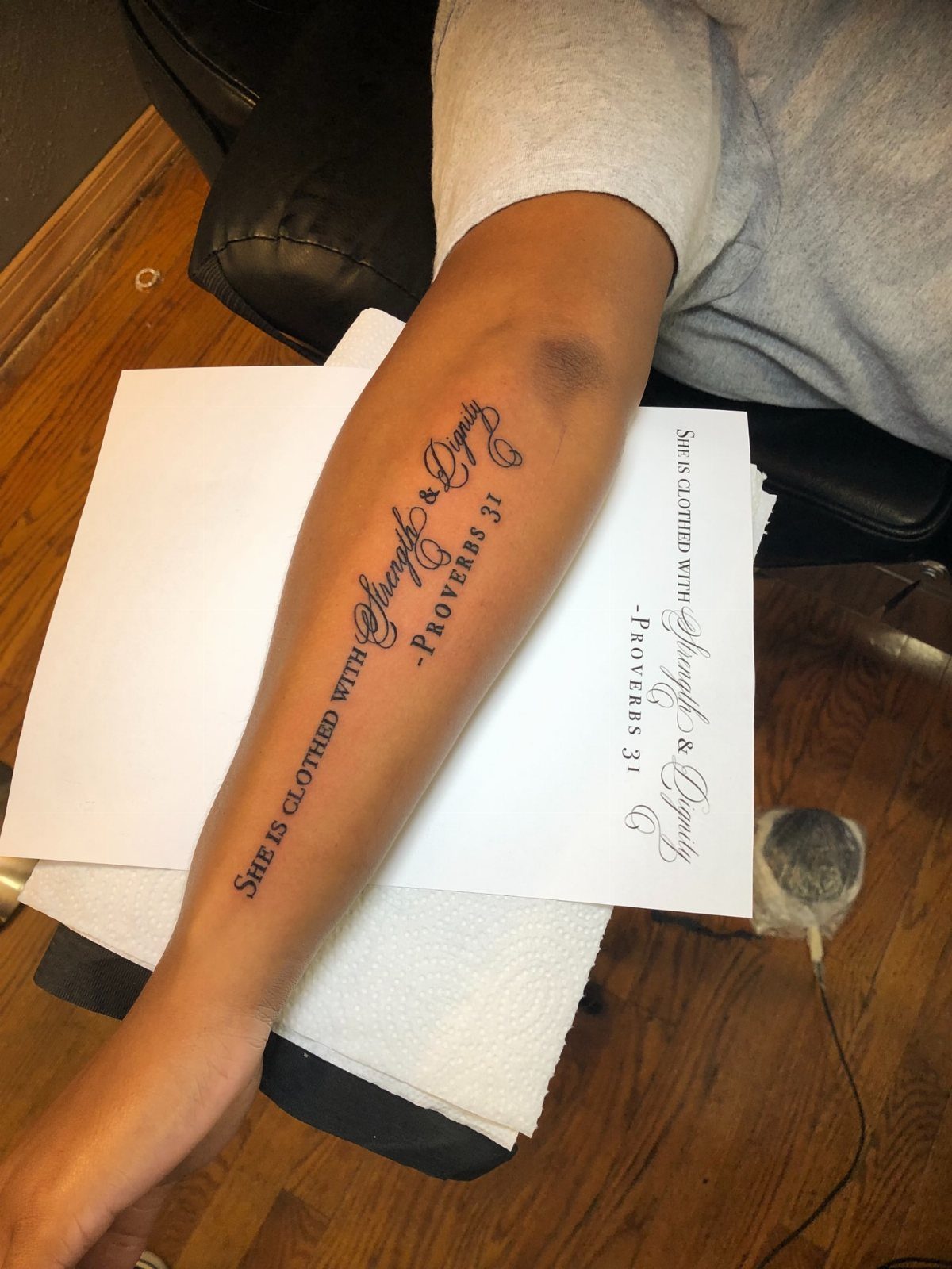
Proverbs 31:25 lands differently when you keep the full clause, "strength and dignity," against versions that drop half. An ampersand saves horizontal space and reads cleaner than spelling it out, especially on a forearm where the line runs with the muscle.
This one draws women who want the verse as self-description rather than aspiration. The dignity half matters as much as strength; skipping it turns the tattoo into a generic empowerment quote.
A paper template beneath the arm shows the sizing step, and I’d hold out for that: too large, and the words wrap awkwardly around the forearm curve.
3. Plans to Prosper You
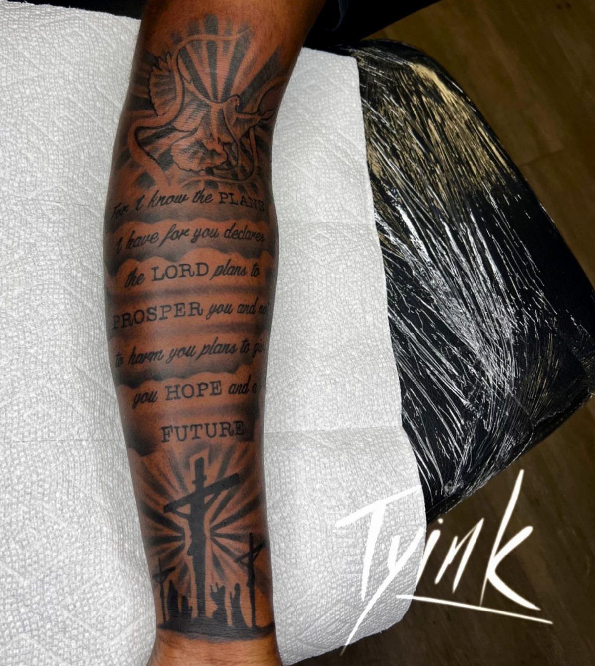
Jeremiah 29:11 handles scale better than most verses because the key words, "PLANS," "PROSPER," "HOPE," "FUTURE," punch in caps while the connecting text stays small.
The verse alone on a forearm carries the same weight if you let the caps do the work.
The optimistic read of this verse gets debated in fuller context, but the tattoo lives on skin, not in seminary. Someone walking through a hard season often picks it as forward promise rather than prosperity doctrine.
Cloud filler around the text softens the edges if you have room.
4. I Can Do All Things
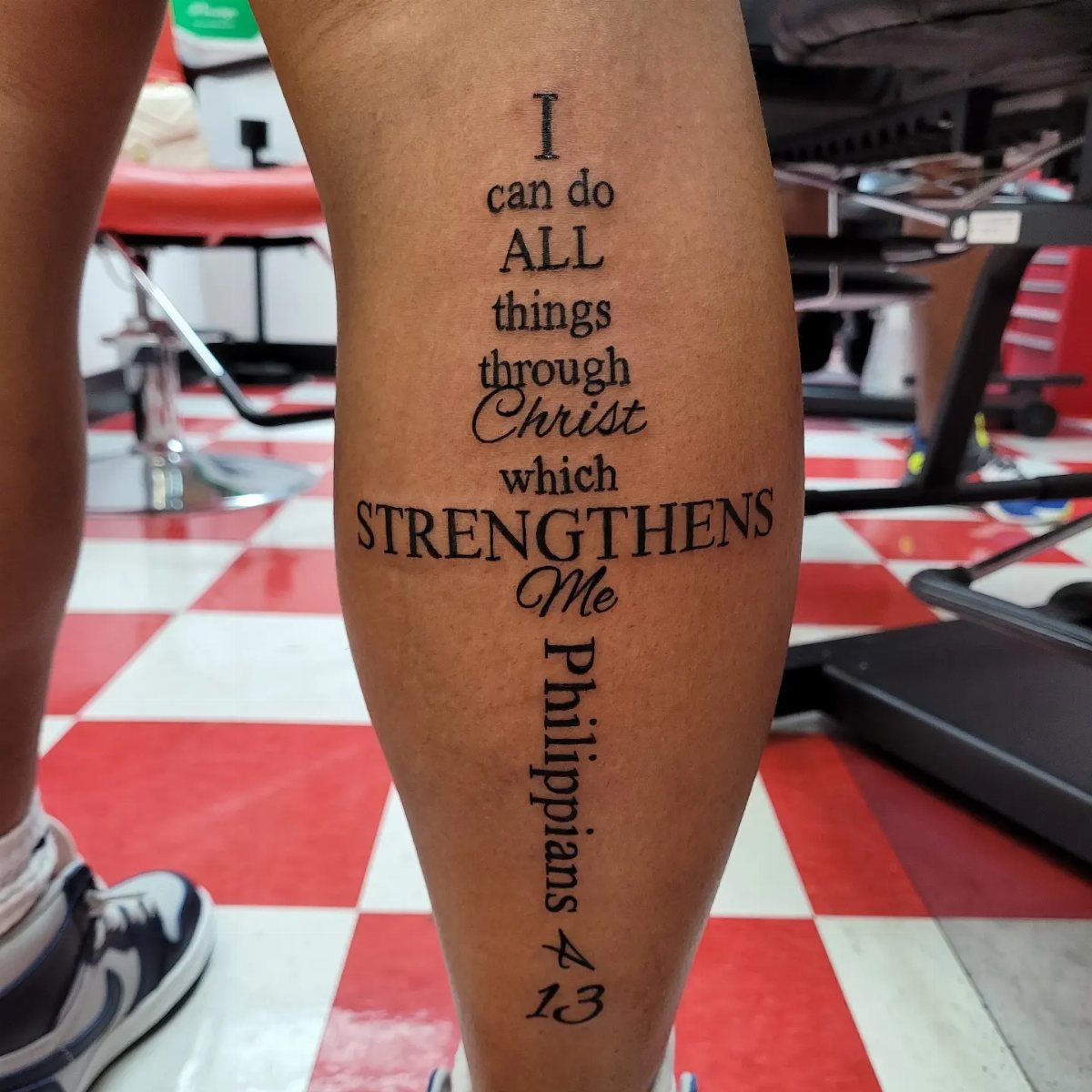
Philippians 4:13 arranges into shapes more naturally than most verses, and the cross formation solves the length problem: "I can do" and "Me" anchor the vertical, "ALL things through Christ which STRENGTHENS" fills the horizontal.
The result reads as symbol first, text second, which suits a calf or back placement where pure script would look crowded.
The leg location means the cross sits upright when standing, sideways when seated. Forearm or wrist keeps the text flat and readable; the cross shape asks for a broader canvas.
Pick the shaped version if you want the reference recognized from across a room, straight script if the words matter more than the form.
5. Trust in the Lord
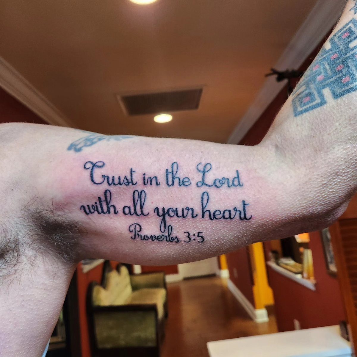
Proverbs 3:5 fits the inner bicep because the curve there cradles a single line of cursive rather than fighting it.
A script font flows without breaks, which means your artist needs steady spacing; too tight, and "with all your heart" blurs together at healing distance.
The full verse continues with "and lean not on your own understanding," but most tattoos stop at the first clause. Including the second half doubles the line count and turns a quiet reminder into a lecture.
Someone who wants the comfort without the correction often chooses this partial version. The inner arm keeps it personal; you show it when you want, cover it when you do not.
6. Love Never Fails
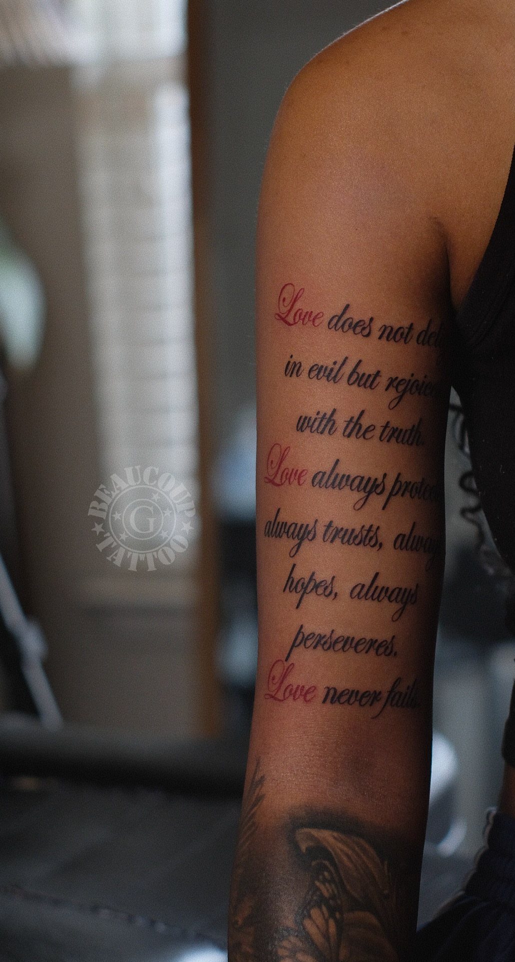
1 Corinthians 13:8 appears most often as part of the longer passage, but isolating "Love never fails" in red ink gives the phrase its own gravity.
The color choice matters here: black for the surrounding verses, red for the anchor line, or red alone if you want the words to read as blood and covenant rather than decoration.
The upper arm placement sits where a sleeveless shirt shows it, a buttoned shirt hides it. Someone marking an anniversary or a recovered relationship often picks this verse, and the red carries that specific weight better than default black.
The full 1 Corinthians passage runs long for most arms; the three-word version says enough if you mean it.
7. Your Word Is a Lamp
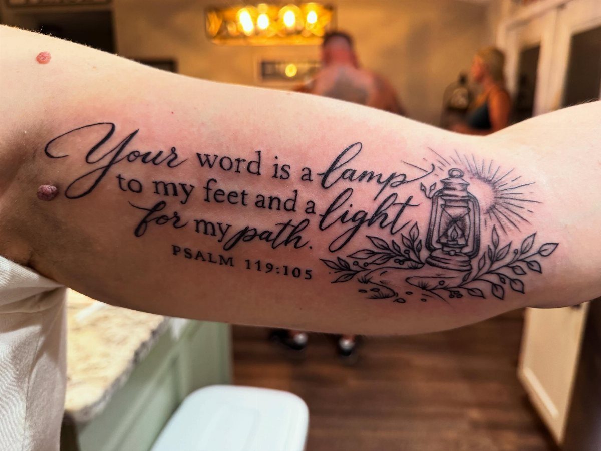
Psalm 119:105 works best when you treat the lantern as the main event and the verse as its caption, not the other way around.
Keeping the text to two lines lets the illustrated lamp take the eye first; a full psalm paragraph across a forearm reads like a page, not a piece.
The verse itself is about direction, so placement on a limb you move through space with, forearm or calf, makes more sense than somewhere hidden. Black ink keeps the lantern’s glass panels readable; color would fight the lettering for attention.
This one suits someone who wants the meaning present but not preaching. Length is the real limit here: even abbreviated, the verse needs space, so a wrist or behind-the-ear placement won’t hold it.
8. Isaiah 60:22 Verse Tattoo
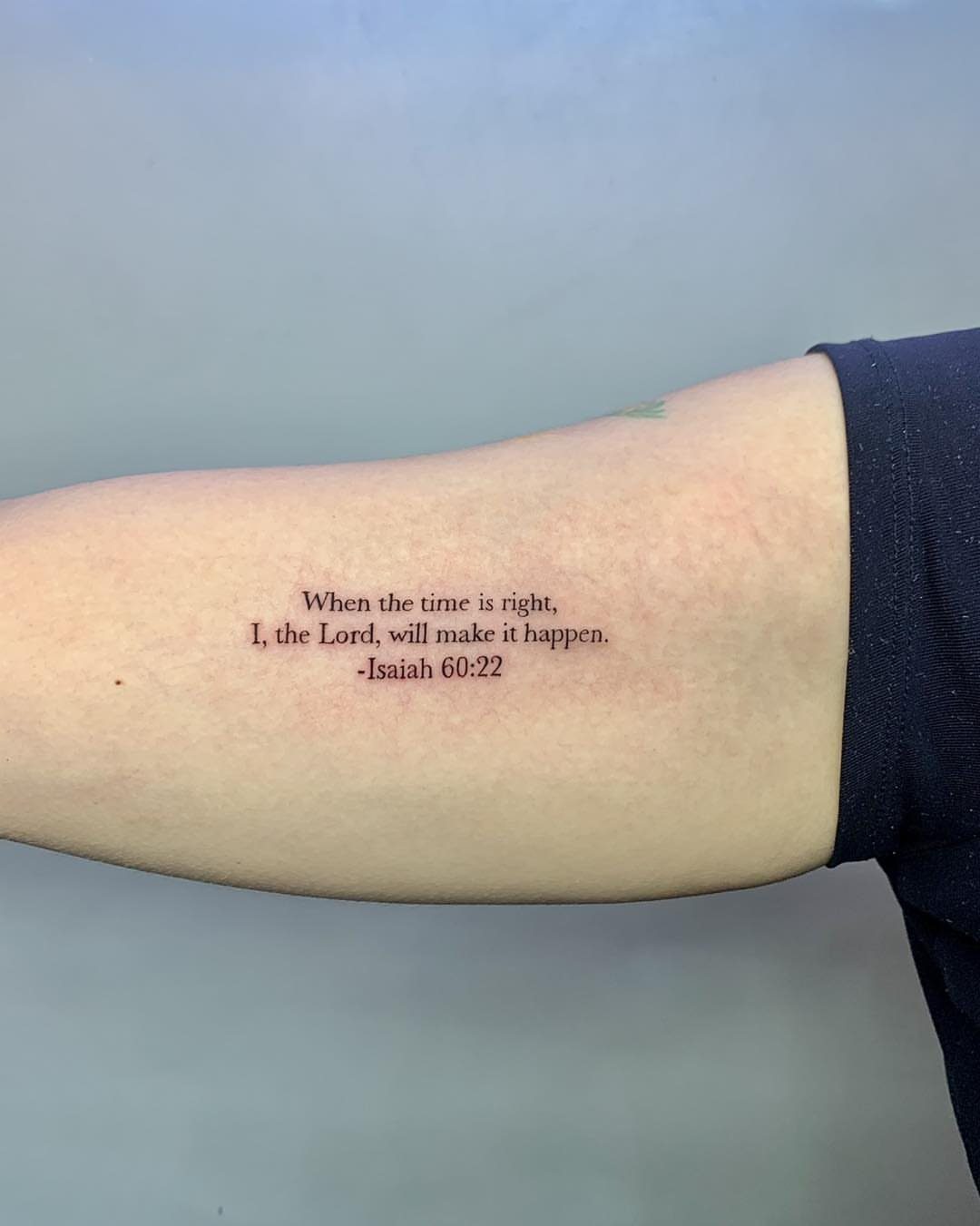
Small text on the inner forearm keeps the full quote readable without dominating. Isaiah 60:22 speaks to waiting and timing, so the placement matters: you see it when the arm turns upward, a private reminder rather than a billboard.
A clean serif or simple script works best at this size. The citation can sit below the quote or run smaller to the side, though stacking them vertically risks crowding on narrower wrists.
I’d ask the artist to proof the spacing at actual size before the needle touches skin; what reads on paper often tightens on the body.
9. Mark 10:9 Couple Wrist Tattoos
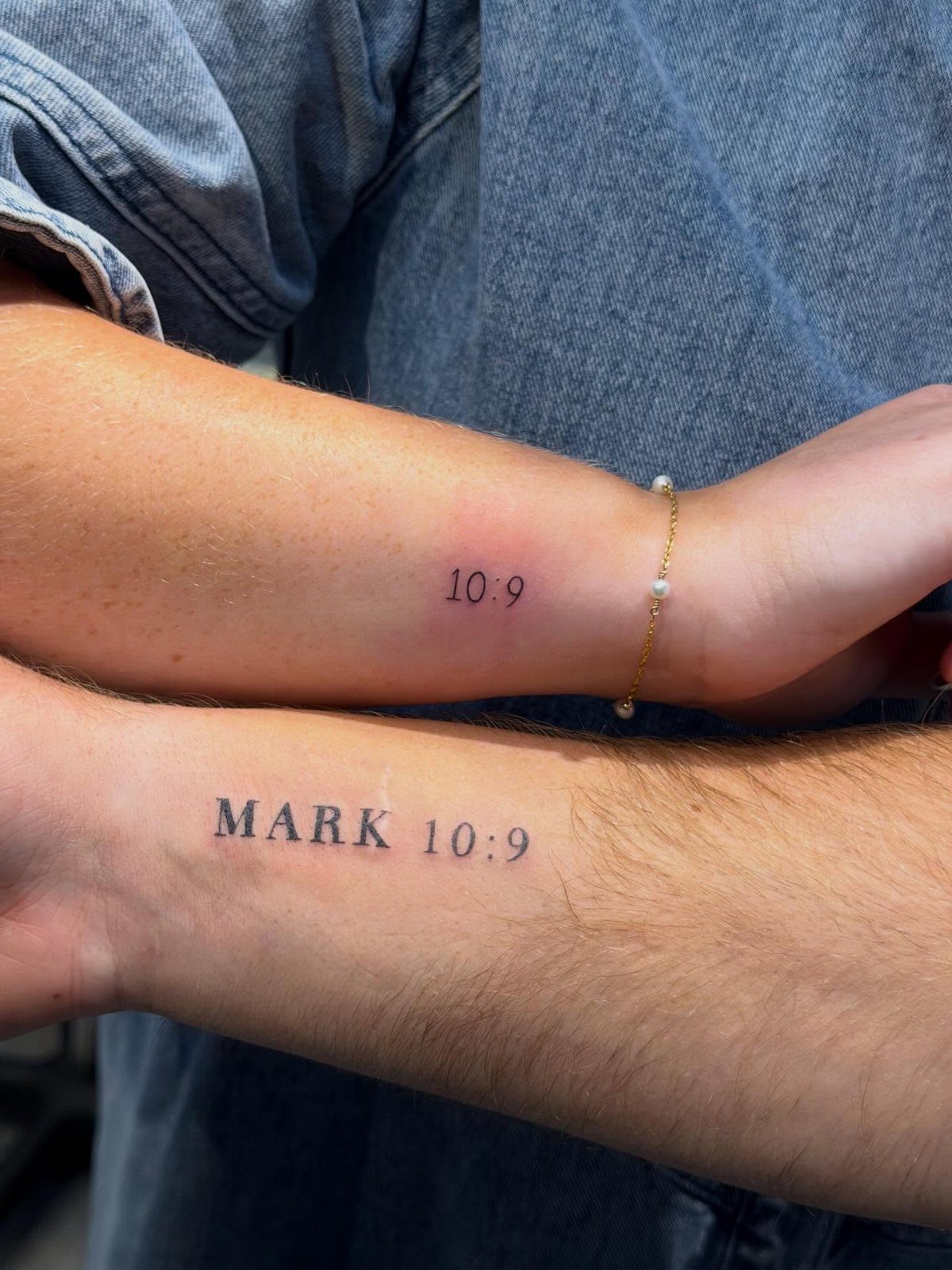
Matching tattoos live or die on the split. One of you carries the chapter and verse, the other just the numbers, and neither piece means the full thing alone.
That interdependence is the point, but it also means planning for a future where the pairing might not always be visible side by side.
The wrist heals fast and shows easily, which helps for daily meaning and hurts for daily visibility. A thin line weight keeps the numerals crisp; bold ink here blurs faster on a spot that bends and sees sun.
I’d skip decorative flourishes entirely. The text is the design.
10. Matthew 6:33 Script Tattoo
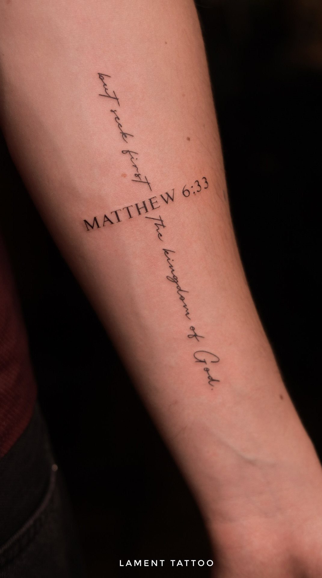
The cross-shaped layout turns the reference into structure, with "MATTHEW 6:33" as the horizontal bar and the verse running vertical. That choice costs you some readability: the eye has to reorient, and the cursive script demands enough size to stay legible.
A larger serif for the citation anchors the piece against the flowing script below. The vertical text needs careful kerning; letters like k and g in "kingdom" can tangle if the artist rushes.
A black background behind the cross shape pushes the negative space forward and frames the words like a window.
I’d only go this complex on a forearm with real estate to spare; compressing the cross to fit a smaller spot loses the effect.
11. Isaiah 43:2 Dove Tattoo
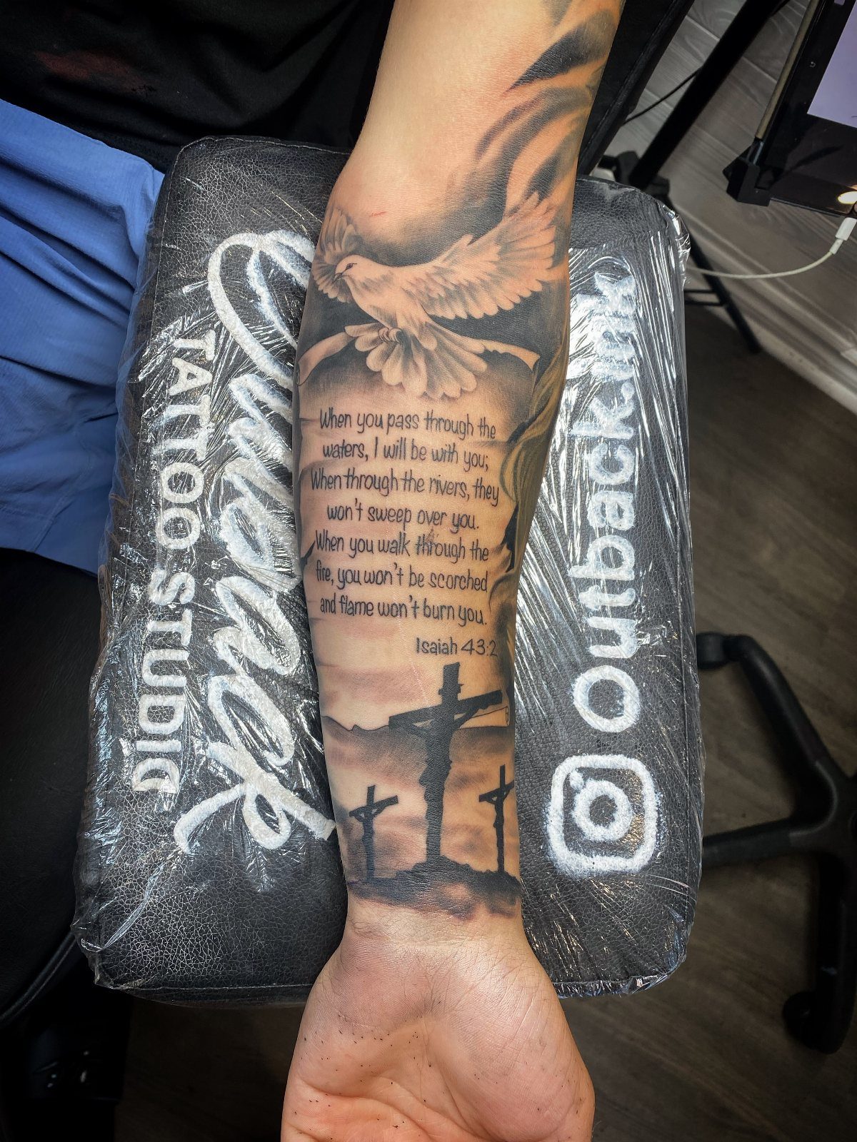
Three elements compete for attention here: the dove, the three crosses, and a long passage of text. The artist solved it by letting the bird and hill carry the imagery while the verse settles into readable lines below.
That much text needs width; the inner forearm gives you a flat canvas where small lettering won’t distort as much as on a bicep or calf.
A dove in flight reads differently from one at rest. The upward angle pairs with Isaiah 43:2’s language of passing through water and fire without being consumed; the bird rises above the crosses rather than descending toward them.
I’d check that the three crosses scan as Calvary and not accidental repetition, which means getting the middle one slightly elevated or scaled.
12. Ephesians 1:7 Scripture Tattoo
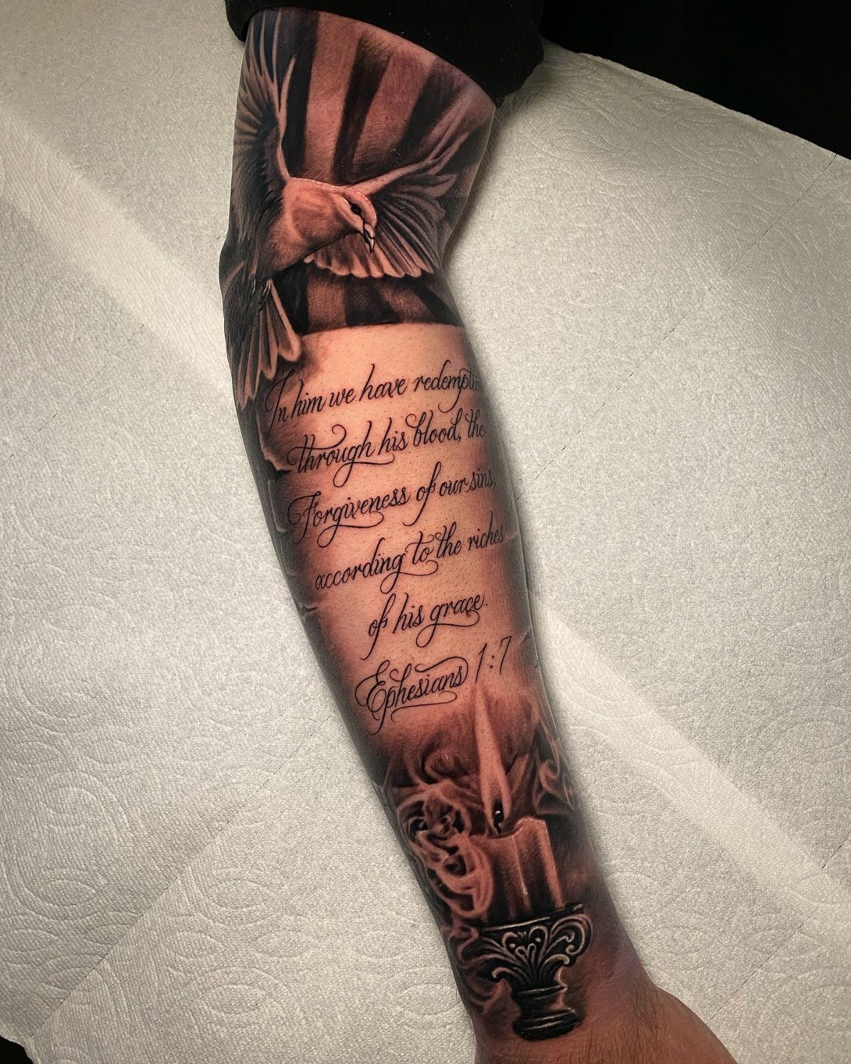
Ephesians 1:7 centers on redemption and forgiveness, and the imagery here follows that logic: the dove rises through light, the candle burns below.
It’s a vertical composition that gains height from the stacked elements, so the forearm works better than a horizontal placement like the upper arm.
Realism in the bird and candle demands an artist comfortable with grey wash; flat black would kill the sunbeam effect.
The script sits between them as the connective tissue, and at this size it needs to be readable without pulling focus.
I’d budget for multiple sessions if the candle’s flame detail matters to you; that smooth gradient from yellow core to grey smoke separates competent work from memorable pieces.
13. Luke 15 Parable Lamb Tattoo
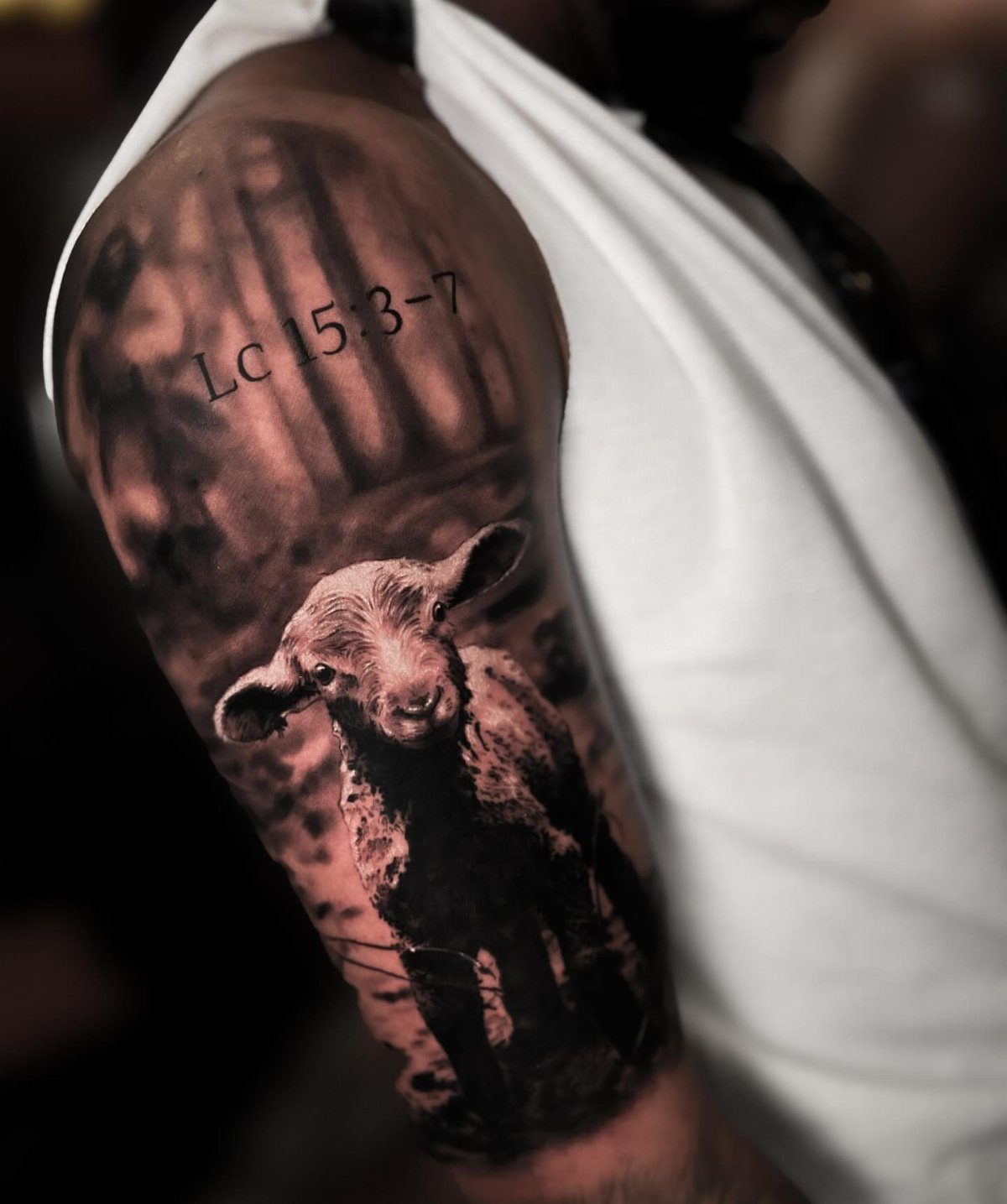
The lamb in shadowed forest is a specific choice from Luke 15, the lost sheep parable, and the reference "Lc 15:3-7" sits above rather than integrated into the scene.
That separation keeps the image from becoming illustration for the text; they coexist.
Realism at this scale on the upper arm allows depth in the trees and wool texture, but it also commits you to a larger piece than a simple verse.
The shadow work matters more than the lamb itself; without enough contrast, the animal disappears into the background. I’d consider whether the forest setting speaks to your own experience or if open pasture fits the parable’s original hills better.
Either works, but the forest reads more modern and slightly darker in tone.
14. Romans 8 Geometric Tattoo
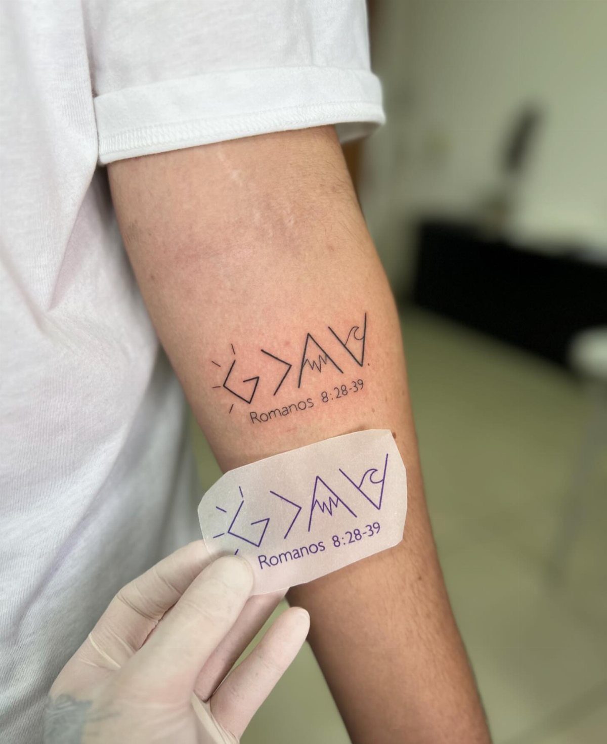
Roman numerals or straight digits both work for the chapter reference, but the geometric framing around this piece does the heavy lifting of making scripture feel architectural rather than decorative.
A fine-line artist who builds tattoos from rulers and compasses will lay the geometry first, then fit the text to the negative space.
This one suits someone whose faith has structure, who wants the reference visible to fellow believers without shouting the full text to strangers. Legibility at a distance matters; a passerby sees the shape before the words.
Choosing the Right Verse
A verse that felt urgent during a crisis often reads differently once the season passes.
I’d test the words for at least a year before committing: carry them on a note in your wallet, set them as a phone wallpaper, see if they still speak or if they flatten into decoration.
Translation matters more than people expect. The same verse in ESV, NIV, and KJV can shift in rhythm and emphasis, and your eye will live with one version for decades.
I’d read the passage in two or three translations side by side, then pick the phrasing that sounds like your own voice rather than the one you were assigned in childhood.
Placement Considerations
The forearm and wrist dominate for a reason: you read your own tattoo dozens of times a day, and those spots sit in your natural sightline. But visibility cuts both ways.
A wrist piece shows in every job interview, every family gathering, every photograph. I’d place a verse I need to see on the inner forearm, where a glance down catches it but a long sleeve erases it for the room.
The chest carries weight for longer passages because the skin there stays relatively flat and the muscle beneath gives the text a steady plane.
Ribs and sides distort more with breath and movement; script there needs simpler letterforms to stay legible.
Behind the ear and along the collarbone have become popular for single lines, though the small canvas means severe limits on word count and the curve of bone can warp thin lettering over time.
Design Personalization
A cross behind or beneath the text reads as shorthand, but I’d rather see the symbol integrated than stamped on.
The ampersand in "strength & dignity" can be drawn from a specific historical typeface, a small design choice that personalizes without adding clutter.
A dove, an anchor, a fish: each symbol has centuries of use, and I’d choose one that connects to the verse’s context rather than grabbing the first religious icon that comes to mind.
Your artist’s portfolio shows whether they handle fine detail in skin; religious lettering demands steadier line work than bold tribal work prepares them for.
Cultural Significance
Early Christian pilgrims sometimes received tattoos at holy sites, marks of completed journeys rather than fashion. That history sits far from the modern studio, but the impulse connects: skin as record of something that happened to the soul.
What reads as testimony to the wearer often reads as provocation to the room. A visible verse invites question, assumption, sometimes challenge.
I’d decide beforehand whether I’m open to conversation or whether the tattoo serves a private need that happens to be worn outward.
Religious tattooing has grown more accepted in professional and social settings over the past few decades, but Bible verses carry extra weight. They announce not just belief but the priority of that belief among all the others a person holds.
I’d make sure the verse I chose ranks where I’m placing it.
Fun fact: If you were wondering, the most used Bible verse reference for tattoos that Christians have permanently marked on their skin is Leviticus 19:28, which loosely says that you should not harm yourself or permanently mark your skin.
Frequently Asked Questions
Is it okay to tattoo a Bible verse?
Many people treat Bible verse tattoos as a personal expression of faith rather than a doctrinal statement.
Jeremiah 29:11, "For I know the plans I have for you," tends to find its way onto skin during rough stretches, read as a held breath rather than a promise of ease.
Should I get a Bible verse tattoo in color or black ink?
Black ink keeps illustrated elements like the lantern in Psalm 119:105 readable and lets the lettering stay clear. For 1 Corinthians 13:8, where "love never fails," red ink shifts the tone toward sacrifice and binding promise, away from simple ornament.
Most verse tattoos stay black for longevity and simplicity, with color saved for a single accent line that carries deliberate meaning.