The 23 ideas below run from a single black stick figure that takes twenty minutes to full sleeves of color realism needing six sessions or more.
What decides which one belongs on your skin is whether you want the reference to read instantly to strangers or stay private until you explain it.
The teal static around Samara’s television screen and the acid-green blood on a Xenomorph head are the kind of specific color choices that separate a film tattoo from generic monster art.
1. Silence of the Lambs
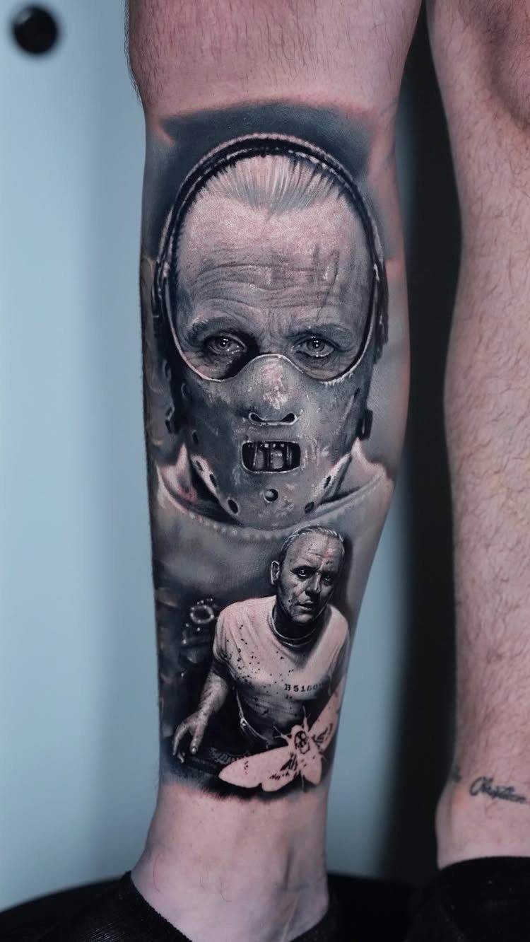
Hannibal Lecter’s restraint mask, prison jumpsuit, and that death’s-head moth give three distinct scenes to work with, which helps if you want a larger piece that reads from top to bottom.
The mask works strongest as the focal point; the moth sits well below it or off to the side as a quieter counterweight. Black-and-grey realism handles the skin texture and metal reflections better than color would.
I’d put this on a calf or outer thigh where the vertical space lets the prison scene breathe underneath.
The moth’s skull pattern needs an artist steady enough to keep the symmetry tight; ask to see healed photos of similar insect work before you book.
2. Halloween
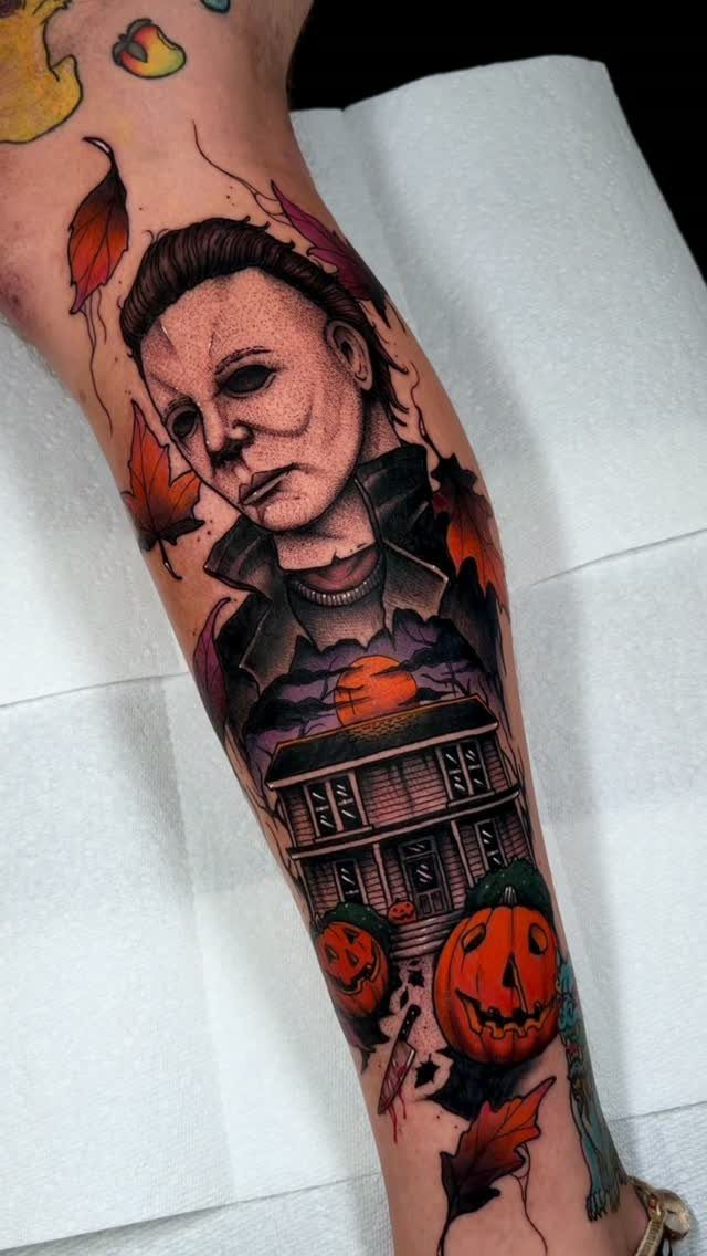
Michael Myers rewards the collector who already has horror pieces and wants something that reads autumnal from a distance.
The mask in flat white against orange leaves and black house siding gives you that seasonal cover if sleeve space is running low.
What changes the outcome is how much blood the artist builds into the knife and background; too much red tips it into slasher camp, while mostly blacks and burnt oranges keeps it closer to Carpenter’s original restraint.
A torn-paper edge or newsprint background behind the portrait gives the tattoo the feel of a ripped movie poster. Check whether your artist prefers to stencil the house in one pass or build it in layers across multiple sessions.
3. Beetlejuice
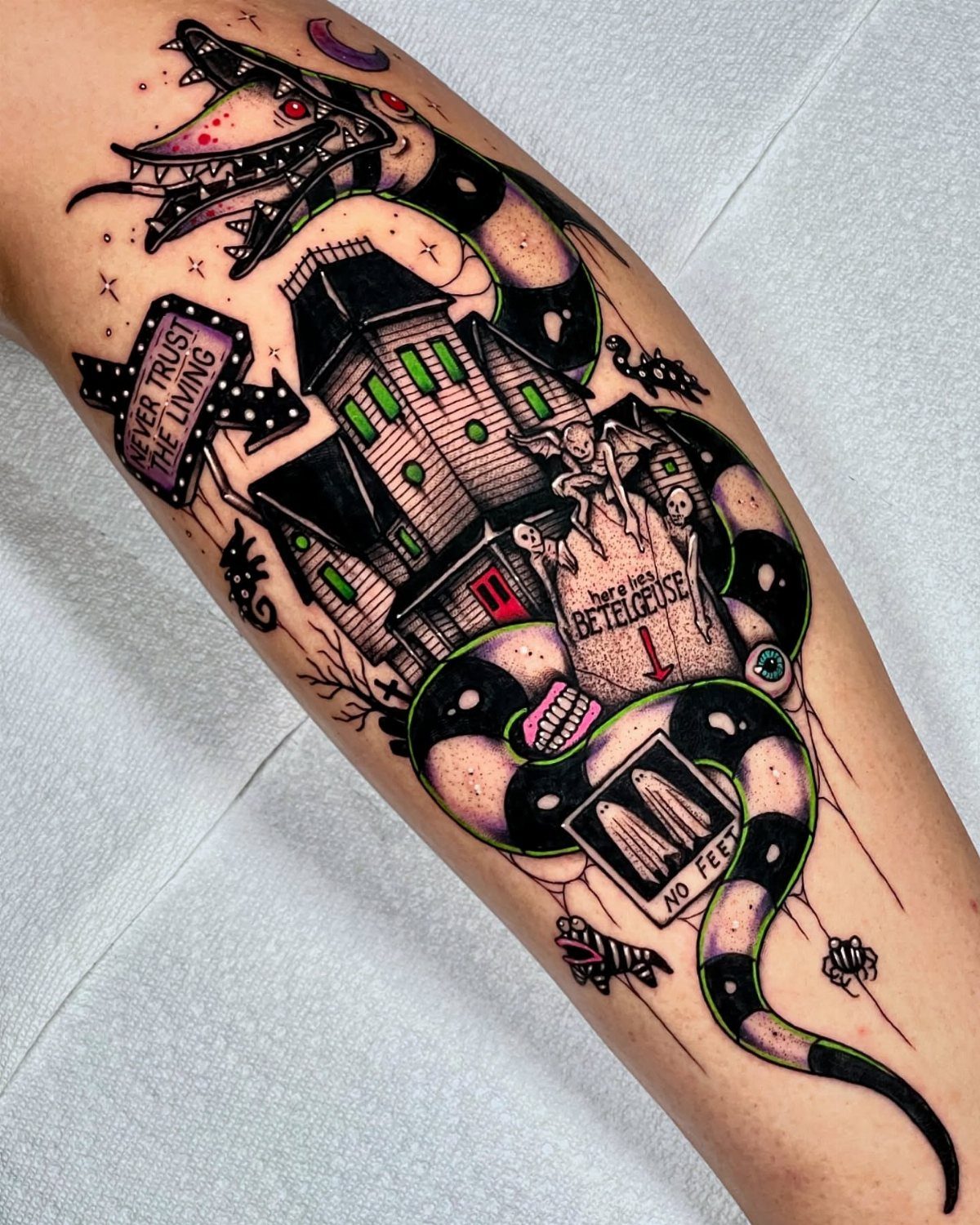
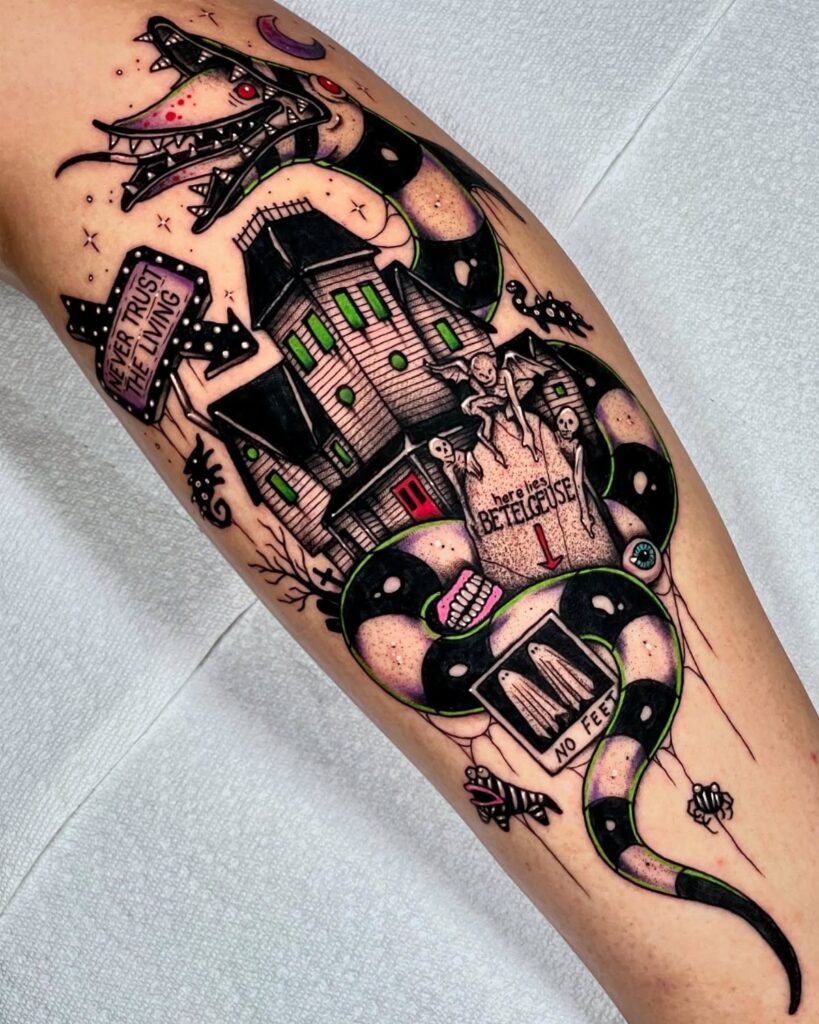
Beetlejuice tattoos work best when they pile on detail; restraint misses the spirit of the thing. The sandworm, tombstone, house, and two signs all need an artist who can keep each one readable once they sit on skin.
"Never Trust the Living" in a banner or plaque shape frames nicely above or below the main scene; "No Feet" works smaller, tucked in as a gag for the viewer who leans close.
Color here is almost mandatory: the snake’s stripes, the house’s green glow, the pumpkin-orange sky. The tombstone spelling "BETELGEUSE" with the extra letters is the detail fans will catch, so get that lettering exact.
For placement, a thigh or upper arm gives the sandworm room to coil without compressing the house underneath it.
4. Jaws
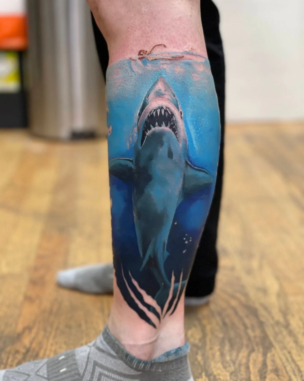
The Jaws poster image translates to skin almost too naturally: the swimmer’s silhouette at surface level, the blue water column, the shark rising from below.
What makes or breaks it is the value shift between deep water and sunlit surface; the tattoo needs that contrast or the shark disappears into a single blue mass.
Angling the shark upward with an open mouth reads more aggressive than the classic straight-ahead poster pose. Either works, but the upward angle fits better on a calf or forearm where the limb’s natural line echoes the ascent.
Ask your artist how they handle the water texture; dotwork or whip shading both work, and the wrong choice turns the ocean into static.
5. Frankenstein
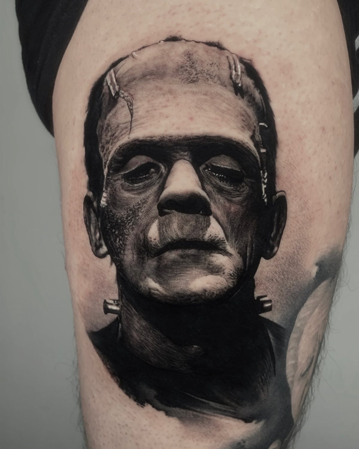
Karloff’s flat-top head and neck bolts are the visual shorthand, but the heavy-lidded eyes and sunken cheeks are what separate a good portrait from a Halloween costume.
Stippled or textured shading on the skin heals better and stays readable longer than smooth gradients.
Elsa Lanchester’s eight minutes on screen in the Bride of Frankenstein are probably some of the most iconic in all film.
— BuzzFeed
6. The Texas Chainsaw Massacre
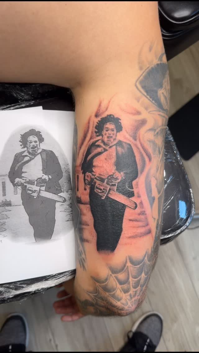
Leatherface in motion, chainsaw running, flame patterns behind him: this is a tattoo that needs space and an artist who can keep the saw teeth distinct at size.
A spiderweb below the main image is a traditional touch that helps anchor a piece that might otherwise feel like a floating portrait.
Black-and-grey with selective red for the saw blade or flame cores is the safer choice; full color on a chainsaw scene tends toward comic book.
What to check is how your artist handles the mask; the stitched leather texture in the original differs from the cleaner look of the remake, and mixing the two reads as a mistake to fans.
The flame patterns work as background filler if you are building a larger horror sleeve and need connective tissue between larger pieces.
7. Evil Dead
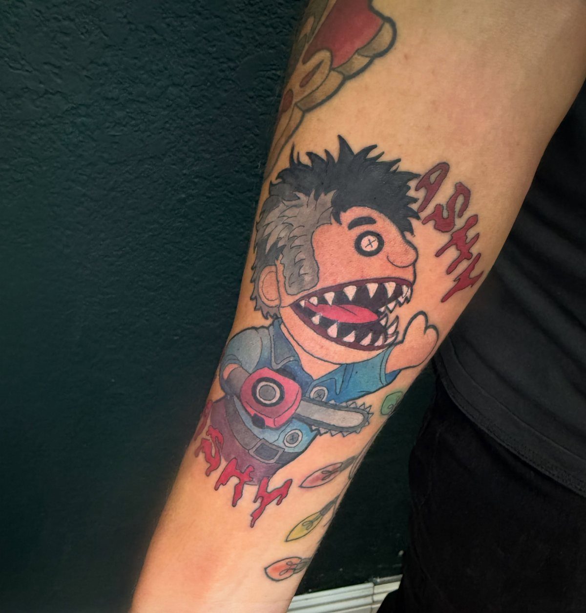
The Evil Dead series lives in that sweet spot between actual terror and camp you can laugh at later, which makes it perfect for a tattoo that reads as horror without weighing down your whole arm.
Ashy Slashy, the puppet version of Ash Williams, keeps the chainsaw hand and the attitude but shrinks them into something that sits comfortably on a forearm.
The red lettering around him punches harder against dark skin; on lighter tones, the black linework carries the piece alone.
A fan who started with the Necronomicon prop replica and built outward from there would get the most mileage here, since the joke lands harder when you know the full franchise arc.
For someone who wants the same energy without the puppet angle, the actual Necronomicon itself works as a standalone book tattoo, though that version reads more serious and needs more space to detail the face on the cover.
8. The Lost Boys
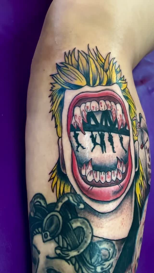
A vampire mouth wide enough to hold a whole scene inside it turns the classic Lost Boys poster image into something only a tattoo can do.
The silhouette of figures hanging from the bridge fits where the tongue would be, which means the artist needs to nail negative space or the whole piece muddies into grey.
Color holds up better on legs and outer arms, places that see less sun than a shoulder or a top-of-wrist placement.
The Lost Boys aesthetic, all leather jackets and boardwalk neon, gives the piece its specific mood; without that color palette, it becomes generic vampire art fast.
Someone who came to horror through Stranger Things nostalgia rather than the actual decade might want to study the film stills first, since the tattoo lives or dies on getting that particular coastal California night-time look right.
9. A Nightmare on Elm Street
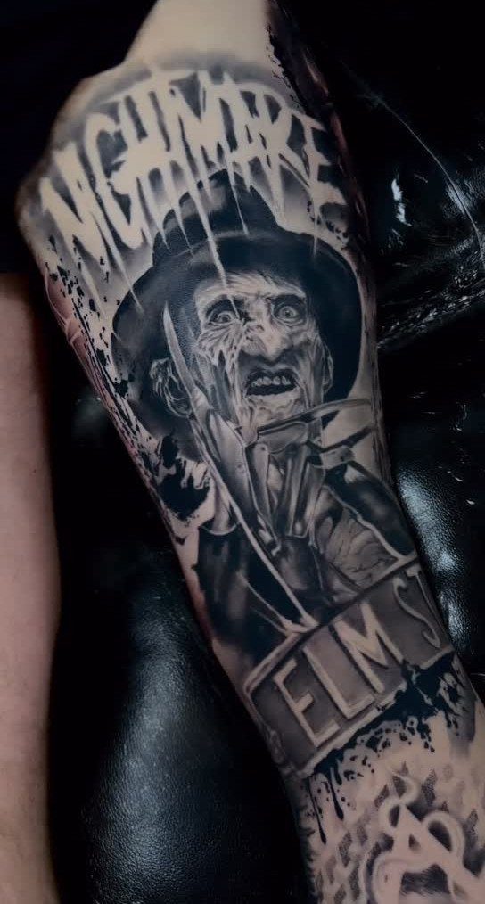
Freddy Krueger’s glove carries built-in signage: the "ELM ST" street sign and "NIGHTMARE" floating above give the image its context without needing Freddy’s full face, which can age badly if the portrait work slips.
The bladed glove alone reads instantly to anyone who grew up with the franchise, and it compresses well onto a forearm or a calf.
Black and grey realism demands an artist who can handle metal reflection against scar tissue, two textures that fight each other if the values are not exact.
A smaller version, just the glove with no text, works on a hand or fingers but trades away the street identity that makes the reference land for casual viewers.
For someone who wants the fear without the franchise baggage, a burned hand silhouette holding the glove reads more abstract and ages more gracefully.
10. Alien
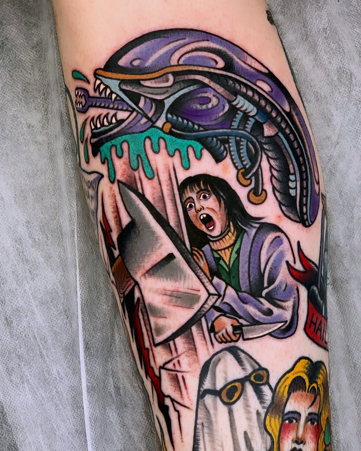
The Xenomorph head in purple and green saliva drips is a color choice that only neo-traditional tattooing makes possible; a straight realism version would stick to the film’s darker palette and lose that graphic punch.
The shape of the alien skull, all elongated jaw and no eyes, fits the vertical stretch of a calf or the outer thigh better than it fits a flat shoulder blade.
Someone building a horror sleeve, mixing in other properties, needs to settle early on whether each segment gets its own color world or whether everything ties together.
The Alien segment holds its own best when the purple reads as actual light hitting the creature rather than just stylized choice.
A single Xenomorph head without the saliva and without the surrounding scene works as a flash-style piece, smaller and faster, but it needs that purple to green shift or it becomes unrecognizable against a busy sleeve.
11. Nosferatu
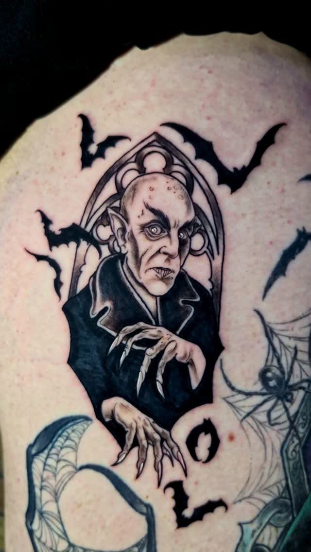
Count Orlok’s bald skull and long fingers, framed in a Gothic window with bats and spiderwebs, draws on a film that most people know from still images rather than actual viewing, which changes how the tattoo functions.
The window frame gives the piece its architectural anchor; without it, Orlok floats disconnected and the tattoo reads as generic vampire.
Spiderweb detail in the corners ages fast if the linework is too fine, so the bats carry more of the visual weight over time.
Black and grey shading on pale skin can wash out, making Orlok’s already pale face disappear; someone with lighter skin might need heavier blacks in the eye sockets and under the fingernails to keep the figure present.
The silent film source means this tattoo signals film history knowledge, not just horror fandom, which suits a reader who wants their reference to read as deliberate curation rather than popular choice.
12. The Babadook
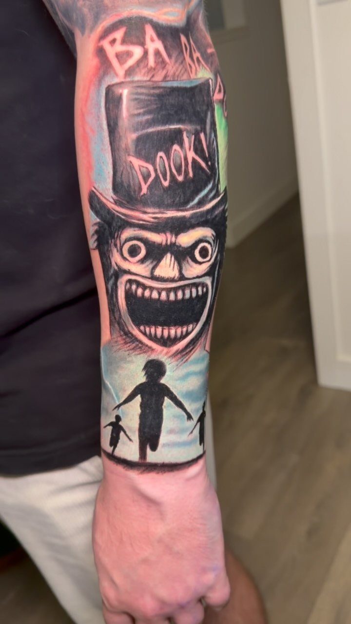
The Babadook’s top hat and grin, with "BA BA DOOK!" in the same jagged type as the pop-up book, works because the film itself made that book into an object you half-believe could exist.
The running children silhouettes below ground the piece in the film’s actual story rather than just the monster design. A forearm placement lets the text read at conversation distance, which matters since the lettering is half the point.
The light blue behind the children is a specific choice that pushes the piece toward color realism; a black and grey version would need heavier contrast to keep the silhouettes distinct from the background.
Someone drawn to the film for its grief metaphor rather than its horror surface might prefer just the book itself, closed, with no figure visible, though that version requires the viewer to know the reference already.
The full figure with text lands for someone who wants the scare first and the meaning second.
13. It
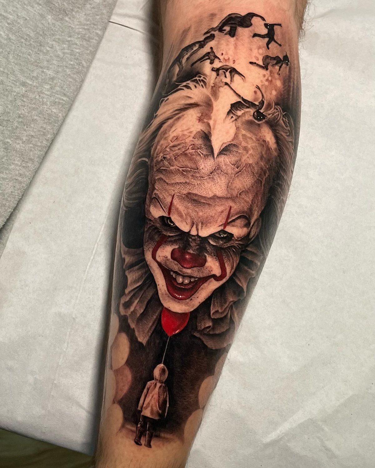
Pennywise works best when the artist commits to either full color or a restrained palette of black, grey, and red accents.
The balloon reads instantly even at small sizes, which makes it a practical choice for a first horror piece or a gap filler between larger work.
A portrait of the clown demands more skin real estate and an artist comfortable with portraiture; the ruffled collar and sharp teeth are where detail gets lost if the scale is too small.
I’d put the balloon on a wrist or ankle, and save a full figure for a thigh or upper arm where the curves of the body can shape the pose.
14. Midsommar
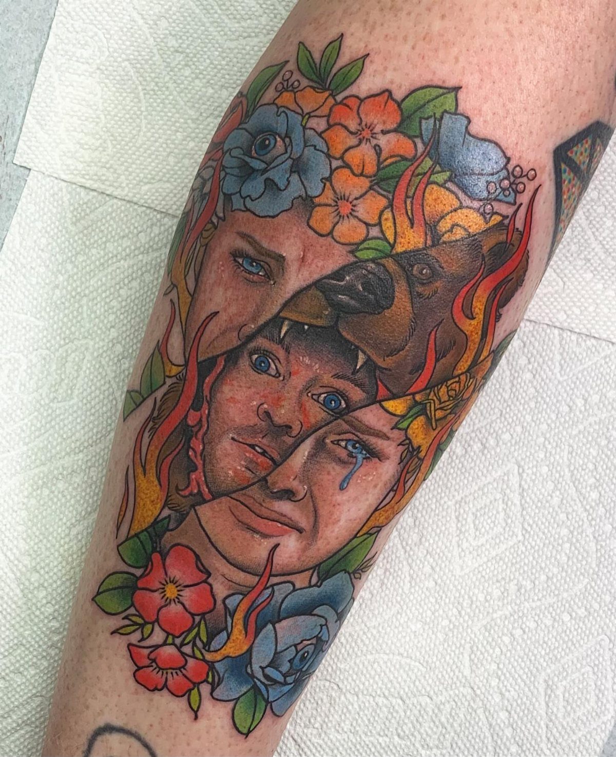
The Midsommar aesthetic lives in its clash of folk sweetness and ritual violence.
A tattoo that pulls from both registers, the flowers and the bear suit and the flames, needs an artist who can balance busy composition without turning it into a sticker sheet.
The film’s color palette of bright orange, blue, and green against skin tone gives the piece its immediate recognition; muted versions lose the joke of how pretty something awful can look.
This one suits a reader who wants conversation more than stealth, since the reference lands only with people who have seen it.
15. Carrie
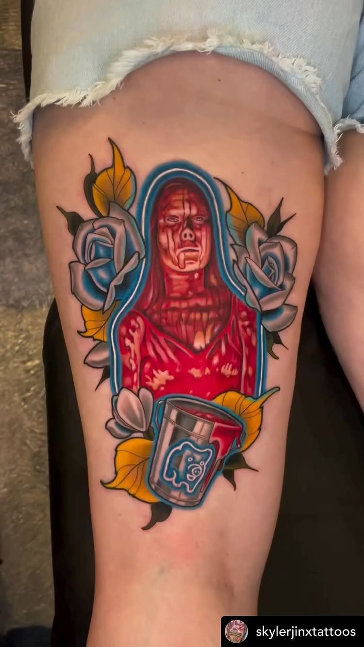
Carrie offers two distinct approaches: the prom queen in her moment of destruction, or the quieter imagery of the blood itself.
Thigh placement gives the roses and the spilled bucket room to breathe, and the neo-traditional style handles the red as a color field rather than a mess of drips.
A smaller version could isolate just the bucket tipping, or just her face in profile.
The red ink will fade faster than black on most skin tones, so budget for touch-ups if you want that blood to stay vivid past the first few years.
16. The Ring
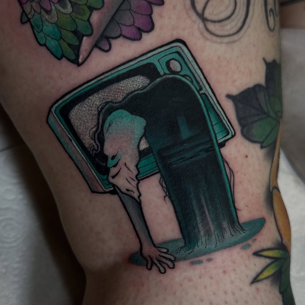
Samara crawling through the television screen translates to tattoo better than most modern horror stills because the composition is already flat and graphic.
The teal of the static and the pale figure against the old wood-grain console give the artist a limited palette to manage, which keeps costs and session time down.
A color piece like this needs an artist who has done television glow before; the wrong teal turns cartoonish.
For a simpler take, the well itself or the ring of light on a videotape label work as black-and-grey alternatives that read from farther away.
17. Candyman
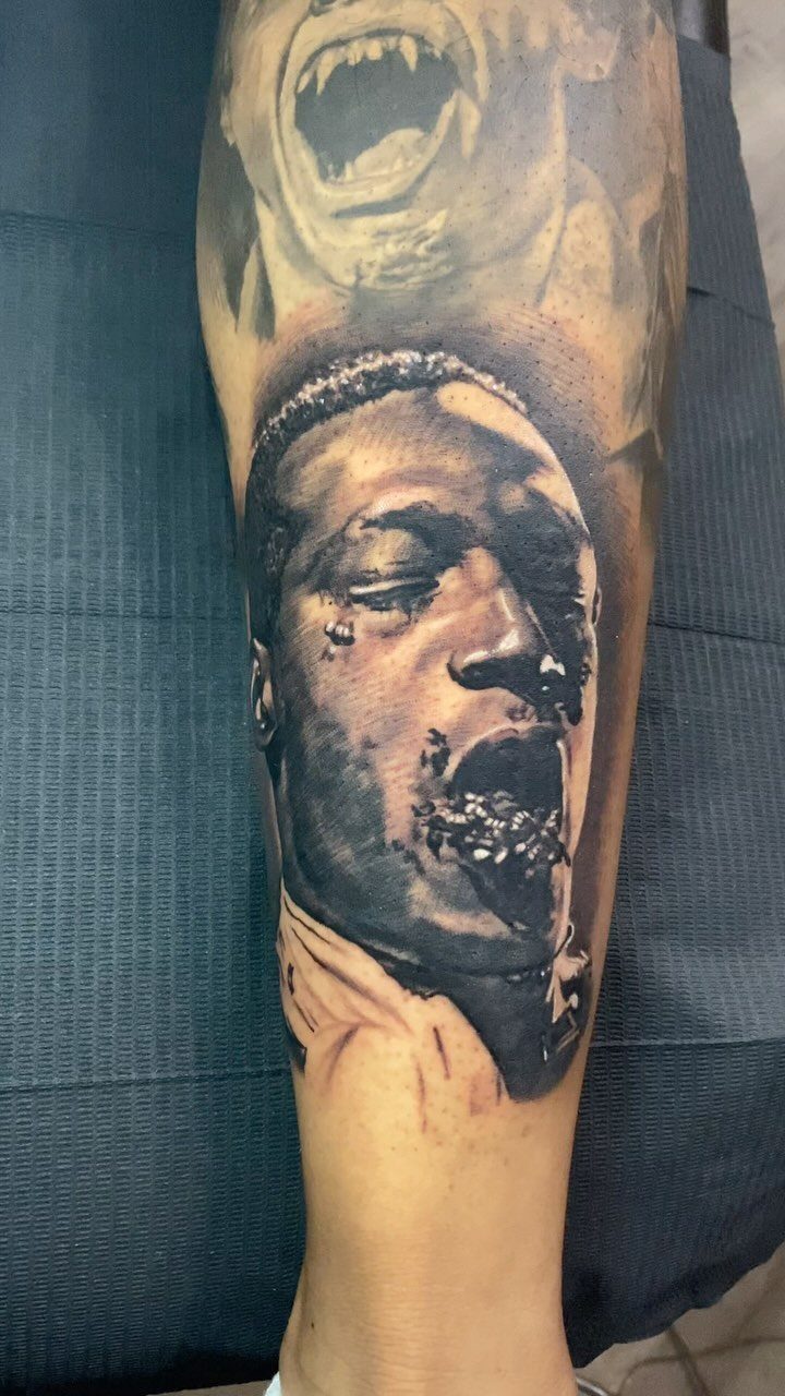
Candyman’s power is in the bees, not just the hook. A portrait without the swarm coming from his mouth is a portrait of any man in a coat; the bees make it unmistakable and give the tattoo motion.
Black-and-grey realism handles the insects well if the artist layers enough gray wash to separate wings from skin from shadow. Lower leg placement sits where trousers or socks can hide it for work, which matters for a piece this large.
A smaller version on a forearm could focus on just the hook and a few bees, trading scale for immediacy.
18. The Blair Witch Project
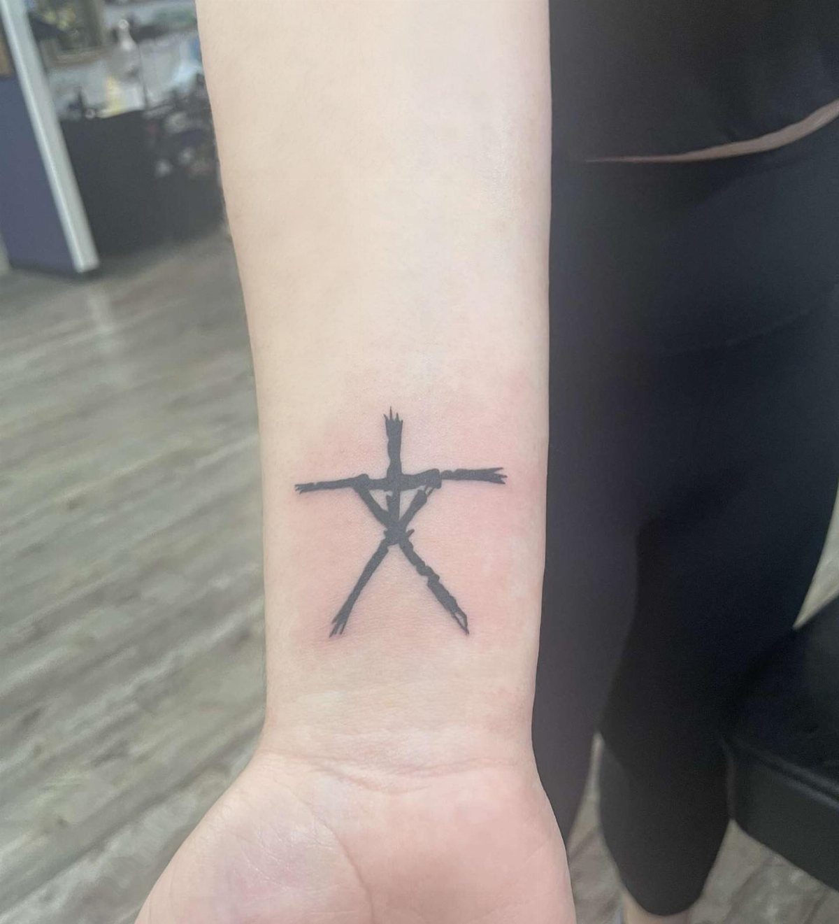
The stick figure from The Blair Witch Project is the most minimal option here, and that is its strength.
A single black glyph on a wrist or behind an ear costs little, heals fast, and reads as a private reference rather than a billboard.
The symbol carries enough weight from the film that it does not need embellishment; adding a forest or a cabin around it dilutes the effect.
This suits someone who wants the reference without the gore, or who is building a sleeve of small horror icons and needs negative space between larger pieces.
19. Doctor Sleep
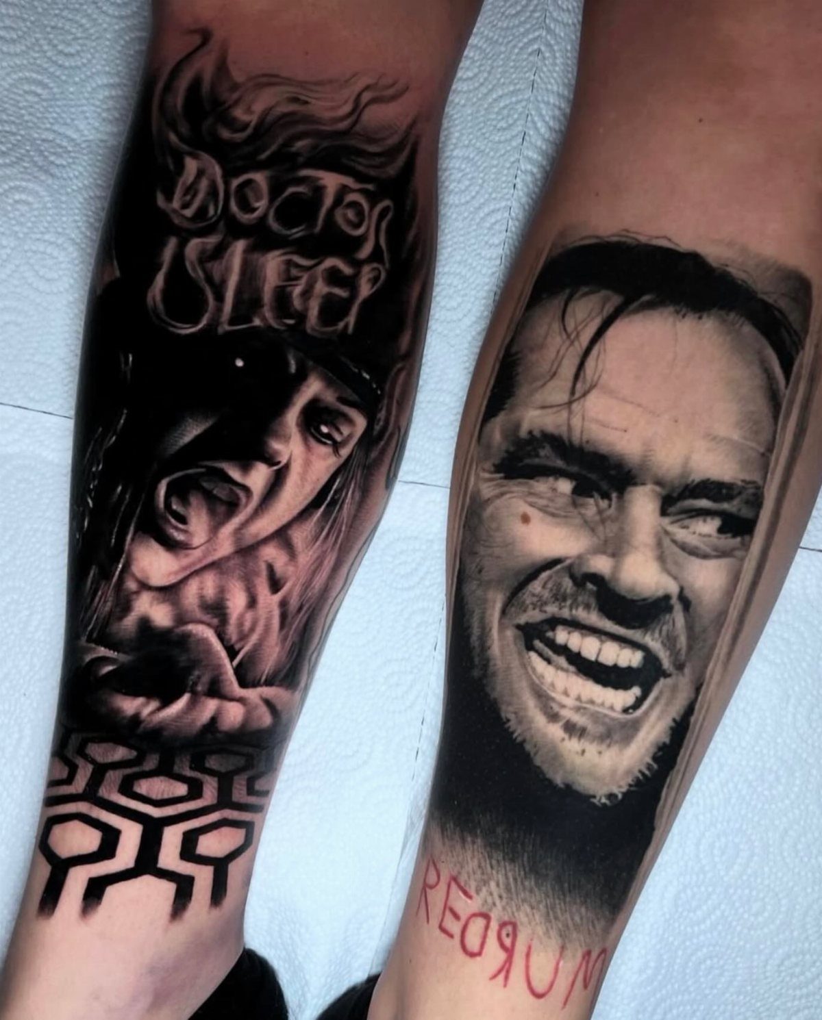
A Doctor Sleep piece lets you carry both Shining eras at once. Rose the Hat paired with Jack’s "REDRUM" works because the two films share DNA without repeating each other.
I’d suggest deciding which film speaks louder for you: the original’s isolation dread or the sequel’s traveling menace. A single-character portrait reads cleaner on a calf or outer arm.
The red lettering needs a confident hand; poorly saturated, it fades to pink fast. Check your artist’s healed photos for color hold before committing.
20. Poltergeist
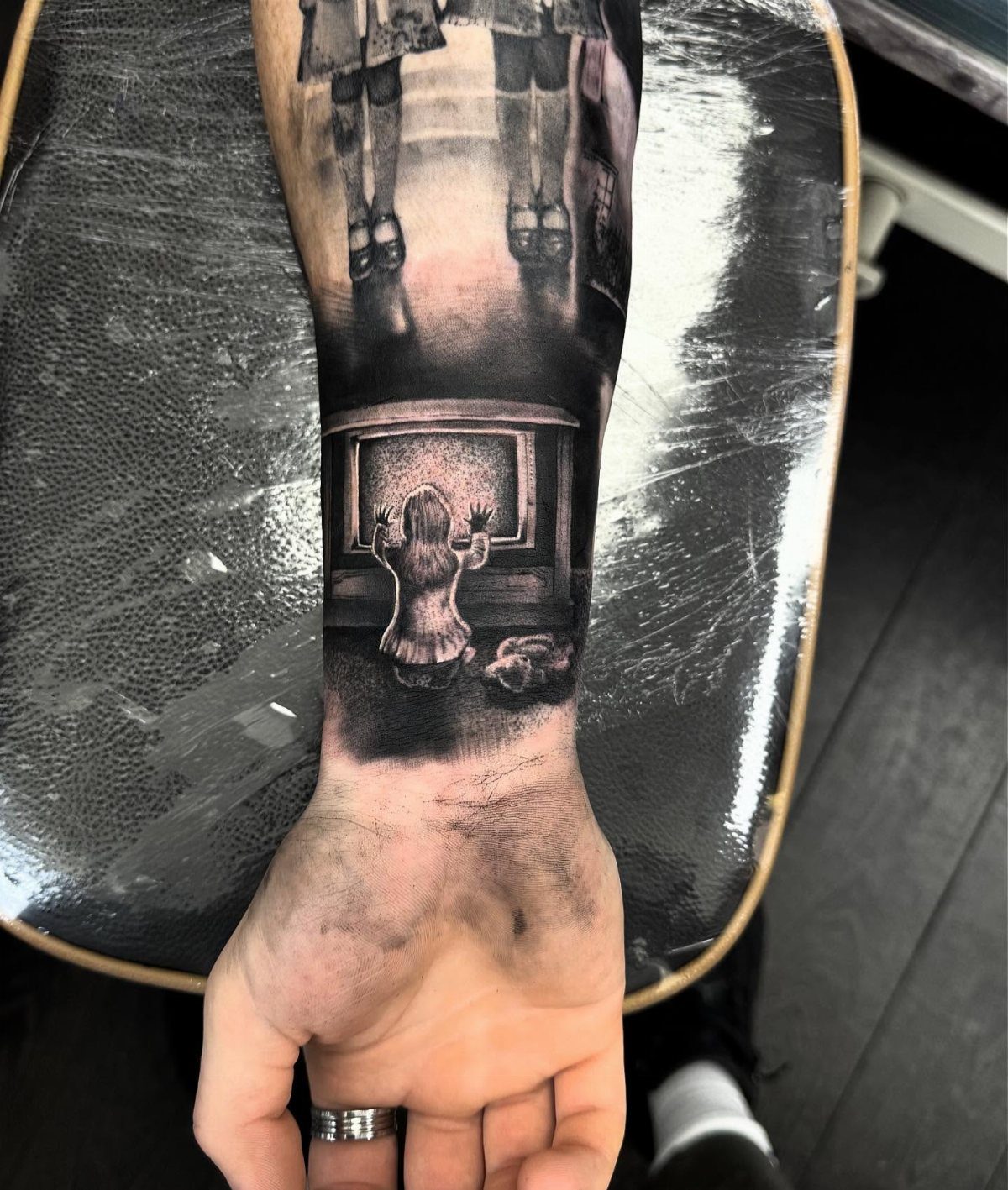
The static TV and Carol Anne arrangement hits harder than any ghost face could. Black-and-grey suits this subject; the glow effect comes from negative space and careful grey wash, not actual color.
Your artist needs experience with light-source rendering, or the screen reads flat. Forearm placement keeps it visible but the kneeling figure compresses smaller than a standing one would.
For a larger back or thigh piece, the closet door or the tree could anchor a scene with more depth. The Grady twins tie two films together only if that crossover matters to you.
21. Gremlins
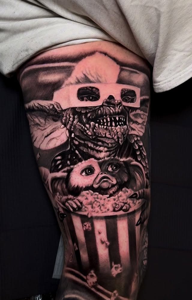
Gremlins opens the door to comedy without undercutting the horror. 3D glasses and a popcorn bucket signal that the wearer isn’t trying to look tough.
That tone shift matters: this design starts conversations instead of stopping them. A thigh gives the gremlin room to sprawl; on an arm, I’d drop the bucket and focus on the face.
Color holds the 80s reference better than black-and-grey, but the popcorn stripes alone carry the joke if budget limits you. Ask whether you want Stripe, a generic gremlin, or the full theater scene with Gizmo below.
22. Child’s Play
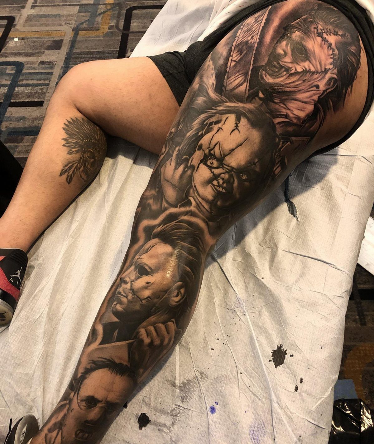
Chucky thrives at small scale, which makes him perfect for a crowded sleeve or a standalone wrist piece. In a leg sleeve mixing Leatherface and Myers, he holds his own through color; that stitched overalls palette breaks up monochrome neighbors.
For a single Chucky, I’d place him at grip height, forearm inside or calf back, where the knife hand points naturally. The scarred face from later films offers more texture than the clean doll of the original.
Your call: nostalgia or nightmare. Either way, the eyes sell it; weak work there and the whole piece looks toy-like in the wrong way.
23. Trick ‘R Treat
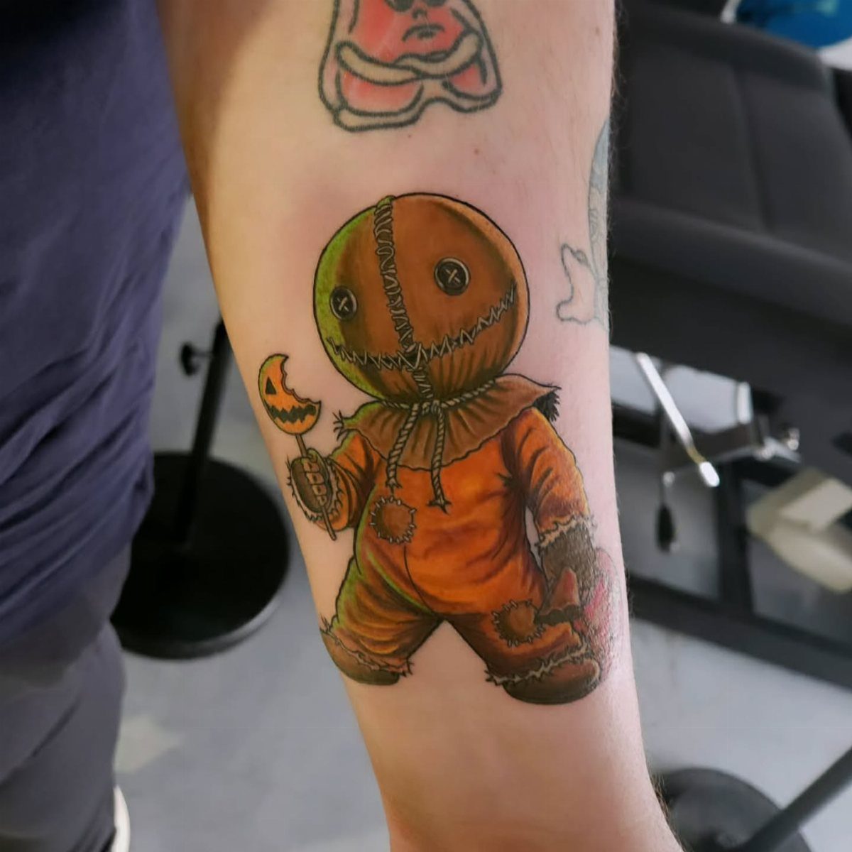
Sam’s burlap sack and orange jumpsuit read instant Halloween without needing anyone to name the film. Color is non-negotiable here, the orange against burlap brown.
Forearm placement lets you add the trick-or-treat bag or the candy bar later if the anthology grows on you. I’d pick this for someone who wants seasonal ink that works year-round, not just October.
The lollipop stick direction matters; pointing toward the hand looks accidental, away from it looks intentional.
Meaning of Horror Movie Tattoos
A horror movie tattoo usually starts with a film you could not shake. The meaning sits in that afterimage, the scene that stayed with you past the credits and the walk home.
For some people the tattoo marks a specific night, a theater or a couch, a person beside them who is gone now. For others it is simply the genre itself, the willingness to sit with fear instead of looking away.
The cultural weight matters too. Horror films have always tracked what a society is afraid of at a given moment, and wearing one on your skin can read as recognition of that history.
Nosferatu ink reads as film literacy, not just fan loyalty. A Candyman tattoo carries specific social weight that a generic monster piece does not.
The personal connection is what keeps the tattoo from becoming costume. When the reference ties to an actual memory or emotion, the design holds meaning past the first few years of wear.
Styles of Horror Movie Tattoos
Horror portraiture leans heavily on black and grey realism, and with good reason. Black and grey needs an artist who can nail value shifts; two close greys bleed together fast once they leave studio lighting.
Neo-traditional brings color back into play. The Alien piece with its purple and green saliva drips, the Midsommar orange and blue against skin tone, the Beetlejuice snake stripes and pumpkin sky; all of these need color to land.
Neo-traditional also allows for graphic choices that realism refuses, like the flat teal static of a Ring piece or the jagged blue behind Babadook silhouettes.
Illustrative and flash-style work suits smaller pieces or gap fillers. Small formats work: a Pennywise balloon at wrist scale, a lone Xenomorph head stripped of background, the Necronomicon as a simple book.
These shrink cleanly and heal quicker than a full sleeve portrait. Detail drops off, especially in faces and tiny lettering.
Placement of Tattoos
Arms, legs, and backs each carry horror ink differently. Arms offer the easiest display and the most natural viewing angle for the wearer.
The outer arm sees more sun than the inner, so color saturation holds longer on the inside.
Legs give vertical space that suits ascending compositions. The Jaws shark angling upward, the Silence of the Lambs moth sitting below the mask, the Alien skull stretching its elongated jaw; all of these follow the limb’s natural line.
Thighs and calves also hide easily under work clothes, which matters for pieces like Candyman that you might not want visible in every room.
Backs and ribs suit larger scenes that need room to breathe.
The Beetlejuice sandworm coiling through a house, the Lost Boys bridge silhouette inside a vampire mouth, a full Halloween house portrait; these become possible once you move past arm and leg real estate.
The cost is sitting time and healing difficulty, since back skin moves constantly with breathing and sleeping.
Frequently Asked Questions
What is the scariest tattoo?
That depends on what hits your nerves personally. A realistic Hannibal Lecter mask in black-and-grey, with the death’s-head moth sitting below it, carries the weight of a character who feels too possible.
Leatherface in motion with flame patterns behind him reads as active threat rather than posed portrait, which some find harder to look at.
The Babadook’s jagged grin and running children silhouettes tap a different fear, the kind that follows you home from a dark room.
What are the top tattoos to avoid?
Full color on a chainsaw scene tends toward comic book rather than horror, so I’d skip that for Leatherface. Smooth gradients on Frankenstein’s monster heal worse and fade faster than stippled or textured shading.
The wrong teal on Samara’s television glow turns cartoonish, and that is a color choice that is hard to undo.
What is the meaning of horror movie tattoos?
They usually signal a love for the genre and a personal tie to a specific film or character, often with nostalgia mixed in. For some, the choice carries a rebellious edge or an acceptance of darker themes.
Others use the image to confront a fear or to mark a favorite icon. The meaning sits with the wearer, not the design.