Gothic tattoos run from a finger-sized coffin outline to a full-back dragon that needs multiple sessions and a cleared calendar.
What decides which idea is yours is whether you want the symbol or the full scene: a bat silhouette reads as aesthetic play, while a castle with moon and gothic window commits to one specific story.
The black and grey ink runs throughout, from weathered cross filigree to the raven’s broken wing strokes.
1. Gothic Cross Tattoo
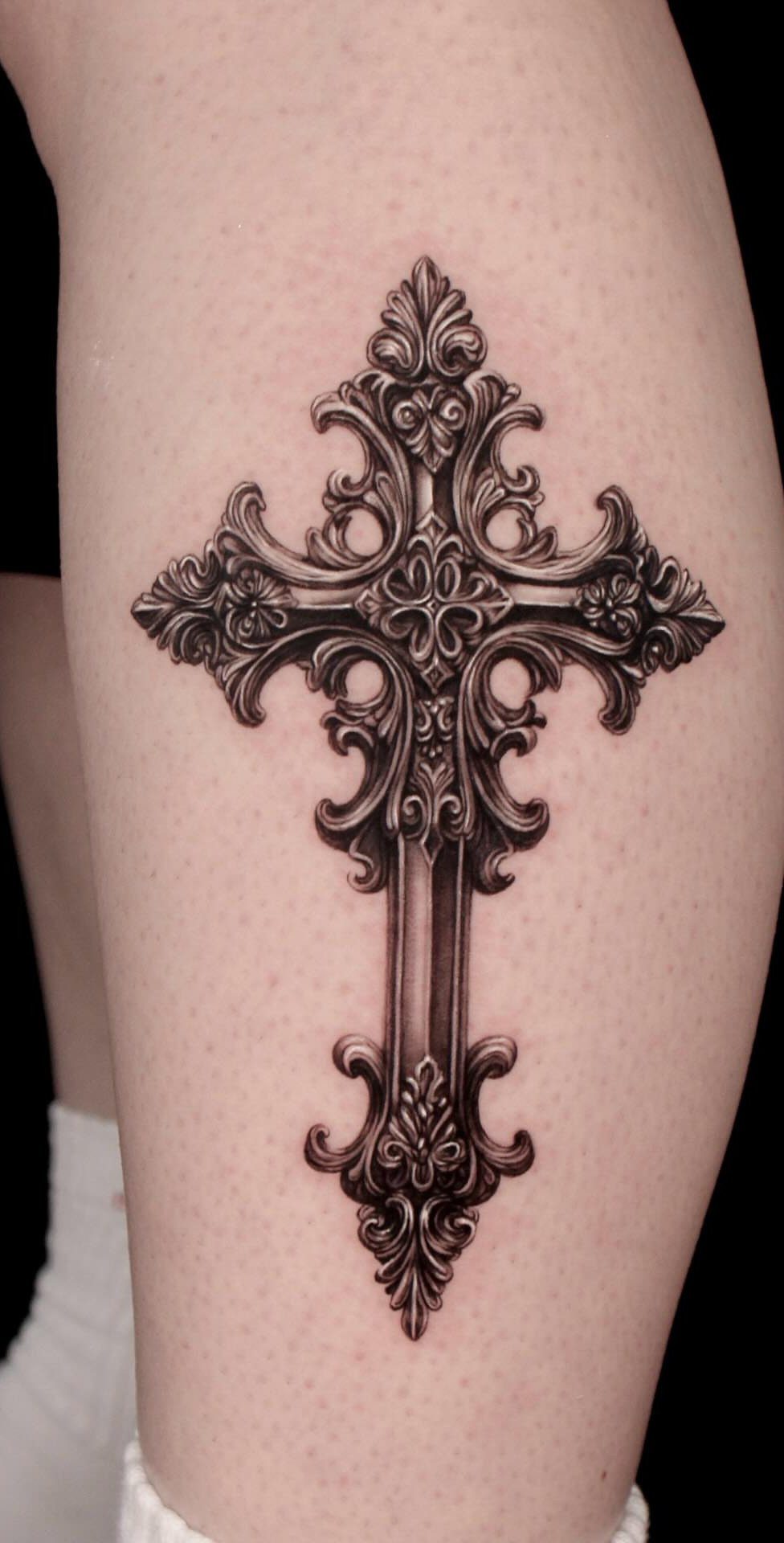
An ornate gothic cross carries weight beyond standard religious ink. The filigree and ironwork patterns suit someone who wants faith to read as battle-tested rather than polished.
Celtic knots woven through the metalwork shift the meaning toward older, earthbound spirituality. Jagged edges or weathered textures push it further from church-pew neatness into something that acknowledges struggle.
I’d steer toward black and grey for the aged-metal effect; color reads celebratory here, which fights the tone. A leg placement spreads the vertical detail without distorting across joints.
This one fits if your beliefs have been complicated by experience, not despite it.
2. Gothic Architecture Tattoo
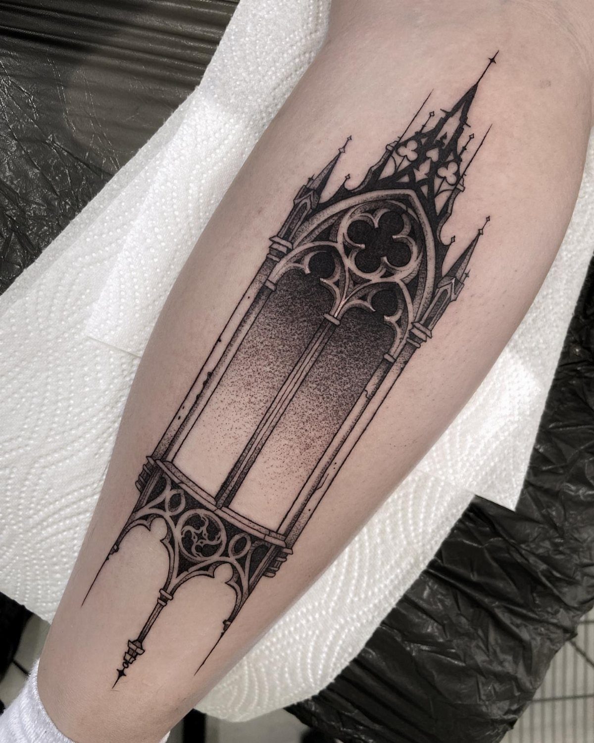
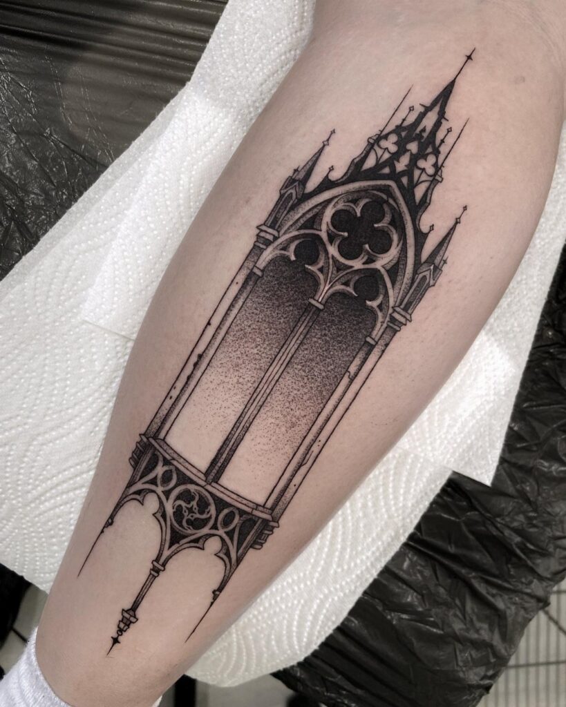
Stone cathedrals on skin borrow the vertical pull of medieval builders, those pointed arches and flying buttresses drawing the eye upward even on a horizontal limb.
The stippled shading mimics weathered limestone; without that texture, the lines go flat and architectural. High contrast matters more than fine detail, since the eye reads the shadow before the tracery.
A forearm or calf gives enough height for the spire to register. Smaller placements lose the scale; monumentality is what matters, even shrunk onto a body.
Gargoyles work as accents, but I’d keep the window or buttress central. The structure carries the meaning; the creature just adds mood.
3. Gothic Flower Tattoo
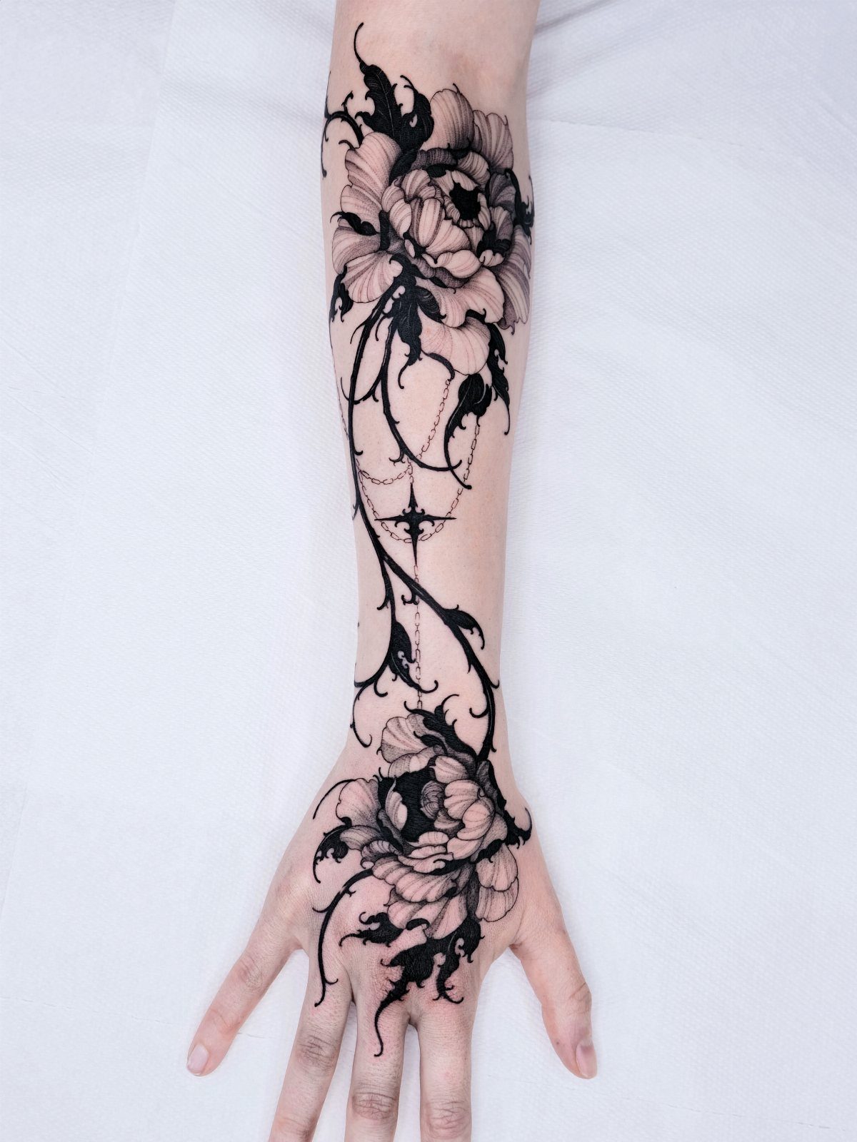
Dark florals twist the usual life-affirming language of botanical ink into something closer to memento mori. Roses dominate for good reason: the layered petals hold detail even in near-black ink, and the thorns pair naturally with gothic tension.
White lilies and orchids carry cleaner associations with death and passage, which shifts the tone more elegy than rebellion. Carnations work if you want something less expected, though their smaller heads demand finer line work.
Thorny vines and hanging chains anchor the bloom in something harder than soil. Without that contrast, a dark rose risks reading as standard neo-traditional.
Pick your flower by what death means to you: the rose for romantic decay, the lily for formal mourning, the orchid for something more exotic and less Western.
4. Gothic Raven Tattoo
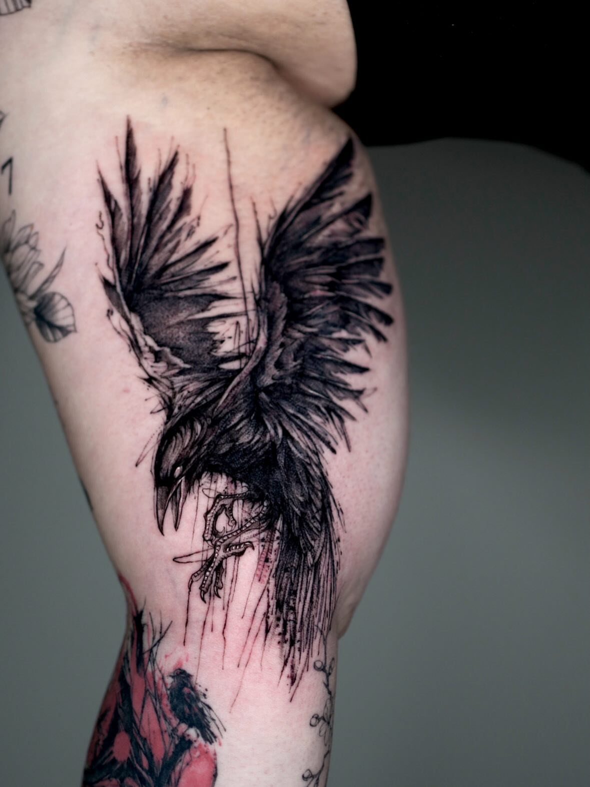
A raven in flight carries the literary weight of Poe and the visual punch of outstretched wings spanning whatever canvas you give it. Red accents add just enough break from total black to catch light without softening the bird.
The sketchy line work suits the subject; too clean and the raven turns decorative, not ominous. Dark, broken strokes keep it circling something.
Size matters here. The wings need room to spread; a cramped raven looks like a crow, which changes the register from apocalypse to nuisance.
Bicep or thigh gives the span, shoulder adds the height for a descending pose.
This one reads grief if you want it to, or simple foreboding if you don’t. The bird doesn’t specify; your context does.
5. Gothic Bat Tattoo
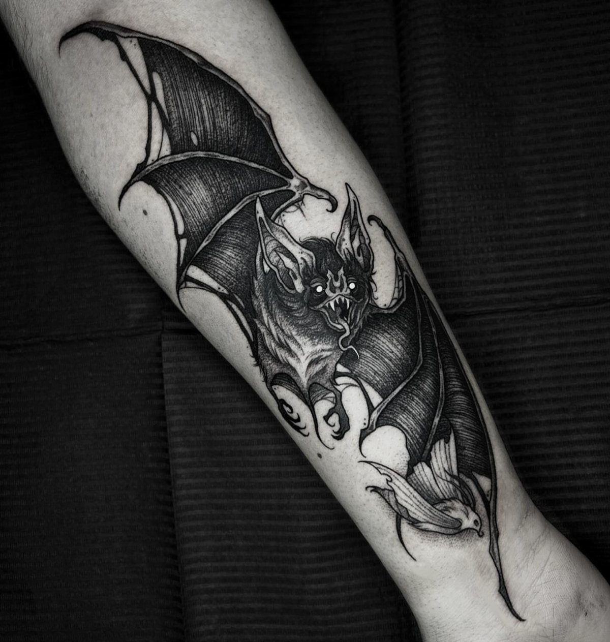
A bat in flight carries two gothic credentials at once: the nocturnal habit and the silhouette that reads as threat even in outline.
Fanged detail and glowing eyes push past naturalism into something more folkloric, which is the choice to make.
Forearm placement keeps it visible, a daily reminder of the aesthetic rather than a hidden token. The back works if you want scale for the wingspan, though you’ll rarely see it yourself.
I’d keep the background dark and minimal. The bat needs negative space to read as movement; cluttered surroundings pin it like a specimen.
This suits someone who wants the symbol without the heaviness of skulls or crosses. The bat is gothic play, not gothic mourning.
6. Gothic Font Tattoo
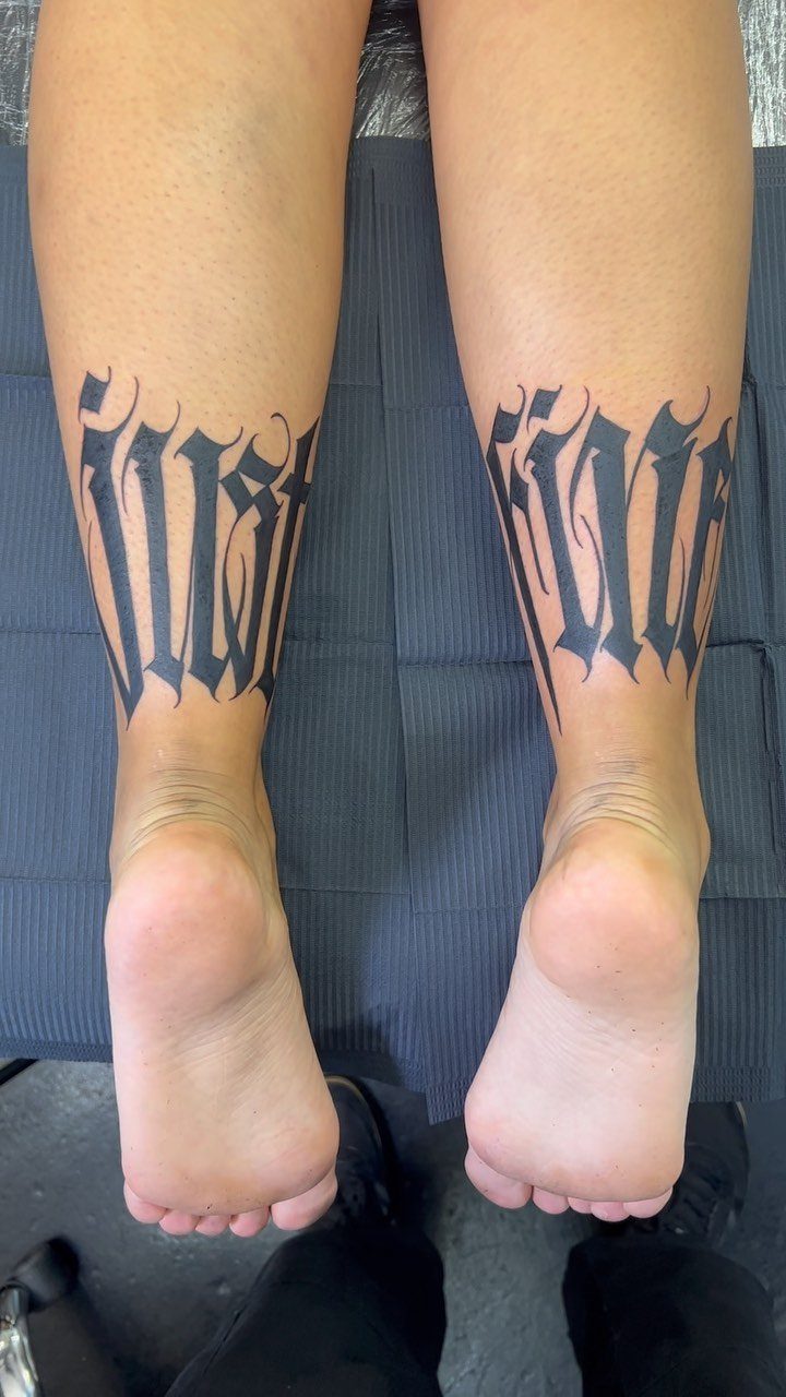
Gothic lettering turns even ordinary words into objects with weight. The thick verticals and sharp serifs read as carved rather than written, which suits permanence on skin.
The scale needs to be large enough for the letterform details to survive, positioned where the leg’s length carries the line without breaking. Calves work; shins hurt more and swell unevenly, which can distort the precision.
A short phrase wins over a single word; one word in this font can look like a brand or a sports logo. A short phrase gives the style room to pattern across the skin.
Pair it with imagery if you want, but the font carries enough on its own. I’d reserve it for text that already feels heavy: names, dates, short credos.
Light content in heavy dress reads as costume.
7. Gothic Heart Tattoo
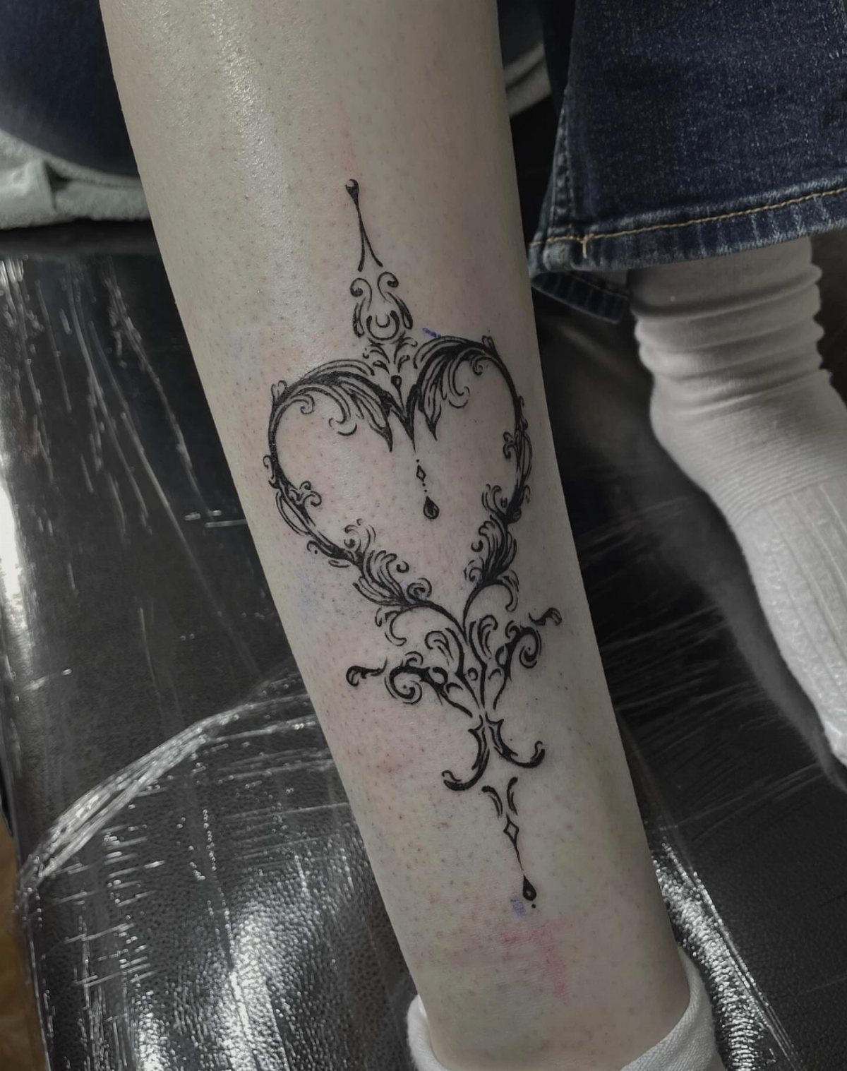
A gothic heart keeps filigree and thorns in the same design, so the mood depends on which one you lead with. Symmetrical curls and dense black ink carry the design without leaning on skulls or blood drops.
That reads closer to Victorian mourning jewelry than to horror.
For something darker, I’d add thorns through the center or a small skull tucked into the lower point. The shape stays readable either way; what changes is whether someone sees romance first or sees the warning first.
This one works on the calf or the upper arm where the symmetry has room to breathe. A wrist placement compresses the detail into noise.
8. Gothic Tree Tattoo
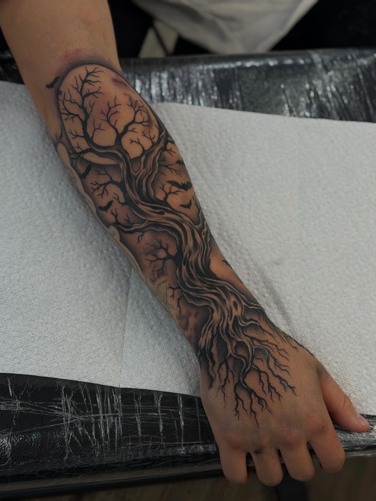
Twisted branches and bare roots carry their own meaning without needing a caption. A tree that runs from forearm onto the hand lets the roots become part of every gesture.
Dark shading does the heavy lifting here. The artist builds depth with solid black at the trunk and grey wash thinning into the branch tips, so the tree reads as alive but not healthy.
That distinction matters: a dead tree is a memorial, a struggling one is a survivor.
Bats or a moon can fill gaps between branches, though the core design stands alone. I’d keep any additions small; the gnarl is the point.
Hand extension raises the commitment. Fingers move, skin there ages fast, and touch-ups are standard.
9. Spooky Cat Tattoo
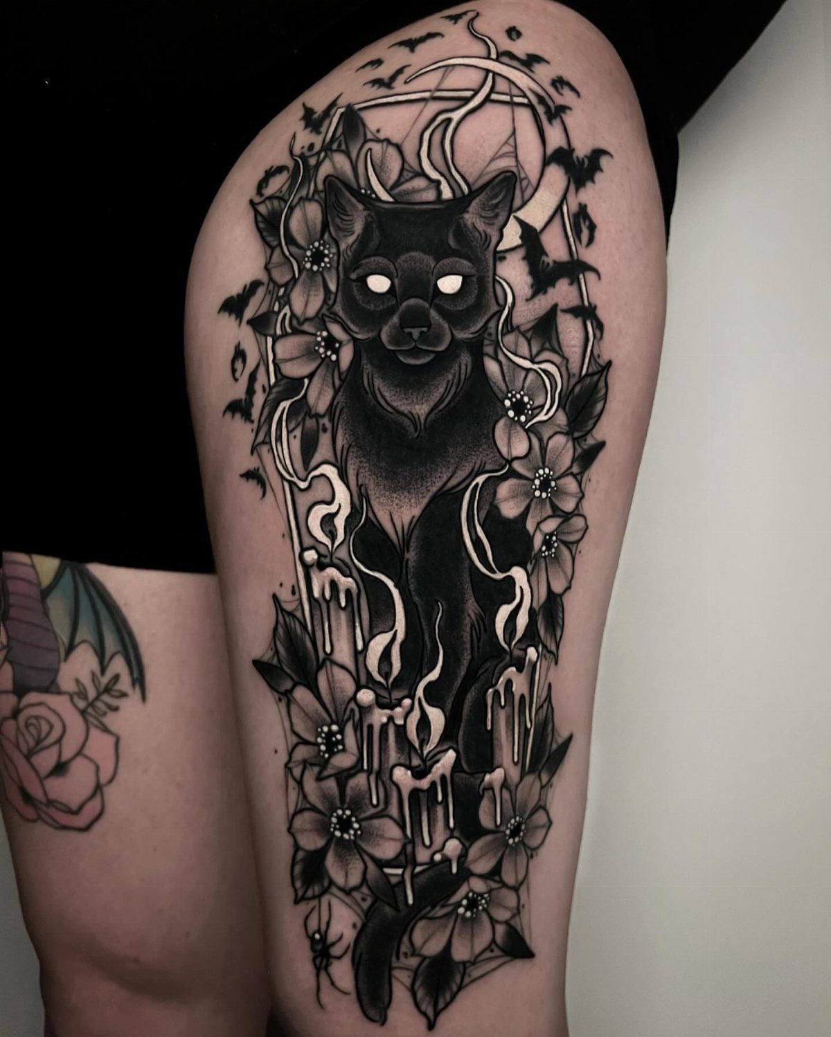
Cats already own the gothic aesthetic without trying. Candles, moon frame, and bats fill the space around the cat, but the eyes carry the whole tattoo.
Charcoal black and exaggerated features turn a familiar pet into something less tame. Glowing eyes in white ink or negative space need a skilled hand to stay sharp against the surrounding dark.
Ask to see healed photos of similar work before you book.
A portrait this size needs the thigh or the upper arm. Smaller placements lose the candle detail and the cat becomes generic.
The arm works for a tighter crop, though I’d drop the frame and keep the eyes.
10. Gothic Angel Tattoo
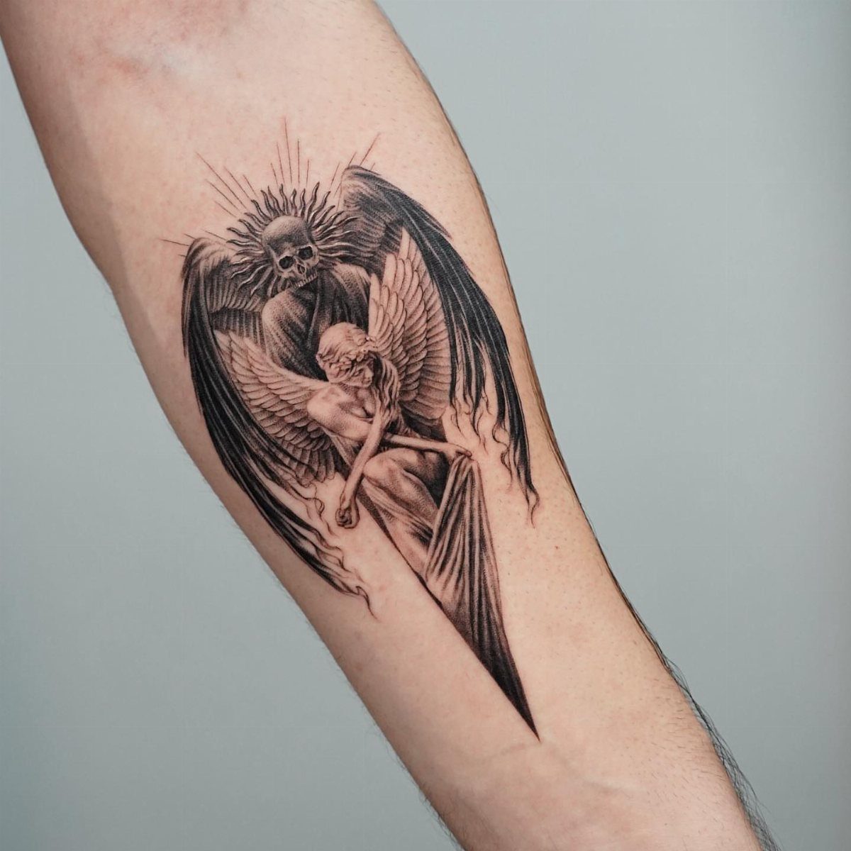
Two winged figures on one arm, one mourning, one skeletal, leave the outcome unsettled. That ambiguity is what separates a gothic angel from a religious one.
The duality reads as personal mythology rather than doctrine. You can weight it toward sorrow or toward menace by which figure you place forward.
Layered figures shift their reading with the angle of your arm.
Intricate linework is non-negotiable here. Feather texture, ribcage detail, and drapery folds all compete for space; a less experienced artist turns that density into mud.
Budget for someone who specializes in black and grey realism.
11. Gothic Castle Tattoo
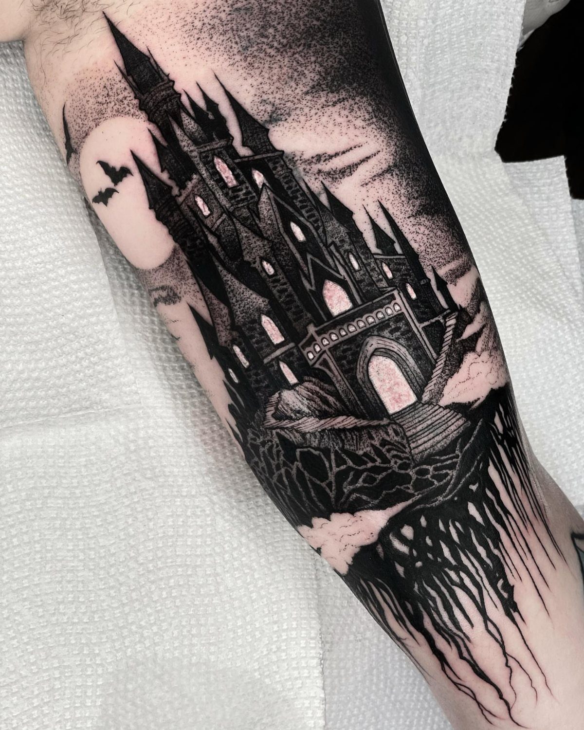
A castle tattoo commits to one building and one mood. Spires, bats, and moon fill the scene; heavy shading pushes it toward gothic rather than fairy-tale.
Every surface reads as stone at night, not as a Disney silhouette.
The cliff base in this version adds stability. Without it, the castle floats; with it, the design anchors to the body and gains weight.
I’d keep that element for any placement, though the size has to justify the detail.
Loyalty to the form means less freedom than an architecture tattoo offers. You are choosing a specific story, not a style.
That suits someone with one place that matters, not someone collecting moods.
12. Gothic Coffin Tattoo
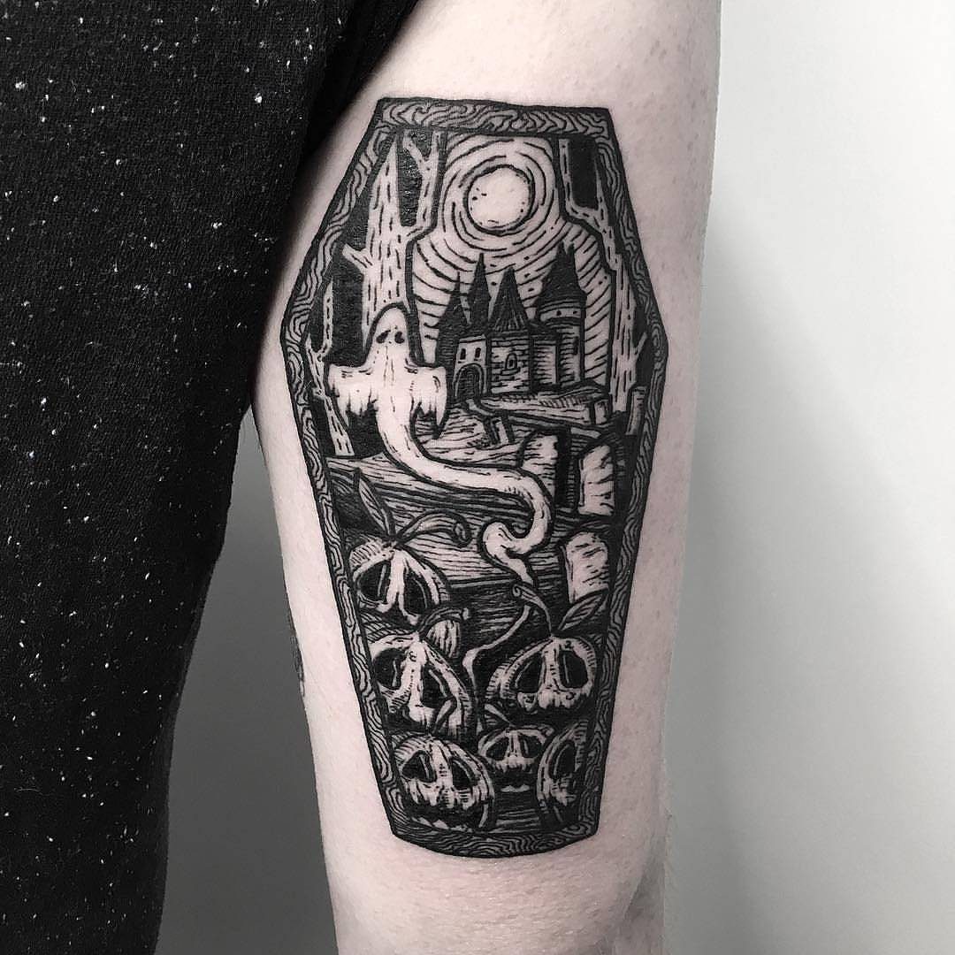
Coffin tattoos carry their own frame, which changes how you compose the scene inside. The coffin becomes a window rather than an object.
A simpler version stops at the outline and maybe nail heads at the corners. That reads as symbol, not as narrative.
The choice depends on whether you want to mark an idea or tell a specific story.
Nail detail at the corners asks less of you than a full interior scene and ages cleaner. Small coffins on fingers or behind the ear use that minimal version well.
An arm piece this size needs interior detail or the coffin shape wastes its space.
13. Gothic Fairy Tattoo
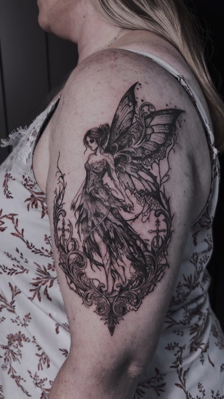
A gothic fairy tattoo turns the usual fluttering sprite into something that looks like it knows secrets you do not. Black and grey ink with dense filigree lets the wings fade into the background rather than stand apart from it.
That darkness is what separates this from every fairy tattoo at the beach. The eyes stay hollow or downcast, the dress tears at the hem, and the realism makes the figure feel present rather than decorative.
I would place this where the detail reads at close range: the upper arm, the outer thigh, the ribs if you can sit for it.
The fairy works best as a companion piece, something you add after a larger gothic theme is already going. On its own it can feel like costume jewelry.
Placed near a raven or a dying rose, the fairy joins a larger scene instead of floating alone.
14. Gothic Spider Tattoo
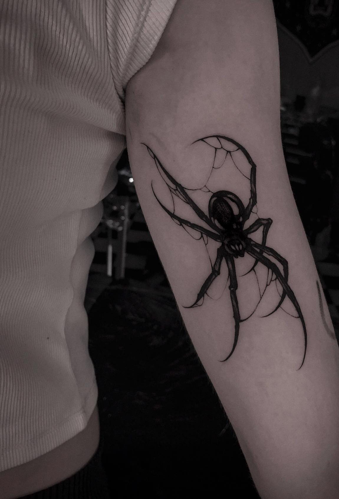
Spiders carry enough weight in gothic imagery that the tattoo almost explains itself, which is exactly why the design matters more than the symbol.
The web strands across the inner arm are fine enough to blur as skin ages unless the artist works high and the client moisturizes.
Placement on the arm or leg gives the spider room to stretch its legs without bending the anatomy wrong. A web wrapping a joint, elbow or knee, reads as movement; a web on flat skin reads as stillness.
Choose based on whether you want the spider waiting or caught mid-escape.
The skull-spider hybrid turns up often in this style, though a pure arachnid reads cleaner and needs less explanation. Either approach works; mixing symbols risks clutter unless the artist specializes in dense blackwork.
15. Gothic Window Tattoo
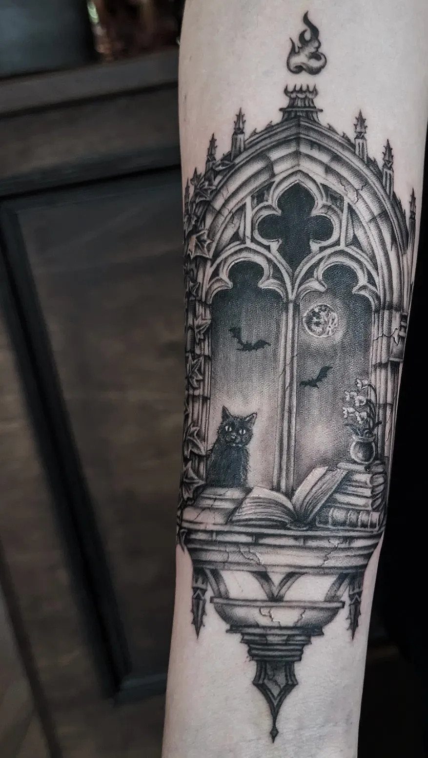
A gothic window tattoo borrows the stone tracery and pointed arch of cathedral architecture, then fills the frame with whatever story you want told.
Stone, cat, open book, bats against the moon: every element stays black and grey so nothing competes for attention. Color is the other path, stained-glass bright, though that choice doubles the sessions and the cost.
Black and grey suits readers who wear mostly black already; color wants someone whose wardrobe already carries jewel tones or who commits to the contrast.
The forearm functions best for this design, flat enough for the architecture to read straight and visible enough to show without undressing.
Check your artist’s line work on small stone texture before booking. The window fails if the masonry looks like generic shading.
16. Gothic Sword Tattoo
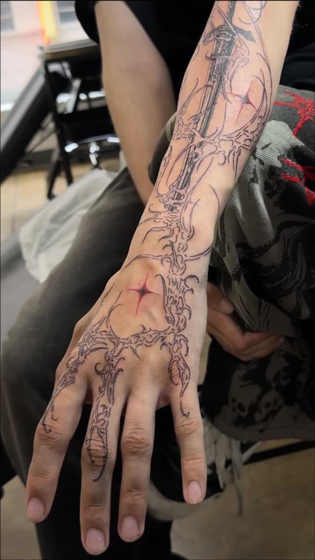
A sword in gothic styling carries more scrollwork than a functional blade ever could, and that ornament is the point.
The arm or back handles the length best. Forearm placement keeps the sword straight and the detail readable; wrapping it around a limb bends the perspective and turns the blade into a ribbon.
The spine-as-hilt variation adds a second symbol without crowding, though that pairing wants a larger canvas than either element alone.
Red accents work when kept minimal, as above. More color than this and the sword starts reading as fantasy rather than gothic.
17. Gothic Dragon Tattoo
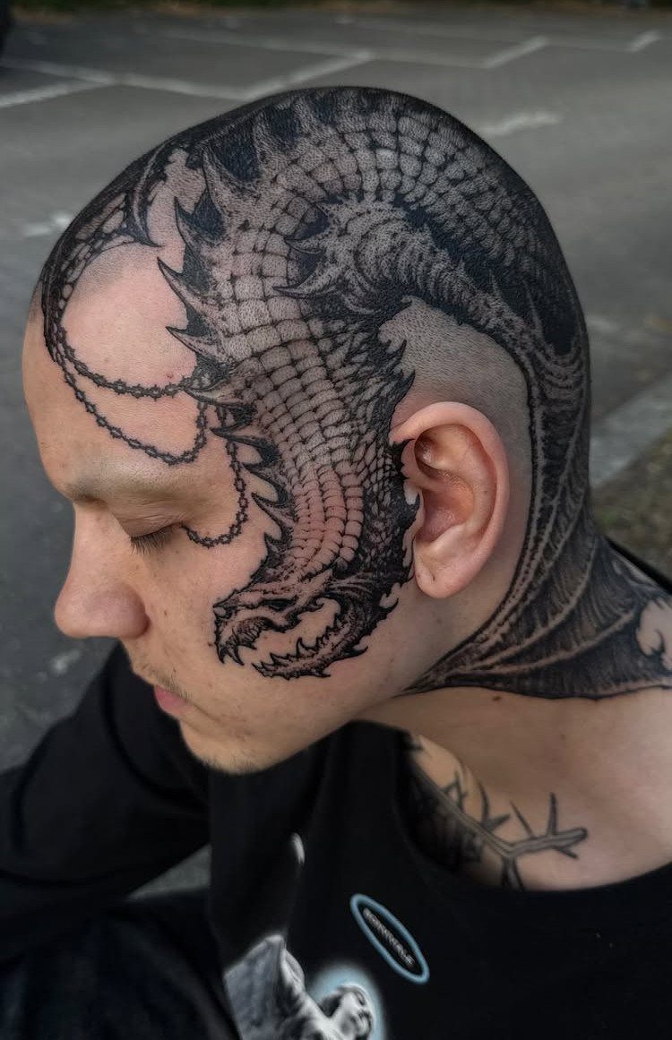
Dragon tattoos usually land in bright greens or fierce oranges; the gothic version stays in black and grey, all scale and shadow. Scalp-to-neck placement is for someone past the point of hiding anything.
Larger areas suit this design. The dragon needs length for the body to coil and the tail to taper, and the head wants detail that collapses if compressed to fist size.
A full back or chest piece carries the same visual weight without the daily visibility.
Time is the real cost. A dragon this intricate runs multiple sessions, and the scalp heals differently than skin with more give.
Clear the schedule, and the budget, before starting.
Placement Recommendations
Arms, back, and thighs carry the larger gothic designs without distorting the vertical lines or the dense blackwork.
The arm’s length suits swords, windows, and cathedral spires; the back gives dragons and castles room to scale; the thigh hides and shows on your own terms.
Smaller placements demand simpler versions. Wrists and fingers work for coffin outlines, nail heads, minimal bats.
The skin there ages fast and the detail will blur, so I’d keep the design bold even at small size.
The neck, hands, and ribs are the painful sites, and that pain buys you visibility. Budget for touch-ups on fingers and palms, the ink settles unevenly where skin thickens and flexes.
Color Usage in Gothic Tattoos
Stone texture, aged metal, and shadow all build from a base of black and grey. The eye reads the darkness first in this style; color risks softening that impact into something celebratory.
Deep reds and purples work as accents, not fields. Blood red at a rose’s center or a jewel’s glint catches light without breaking the tone.
Negative space matters more than hue. The un-inked skin provides the contrast that keeps heavy blackwork readable as years pass.
Without those breaks, the design ages toward a single dark mass.
Tattoo Care and Longevity
Black ink holds up better than color over time, though it does tend to feather outward through the years.
Fine lines in small architectural work tend to blur together; after a decade or so the detail can turn into solid dark patches.
I go bigger when I want the design to last, and I make sure the artist leaves enough open skin; the gap between ink and your own color is what keeps a piece readable.
For gothic lettering, space the letters slightly wider than looks right. Over time the ink spreads and the spaces fill in; lettering packed too tight becomes a solid black stripe within ten years.
Moisturizing matters for web strands and fine filigree. The thin lines in spider legs or window tracery blur faster than solid black, and dry skin accelerates that.