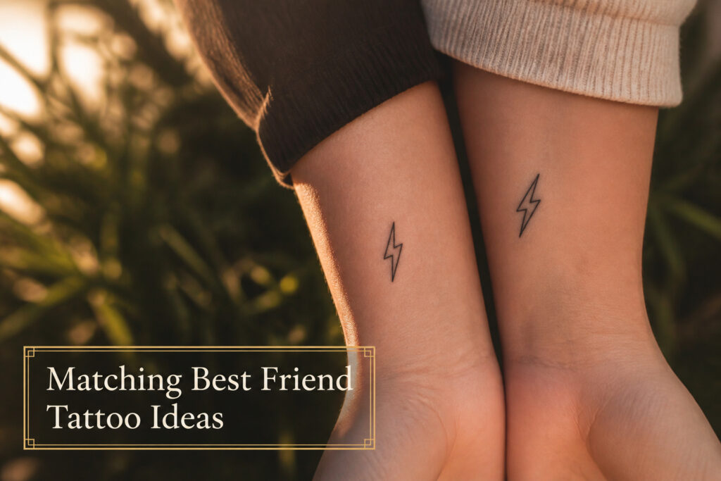
Simple lightning bolts win for matching best friend tattoos because a two-inch black line reads as instant electricity without shading or color, keeping the appointment short and the cost low. Skip this if one of you wants imagery that completes only when you stand together; the bolt stands alone.
The catch is size. A bolt that wraps the wrist turns into a tribal band from the early 2000s. Keep it small enough to stay readable at a glance, and consider a tiny yellow fill at the center if you want it to catch light six months later.
1. Simple Lightning Bolts
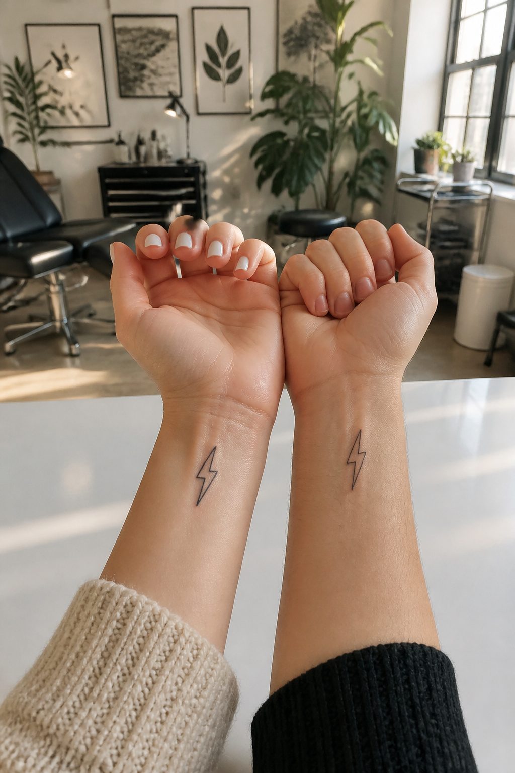
Lightning bolts carry a spark that fits the energy of a real friendship, and the shape translates cleanly to skin. A thin black line, maybe two inches long, reads as instant electricity without needing shading or color. That minimal approach keeps the cost low and the appointment short, which matters if one of you is nervous about the needle.
Wrist placement lets the bolts face each other when you hold hands, or line up into one longer strike when you press your arms together. Ankles work the same way, hidden enough for work but visible at the beach. A friend of mine went with a single jagged split down the outer ankle bone, and the artist added a tiny yellow fill at the center. The color cost extra and took longer to heal, but six months later it still catches light in a way plain line work would not.
The risk with this design is going too large. A bolt that wraps the wrist starts looking like a tribal band from the early 2000s. Keep it small enough that the shape stays readable at a glance.
2. Twin Flames
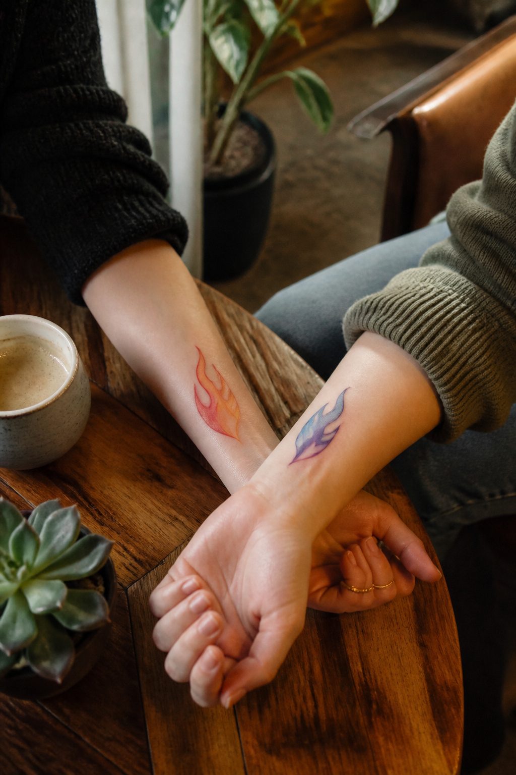
The twin flame concept works surprisingly well for best friends who want matching ink without the romantic baggage. Two matching flame designs, one on each person’s forearm or ankle, read as shared fire rather than couple symbolism.
Literal interpretations range from simple single flames to pairs that mirror each other, tips bending toward or away. Abstract versions split the motif: one friend carries the spark shape, the other the rising heat lines, so the pieces complete each other visually only when photographed side by side.
Color changes the meaning more than most people expect. A warm orange-red palette keeps the energy friendly and open; blue or purple tones shift the same shape toward something more melancholy or mystical than most friendships want to broadcast. Black linework stays the safest default for matching sets.
Placement matters for longevity. The outer forearm sees enough sun that fine detail fades within a few years; the ribcage or upper thigh protects the lines but removes the easy side-by-side photo opportunity that makes matching tattoos fun in the first place. The inner bicep splits the difference: visible when you want it, hidden for professional settings, and the skin there ages relatively well.
3. Foodie Friends
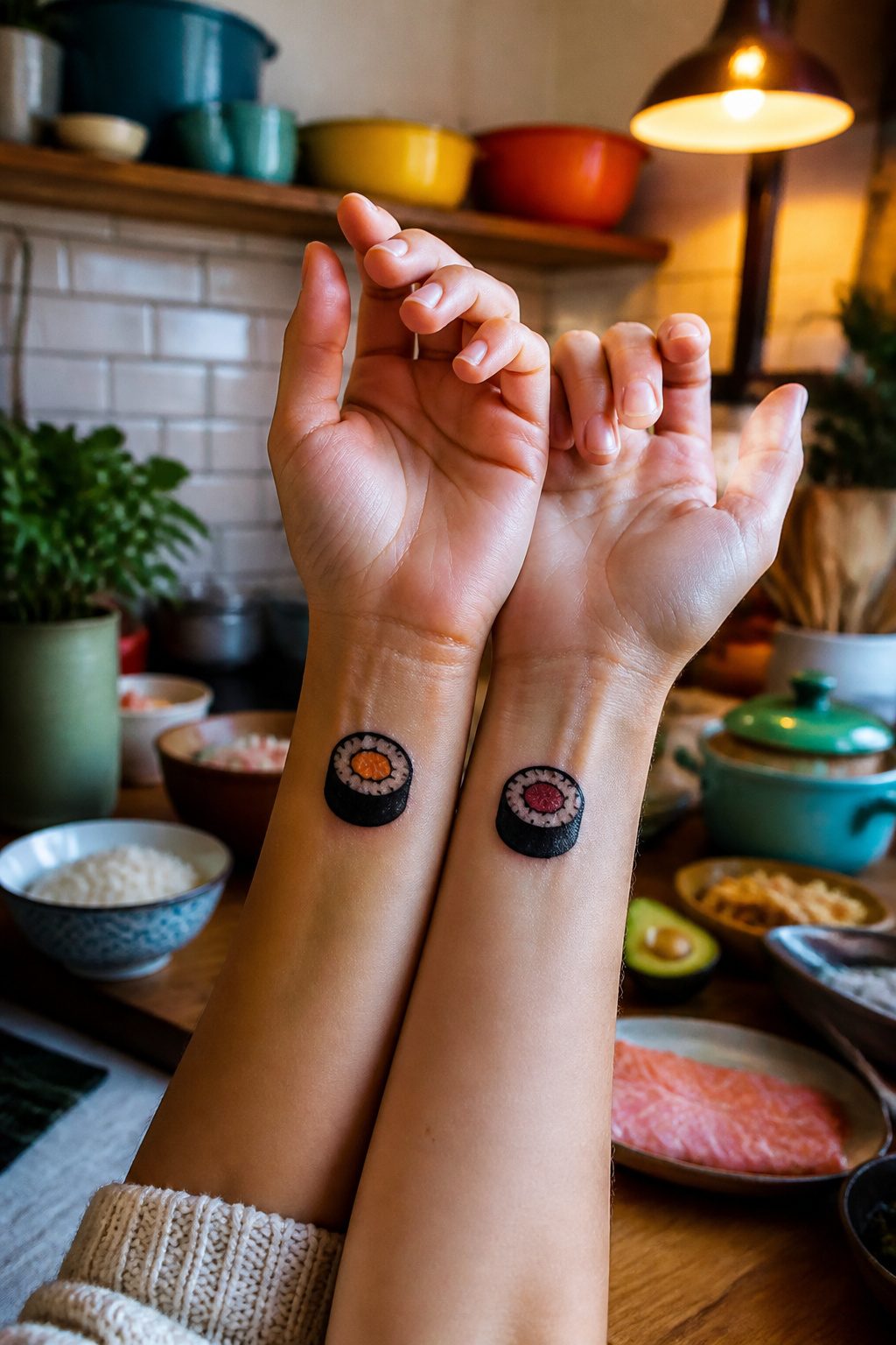
Some friendships run on inside jokes about the one restaurant you always end up at, or the food you both pretend to hate but secretly order every time. Matching best friend tattoos that borrow from those moments tend to land better than generic symbols because the meaning is already baked in. Sushi rolls are the usual example: two people might each get a single maki piece, one with salmon and one with tuna, or split a pair of chopsticks between two wrists so the image only completes when you sit side by side.
The trick is keeping the shape simple. A sushi roll reduced to its silhouette, a dumpling with three pleats, a slice of pizza with the cheese pull frozen in two lines, these read instantly at tattoo scale. Add too much detail and the rice grains blur into gray noise within a few years. Color can work, but black linework holds up longer on hands and ankles where foodie tattoos usually go.
What makes these stick is the specificity. A pineapple means nothing. A pineapple because you both got food poisoning from a pineapple pizza on a road trip to Portland means everything. The tattoo just has to be recognizable enough that the two of you see the joke, and clean enough that it still looks like food in a decade.
4. For a Trio
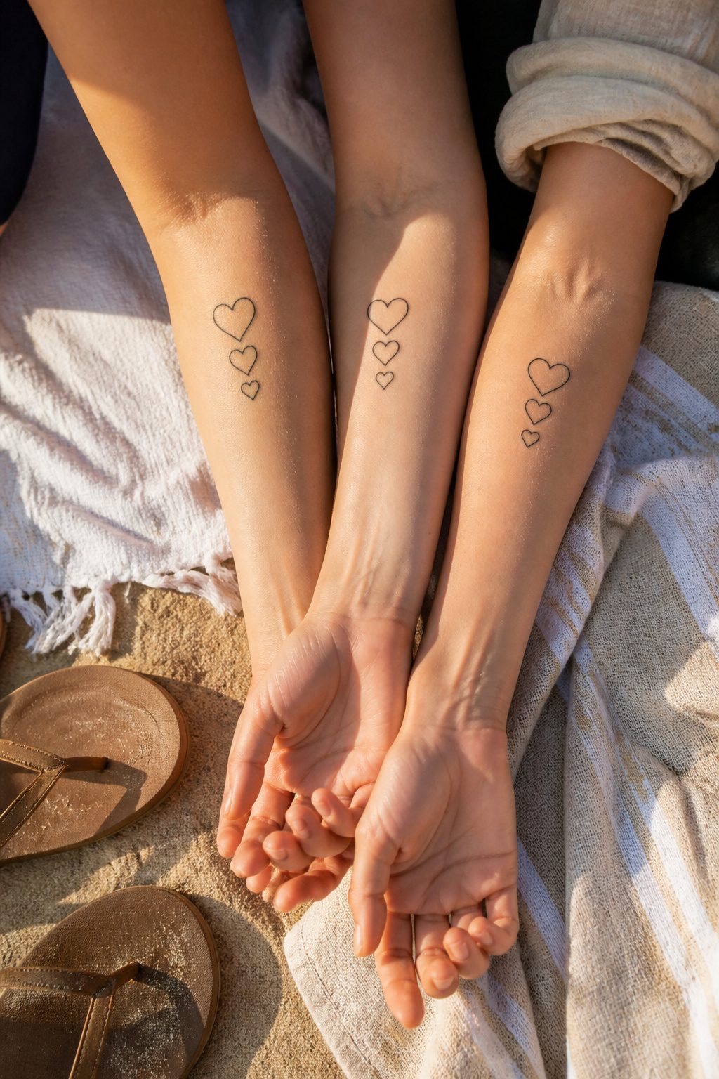
Three friends carrying the same design means the shape has to read cleanly from every angle, not just the front-on view you’d check for a pair. Triple hearts, small and interlocked or staggered in size, work because the weight stays even no matter whose arm the tattoo sits on. With two people you can mirror a image left-to-right and call it balanced. Add a third and the composition has to hold up three ways, which is why simple geometry wins over anything directional like an arrow or a script phrase that points one way.
Placement coordination also scales up fast. Two friends can pick left wrist and right wrist and still look like a set in photos. Three people need to agree on exact spots, not just general areas, or the group shot starts to look like a coincidence. Inner forearm, all three, same height from the wrist bone: that kind of specificity matters more than the design itself once you are past three people. I have seen trios where one person went for the ankle instead and the matching effect disappeared in every group photo after the first week.
5. Drinking Buddies
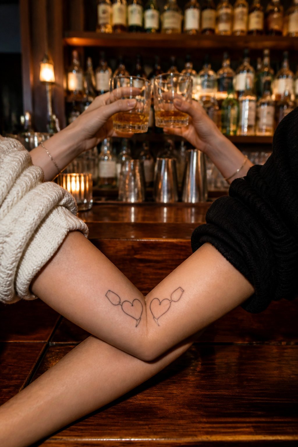
Wine glass hearts are the design most people picture for friends who bond over drinks, two stems crossing to form the shape. The ones that last tend to abstract the concept rather than spelling it out. A single curved line suggesting a glass, or two stems that only resolve into hearts when placed side by side, keeps the meaning private between the people wearing it.
Fine line work suits this idea especially well, since the thin strokes keep the image light enough to feel like a toast rather than a label. The catch is that thin lines demand more precision from the artist, and a shaky stem or wobbly curve reads as a mistake rather than a style choice. Checking an artist’s healed work, not just fresh photos, matters more here than with heavier linework.
The risk with any drink-themed tattoo is dating itself to a specific phase of life. The friends who make it work usually choose a symbol that stands for the conversation, not the beverage. A shared glass becomes shorthand for the hours inside it, and the best designs leave enough space for that meaning to shift as the friendship does.
6. Classic Butterflies
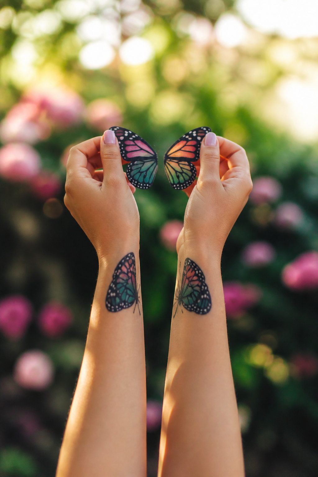
Butterfly tattoos have stayed in the matching best friend rotation for decades, and the staying power comes from how many ways two people can split the design. One solid approach is each friend taking one wing of a single butterfly, so the ink reads as a half-piece alone and locks together when you stand side by side. The sources describe this as basically those childhood best friend necklaces with the split heart, except the half-butterfly still looks finished on its own.
Symmetry is not the only play. Two separate butterflies, one per person, work better when you choose a species that means something specific to the friendship rather than defaulting to monarchs because they are easy for the artist to render. The transformation symbolism gets mentioned a lot, and it holds up if you and your friend actually watched each other change in some identifiable way. Without that lived context, it is just a pretty insect.
Placement matters for visibility. Arm and wrist spots turn the tattoo into something you see daily, which is the point of matching ink. A hidden butterfly defeats the purpose unless your friendship runs on inside jokes no one else needs to get.
7. Animal Lovers
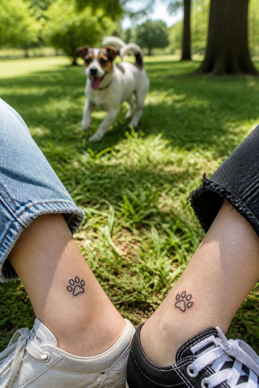
Paw prints are the default animal tattoo, but the ones that last are tied to a specific pet you both know. A generic print looks like clip art by year three. When my friend and I each adopted rescue dogs from the same litter, we considered matching portraits, then settled on a simplified line version of the shared white patch on their chests. The design stayed readable at two inches, and the meaning stayed intact because the shape only makes sense if you were there.
The style choice changes the emotional weight more than people expect. Realistic fur texture on a small tattoo turns muddy; geometric breakdowns or single-line silhouettes age cleaner and read as intentional rather than failed realism. If the pet is still living, a living-artist style with open linework leaves room. If you’re memorializing, the heavier black-fill traditional style carries the tone without needing explanation.
The same logic applies beyond dogs. Shared cat eyes, the specific curve of a horse’s neck, the wing posture of a bird you both rehabbed: the constraint of a real animal forces the design into something personal. Without that constraint, you and your best friend are just wearing the same stock image.
8. Quotes
Words carry weight when they’re permanent, but the font does half the talking. My sister and I spent three hours in a shop flipping between a typewriter face and her own cursive before we realized the letters themselves weren’t the problem; it was whether the ascenders and descenders would tangle into a blur at wrist-scale. Serif or sans, script or block, each reads differently after healing. Thin lines spread. Dense text muddies. Line breaks matter more than most first-timers expect. A phrase stacked in three short rows on a forearm stays legible; the same words crammed into one running line across a collarbone turns into texture from six feet away. Inside jokes hit harder in handwriting that matches a birthday card she once sent you. Song lyrics need breathing room, especially if you split them across two bodies and the reunion only works when you stand side by side. Placement changes everything. Ribs move, skin stretches, and what looked crisp in the stencil softens into something else entirely.
9. Zodiac Signs
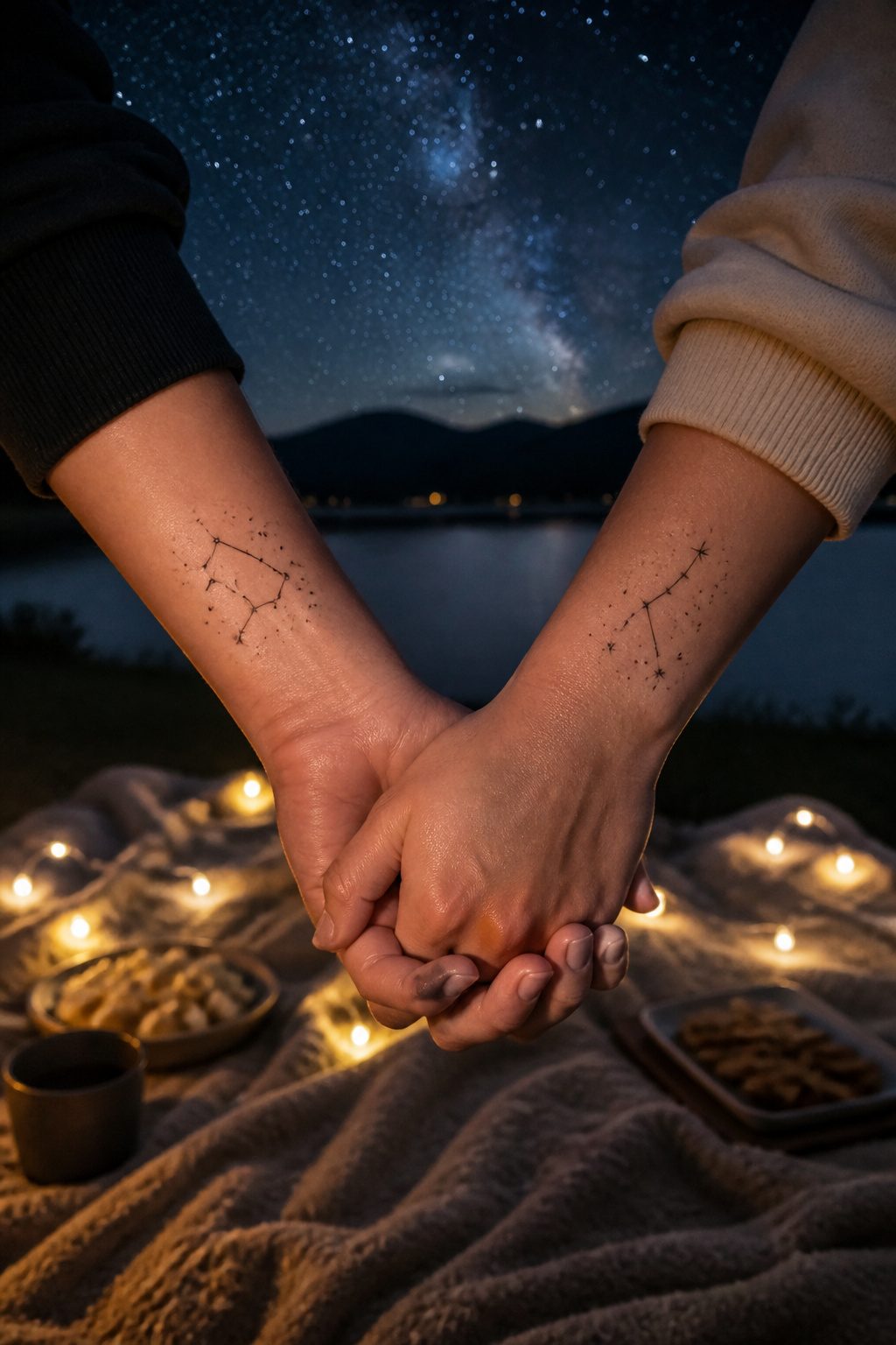
Astrology runs through a lot of friendships the way music or a shared hometown does, and matching best friend tattoos built around zodiac signs have shifted in style more than most people realize. The older approach leaned hard on glyphs, those compact symbols that stand for each sign. They read clearly from across a room, but they also read as very 2014. Fine-line constellation work has largely replaced that look, and the difference matters for placement. A constellation tracing Cancer or Sagittarius stays legible at two or three inches, sits quietly on a wrist or behind an ear, and still signals the connection to someone who knows the pattern.
Three main approaches tend to work for pairs. Matching sun signs suit friends born under the same sign, a direct shared marker. Complementary elements, fire with air or earth with water, let each person carry their own sign while the pairing still holds meaning. The third route pulls both charts into one design, usually the two constellations overlapping or interwoven, which takes more planning with the artist and costs more time in the chair.
The fine-line style demands precision. Lines that thin blur faster if the hand is heavy or the aftercare slips, so the artist’s steadiness matters more than with bolder work. A constellation also leaves room to add later, a moon phase, a date, something that layers meaning without crowding the original stars.
10. Tiny Hearts
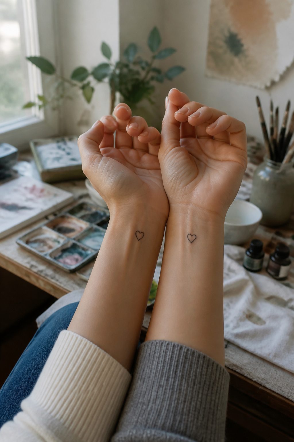
Hearts smaller than a fingernail still sit at the top of most artists’ request lists for matching best friend tattoos. The shape heals cleanly because there are no corners to blur, and the ink settles predictably even as skin changes over the years. What separates a meaningful tiny heart from something that looks like clip art usually comes down to two decisions the artist makes in the first ten minutes: line weight heavy enough to hold at 3–5 millimeters, and placement that follows a bone or a joint rather than floating in the middle of blank skin. A heart tucked at the inner wrist, where the radial bone creates a natural frame, reads as intentional. The same outline dropped an inch higher on softer tissue looks like an afterthought. Placement against structure gives the symbol its gravity without needing to enlarge it.
11. Sun, Moon, and Stars

Celestial designs sit near the top of every list of matching best friend tattoos for a reason that holds up in practice. A sun and moon pairing gives two friends with opposite temperaments a built-in logic: one carries the warmth, the other the quiet, and neither design looks incomplete without its counterpart. The visual weight stays balanced because the two shapes are already familiar opposites.
Adding a third element for a trio shifts that balance and needs real planning. The E. E. Cummings line "you are my sun, my moon, and all my stars" gets quoted often because it names the problem directly: stars want to scatter, and scatter badly in a tattoo if you let them. Keep the stars subordinate, smaller or simpler linework than the sun and moon, or the whole piece turns to noise. A Nottingham artist who tattooed matching Tarot sun and moon cards on two friends noted that placement freedom matters here: one friend wore hers on a finger, the other elsewhere, and the designs read as related rather than identical. That flexibility helps with trios too, since three people rarely want the same spot. The hierarchy of size and placement matters more than the imagery itself.
12. Lock and Key
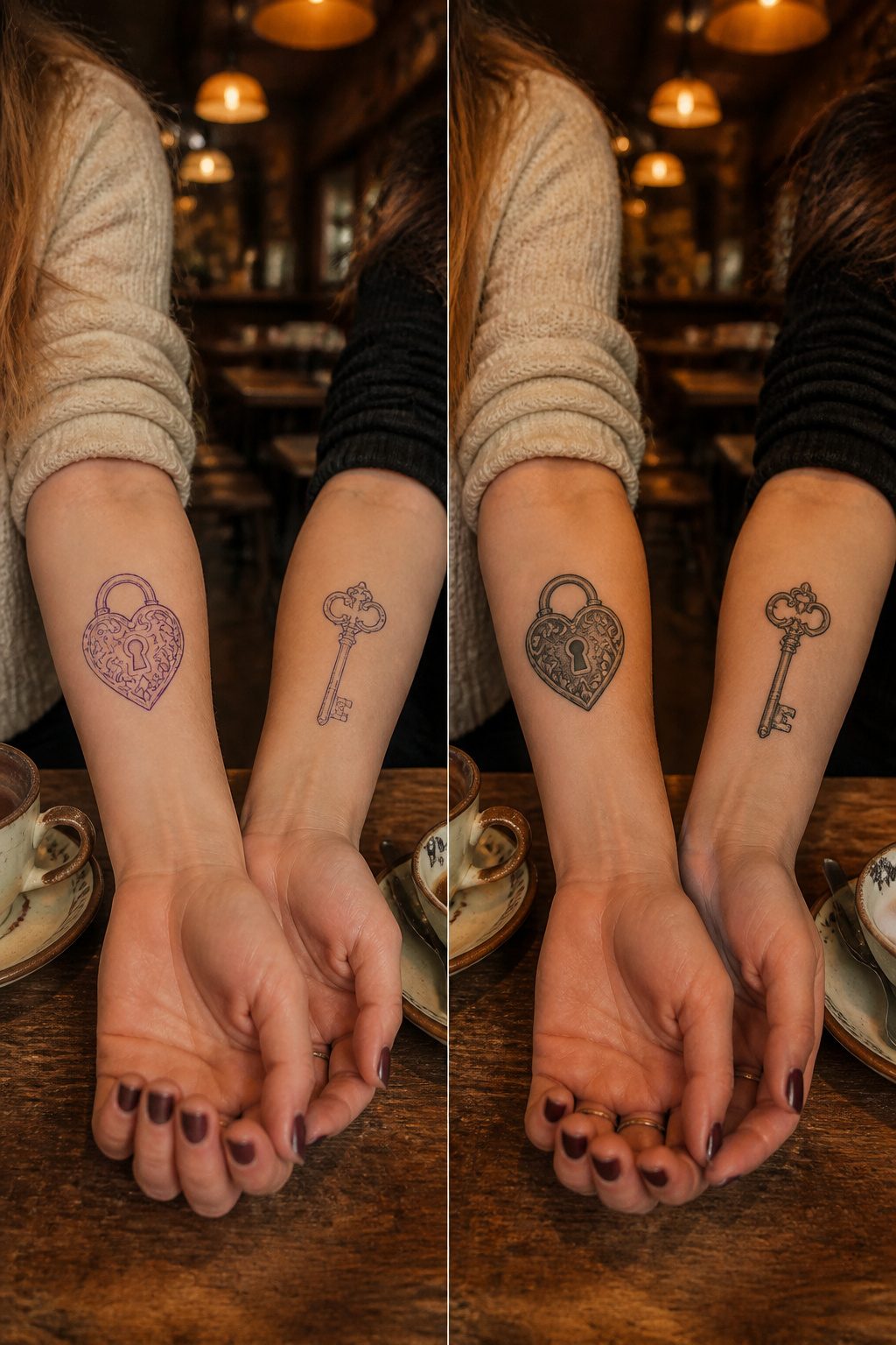
The lock and key motif has drifted from its romantic origins into something friends now claim for themselves. A best friend pair I watched plan theirs ran into the sizing problem almost immediately. The lock needs visual weight, the key needs delicacy, and matching best friend tattoos of this kind rarely work at identical scale. One of you ends up with a larger piece, the other with something finer, which pushes the two toward different placements. The ankle carries a small key well; a wrist or forearm suits the lock better. That asymmetry is the point, really. The design only completes its meaning when the two of you stand together, yet each half still reads as a complete image alone. Fine line work suits both shapes, though the key’s thin lines demand an artist with steady precision. A thicker line would turn the key clunky, and the lock heavy.
13. Avocado
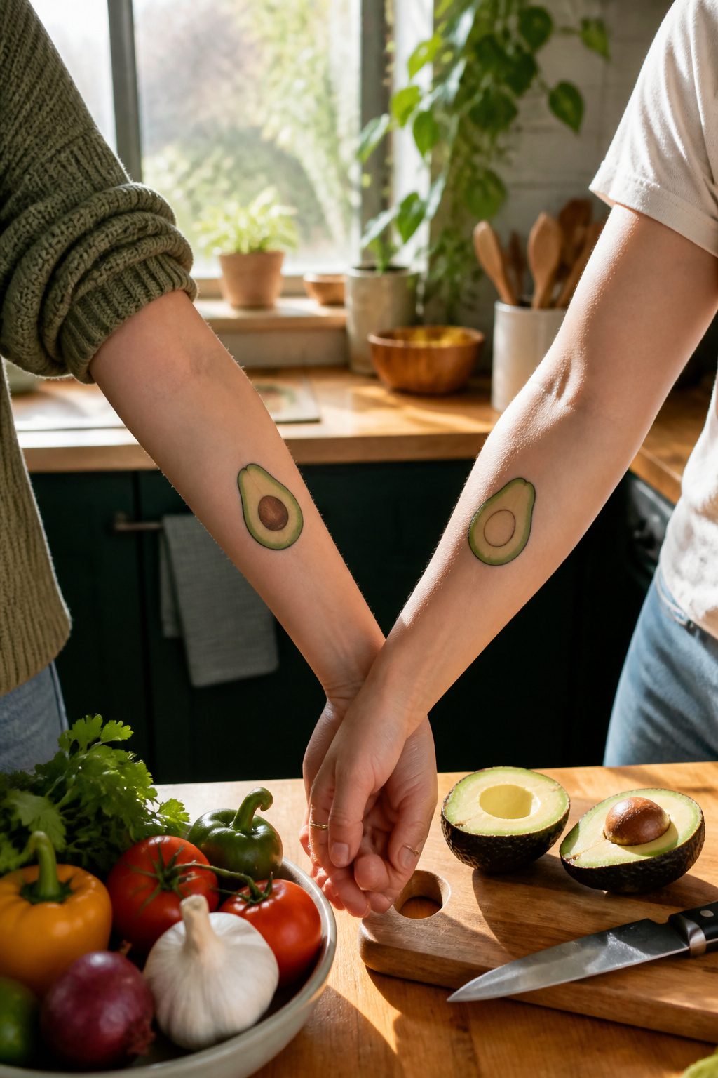
The avocado tattoo trend usually splits the fruit in half so each friend carries the pit or the empty cavity, playing on the "you’re my other half" idea that works best when the two halves line up side by side. The pit shape has to read instantly at small sizes, which is where this design often fails: too much detail around the seed, and from three feet away it looks like two generic green blobs instead of a recognizable avocado. Clean edges and strong contrast between the flesh tone and the darker pit solve this, so the tattoo still scans as food and not just abstract curves. Placement matters less than scale, but forearms or ankles give enough flat space for the halves to sit naturally. My preference leans toward slightly stylized pits with a small highlight mark, the kind that keep the cartoon warmth without tipping into clip art territory.
14. Paper Airplane

A paper airplane tattoo lands differently when it is inked for a friend rather than a travel blog. The folded-line silhouette is naturally minimalist, which keeps the matching set readable at wrist or ankle scale, and the slight angle shift between two people’s versions, one climbing, one gliding, can read as two people on the same journey at different moments.
The risk sits in how common the image has become. Without something added, a paper airplane reads as generic wanderlust, the kind of flash art picked off a studio wall before a spring break trip. What saves it for friendship is context you build in: the city code of where you met tucked along a wing edge, or a flight path that traces the actual route of a trip you took together.
Line weight matters more than detail. A single-needle outline holds up cleaner than anything shaded, and the simpler the fold, the less it blurs over years. Two friends matching should settle on the same paper plane style, not just the same subject. One person’s crisp geometric fold and another’s hand-drawn sketch version stop reading as a set and start looking like two separate tattoos that happen to share a theme.
15. Infinity Symbols
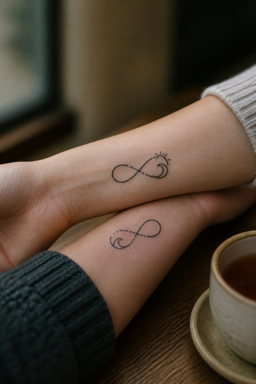
The infinity symbol carries an obvious permanence that makes it read as friendship at first glance, which is exactly why tattooers now treat it as a cautionary tale. Early executions were often rushed: thin lines blown out by inexperienced hands, the loop stretched too wide or pinched too narrow, the whole thing looking like a stock clip-art transfer rather than a mark two people chose together. Making it specific takes work. A plain infinity sign sits on Pinterest boards by the thousands, so the question becomes what you wrap around it. Names woven through the loops, a shared date tucked into one curve, or a small element that only the two of you recognize can pull it back from generic territory. The real risk is choosing the symbol alone and hoping the friendship fills in the meaning. Without that extra layer, it reads as a design you picked because you could not think of anything else, and in a shop full of flash sheets, that absence shows.
16. Matching Characters
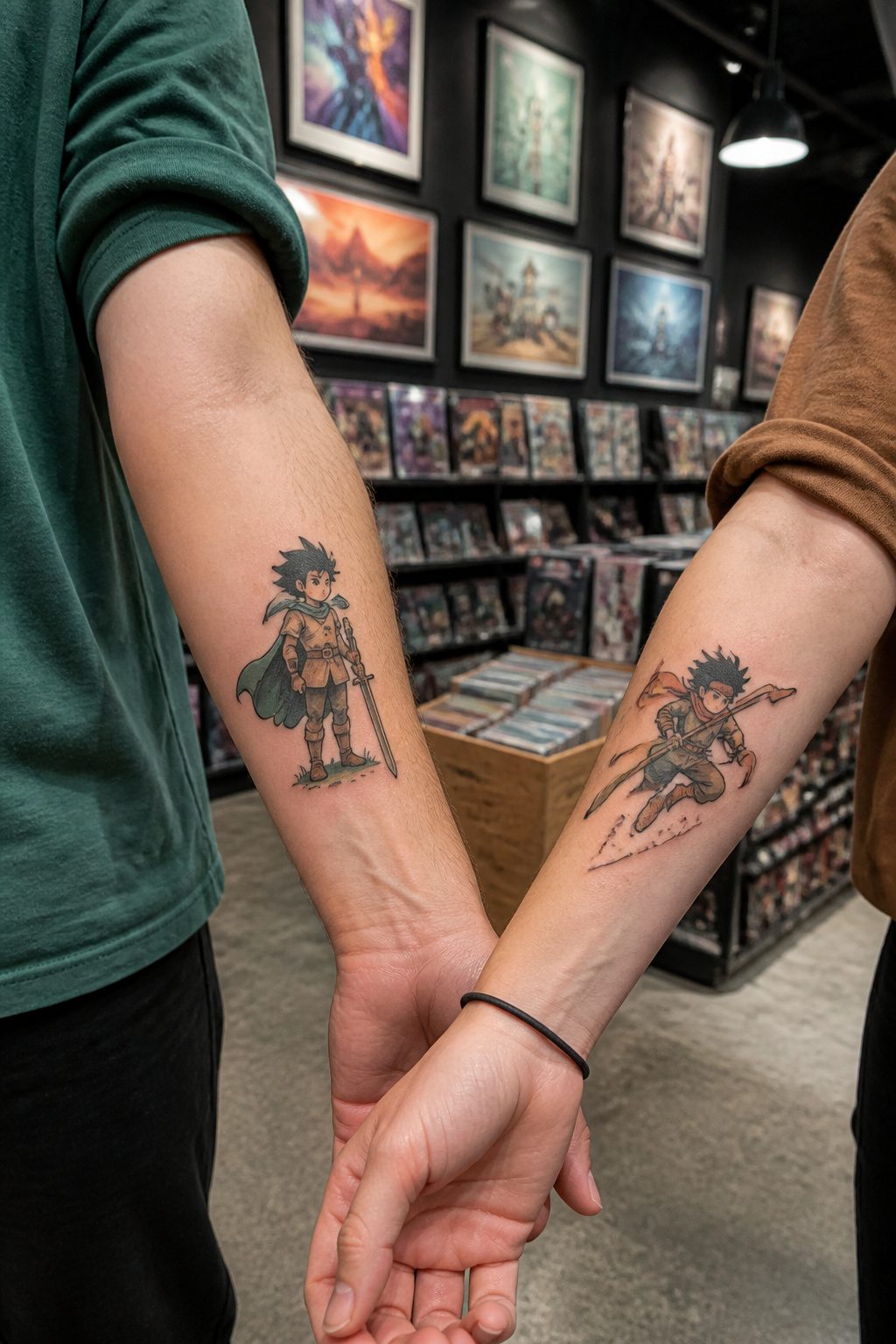
Pop culture pairs look irresistible on the Pinterest board: Bert and Ernie, Mario and Luigi, recent anime duos that lit up a convention season. The problem is that the character you love today becomes the dated reference you explain tomorrow. Styles shift, scandals happen, and that beloved franchise might age about as gracefully as a mid-2000s sitcom tattoo.
Copyright adds another wrinkle. Many reputable artists will not ink a straight copy of Disney, Nintendo, or studio-owned artwork, since the IP holder can theoretically come after the shop. What you often get instead is an "original interpretation": the artist redraws the character in their own style, or abstracts it enough to dodge a letter from a legal department. Sometimes the result is charming. Sometimes it looks like a bootleg plush from a gas station.
If you are set on this route, ask the artist upfront what they will and will not reproduce, and whether their version still reads as the character you wanted. A friend of mine walked in wanting matching Totoros and walked out with two gray blobs that only made sense if you already knew the reference. The friendship lasted. The tattoos became a cautionary story instead of a shared emblem.
17. Minimalist Designs
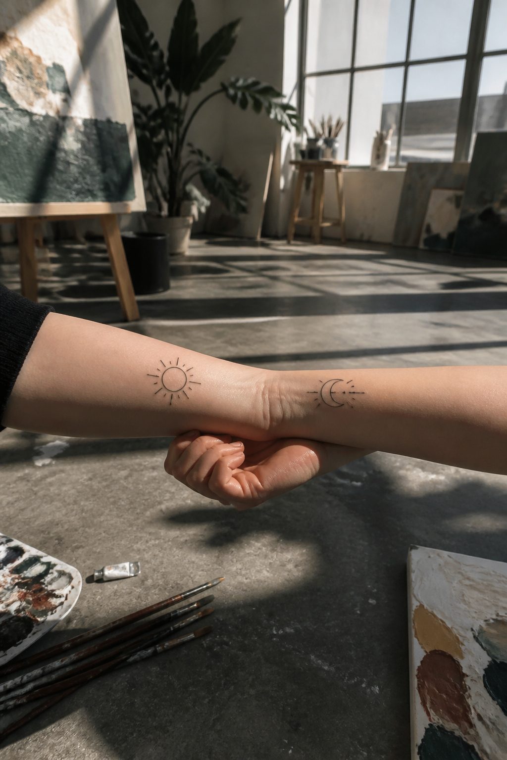
Single needle work and limited line weight variation are what actually separate a minimalist matching best friend tattoo from just a small one. The needle configuration matters here: a single needle deposits finer pigment with less skin trauma, which keeps lines crisp at sizes that would blur under heavier equipment. Negative space does the heavy lifting in these designs, meaning the skin left untouched carries as much meaning as the ink itself. That precision demand is where most plans fall apart. Not every artist who advertises "fine line" has the steady hand or the healed portfolio to prove it, and a minimalist piece leaves nowhere for a wobble to hide. Book the consultation around healed photos, not fresh ones, because the difference between a clean line and a blown-out one only shows after the skin has settled. The search takes longer, but a friendship symbol rendered in three hair-thin strokes deserves an artist who treats that restraint as the hard skill it is.
18. Matching Flowers
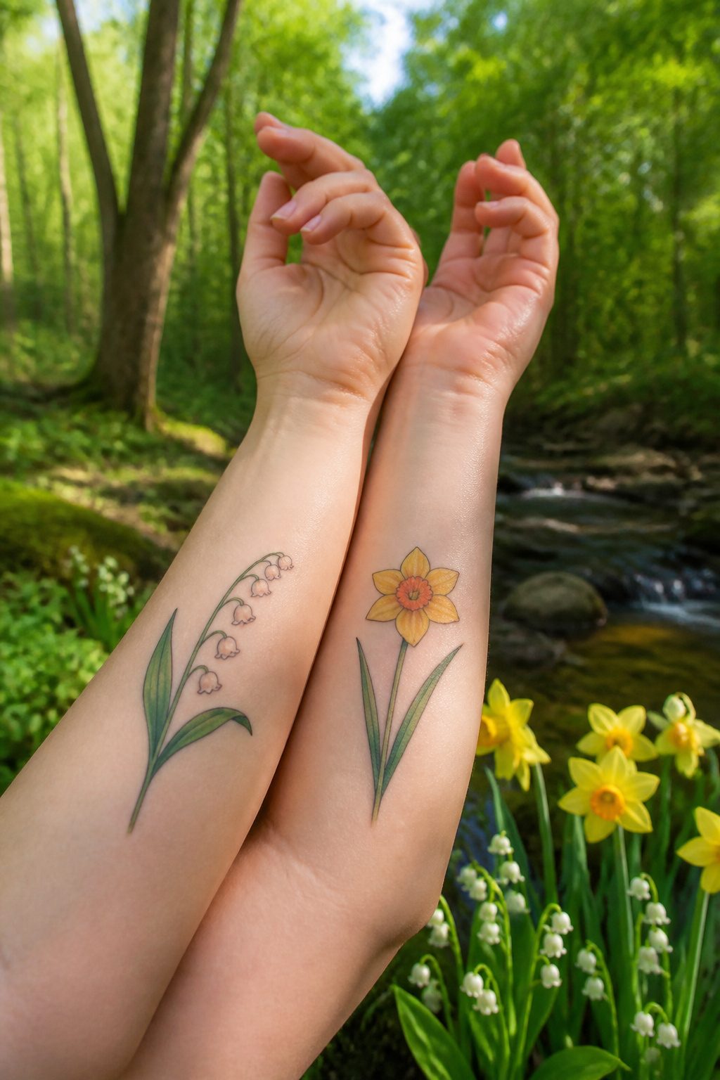
Botanical matching tattoos work best when the plant means something specific to the friendship. Two people carrying the same bloom, or two species that grow together naturally, tend to hold up better over years than designs chosen only because they look good on Pinterest.
Birth flowers give an easy anchor: one friend takes January’s carnation, the other takes March’s daffodil, and the pairing reads as intentional rather than random. State flowers or the variety tied to a particular road trip or shared apartment carry even more staying power. Aesthetic matching without that layer usually fades into regret faster than the ink itself fades.
Color ages faster and less predictably than black-and-grey on botanical work. Greens shift toward blue or muddy grey depending on the ink batch and the artist’s mix. Watercolor-style petals, popular for matching sets around 2019, now show the most uneven settling in the portfolios I’ve looked through. Solid black linework with limited shading stays readable at five and ten years; color demands touch-ups or acceptance that the original tone will drift. If one friend lives in a sun-heavy climate and the other doesn’t, the mismatch accelerates.
Complementary species, like two halves of a stem that complete each other only when the friends stand together, solve the symmetry problem without forcing identical art onto different bodies. The concept matters more than the execution being perfect mirror images.
19. Puzzle Pieces
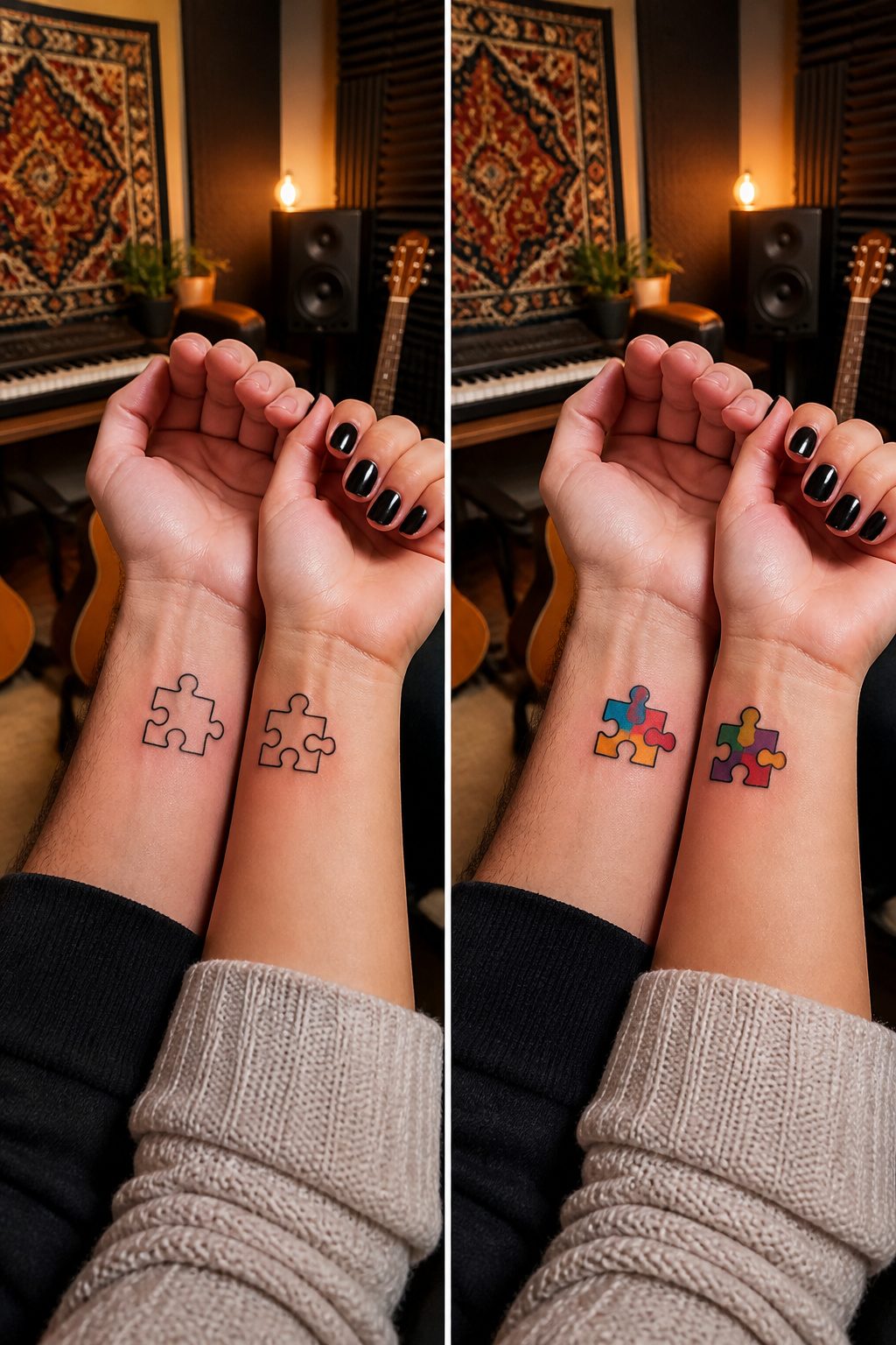
Puzzle piece tattoos only read as friendship imagery when the two shapes actually interlock. A piece with a single knob and two holes looks incomplete on its own, but pair it with its mate and the negative space between them clicks into something whole. The common mistake is choosing two pieces that share a straight edge or both have the same tab pattern, which would never connect in a real puzzle. The tab and blank have to mirror each other exactly, or the design falls apart the moment someone looks closely.
Color choice matters more than people expect. Two friends often pick different palettes for their halves, but a puzzle piece split between hot pink and forest green reads as two random shapes rather than one object separated. Keeping the line weight and fill style consistent across both arms or ankles preserves the single-puzzle illusion.
Placement adds another layer. The pieces work best on body parts that naturally face each other when the two people stand side by side, inner forearms being the obvious choice. What breaks the effect is putting one piece on a shoulder and the other on a calf, forcing an awkward pose to show them together.
20. Smiley Faces
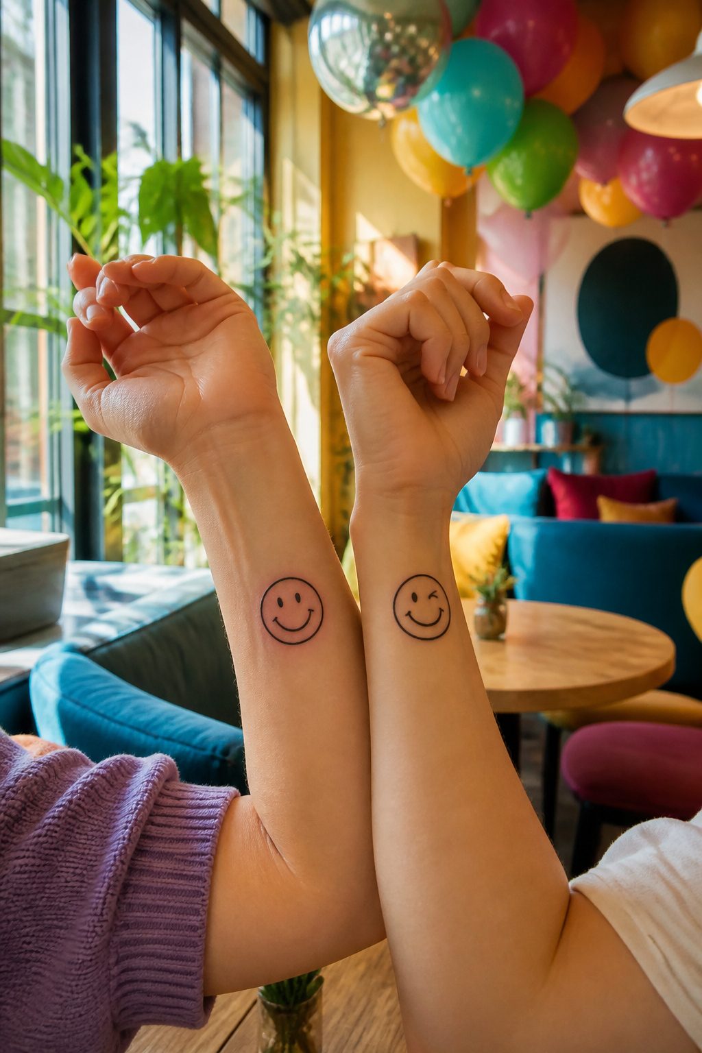
The smiley face has cycled back from 90s sticker sheets to tattoo shops, and the jump makes sense for friends who want something that reads instantly without shouting. A pair of matching best friend tattoos in this style work because the symbol is already in everyone’s visual vocabulary; the job becomes making it yours.
Line quality carries most of that weight. A fine-line version, which requires more precision from the artist than thicker work, reads delicate and intentional. Two friends might split the expression: one keeps the classic upturned grin, the other adds a crooked mouth or half-lidded eyes that say "I know you’re faking it." That tension, one source notes, mirrors how a real friend reads the difference between genuine happiness and performance.
Placement stays flexible. Wrists keep it visible, but the simplicity scales to ankles, ribs, or the back of an arm without losing clarity. Added elements help too: tiny tears, halos, or even mismatched accessories let the same base shape carry two personalities. The 90s nostalgia layer helps if you and your friend actually lived through slap bracelets and mood rings; the ironic adoption works if you did not. Either way, the recognizability means the tattoo still communicates years from now, even if the friendship itself becomes a memory rather than a daily thing.
Where to Place Matching Tattoos
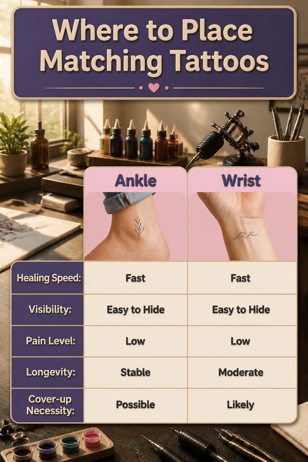
Ankle and wrist placements show up constantly in best friend tattoo photos for a reason: both spots heal fast, stay fairly flat over time, and let you hide or show the work without much effort. The collarbone and ribs are options too, though the bone proximity makes the session sting more and the skin there shifts with age in ways that blur fine lines faster.
Matching placement is not required, and in practice it rarely works as well as people expect. One of you might need yours fully covered for a corporate job while the other works from a laptop in jeans. Asymmetrical choices, one on an ankle and the other on a wrist, let the design read as coordinated without forcing identical aftercare routines or lifestyle compromises. The tattoo still reads as a pair when you show it; the rest of the time it sits where it actually fits your body and your day.
Symbols That Actually Mean Something
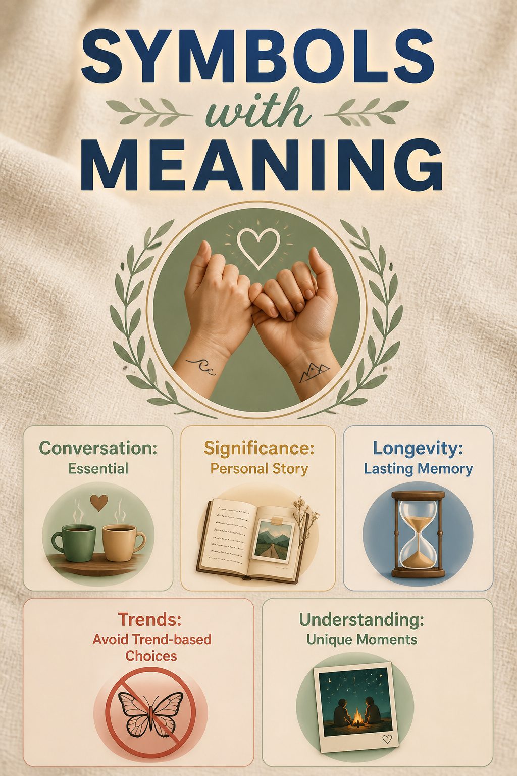
A matching tattoo that lasts starts with a conversation most friends skip. Before anyone opens a Pinterest board, sit down and ask what moment actually defines you two. Was it a road trip that went wrong, a phrase you repeated until it stopped making sense, a song that played during the one bad year? The symbol that carries weight will come from that story, not from a list of generic friendship icons.
The gap between a pretty design and a meaningful one shows up five years later. One still maps to a real memory every time you glance at it. The other just sits there, a decoration you have to explain. The test is whether the image still makes sense if you stop being friends; shared history survives that hypothetical, trend-based choices do not.
Prompts worth using: what did we do together that no one else would understand? What object was present? What did we almost throw away? The answers rarely match the popular symbols, which is exactly why they work better inked into skin.
Size and Style Questions to Settle First
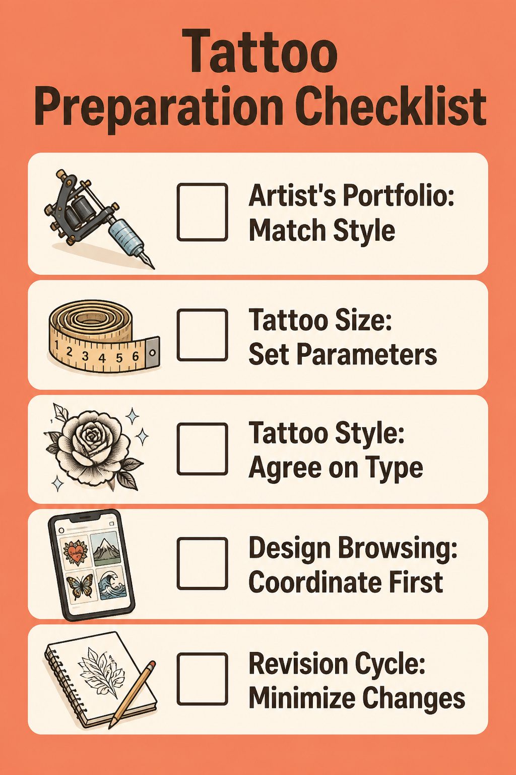
Fine line tattoos demand more precision than thicker-lined work, so the artist’s portfolio needs to match your chosen style before you even book. A tiny lightning bolt on the wrist holds almost no detail, while a larger piece on the shoulder can carry linework that reads cleanly from across the room. Traditional, blackwork, and illustrative styles each pull from different artist skill sets; one person who nails bold American traditional roses may struggle with the whisper-thin single needle your friend wants. Settling on size and style before you scroll designs cuts the revision cycle in half, because "something small and cute" means nothing until you both agree on two inches versus six and whether that cute thing lives in thick black outlines or hairline greywash. Matching best friend tattoos only work if the parameters match first; browsing Pinterest without that filter wastes an evening and leaves you both liking completely different posts.
Frequently Asked Questions
What are some cute best friend tattoo ideas?
Matching lightning bolts, twin flames, foodie symbols like sushi rolls or pizza slices, butterfly halves that lock together, and tiny hearts all work well. The article also covers zodiac constellations, lock-and-key pairs, avocados split in half, and minimalist single-needle designs. What makes them cute depends on whether the shape carries a private story only the two of you share.
How do I choose a matching tattoo with my best friend?
Start with a shared memory or inside joke rather than a generic symbol. The article stresses that a pineapple means nothing, but a pineapple from a food-poisoning road trip means everything. Pick something recognizable at a glance, keep the shape simple enough to age cleanly, and agree on placement details like exact height from the wrist bone so the matching effect shows up in photos.
What is the best placement for best friend tattoos?
Wrists and inner forearms make side-by-side photos easy, while ankles stay hidden for work but visible at the beach. The article notes that ribs and upper thighs protect lines from sun but kill the photo opportunity, and that three friends need exact matching spots or the group shot looks accidental. Inner bicep splits the difference for visibility and aging.