These book tattoos ideas run from the White Tree of Gondor at thigh size to a full Hogwarts skyline sleeve, and the right one depends on whether your reading life centers on one defining story or the daily ritual itself.
1. White Tree of Gondor from the Lord of the Rings
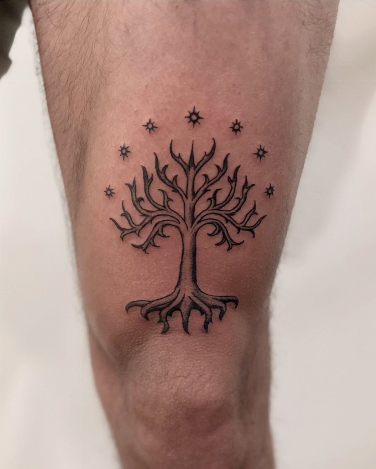
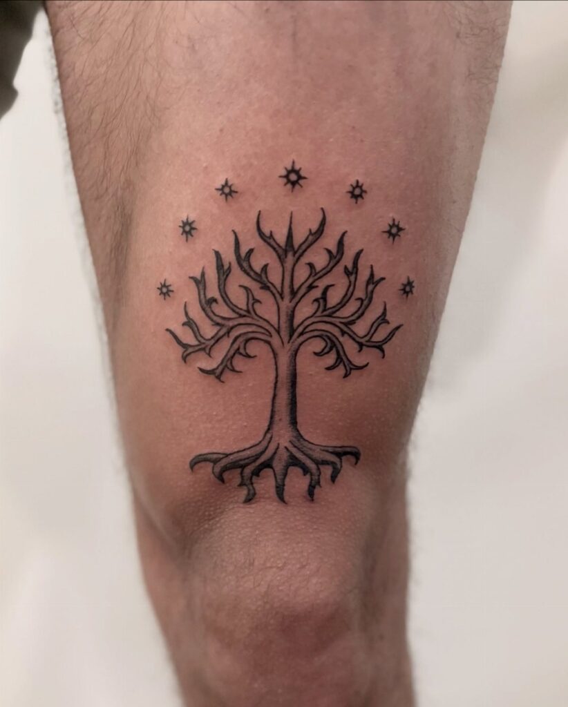
The White Tree of Gondor works best at a scale that lets the stars arc cleanly above the branches. At thigh or upper arm size, the roots and crown stay sharp instead of blurring together.
I would place this where a short sleeve still hides it for professional settings; the detail rewards close inspection but does not shout across a room.
The black ink ages well on this design, though the fine star points may need a touch-up after a few years.
This one suits a reader who wants one definitive Lord of the Rings piece rather than a collage of references. It trades the instant recognition of the One Ring for something a fellow fan spots with satisfaction.
2. The Hobbit Tattoo
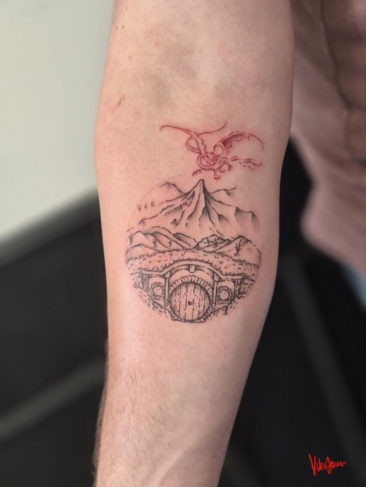
Bag End, the Lonely Mountain, and Smaug layered in one forearm piece tells the whole journey in a single frame.
The red ink for the dragon is the detail that separates this from a generic mountain scene; without it, the hobbit hole reads as any countryside cottage.
A circular frame keeps the composition tight on a forearm’s length. The inner arm placement catches less sun than the outer, which matters for red pigment; it fades faster than black.
This design asks for an artist comfortable with architectural detail at small scale. I would check their portfolio for doorways and rooflines before booking.
The reader who lived in The Hobbit before graduating to The Lord of the Rings gets the most from this one.
3. Alice in Wonderland
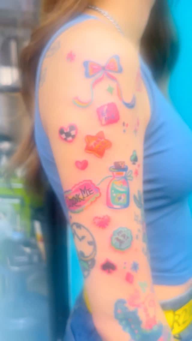
Pastel color work on literary tattoos is harder to find than black-and-grey; the "Drink Me" bottle and pocket watch here need an artist who mixes custom tones rather than pulling from a standard palette.
The bow and card suits fill gaps between larger pieces, which is how this sleeve reads: collected over time rather than planned at once.
A single Alice element works for someone testing whether book imagery suits them. The potion bottle translates well to ankle or wrist scale; the clock face needs more room for the hands to read clearly.
I would start with one icon and build outward only if the style holds up healed. Pastel can heal muddy; the reader should expect one follow-up session at minimum.
4. Literary Quote
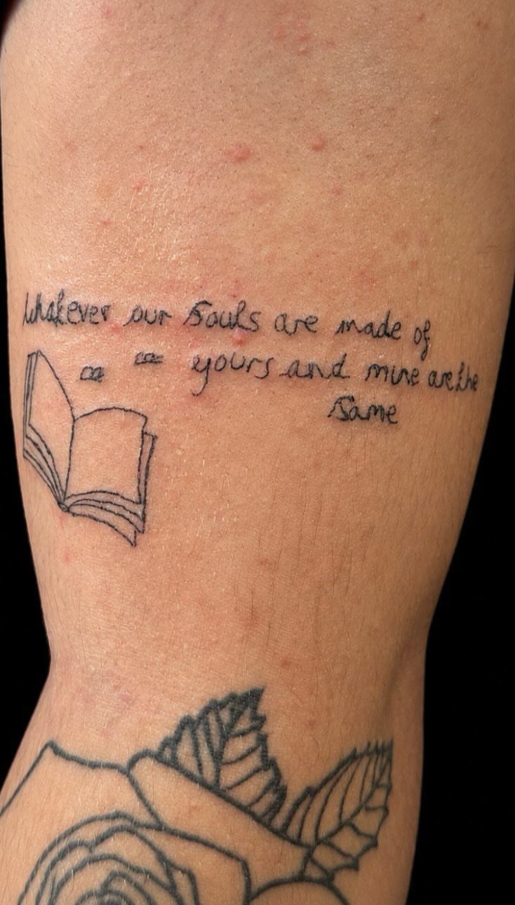
A handwritten quote paired with a small open book keeps the text from floating unanchored on the skin. A short Emily Brontë line carries weight beyond its length; shorter phrases age better than paragraphs.
The book illustration frames the words and gives the eye a resting place. I would match the handwriting style to the source: a Victorian novel calls for something different than a mid-century American one.
Placement on the leg or outer arm keeps the text readable as skin shifts; ribs and inner bicep distort lines over time.
This suits the reader who returns to one passage repeatedly, not someone who collects favorite lines from every book finished.
5. Quill and Ink Bottle
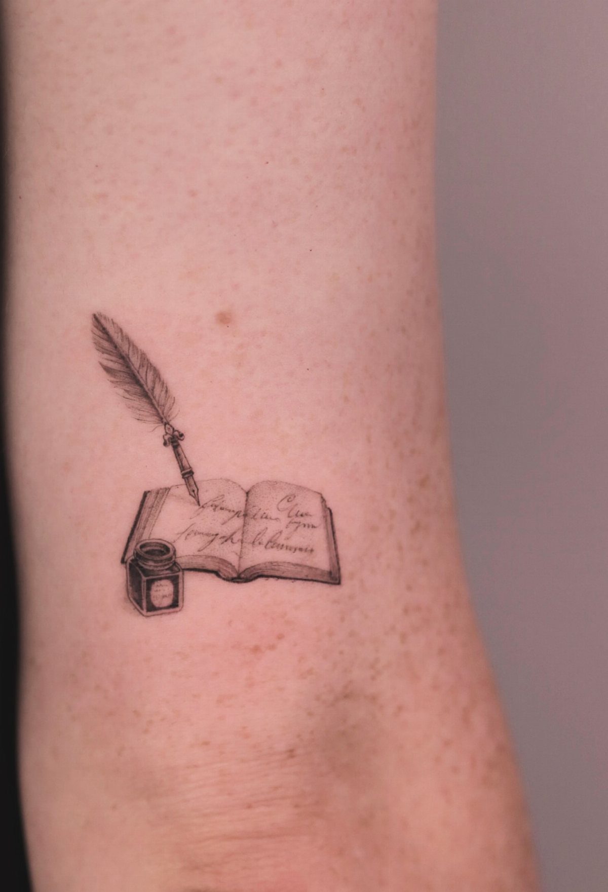
A quill and ink bottle next to an open book reads as the tools rather than the product: the writer’s tattoo, not the reader’s.
The fine lines in the visible piece need an artist steady enough that the quill shaft does not wobble; this is linework that shows every hesitation.
I would add cursive only if the script is large enough to stay legible healed. Illegible pages are the safer choice; they suggest text without committing to letters that blur.
This design suits someone who journals, drafts, or otherwise makes marks on paper themselves. For the reader who never writes longhand, the coffee cup pairing below makes more honest sense.
6. Book and Coffee Cup
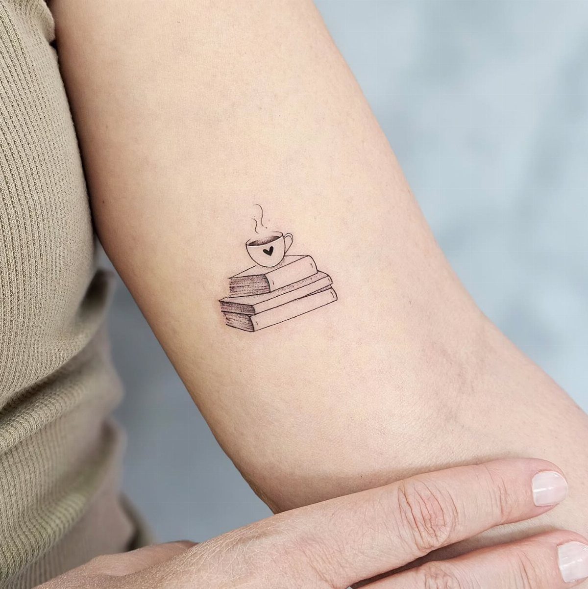
Three books under a steaming cup fits the space a coffee sleeve leaves bare on the forearm: a small tattoo that earns its place through daily relevance. The minimalist line weight stays readable even at a small size.
I would vary the book spines by height or add one slight tilt so the stack does not read as a single block.
The steam lines are the detail most likely to spread; a single wisp reads cleaner than multiple curls.
This one works for the reader whose reading time is specifically the morning cup, not the late-night binge. It trades literary specificity for the broader pleasure of the habit itself.
7. Fairy Tale Castle and Book
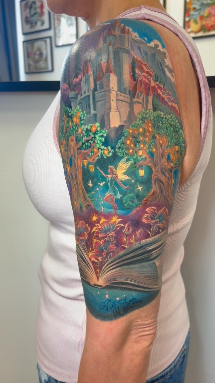
A castle rising from open pages works best when the book itself stays readable at a glance. The reader should recognize the shape before noticing the architecture.
Size matters here. Small turrets blur fast; give the castle enough room for the details to hold.
I’d place this on the upper arm or thigh where the artist can stretch the spread and still keep the lantern light soft.
Color holds the magic. The castle needs warmth against cooler page tones, or the whole piece flattens.
Ask to see healed photos of the artist’s architectural work; straight lines that look crisp fresh often bleed.
This one suits readers who loved a specific tale early and still return to it. Pick the castle from that story, not a generic silhouette, or the meaning thins out.
8. Book and Flower Combination
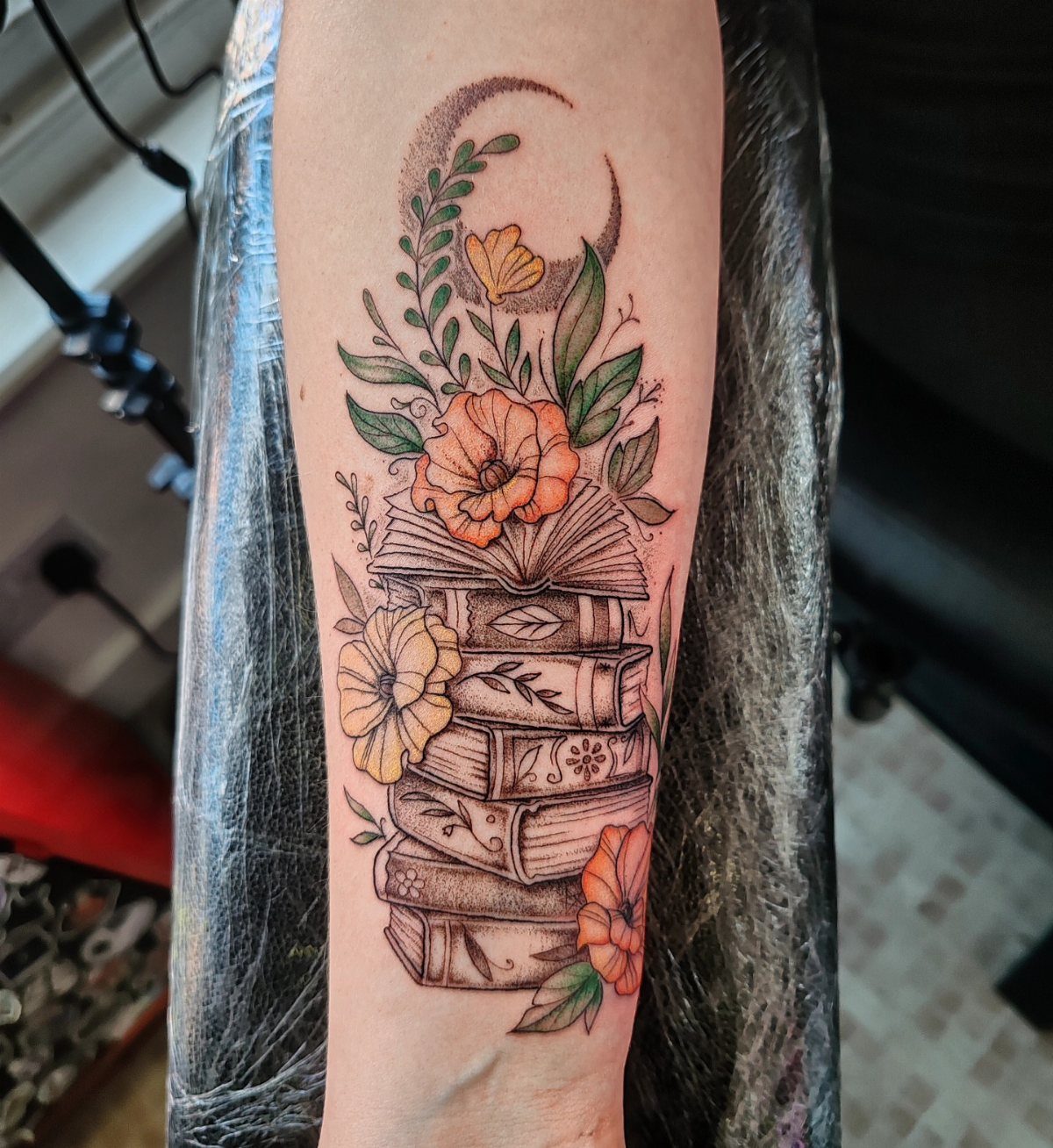
Vintage spines wrapped with nasturtiums or poppies give the stack a season, a sense that the books themselves grew. The moon at the top pulls the eye upward and keeps the composition from feeling bottom-heavy.
The flowers should mean something specific to you. Birth month, a grandmother’s garden, the color of a jacket worn while reading a favorite novel.
Generic blossoms make this pretty; named ones make it yours.
Orange and yellow against aged leather reads warmer than pink or purple, though cooler palettes suit winter readers. Check that your artist understands botanical structure; stylized petals age better than photorealistic ones on a moving forearm.
I’d add the crescent only if night reading is the memory you want kept.
9. Typewriter
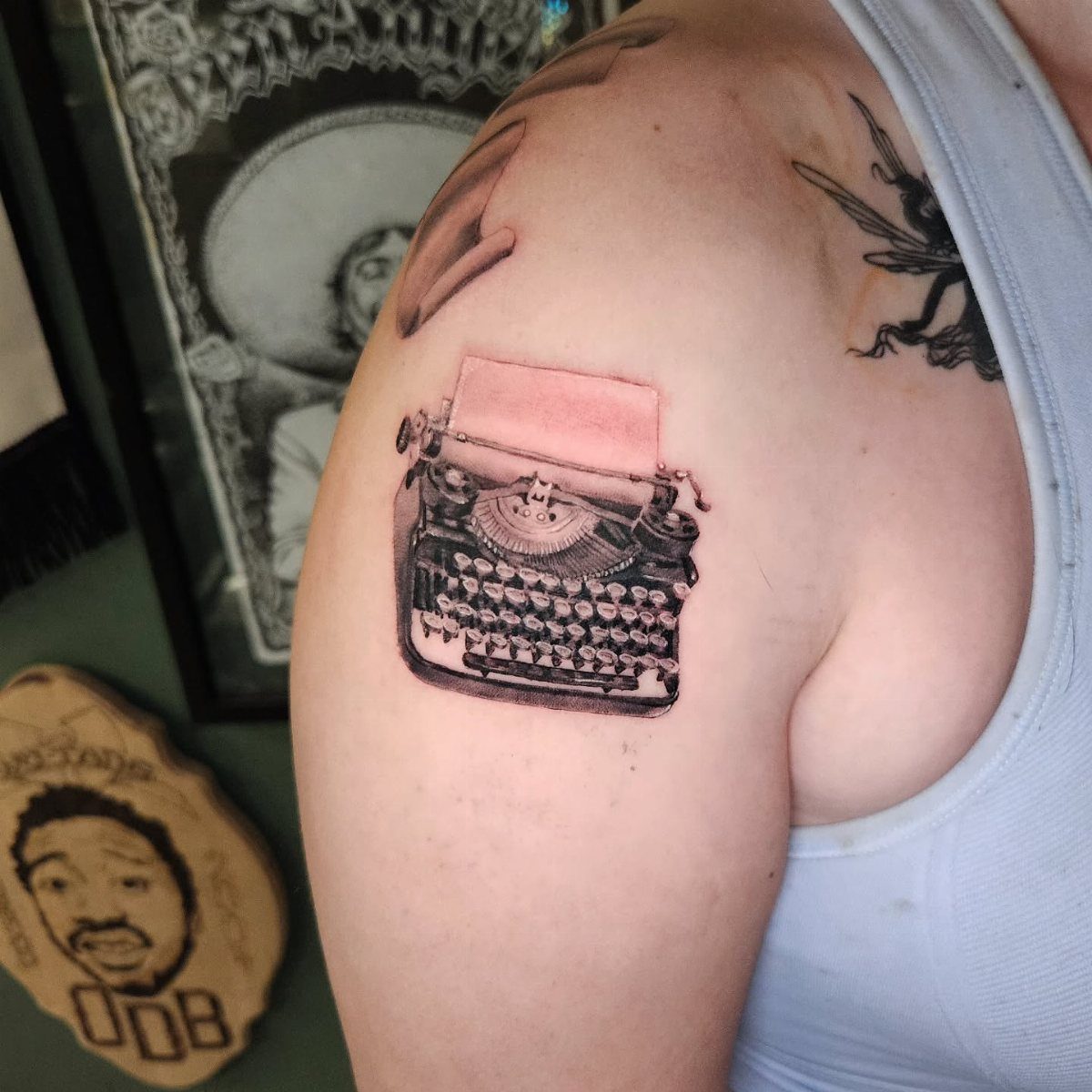
Black and grey realism demands an artist who specializes in metal and shadow. The typewriter’s keys, the paper’s edge curl, the carriage return lever at just the right angle: these separate a working machine from a toy illustration.
Placement on the shoulder lets the paper trail toward the collarbone, which carries the story outward. The upper arm works for a tighter crop, more machine, less atmosphere.
Paper content is your choice. A blank sheet keeps it universal.
A single visible sentence from your own work, or a line that started everything, turns the tattoo into a private signature. Either way, specify the font; Courier reads right, Helvetica reads wrong.
This one fits writers more than readers, though a devoted reader who journals daily earns it too.
10. Mythical Creature and Book
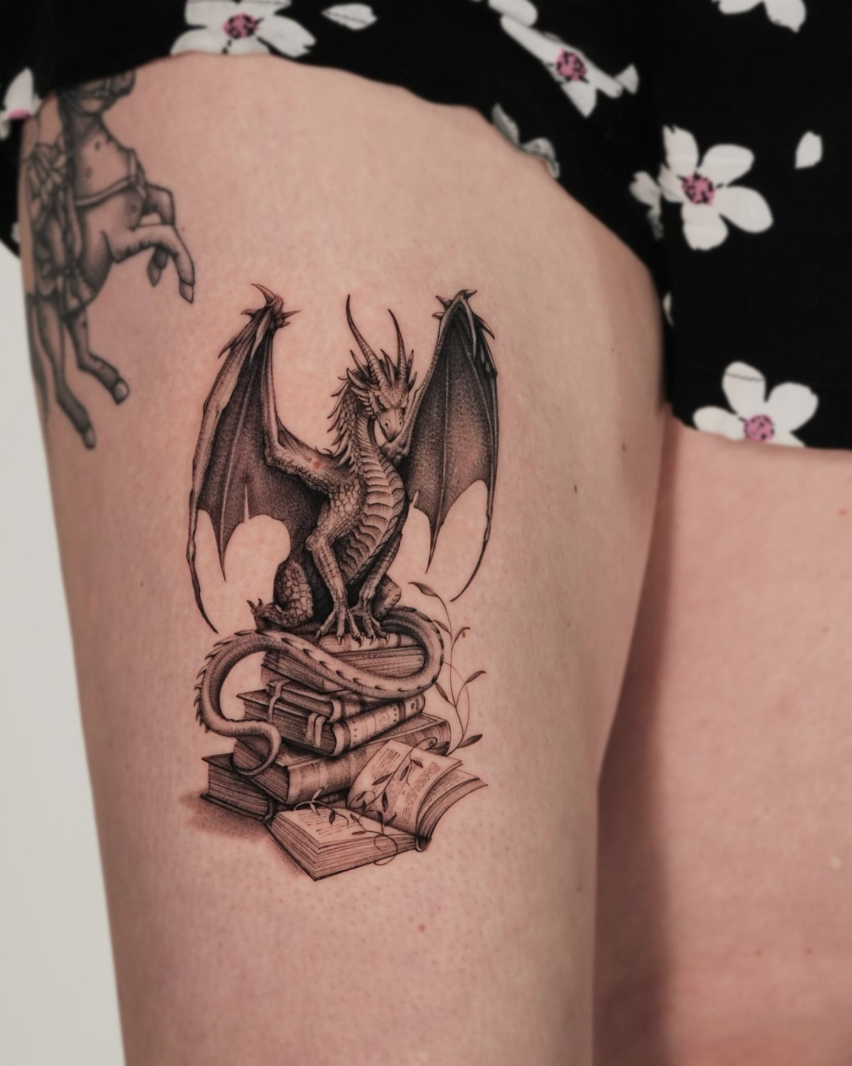
A dragon coiled over stacked spines needs careful weight distribution. The creature’s body must read as resting, not floating, or the books lose their physical presence.
The tail wrapping down one side anchors the composition.
Black and grey suits the subject’s age, but consider one accent color: gold for the hoard, or red for the flame held back. Full color on a mythical piece can turn comic faster than you’d expect.
The books beneath should show wear. Cracked leather, softened corners, titles half-visible.
New-looking spines underneath an ancient dragon breaks the logic.
This suits the reader who reread The Hobbit annually, who knows Smaug’s dialogue by rhythm. Generic dragon lovers have other options; this one belongs to the library first.
11. Books and Stars
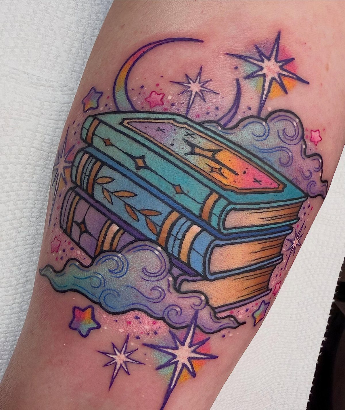
The celestial elements need breathing room; too many stars crowded around the spines and the whole thing becomes a sticker design.
Warmer complexions turn those shades muddy within months. Gold for the stars and page edges holds up across most skin, though it needs a touch-up to stay bright.
The crescent placement matters. Top center is expected; off to one side, rising from behind the stack, feels more like a specific memory of reading past midnight.
I’d skip this if your book collection lives in daylight. The night sky should match your habit.
12. Deathly Hallows Symbol
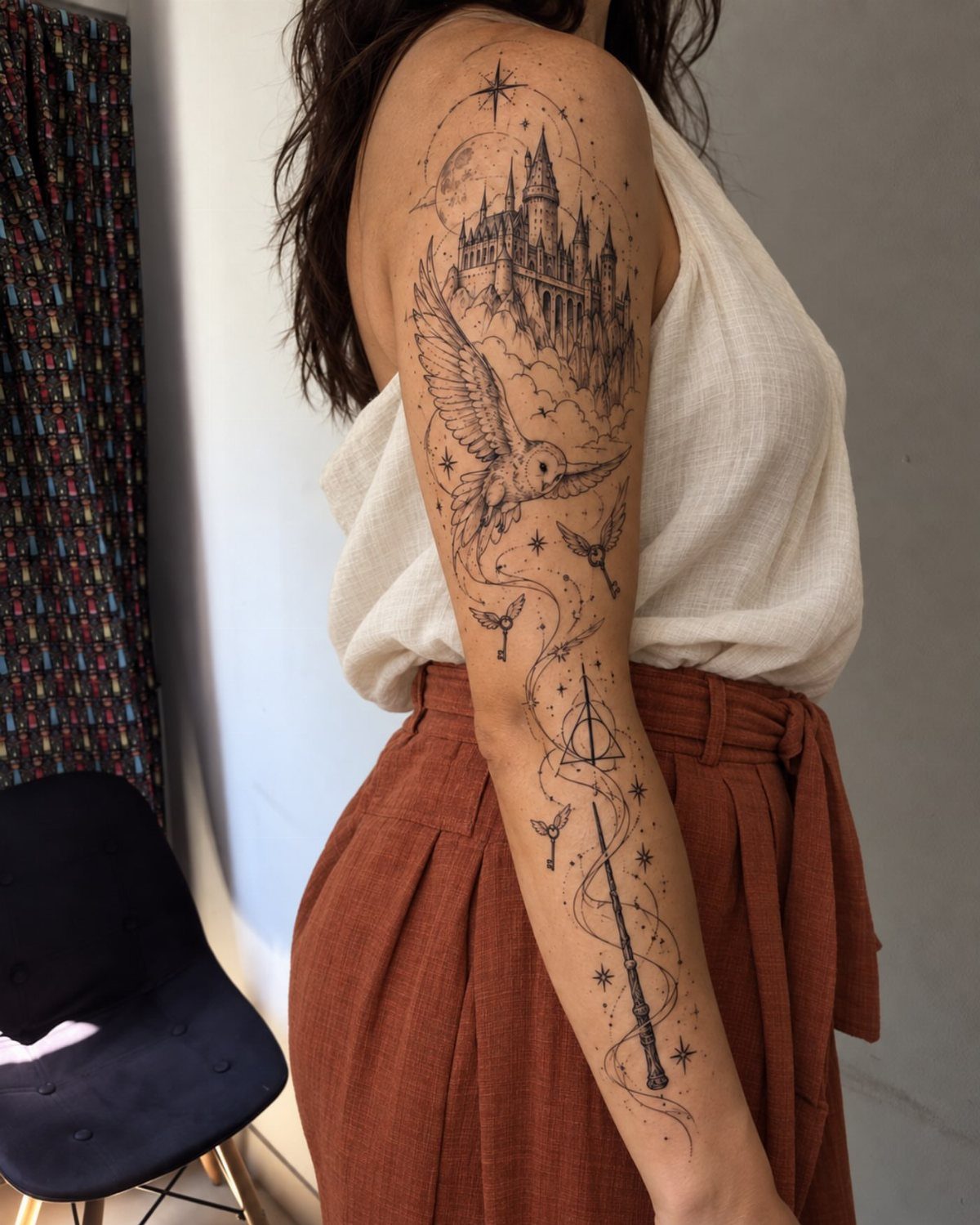
Alone, it reads as shorthand; embedded, it becomes scenery.
Black ink ages cleanly on this symbol, which matters if you’re building around it later. The geometric precision means any line that wanders shows immediately.
Pick an artist with steady linework over one with flashy shading.
The symbol carries weight beyond the books now. Strangers recognize it.
Decide whether you want that conversation or the quieter nod between readers who ask first.
I’d place this only if the series shaped your actual choices, not just your childhood afternoons. The tattoo lasts longer than nostalgia.
13. Hogwarts Skyline
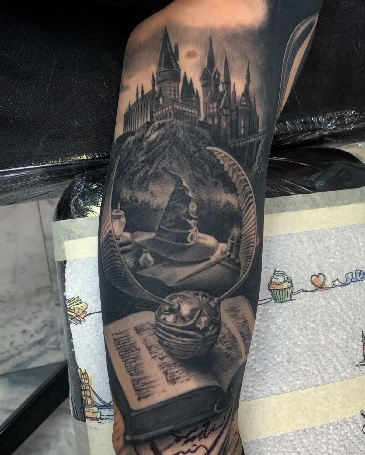
A castle silhouette carries more weight when it holds personal memory: which house you sort yourself into, which professor you still quote. The Sorting Hat sits centered between snitch wings and an open book, all in black and grey.
That layout works because the castle sits highest, drawing the eye upward; the book grounds it at the wrist or forearm. Color is an option, but the stone reads clearer in grey wash.
I’d keep the line weight consistent throughout. Heavy black in the castle towers, lighter stipple in the sky behind them.
The snitch wings need that same density or they disappear into skin tone. Below a certain size, the tower windows muddy together.
A forearm placement preserves the architecture.
This one suits the reader who wants Potter visible from across a room but still elegant up close. Tradeoff: it asks more of your artist than a simple lightning bolt.
Check their portfolio for architectural work, not just fandom pieces.
14. Eyes of Doctor T. J. Eckleburg
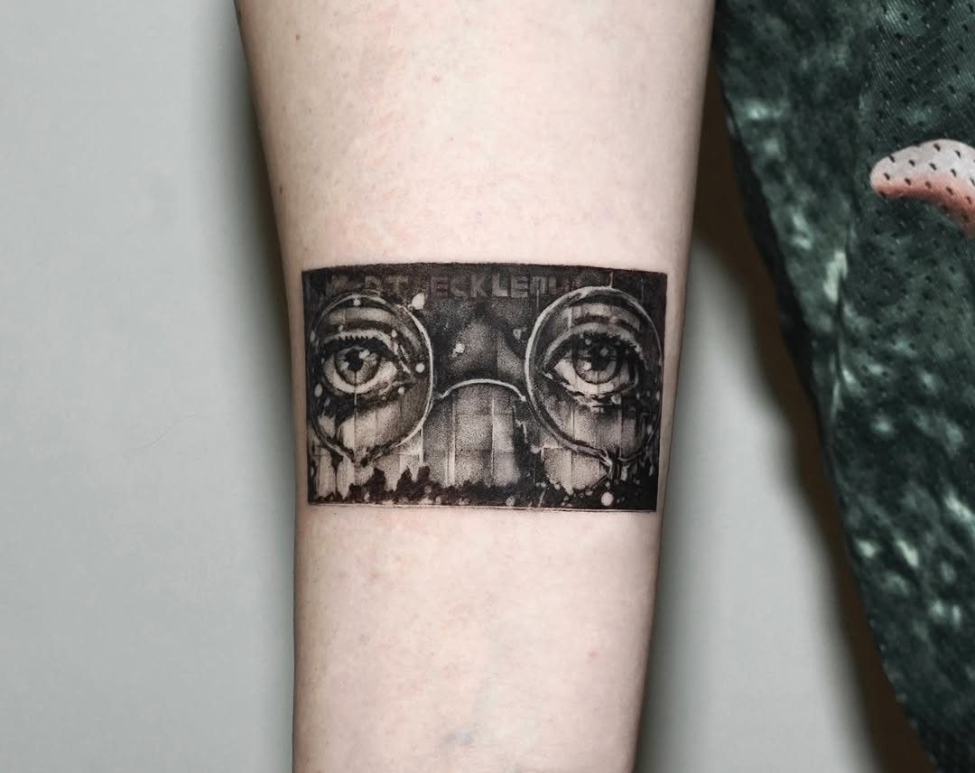
Fitzgerald’s billboard eyes work as tattoo material because they already look designed for skin: flat, graphic, meant to be seen at speed from a highway. The spectacles are the detail that makes them unmistakable.
Without the frames, they’re just eyes; with them, they’re the novel’s judgment made visible.
Placement shapes the meaning. On the forearm, they face outward toward whoever you’re talking to.
On a ribcage or thigh, they turn inward, more private meditation than accusation. The lettering "TJ ECKLEBURG" needs careful spacing; too tight and it blurs, too loose and it looks like two separate tattoos.
Color would push toward pop art, away from the dust and ash of the book’s valley of ashes. This one rewards the reader who loved the novel’s moral weight, not just its parties.
If Gatsby’s green light speaks to you more, this isn’t your symbol.
15. Peter Pan Tattoo
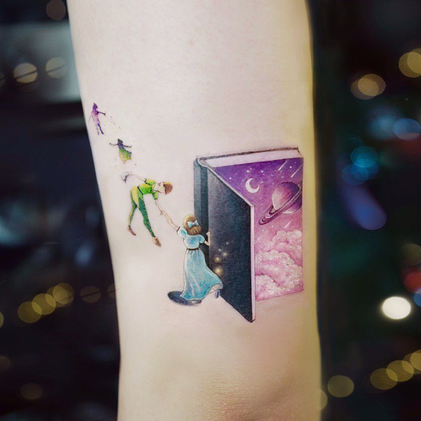
Bring the book if you want literary fidelity; bring the film still if you want this specific nostalgia.
The cosmic pages are the detail that elevates it. A plain book would read as static; the starfield turning into moon and planet gives the escape velocity the theme needs.
Color is doing heavy work here, the purple against skin tone creating depth that black ink would flatten.
Size protects the small figures. Peter and Wendy at small scale lose their expressions entirely.
I’d want enough space for the full composition, more if the book spine and pages stay readable. This suits the reader who still keeps a childhood copy on their shelf, who wants the longing more than the boy himself.
16. Timshel from East of Eden
Timshel
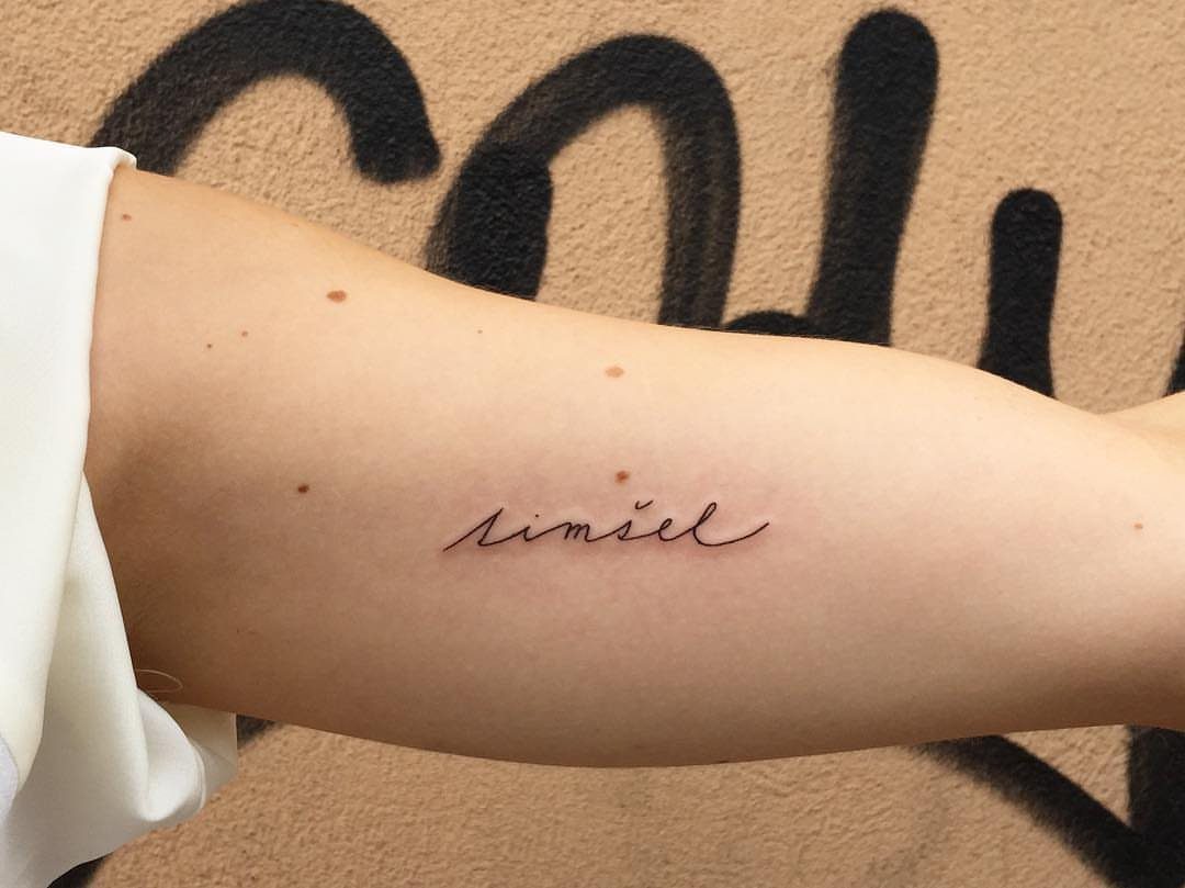
A single word carries the whole of East of Eden if that word is timshel. The Hebrew translates to "thou mayest," Steinbeck’s hinge between command and permission, and the cursive keeps it whispered rather than shouted.
The font choice is the entire decision here. Cursive connects the letters, makes it flow as one breath; block letters would break it into announcement.
I’d ask for a hand-drawn script, not a typeface, so the ‘t’ and ‘s’ carry the writer’s own motion. Placement near the wrist keeps it self-readable, a private reminder you glance down to find.
This is for the reader who underlined that passage, who felt the weight of choice land on them personally. It trades spectacle for intimacy; someone seeing it won’t know the reference unless they ask.
That asking is part of the point.
17. Quote from the Bell Jar
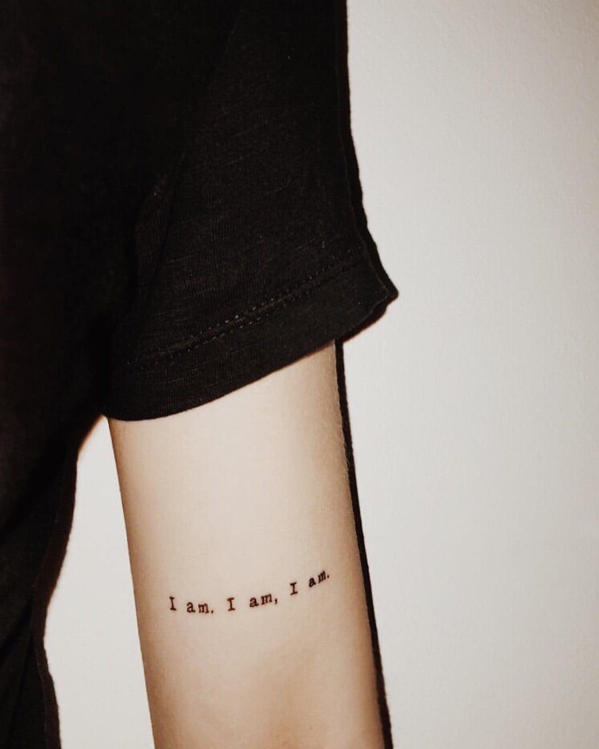
"I am, I am, I am." The repetition is the heartbeat, and the typewriter font honors that mechanical insistence.
Plath’s original line runs longer, includes the deep breath and the listening; the tattoo extracts the pulse alone, and that extraction is a valid choice. Shorter means more placements possible, more survivable over decades of skin changing.
"I am, I am, I am." with the first comma, and that pause is what saves the line from chant, gives it the stagger of someone fighting to continue.
I’d keep the periods too, all three, though some artists argue for clean omission. The typewriter face needs crisp lines; a script would romanticize what the novel refuses to romanticize.
This one reaches the reader who found the book during their own bad season, who wants the affirmation without the prettiness. Upper arm placement keeps it coverable.
Legibility at distance suffers; this is a tattoo for mirror moments, not public declaration.
18. Cat Sleeping on Books
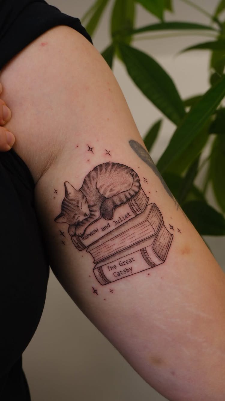
A sleeping cat draped over books turns a literary tattoo into a portrait of the reading life most book people actually live: quiet, interrupted by nothing more demanding than a warm weight on your lap.
Spine titles that swap classics for cat puns bend the idea toward humor, though the same layout stays solemn with real titles.
Black and grey shading suits the soft fur and the paper edges both.
I’d ask the artist about the cat’s breed or pattern; a generic cat reads as stock art, but the specific tabby stripes on your own pet make it yours.
Best for readers who already have the cat hair on their sweaters to prove it.
19. Stained Glass Window and Bookshelves
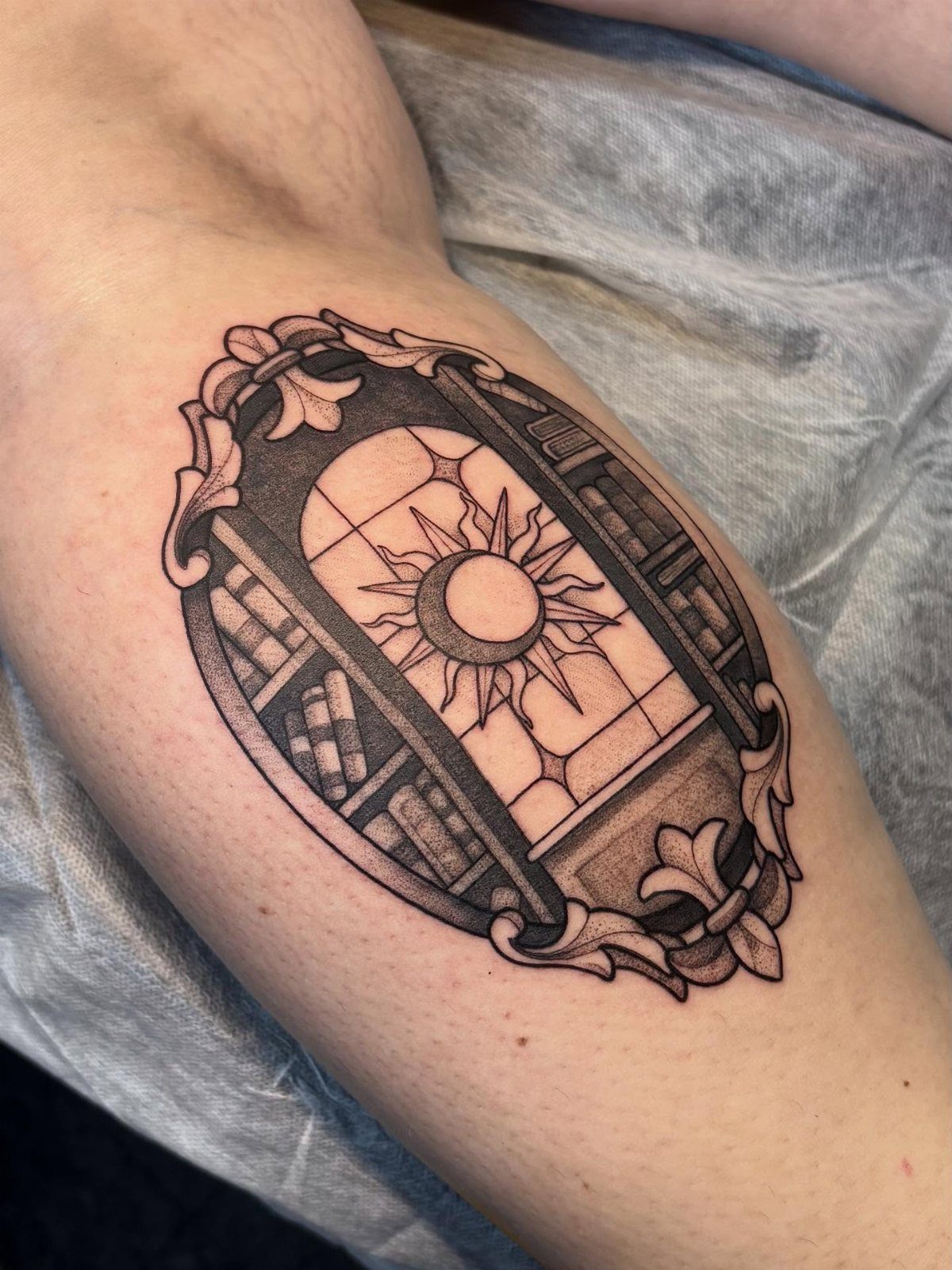
Stained glass and bookshelves share a natural alliance: both filter light into something you can study. An arched window borrowed from cathedral architecture grounds the shelves in something domestic.
That tension between sacred and ordinary is what makes the design hold together.
Baroque framing this ornate needs enough flat skin to breathe. An inner bicep or thigh gives the oval room; wrapping it around a joint would cramp the detail.
The sun-and-moon motif in the glass reads as timeless, but you could swap in a scene from a specific story if one lit moment matters more to you.
I’d pick this for someone who wants their book love to look like heritage rather than hobby.
20. Bookshelf Tattoo
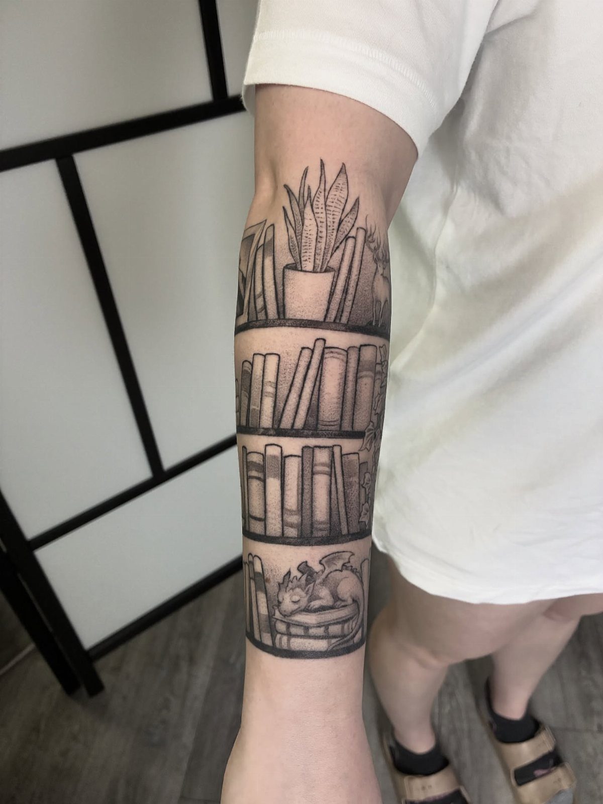
A forearm shelf loaded with books, a plant, and a tiny dragon turns the arm into a room the reader inhabits. A dragon small enough to miss at first rewards looking closer, the same pleasure a crowded bookshelf gives.
The tiers need planning. Too many books and the lines blur at healing size; too few and the shelves look sparse.
One living element, like that potted plant, breaks the rectangle of spines. One impossible element, like the dragon, keeps it from reading as pure realism.
This one suits collectors, the kind of reader who arranges by color and owns it.
21. Open Book with Quill Tattoo
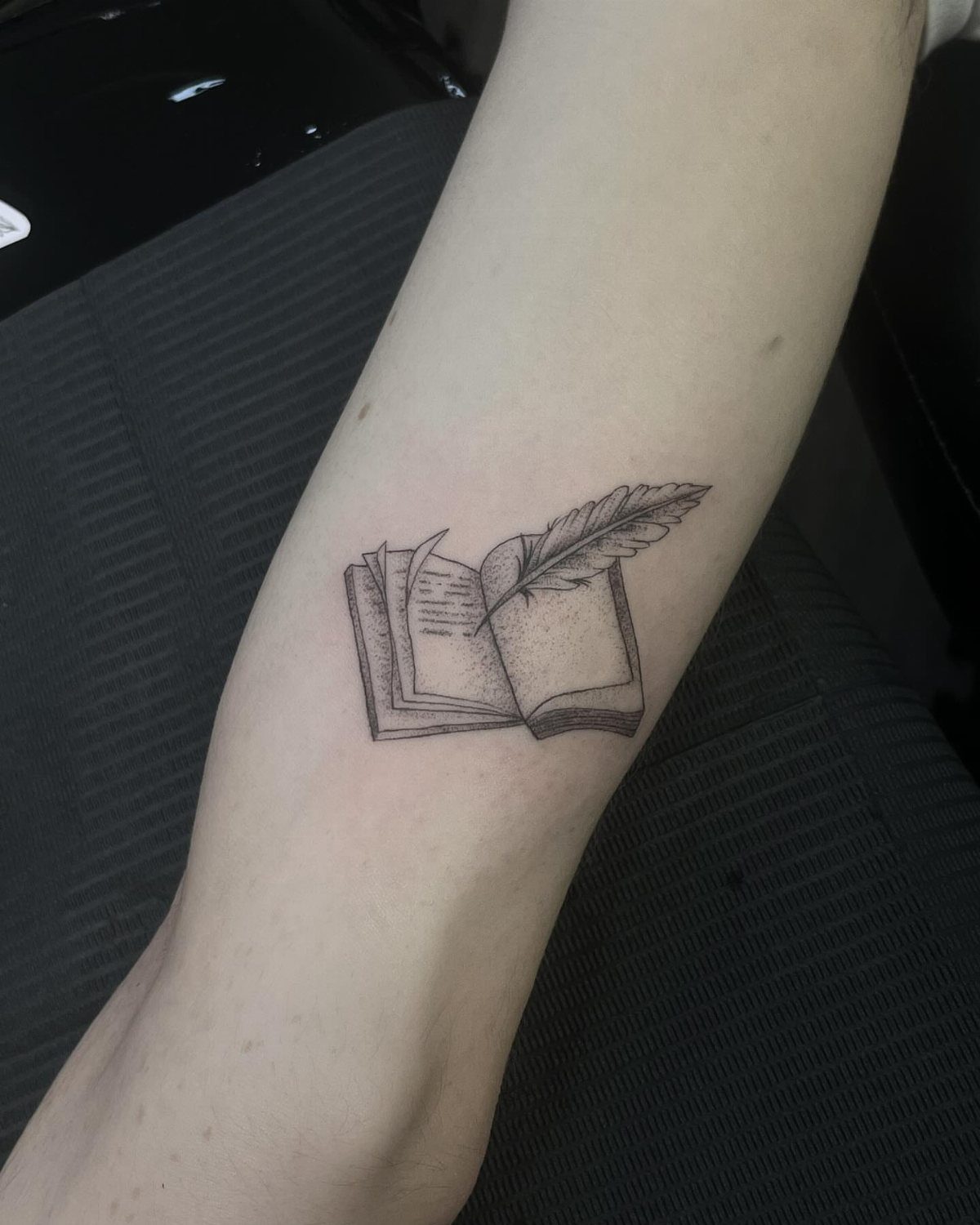
An open book with a quill resting across it speaks to writing, not just reading: the moment before the mark is made. A feather that curves with the page turn keeps the whole image moving even while still.
Black and grey ink keeps the quill from looking decorative; color would push it toward costume. The page edges need fine line work to read as paper rather than slab.
If you wanted variation, a few pages could lift free of the block, though that asks for more skin and more sessions.
I’d steer a first-time tattoo client toward this over busier designs. The shapes are simple, the meaning legible from across a room, and it ages cleanly.
22. Bell Jar Fig Tree Tattoo
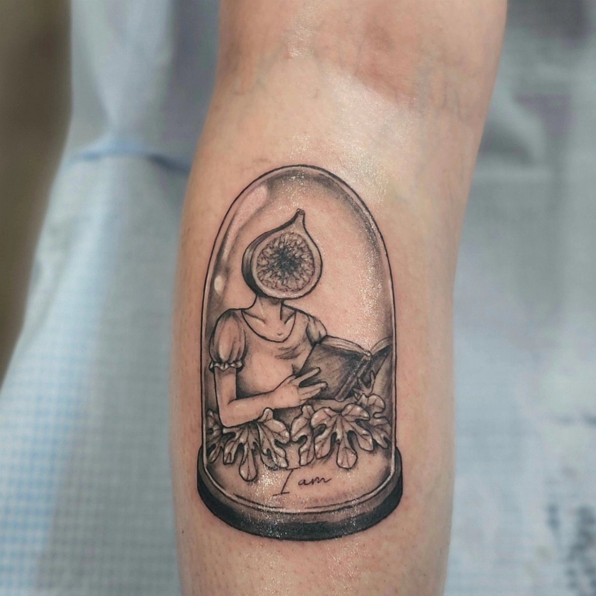
Sylvia Plath’s fig tree passage gives this image its weight: each fig a possible life, the paralysis of wanting all of them. The tattoo translates that into a single surreal figure, fig-headed, reading inside glass.
"I am" inscribed on the jar names the struggle without explaining it.
Fine line work this delicate has a shorter lifespan than bolder tattoos. The bell jar lines will soften first; the fig texture may need touchup sooner than the rest.
That fragility suits the source, honestly. Plath’s own lines have outlasted her, but barely, and always with damage visible.
Choose this if the passage found you at a specific stuck moment and you want to carry the recognition.
23. Open Book with Mountain Landscape
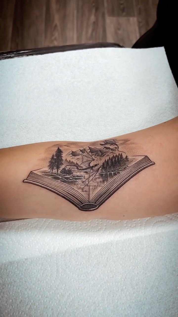
Mountains, pines, water, and dragons rising from open pages: the tattoo claims that landscape lives inside the book, not just describes it.
Dragons are the tell that this is fantasy territory, Tolkien or Le Guin or the reader’s own unwritten map.
The detail density here demands space. Forearm or calf minimum, and the artist needs confidence with atmospheric perspective to keep the far peaks reading as far.
Black and grey handles mist well, but if your source story has a specific dragon color, that single note of pigment would pull the eye to the creature emerging.
Best for the reader who has walked into woods because a book sent them there, and would again.
24. Glowing Magical Open Book
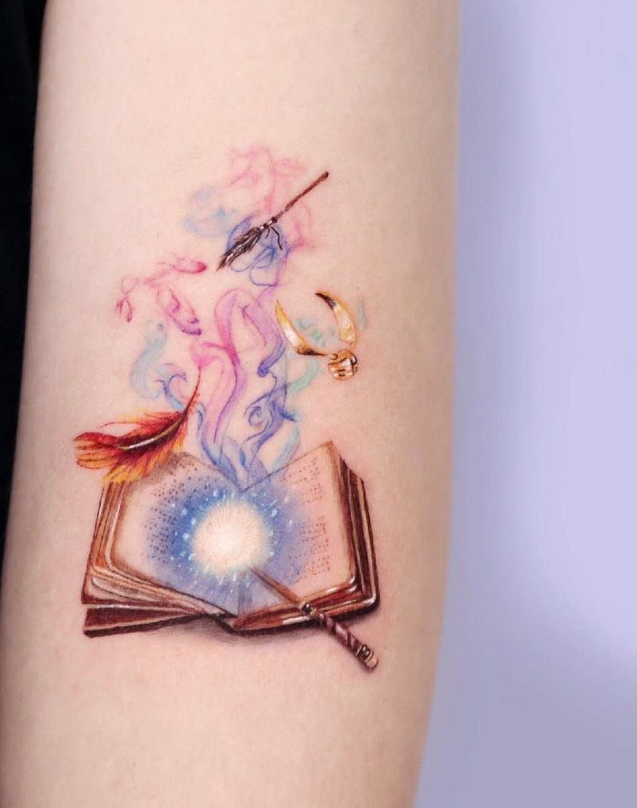
A glowing book tattoo works best when the light reads as coming from inside the pages, not painted on top.
The artist builds this with saturated magentas and teals fading to skin tone at the edges, so the glow looks like it is leaking out. Dense color work like this runs long, and the bill climbs with every extra element.
The wand, quill, and snitch turn a general magic theme into something Harry Potter–specific, which helps if that is your series. Without those references, the same glow and smoke still reads as fantasy, just more quietly.
I would drop the extra objects for a first tattoo and keep the book alone; the light carries the whole idea.
25. Character Reading a Book
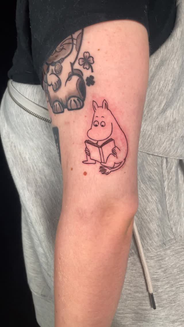
A small figure lost in a book turns the reader into the subject, not the object. A rounded back and eyes dropped low is the posture of someone who has forgotten where he is.
That body language matters more than the character choice; even a generic stick figure reads the same if the angle is right.
Black outline keeps it readable at this scale, about the size of a deck of cards or smaller. Color would muddy the details.
A tiny reader gets lost on a big flat area, but it nests well under something else or on a wrist where you see it while holding a book yourself.
Choosing a Meaningful Design
A book tattoo holds up longest when it connects to something specific you return to, not just a title you finished once and moved past.
The passage you underlined twice, the character you kept coming back to, or the quote you wrote down somewhere carries more weight than one you only remember liking.
The design can mark a book that changed your direction, or one that met you at a particular moment and still reads differently now. Either way, the meaning deepens with time if the source material rewards rereading.
Some readers choose the book itself as object: cracked spine, softened corners, the physical sign of use. Others choose what the book contains.
Both approaches work; the mistake is choosing for visual appeal alone and hoping significance follows.
Placement Considerations
The forearm offers daily visibility and enough length for stacked spines or an open spread. It also catches sun, which matters for color work and fine detail.
Ribs and back suit pieces you want present but not announced.
Larger compositions need the space a thigh or upper back provides. A single small icon, the potion bottle or a closed book, fits ankle or wrist without crowding.
I’d match the placement to how often you want to see it yourself versus how often you want others to ask about it.
Styles of Book Tattoos
Realistic style demands an artist who can render paper texture, leather wear, and the particular fall of light across a page. The healed result depends on their patience with small detail; what looks crisp at the appointment may soften.
Minimalist line work suits smaller pieces and ages cleanly. A single book outline, thin spines, or a quill reduced to its essential curve stays readable at a distance without shouting.
Illustrative work sits between: more detail than minimalism, less photographic precision than realism. It allows color, stylization, and the mood of a specific story to come through.
I’d check healed photos from a year or more back, not just fresh work. Style on skin changes; the artist’s healed portfolio tells you what actually lasts.
Incorporating Quotes
A short phrase ages better than a paragraph. Skin shifts, lines blur, and a sentence that fits cleanly at twenty may crowd by forty.
The font carries as much meaning as the words.
Pairing text with a small image, an open book or a relevant object, anchors the words so they do not float.
Lines distort where the body flexes most.