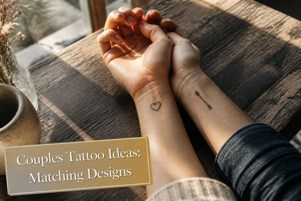
Couples tattoos in 2026 range from full forearm pieces to dime-sized symbols you hide behind an ear, and the deciding factor is how much meaning you want the design to carry when your partner is not in the room.
The catch is permanence; removal never fully erases the ink, so the design must still belong on your body alone.
Joe Jonas and Sophie Turner split "To infinity" and "& beyond" across two wrists, a four-word test that only works if each half survives on its own.
1. Minimalist Tattoos
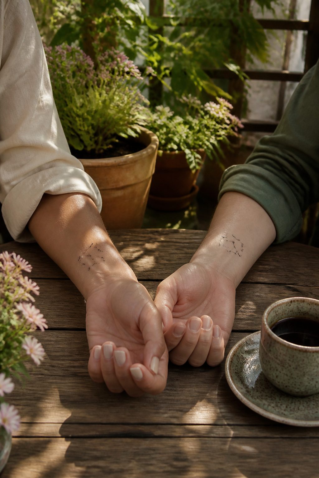
Fine-line symbols have become the dominant style for couples who want ink that stays quiet but still carries weight.
Hearts, stars, anchors, initials, and Roman numerals in single-needle work now fill Pinterest boards for a reason: they hide easily under a watch strap or collar, age without the blowout that swallows bolder lines, and still read as intentional rather than accidental.
The shift toward softer, cleaner tattooing has changed what couples actually request from artists. Where older matching pieces leaned on heavy black outlines to stay legible, these designs rely on delicate detail work that sits close to the skin.
That same softness photographs well, which has pushed the style across TikTok and Instagram faster than traditional bold work ever traveled.
A couple I watched choose their pieces last spring spent longer debating placement, wrist versus behind the ear, than they did on the symbol itself, a tiny shared constellation no bigger than a dime.
Their logic was that the smaller the mark, the more the meaning had to do the talking.
2. Lock and Key Tattoos
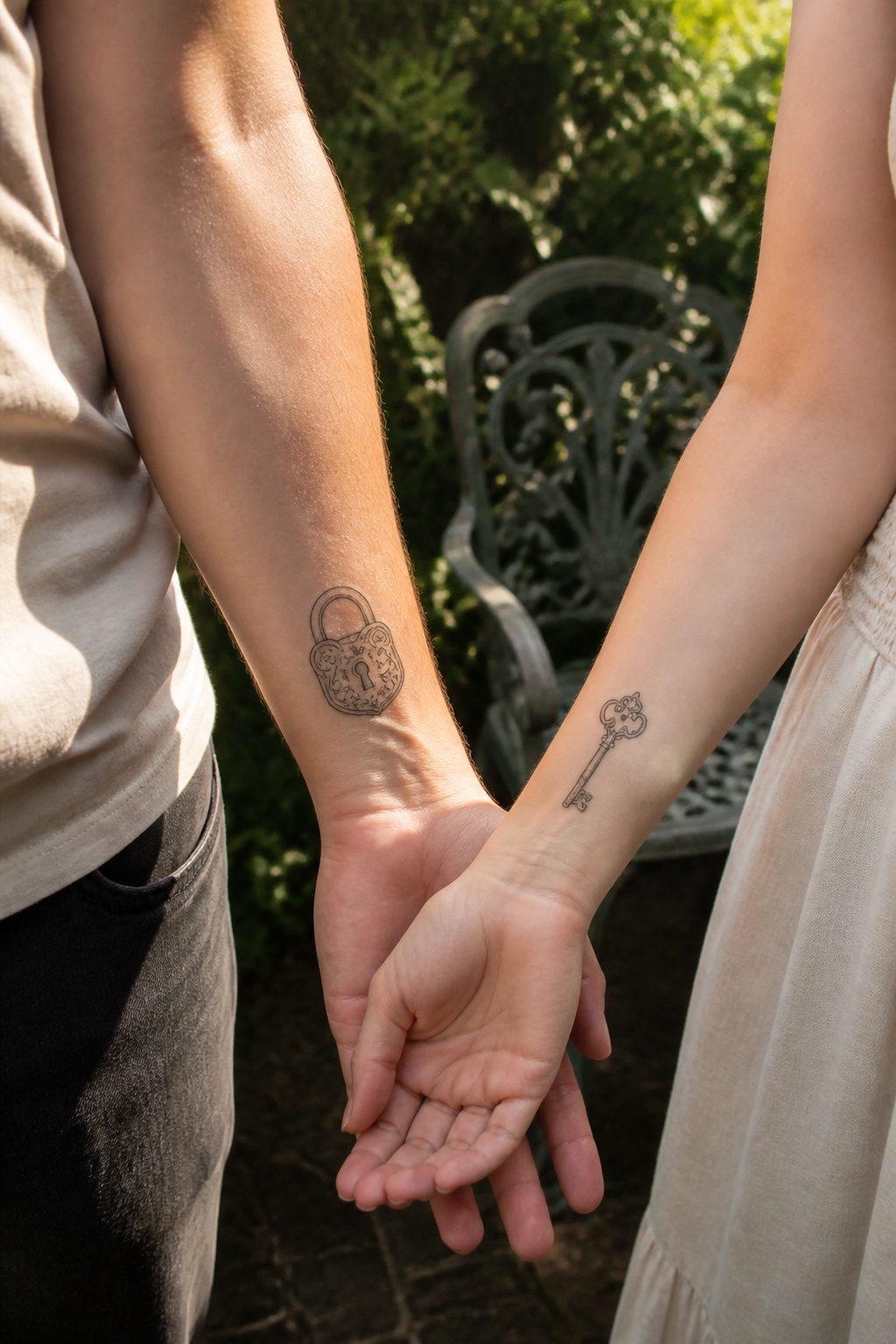
A lock on one partner’s wrist and the matching key on the other’s still reads as trust and exclusivity, the same meaning it’s carried for decades.
What changed is the artwork. The heavy traditional style with thick black outlines has largely given way to fine-line work so delicate the metalwork looks almost drawn in pencil.
Some couples keep the vintage details, ornate scrollwork and all. Others strip it to the absolute minimum, a single clean contour for each piece.
Size matters more here than with most matching tattoos because the mechanism has to remain readable. Too small and the teeth of the key blur together; too large and the symbolism starts to feel theatrical.
The sweet spot for most pairs is somewhere between a thumb and a palm in height, placed where the two designs can be shown side by side without contortion.
Initials tucked beneath the lock or key add a literal layer, though that choice splits opinion cleanly.
Some artists treat it as the extra touch that makes the set personal. Others find it redundant, the lock-and-key pairing already saying what needs saying.
3. Nature-Inspired Tattoos

Nature-inspired tattoos keep climbing alongside slow living and earthy aesthetics, and couples are using them to mark shared ground rather than identical taste.
Two intertwined flowers, like roses or lilies, speak to unity and growth without demanding the same stem on both people.
The sun and moon pairing works similarly: one carries daylight, the other holds the night, and together they balance duality without matching exactly.
Split designs, where each person carries one half of the symbolism, let the tattoo read complete only when you’re together.
Waves paired with mountains hit the same note from a different angle. One partner wears the soft, shifting water; the other gets the solid, weathered peak.
The contrast matters more than sameness here, and the design holds up because both are nature’s work. Celestial bodies follow the same split logic, with mystical, dreamy aesthetics driving much of the current interest.
Pinterest trends lean into these organic and celestial motifs right now, which means the designs feel current without chasing hype. What lasts is the meaning underneath: growth, stability, adventure, or the interplay of difference that actually sustains a partnership.
4. Significant Dates
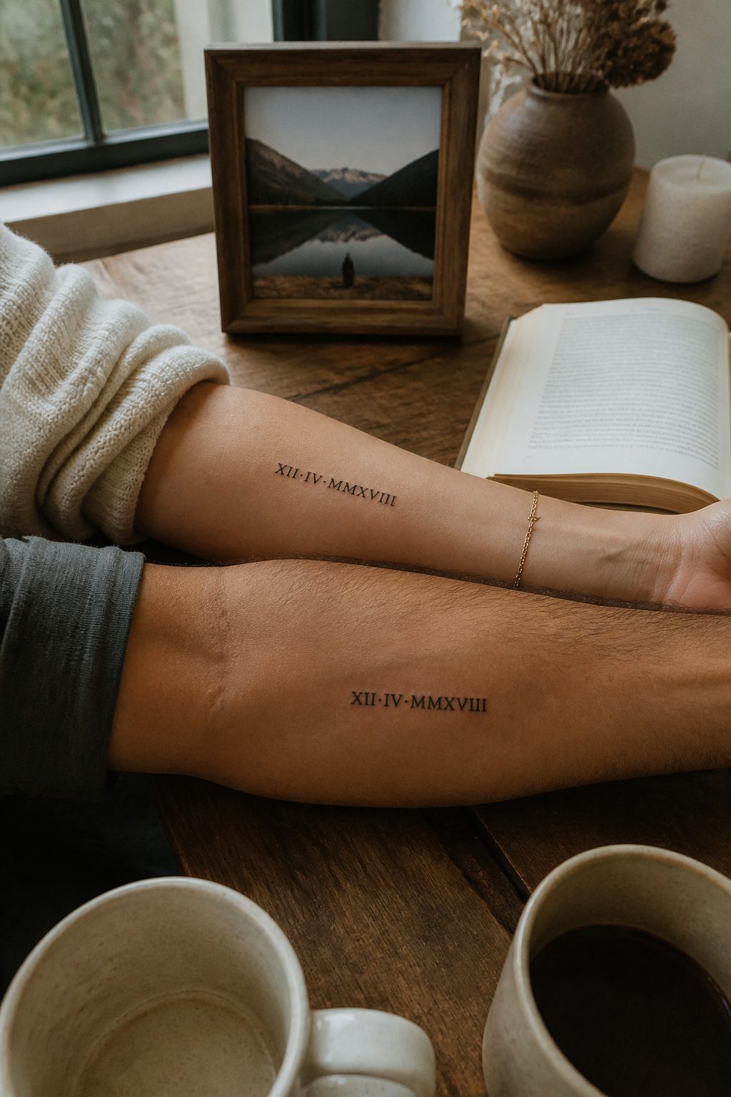
Anniversaries, first meeting dates, and the day everything shifted carry more weight than any symbol because the numbers already mean something to only the two of you.
Roman numerals keep the date legible to strangers while staying intimate, a quiet code that reads as elegant ink rather than a calendar entry.
Fine-line script works the same way, especially in placements where a glance down reminds you without broadcasting to a room.
The sources lean toward subtle placements for these, and that restraint makes sense. A date on the inner forearm, the ribcage, or along the collarbone stays personal by default, visible when you choose and hidden when you prefer.
Some couples go larger with the numerals and add a short line of text underneath, a small quote or the city where it happened, though that risks cluttering what works best as understatement.
Two formatting paths exist, and the choice is genuinely a fork rather than a hierarchy. Roman numerals suit couples who want the date to read as design first, meaning second.
Script suits those who want the language itself to carry the warmth. Either way, the typography matters more than the placement: a rushed font turns a meaningful sequence into a number you regret.
Ask to see the artist’s previous lettering work before committing, and request a stencil test on your actual skin, not just paper.
5. Shared Interests
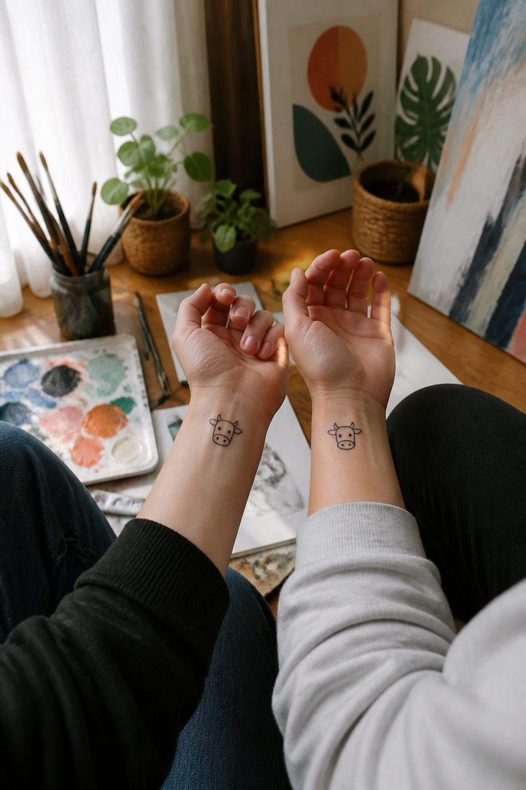
A couple I know has matching tattoos of the little cow emoji from their phones, which looks like nothing to anyone else.
For them it traces back to an early text thread where "I love you mooo-ch, mooo-ch, moooooo-ch" became their ritual, and the image turned into a private seal they now wear on their wrists.
The design stays simple so the story stays yours; a stranger sees a cartoon animal, not the three years of late-night messages behind it.
The same logic works for a shared series binge, a game you both play, a song on repeat during a road trip.
One pair I came across swapped the positions of the boy and girl from the Atypical intro drawing depending on who wore it, so each carries the other in the frame.
The reference is invisible unless you have the context, which is exactly the point.
These tattoos hold up because the source material outlives the relationship status: you still loved that band, that book, that stupid joke even if the person beside you changes.
6. Abstract Line Tattoos
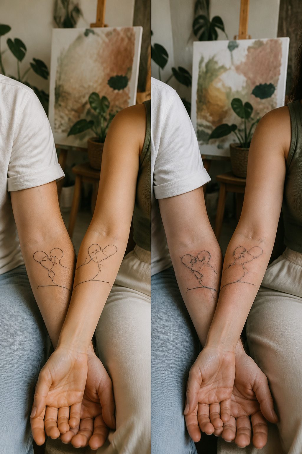
Continuous line art translates especially well to couples tattoos because a single stroke can travel across two bodies and still read as one gesture.
The design stays abstract, so the meaning stays private; nobody else needs to know where your line ends and your partner’s begins.
Geometric shapes work the same way. Two interlocking triangles or mirrored arcs placed on inner forearms will align edge-to-edge when you stand shoulder to shoulder, completing a form that neither tattoo fully owns alone.
Non-representational designs also let you split a larger shape, like a circle or wave, so each person carries half. The image only resolves when you are together, which is the quiet power of this style.
The line should be drawn by one artist in one session if possible, or at least planned from a single stencil, so the weight and flow match exactly.
A thick stroke on one arm and a thin one on the other breaks the illusion that the two tattoos were ever meant to connect.
7. Matching Symbols
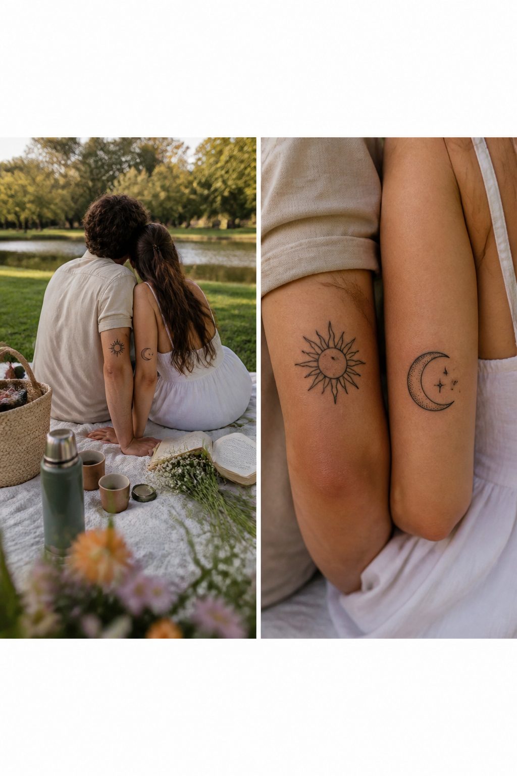
Paired symbols carry a different weight than literal matches like lock and key.
The sun and moon, two halves of an avocado, a rocket and its planet, these designs hold meaning even when the wearers are apart, which is the point that separates this category from more direct "you complete me" imagery.
One person carries daylight, the other carries night, and neither tattoo becomes a puzzle piece waiting for its mate to make sense.
What convinced me, reading through the popular arrangements, is how modern couples are splitting the symbolism rather than mirroring it.
Matching suns and moons on both partners still happens, but the stronger choice gives each person one half of the pair. The contrast itself becomes the bond, honoring that you are not dating a mirror copy of yourself.
Gemstone inlays have entered this space too, with blue and red stones set into the celestial shapes to mark individuality inside the shared theme.
The style matters as much as the symbol: celestial imagery is pulling strongly from mystical, dreamy aesthetics right now, which shows in the linework and the color palettes couples request.
An anchor and compass, different flowers from the same botanical family, these follow the same logic. The imagery differs, but the concept unifies.
8. Quotes and Phrases
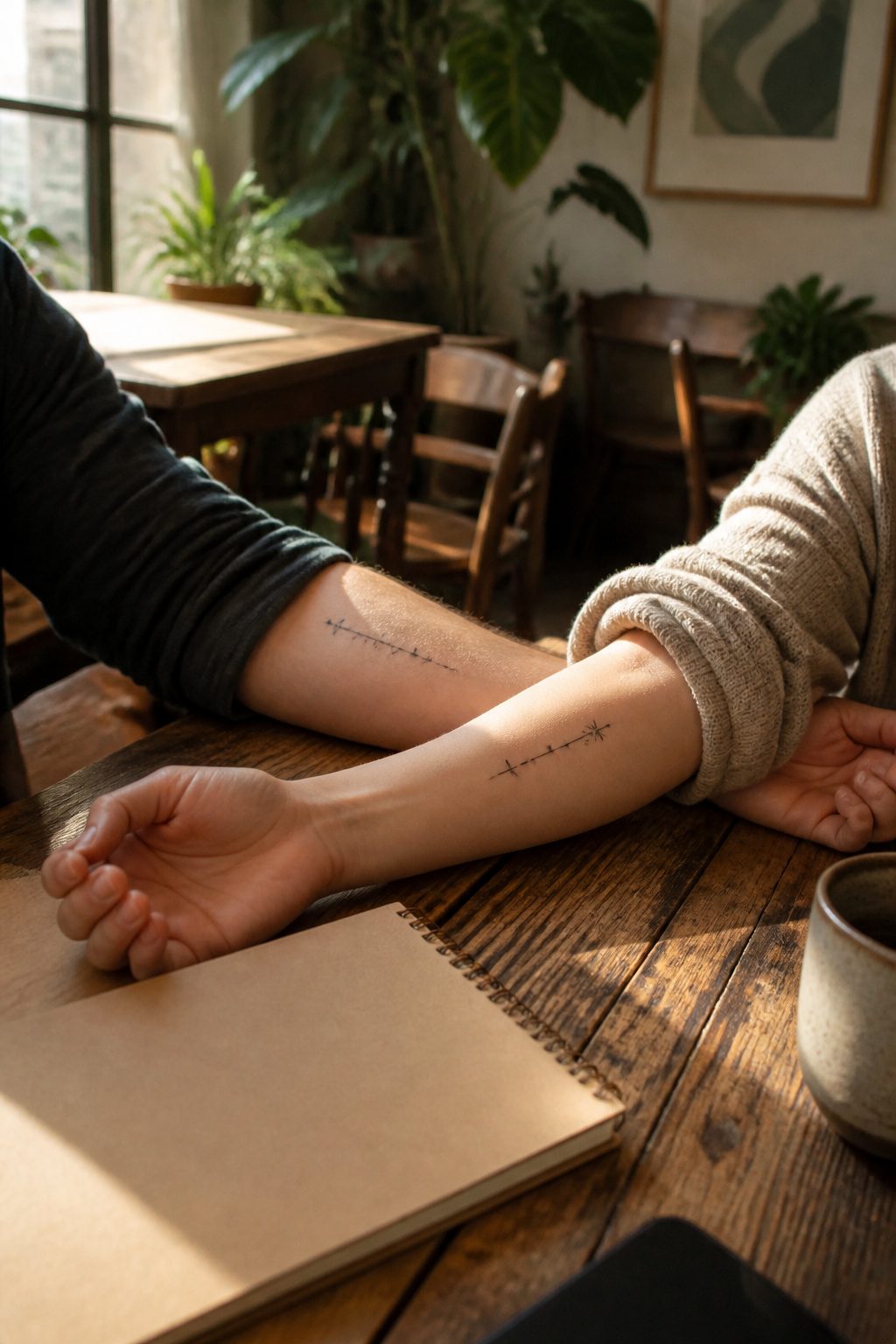
Split quotes work best when the line is short enough that neither half looks orphaned on its own.
Joe Jonas and Sophie Turner chose the four-word Toy Story line, "To infinity" on his wrist and "& beyond" on hers, and that economy is what saves it.
A longer quote risks one partner carrying filler words while the other gets the payoff.
Matching phrases in different languages are another path, though the same risk applies. A bilingual design only reads as clever if both partners actually speak those languages; otherwise it drifts toward decoration without weight.
Script and serif fonts age faster than imagery does. Letterforms thin out, blur, or trend toward datedness in ways a simple symbol usually does not.
What reads as elegant at twenty-five can look like a label at forty, and text offers no visual shorthand the way a sun-and-moon pairing might.
If the phrase is non-negotiable, a clean sans-serif with generous spacing holds up longer, but the honest tradeoff is that words carry more maintenance over decades than pictures do.
9. Finger Tattoos
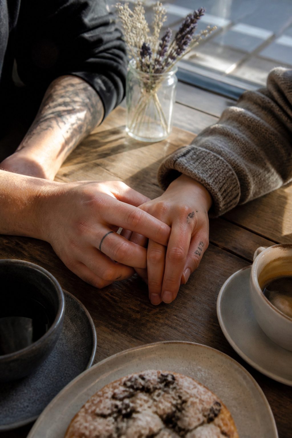
Finger tattoos sit right where you and everyone else can see them, which is exactly the point for couples who want commitment without the jewelry box.
A thin band of ink around the ring finger, a shared symbol on the inside knuckle, or a date in Roman numerals tucked beside it reads as intentional rather than accidental.
The placement signals permanence in a way a necklace or bracelet never quite could, and for partners who work with their hands or simply lose rings, the tattoo replaces the band rather than supplementing it.
The catch is real and immediate. Hands wash, grip, scrape, and sun-expose constantly, so finger ink fades faster than almost anywhere else on the body.
What reads crisp in the shop softens within months; the fine linework that makes these designs elegant is the same linework that blurs quickest.
Touch-ups become maintenance, not exception, and anyone choosing this placement should budget for that rhythm from the start. The symbolism holds, but only if you accept that the image itself will need refreshing to keep its shape.
10. Animal Tattoos
Penguins carry one of the clearest stories in the animal kingdom, since the birds mate for life and raise chicks through Antarctic winters that would break most partnerships.
A penguin pair can be rendered in watercolor, linework, or the geometric style that has dominated Instagram feeds for the past two years; what matters is that the two figures read as a unit without being identical mirrors.
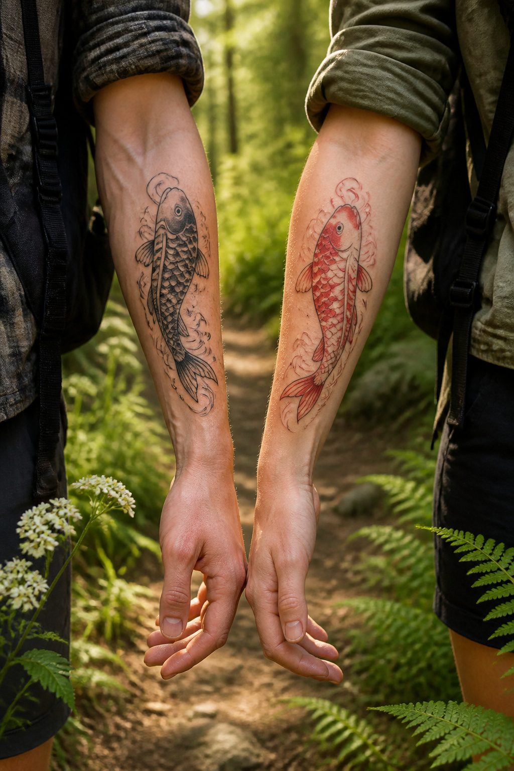
Koi fish offer a different structure, one built on movement rather than stillness.
The traditional pairing, a black male and red-and-white female, swims upward against currents in Japanese ink painting, and couples often adapt this by matching the fish while shifting the shading or adding color to only one partner’s piece.
The detail work on scales and fin edges is demanding enough that a skilled artist matters more than the sketch you bring in.
Wolves and certain bird species, including swans and albatrosses, round out the biological-fidelity approach.
Wolves operate as pack animals with a single breeding pair, which reads as loyalty without the saccharine edge of more common symbols. Birds that return to the same nesting site annually give couples a narrative about migration and homecoming.
The personal move, in every case, is adding a location coordinate, a date in Roman numerals, or a background element from a trip you took together. Glamour put the underlying point cleanly:
it doesn’t matter what anyone else thinks: Each couple knows what’s best for them.
That license to deviate is what keeps an animal tattoo from looking like clip art.
One partner’s koi might swim left, the other right, with current lines that meet only when you stand shoulder to shoulder. The biology gives you the language; the asymmetry makes it yours.
What to Consider Before You Book
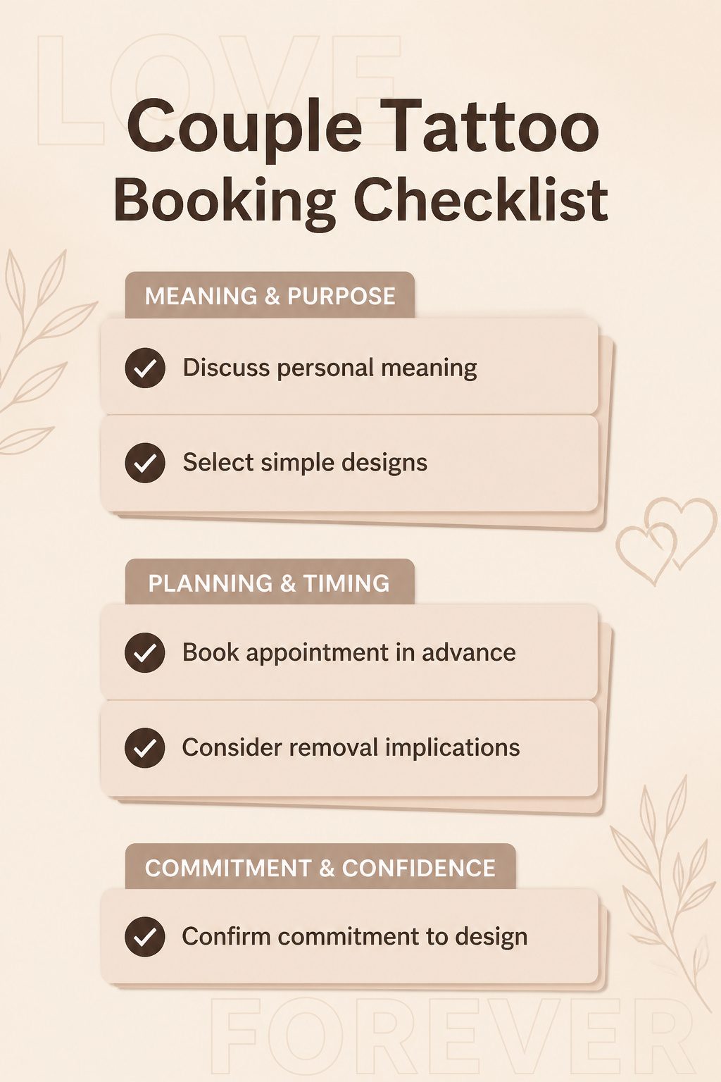
A matching tattoo only works if both of you want the same thing for the same reason.
The design should hold weight beyond the relationship itself, something that still means something if read alone. A date, a place, a shared interest, or a symbol that mattered before you met keeps the ink from becoming a label.
Placement and line weight matter more than detail.
Thin lines and simple shapes age cleaner; dense work blurs faster, especially on hands where nerve endings also make the session harder to sit through. Book a week before any event so healing finishes in time.
The harder question is permanence.
Removal is expensive, painful, and never fully erases the tattoo. If the relationship shifts, the mark stays.
Both of you need to answer honestly whether the design still belongs on your body independent of the other person. If either answer stalls, wait.
Where to Place Them
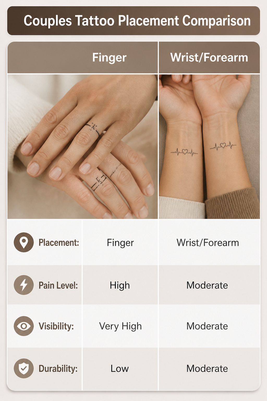
Finger placement looks romantic in photos, but the bone sits close to the skin there, so the needle registers every vibration.
A small band or initials on the inside of a finger also fades fast; the skin renews itself constantly from gripping and washing.
If you want the pair to read as a set, both partners need the exact same finger and orientation; otherwise one hand looks decorated and the other looks accidental.
Wrists and forearms give the design room to breathe and hurt less than bone-forward spots.
The pair shows when you hold hands across a table, but each tattoo still holds up alone. Fine-line work here ages better than on fingers because the skin takes ink more evenly.
Behind the ear hides the tattoo entirely until you tuck hair back. That placement works for couples who share something private, a small symbol or matching shape that only appears when you choose to reveal it.
The pain sits in the moderate range; the skull buffers some of the sensation, though the needle noise that close to your ear rattles more than it stings.
For discretion, the forearm, wrist, or ankle carry small designs cleanly without demanding daily explanation.
The upper arm or thigh hurt less because flesh pads the bone, though those spots rarely read as a matching pair unless you plan around short sleeves or swimwear.
Why the Trend Moved Small
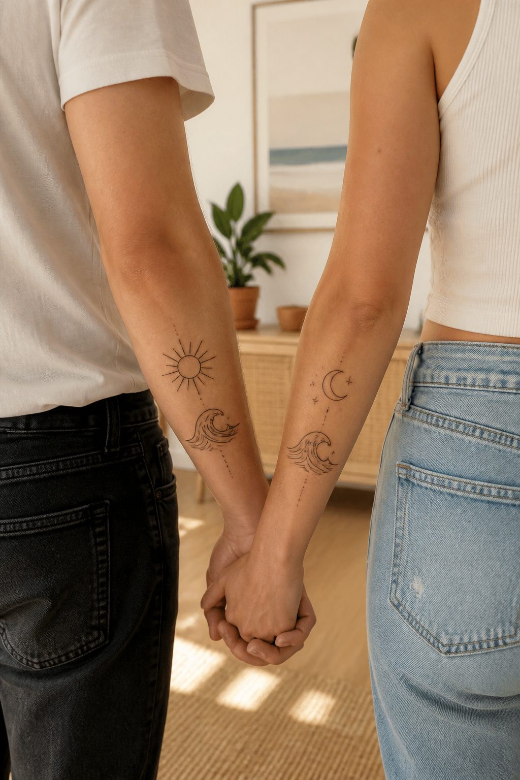
The shift toward small, quiet tattoos started showing up in my feed around 2024, and by 2025 it had become the dominant look on Pinterest.
Couples now ask for artwork that carries emotional weight without shouting across a room. Clean lines and tiny symbols placed where only a partner sees them feel more intimate than a full forearm declaration, and they age better too.
This mirrors the broader move toward micro tattoos in general. These designs use extremely fine detail and take up minimal space, which makes them practical for first-timers and anyone in a professional setting where visible ink still raises eyebrows.
The aesthetic is minimalist by necessity: the smaller the canvas, the more every line matters.
What changed in couples work specifically is the motive.
Older matching tattoos often read as ownership markers, names and portraits exchanged like contracts. The 2025–2026 designs express connection through shared memory, emotional symbolism, or a private reference that means nothing to strangers.
A couple might choose a micro finger tattoo over a wedding band, or two halves of a single motif that only complete their meaning when the partners are together.
The result is personal without being theatrical, and that restraint is exactly what makes it last.
Testing With Temporary Ink
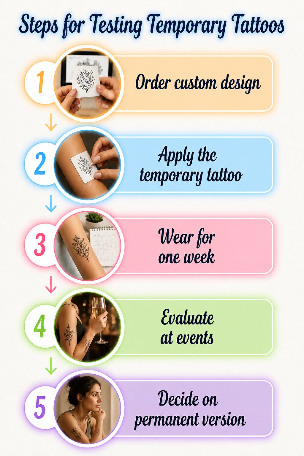
Temporary ink gives a real preview, but the timeline matters more than most couples expect.
A standard temporary tattoo lasts anywhere from a few days to a couple of weeks, which is barely enough to move through a full morning routine, let alone a wardrobe change or a beach weekend.
Order a custom temporary in your exact design and wear it through at least one work week and one social event before you decide. The sources I read split on whether this step actually predicts happiness with the permanent version.
One view says testing placement and visibility on your own skin is invaluable; another holds that no temporary version captures the experience of sitting for the needle or living with something that will not wash off.
Both make sense. The temporary test answers practical questions: does the placement catch on jewelry, does the size read right from conversation distance, does the meaning hold up when you are not in the romantic moment that inspired it.
It does not answer the emotional one, which is whether you want this mark to outlast the relationship. That question sits outside any trial run.
Frequently Asked Questions
What should I consider before getting a matching tattoo?
Ask whether the design still belongs on your body if the relationship changes, because removal is expensive, painful, and never fully erases the mark.
Both partners need to want the same thing for the same reason, and the ink should hold meaning beyond the relationship itself, like a date, place, or shared interest that mattered before you met.
Thin lines and simple shapes age cleaner than dense work, and you should book at least a week before any event so healing finishes in time.
What are the best places on the body for couple tattoos?
Wrists and forearms give the design room to breathe, hurt less than bone-forward spots, and let the pair show when you hold hands across a table while each tattoo still holds up alone.
Fingers look romantic but fade fastest and need constant touch-ups; behind the ear hides the tattoo entirely until you tuck hair back.
For discretion, the forearm, wrist, or ankle carry small designs cleanly, while the upper arm or thigh hurt less because flesh pads the bone.
What are the latest trends in couple tattoos?
Small, quiet tattoos with clean lines and tiny symbols placed where only a partner sees them have dominated since 2024, replacing older ownership-marker styles like names and portraits.
Fine-line artwork, celestial symbols, minimalist designs, and nostalgic themes are what couples search for most right now.
The shift expresses connection through shared memory, emotional symbolism, or private references that mean nothing to strangers, making the result personal without being theatrical.